Figma Dashboard UI Kit Essentials
Introduction to Figma UI Kits
Figma UI kits serve as indispensable tools for UX/UI designers and front-end developers. These kits are collections of pre-designed components that can be used to streamline the design process. The main purpose of a Figma UI kit is to provide a foundation of elements, such as buttons, forms, icons, and navigation bars, which can be easily customized to suit various projects.
Using a Figma dashboard UI kit can significantly enhance the efficiency of the design workflow. Designers are able to focus on the creative aspects of their work rather than spending excessive time on repetitive tasks. A well-structured kit includes all necessary components, allowing for quick development of user interfaces.
Importance of Dashboard UI Kits for Designers
Dashboard UI kits play a crucial role in modern design projects. They are specifically tailored for creating dashboard interfaces, which often require a diverse set of components to convey information effectively. Here are several reasons why dashboard UI kits are important for designers:
| Benefit | Description |
|---|---|
| Streamlined Workflow | Pre-designed elements save time and effort, leading to faster project completion. |
| Consistency | Utilizing a standardized set of components ensures uniformity across different parts of the design. |
| User-Centric Design | Designed with usability in mind, these kits help create interfaces that enhance the user experience. |
| Adaptability | Dashboards can be tailored to different users and industries through simple customization. |
In addition to these advantages, Figma dashboard UI kits are often updated to stay in line with the latest design trends. Designers can leverage these kits to incorporate modern aesthetics into their projects seamlessly. For a broader range of tools, individuals may explore free Figma UI kits or specialized options like figma wireframe ui kit and figma mobile ui kit.

Benefits of Figma Dashboard UI Kits
Figma dashboard UI kits offer numerous advantages that enhance the design process for UX/UI designers and front-end developers. These benefits include consistency in design, time efficiency in prototyping, and an enhanced user experience.
Consistency in Design
One of the primary benefits of using a Figma dashboard UI kit is the consistency it brings to design projects. A well-structured UI kit provides predefined styles, components, and layouts, ensuring that all design elements work harmoniously together. This consistency is crucial for maintaining brand identity and delivering a professional appearance.
| Element | Importance |
|---|---|
| Typography | Uniform font styles and sizes create a cohesive look. |
| Colors | A defined color palette helps in creating a recognizable brand. |
| Components | Reusable design elements maintain uniformity across screens. |
Time Efficiency in Prototyping
Figma dashboard UI kits significantly reduce the time needed for prototyping. By providing ready-to-use components and templates, designers can quickly assemble prototypes without starting from scratch. This time saving allows designers to focus on refining user interactions and aesthetics rather than on basic design tasks.
| Task | Time Saved with UI Kit (Approx.) |
|---|---|
| Creating Buttons | 50% |
| Designing Navigation Bars | 40% |
| Building Forms | 60% |
Utilizing a UI kit streamlines the design workflow, enabling faster iterations and improved productivity.
Enhanced User Experience
A well-designed dashboard UI kit ultimately leads to a better user experience. By employing UI components that adhere to established design principles, designers can create intuitive interfaces that meet user needs effectively. Consistent navigation, clear visual hierarchy, and thoughtful interactions contribute to overall user satisfaction.
| UI Element | Impact on User Experience |
|---|---|
| Consistent Navigation | Reduces user confusion and enhances usability. |
| Responsive Design | Ensures accessibility across various devices. |
| Intuitive Interactions | Facilitates easy and efficient user interactions. |
Employing a Figma dashboard UI kit allows designers to prioritize user experience while maintaining high design standards. For further reading on various UI kits, visit our articles on figma wireframe ui kit and figma mobile ui kit for tailored options.
Utilizing Figma Dashboard UI Kits
Figma Dashboard UI Kits offer a range of features and options that can significantly enhance the design workflow for UX/UI designers and front-end developers. This section focuses on customization options and collaboration features that make these kits essential tools in the design process.
Customization Options
Customization is one of the key advantages of using Figma Dashboard UI Kits. Each component within the kit can be easily modified to fit specific project requirements. Designers can change colors, fonts, sizes, and even layouts to match their branding or user preferences. This level of flexibility fosters creativity while ensuring that the designs maintain a cohesive look.
Below is a table illustrating common customization options available in Figma Dashboard UI Kits:
| Customization Aspect | Options Available |
|---|---|
| Color Palette | Primary, Secondary, Accent |
| Typography | Font Families, Sizes, Weights |
| Component Size | Fixed Sizes, Fluid Resizing |
| Layout Structure | Grid Systems, Flexbox, Layering |
By leveraging these customization options, designers can create unique and tailored dashboards that enhance the overall user experience.
Collaboration Features in Figma
Figma's collaboration features are another reason why utilizing Figma Dashboard UI Kits is beneficial. The platform allows multiple team members to work on the same design simultaneously. This real-time collaboration eliminates version control issues and fosters effective communication among team members.
Key collaboration features include:
- Comments and Feedback: Team members can leave comments directly on the design, making it easier to track feedback and incorporate changes.
- Version History: Figma maintains a history of design changes, allowing designers to revert to previous versions if needed.
- Sharing Options: Designs can be easily shared with stakeholders using a simple link, making it accessible for review without needing to download files.
The combination of these collaboration features streamlines the design process and helps ensure that all project stakeholders are aligned with the design direction.
Utilizing Figma Dashboard UI Kits not only enhances the customization experience but also promotes teamwork and efficient communication, making it an essential aspect of modern design practices. For additional resources, designers can explore our articles on free figma ui kits and best figma ui kits.
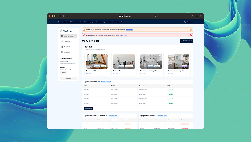
Types of Components in Figma Dashboard UI Kits
Understanding the various components available in Figma dashboard UI kits is essential for effective design. These components can be categorized into common elements and more advanced features, providing designers with a comprehensive toolkit for their projects.
Common Components
Common components form the backbone of any dashboard design and typically include essential elements that users interact with regularly. These components streamline the design process by providing ready-made solutions that maintain visual consistency.
| Component Type | Description |
|---|---|
| Buttons | Interactive elements for user actions |
| Input Fields | Areas for data entry and user input |
| Dropdown Menus | Selectable options that open vertically |
| Icons | Visual symbols representing functions or content |
| Cards | Containers for displaying grouped information |
| Navigation Bars | Horizontal or vertical menus for page navigation |
Designers can enhance their projects by leveraging these common components, ensuring a faster and more efficient workflow.
Advanced Components for Dashboard Design
Advanced components offer additional functionality and can help in creating more dynamic and sophisticated dashboard interfaces. These components are designed to cater to complex user interactions and visual storytelling.
| Component Type | Description |
|---|---|
| Charts and Graphs | Visual representations for data analytics |
| Progress Bars | Indicators showing the completion status of tasks |
| Modals | Pop-up windows for additional content or actions |
| Date Pickers | UI elements for selecting dates and times |
| Tooltips | Contextual information boxes that appear on hover |
| Tabs | Segmented areas for organizing related content |
The integration of advanced components allows designers to elevate their dashboards, creating a more engaging and informative user experience. For additional design options, check out our guide on figma wireframe ui kit or explore free figma ui kits available for customization.
Design Best Practices with Figma UI Kits
Designing effective user interfaces using a Figma dashboard UI kit requires attention to detail and an understanding of best practices. Two critical aspects to focus on are creating responsive designs and maintaining visual hierarchy.
Creating Responsive Designs
Responsive design ensures that applications function well across various devices and screen sizes. When using Figma UI kits, designers should prioritize flexibility and adaptability in their layouts. This can be achieved through the following strategies:
| Strategy | Description |
|---|---|
| Use Flexible Grids | Implement grids that adjust according to screen size. |
| Employ Constraints | Set constraints for elements to resize proportionally. |
| Test on Multiple Devices | Regularly preview designs on different screen sizes. |
| Adapt Typography | Ensure text resizes effectively across devices. |
Utilizing a Figma mobile UI kit can guide designers in achieving necessary responsive behaviors and layouts tailored for varying platforms.
Maintaining Visual Hierarchy
Visual hierarchy is essential in guiding users through a design by organizing information effectively. By thoughtfully arranging elements based on importance and functionality, designers can enhance usability. Key considerations include:
| Element | Importance |
|---|---|
| Size | Use larger fonts and elements for primary actions. |
| Color | Apply contrasting colors to highlight key features. |
| Spacing | Use white space to separate different sections. |
| Alignment | Ensure consistent alignment for a structured appearance. |
To master these concepts, exploring various free Figma UI kits can provide inspiration and practical examples of effective visual hierarchy in dashboard designs.
By adhering to these best practices in responsive design and visual hierarchy, designers can craft engaging and user-friendly interfaces that leverage the power of Figma dashboard UI kits.
Enhancing Your Design Workflow
Integrating Figma UI Kits with Your Design Process
Incorporating a Figma dashboard UI kit into the design workflow can significantly streamline the development process for UI/UX designers and front-end developers. These kits provide pre-designed components that can be easily adapted to meet specific project requirements.
To effectively integrate a Figma UI kit, designers should begin by familiarizing themselves with the components available within the kit. This can include buttons, cards, forms, and navigation elements. Understanding the elements that are available facilitates the design process and minimizes the time spent on creating components from scratch.
A typical integration process might include the following steps:
| Step | Description |
|---|---|
| 1. Analyze Kit | Review the components within the dashboard UI kit to identify suitable elements for the project. |
| 2. Plan Layout | Sketch the layout using the identified components, ensuring a cohesive design. |
| 3. Implement Components | Drag and drop selected elements into the design canvas, modifying as needed. |
| 4. Prototype | Utilize Figma's prototyping features to demonstrate interactions and flows. |
Collaboration is also crucial when using a Figma kit. Designers can share documents with team members, obtain feedback, and make necessary adjustments in real time.
Staying Updated with Latest UI Trends
For designers, keeping up with the latest trends in user interface design is essential for maintaining relevance in a competitive field. Regularly exploring new tools, components, and styles can inspire creativity and enhance design quality.
Figma dashboard UI kits often incorporate the latest trends in visual design, making them valuable resources for staying current. Some trends to note include:
| Trend | Description |
|---|---|
| Dark Mode | Increasing preference for interfaces that offer both light and dark themes to reduce eye strain. |
| Minimalism | Simplified designs that focus on essential elements to enhance usability. |
| Microinteractions | Subtle animations that improve the user experience by providing feedback or guidance. |
| Customization | Flexible kits that allow designers to tailor components to specific project needs. |
By utilizing resources such as free figma ui kits and exploring options like the figma mobile ui kit, designers can stay updated with the latest best practices. Engaging with communities, attending webinars, and reading articles on best figma ui kits will further enhance their knowledge of current design trends.