
Understanding Figma Wireframe UI Kits
Importance of Figma UI Kits in Design
Figma UI kits serve as essential tools for UX/UI designers and front-end developers. These kits provide a collection of pre-designed elements and templates, enabling designers to streamline their workflow. By utilizing a Figma wireframe UI kit, designers can save time and maintain consistency across their projects.
The use of UI kits fosters collaboration among team members, allowing for a shared understanding of design elements. Teams can achieve a cohesive look and feel for their applications and websites, which enhances user experience. Additionally, these kits offer a starting point for projects, reducing the effort needed during the initial phases of design.
Role of Wireframe UI Kits in the Design Process
Wireframe UI kits specifically focus on the foundational layout of a product. They provide low-fidelity representations of user interfaces, allowing designers to visualize the structure and functionality before diving into high-fidelity designs. This method of early visualization is crucial for validating concepts and making necessary adjustments promptly.
The table below outlines the key aspects of wireframe UI kits in the design process:
| Aspect | Description |
|---|---|
| Initial Conceptualization | Helps designers brainstorm and quickly visualize ideas. |
| User Flow Mapping | Allows for mapping user journeys and interactions. |
| Rapid Prototyping | Facilitates the creation of clickable prototypes for testing. |
| Feedback Integration | Simplifies gathering feedback from stakeholders and users. |
By employing wireframe UI kits, designers can efficiently transition from concept to prototype, leading to enhanced efficiency and improved communication during the design process. For those interested in expanding their resources, exploring free Figma UI kits can provide additional foundational elements.

Key Components of the Best Figma Wireframe UI Kit
A well-designed Figma wireframe UI kit comprises several essential components that enhance the user experience during the design process. Understanding these components can help UX UI designers and front-end developers create effective user interfaces.
Layout Components
Layout components form the foundation of any design. They provide the structure necessary for organizing elements and creating a cohesive visual hierarchy. The best wireframe UI kits include:
| Component Type | Description |
|---|---|
| Grids and Columns | Guidelines for alignment and spacing |
| Cards | Modular sections for displaying content |
| Containers | Areas for grouping related elements |
| Sections | Divisible parts for page organization |
These layout components facilitate the arrangement of elements, making designs clear and user-friendly. Proper use of layout components can greatly enhance the usability of web and mobile applications.
Typography Elements
Typography plays a crucial role in user interface design. The choice of fonts, sizes, and styles can greatly affect readability and user engagement. A quality Figma wireframe UI kit should include a variety of typography elements, such as:
| Element Type | Description |
|---|---|
| Headings | Differentiated text for titles |
| Body Text | Standard text used for content |
| Font Sizes | Hierarchical sizing for emphasis |
| Text Styles | Variations for bold, italic, and normal |
Including these typography elements ensures that designers have a range of options, allowing them to create effective text layouts for different applications. For those specifically interested in comprehensive typography options, exploring a figma mobile ui kit can be valuable.
Color Schemes
Color schemes are essential in establishing the visual identity of a design. A well-structured Figma wireframe UI kit will provide a selection of pre-defined color palettes, including:
| Palette Type | Description |
|---|---|
| Primary Colors | Main colors for branding and accents |
| Secondary Colors | Complementary hues |
| Background Colors | Neutral tones for overall layout |
| Interactive Colors | Colors for buttons and links |
Choosing the right color scheme can significantly impact user perception and interaction. Designers should consider the emotional responses elicited by colors to enhance user experience. For more guidance on color options, reviewing the best figma ui kits will be beneficial.
By focusing on these key components—layout, typography, and color—designers can leverage the capabilities of a figma wireframe ui kit to create functional and aesthetically pleasing interfaces.
Interactive Elements
An essential aspect of any Figma wireframe UI kit is its interactive elements. These components are crucial for creating a user-friendly experience and enhancing the overall functionality of the design. This section explores three key interactive elements: buttons and icons, navigation bars, and form fields.
Buttons and Icons
Buttons are vital interactive components that prompt users to take action. In a Figma wireframe UI kit, various button styles should be included to cater to different use cases, including primary, secondary, success, and danger buttons. Icons, on the other hand, help enhance the visual appeal and usability of buttons, providing users with quick reference points.
| Button Type | Description | Recommended Use |
|---|---|---|
| Primary Button | Main action button | Primary calls to action |
| Secondary Button | Alternate action button | Supporting actions |
| Success Button | Indicates successful action | Confirmations |
| Danger Button | Indicates an action to avoid | Deletions or critical warnings |
Navigation Bars
Navigation bars serve as roadmaps for users, guiding them through the layout and structure of the website or application. A well-designed navigation bar should incorporate clear labeling, intuitive grouping, and responsive elements. Figma wireframe UI kits should include options for vertical and horizontal navigation bars, dropdown menus, and breadcrumb navigation to ensure comprehensive usability.
| Navigation Bar Type | Description | Key Features |
|---|---|---|
| Horizontal Navigation | Positioned at the top of the page | Dropdown menus, icons, search functionality |
| Vertical Navigation | Positioned on the side of the page | Collapsible sections, multi-level options |
| Breadcrumb Navigation | Shows user's location within the site | Hierarchical links, easy path backtracking |
Form Fields
Form fields are integral for gathering user input, making them a critical component in Figma wireframe UI kits. A comprehensive kit will include various types of form elements, such as text inputs, checkboxes, radio buttons, and dropdowns. Each form field must be designed for clarity and ease of interaction to enhance user experience.
| Form Field Type | Description | Best Practices |
|---|---|---|
| Text Input | Single-line input for text | Clear labels, placeholder text, validation |
| Checkbox | For multiple options selection | Visible selection, group-related options |
| Radio Button | For single-choice selection | Clearly labeled options, mutually exclusive |
| Dropdown | For selecting one option from a list | Appropriate length, easy scrolling |
While designing interactive elements, maintaining consistency across all components is crucial for a seamless user experience. For additional resources on selecting the best components, refer to our articles on best figma ui kits and free figma ui kits.
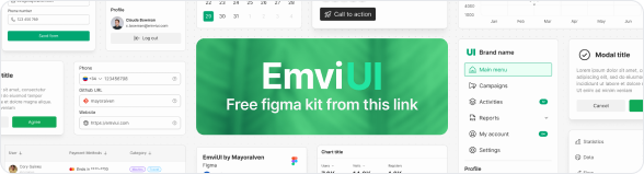
Click on the image to open the figma file
Customizability and Flexibility
Customizability and flexibility are critical aspects of a high-quality Figma wireframe UI kit. These features empower UX/UI designers and front-end developers to tailor their designs according to specific project needs.
Ease of Use and Modification
A user-friendly interface is essential for efficient design work. The best Figma wireframe UI kits are designed with intuitive navigation and clear organization, making it easy for users to locate and modify components. Pre-defined styles and components allow for quick alterations, enabling designers to implement changes rapidly without extensive learning curves.
| Feature | Description |
|---|---|
| Intuitive Layout | Clearly organized components and styles for easy access. |
| Pre-defined Styles | Ready-to-use templates that facilitate quick modifications. |
| Drag-and-Drop Functionality | Effortless incorporation of elements into designs. |
Compatibility with Various Design Styles
Flexibility in design style is another key feature of top Figma wireframe UI kits. These kits often include a range of components that can easily adapt to different aesthetics, from minimalistic themes to more complex layouts. This versatility allows designers to maintain consistency across varying projects and user interfaces without starting from scratch each time.
| Design Style | Compatibility |
|---|---|
| Minimalistic | Simple components that focus on usability. |
| Bold and Colorful | Diverse color options and bold elements for creative designs. |
| Corporate | Professional layouts suitable for business environments. |
Scalability and Consistency
As projects grow, a scalable design system becomes vital. High-quality Figma wireframe UI kits provide components that maintain their design integrity regardless of scale. This consistency ensures that as teams add new features or screens, the overall look and feel of the application remain cohesive.
| Aspect | Importance |
|---|---|
| Scalability | Ability to expand designs without losing quality. |
| Consistency | Uniform components that uphold a signature style across multiple platforms. |
Efficient customization, compatibility with a variety of design styles, and scalability are essential components in the evaluation of the best Figma wireframe UI kit. For further exploration of UI kits, consider looking at our articles on figma dashboard ui kit, figma mobile ui kit, and best figma ui kits. Additionally, free options are available, which can be valuable for those seeking budget-friendly resources; check our article on free figma ui kits for more information.
Collaboration Features
Collaboration is essential in the design process, especially for UX/UI designers and front end developers. A well-equipped Figma wireframe UI kit enhances teamwork and streamlines project workflows. The following components highlight the collaborative features that make a Figma UI kit invaluable.
Shared Styles and Components
One of the standout features of the best Figma wireframe UI kits is the ability to utilize shared styles and components. This allows team members to maintain consistency across the project without having to recreate elements.
| Feature | Benefit |
|---|---|
| Shared Styles | Maintain uniformity in design |
| Components | Easily reuse and update design elements |
Designers can create and apply styles for typography, colors, and components (such as buttons and cards) across the entire project. This unifies the visual identity, making collaboration more efficient.
Real-Time Collaboration Tools
Figma is renowned for its real-time collaboration capabilities. Multiple team members can work on the same project simultaneously, making edits that are instantly visible to others. This fosters a more dynamic and interactive design process.
| Tool | Functionality |
|---|---|
| Comments | Team members can leave feedback directly on designs |
| Live Editing | See changes as they happen |
| Activity History | Track edits and changes made by collaborators |
This feature allows for immediate feedback and reduces the need for endless email chains or separate communication tools.
Version Control and Feedback Integration
Managing changes in a design project can be challenging, but the best Figma wireframe UI kits include robust version control and feedback integration. Designers can revert back to previous versions easily, ensuring that no important progress is lost.
| Feature | Description |
|---|---|
| Version Control | Save multiple versions of the project |
| Feedback Integration | Collect and organize team input |
| Change Logs | Document revisions and rationales |
With integrated feedback tools, designers can gather insights from stakeholders effectively, ensuring that every perspective is considered during the design development process. For more information on effective UI kits, check out our article on best figma ui kits.
Support and Updates
Community Support
When utilizing a Figma wireframe UI kit, access to a supportive community can enhance the user experience. Designers and developers can benefit from forums and discussion groups dedicated to Figma and its wide range of UI kits. These communities serve as valuable resources for sharing tips, seeking advice, and troubleshooting issues that may arise during the design process. Engaging with fellow users often leads to the discovery of new techniques and styles that can improve design outcomes.
Regular Updates and Improvements
The best Figma wireframe UI kits often come from designers who are committed to providing regular updates. Frequent updates can include new components, enhanced features, and improvements based on user feedback. This ongoing support ensures that the kit remains relevant with current design trends and adheres to the latest usability standards. Maintaining an up-to-date UI kit helps users streamline their design processes and produces modern and effective results.
| Update Frequency | Benefits |
|---|---|
| Weekly | New components added, fixing bugs |
| Monthly | Major feature upgrades, performance enhancements |
| Quarterly | Extensive revisions based on user feedback |
Documentation and Tutorials
Comprehensive documentation and tutorials are essential features of a quality Figma wireframe UI kit. Clear guidelines help users understand how to effectively utilize the kit's components. Tutorials can provide step-by-step instructions on various design techniques, which is especially helpful for newcomers to UI/UX design. Familiarizing oneself with the available resources boosts confidence and efficiency in using the kit. For additional resources, users may explore a range of free figma ui kits that offer informative documentation.
Documentation often includes:
- Overview of features
- Detailed descriptions of components
- Workflow suggestions
- Frequently asked questions (FAQs)
The combination of community support, regular updates, and thorough documentation ensures that users can maximize the utility of their Figma wireframe UI kit, leading to more efficient and effective design experiences.