Exploring Figma Mobile UI Kits
Importance of UI Kits in Design
UI kits play a critical role in the design process by providing designers with pre-made components and templates. They serve as a foundational resource that allows for faster and more efficient design workflows. By utilizing a UI kit, designers can maintain consistency across different screens and elements, ensuring a cohesive look and feel for the final product. This is especially important for mobile applications where user experience (UX) is paramount.
Using UI kits can also aid in the rapid prototyping and iteration phases, allowing designers to visualize their concepts quickly. This efficiency not only saves time but also enhances collaboration among team members, as everyone can work from the same visual language. With the emphasis on creating user-friendly interfaces, the integration of UI kits can significantly improve the overall design process.
| Benefit | Description |
|---|---|
| Consistency | Ensures uniformity across all design elements |
| Speed | Accelerates the design and prototyping process |
| Collaboration | Enhances teamwork with shared resources |
| Visual Clarity | Improves user experience through well-designed components |

Benefits of Using Figma for Mobile UI Design
Figma offers a multitude of advantages for mobile UI design. Its cloud-based platform allows for real-time collaboration among team members, making it easy to share ideas and receive feedback instantly. Designers can work together seamlessly, regardless of their location, which streamlines the design workflow.
Another key benefit of using Figma is its powerful design tools that cater to both novice and experienced designers. The intuitive interface enables users to create complex designs without a steep learning curve. Additionally, Figma's component system allows designers to build reusable assets, saving time during the design process.
Moreover, Figma supports plugin integrations, which can enhance productivity further by automating repetitive tasks or providing additional functionalities. Designers can access a variety of tools, such as image optimization, accessibility checkers, and even animation tools, right within the platform.
| Feature | Benefit |
|---|---|
| Real-time Collaboration | Facilitates simultaneous input from multiple users |
| Intuitive Interface | Easy to learn and navigate for all skill levels |
| Component System | Allows for reuse of design elements, promoting efficiency |
| Plugin Support | Expands capabilities and improves workflow |
Through these benefits, using a Figma mobile UI kit not only enhances the design process but also fosters creativity by allowing designers to focus on innovation rather than repetitive tasks. For those interested in exploring more options, check out our articles on figma wireframe ui kit and figma dashboard ui kit.
Understanding Figma Mobile UI Kits
What is a UI Kit in Figma?
A UI Kit in Figma is a collection of pre-designed user interface elements, components, and assets that facilitate the design process. It provides designers and developers with a structured framework to create user-friendly interfaces for mobile applications. Utilizing a UI Kit streamlines the design workflow, enabling users to focus on creativity instead of starting from scratch.
Figma mobile UI kits specifically cater to mobile app design, ensuring that the components are optimized for touch interactions, screen sizes, and mobile usability. This reduces the time required to design apps by providing reusable components tailored for mobile platforms.
Features and Components of Figma Mobile UI Kits
Figma mobile UI kits typically come with a variety of features and components that help enhance the design process. Below are some of the common elements included in these kits:
| Feature/Component | Description |
|---|---|
| Buttons | Pre-designed buttons with various styles, states, and interactions. |
| Input Fields | Forms and text fields ready for user input with different validation states. |
| Navigation Bars | Templates for top or bottom navigation with icons and layouts. |
| Icons | A library of icons for common actions, functions, and interfaces. |
| Typography | Pre-defined text styles that include headings, body text, and captions. |
| Cards | Card layouts for displaying information in a compact format. |
| Colors and Styles | A color palette and style guidelines to ensure consistency in the design. |
| Grids and Layouts | Systems for alignment and spacing that help maintain visual balance. |
These components allow designers to maintain consistency in their designs while adapting the UI Kit to fit specific project needs. Designers can also browse free Figma UI kits or the best Figma UI kits for high-quality options that meet their requirements.
By understanding the structure and components of Figma mobile UI kits, UX/UI designers and front-end developers can effectively leverage these resources to create engaging, user-friendly mobile applications. For more specialized needs, they may also explore options like the Figma wireframe UI kit and the Figma dashboard UI kit for additional functionality.
Types of Figma Mobile UI Kits
Figma offers a diverse range of mobile UI kits, each tailored to different stages of the design process. These kits can help streamline workflows and enhance creativity. Below are three primary types of Figma mobile UI kits: wireframing kits, component libraries, and full-fledged design systems.
Wireframing Kits
Wireframing kits are essential tools for UX and UI designers during the initial stages of a project. They allow designers to create low-fidelity prototypes that focus on layout and functionality rather than aesthetics. These kits typically include placeholders for images and text, navigation elements, and simple interactive components.
| Feature | Description |
|---|---|
| Purpose | Quickly visualize layout and user flow |
| Components Included | Buttons, forms, navigation bars, icons |
| Usage | Ideal for initial brainstorming and feedback |
Wireframing kits in Figma, such as those found in a figma wireframe ui kit, can significantly speed up the design process, enabling collaboration and iteration before moving on to more detailed designs.
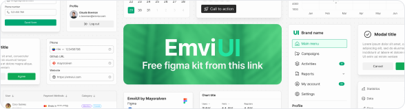
Click on the image to open the figma file
Component Libraries
Component libraries consist of reusable UI elements that integrate seamlessly into various designs. These libraries can contain buttons, icons, input fields, and other user interface components that adhere to specific design guidelines or styles.
| Feature | Description |
|---|---|
| Purpose | Ensure consistency across designs |
| Components Included | Reusable elements, style guides, responsive components |
| Usage | Streamlines the design process for consistent user interfaces |
Using a component library allows designers and developers to maintain uniformity and coherence in their projects. For an extensive list of components, one could explore available options in best figma ui kits.
Full-fledged Design Systems
Full-fledged design systems are comprehensive collections that go beyond basic components and guidelines. These systems encompass everything from design tokens to accessibility guidelines, providing a complete framework for building cohesive applications. They often include branding elements, grid systems, and layout guidelines.
| Feature | Description |
|---|---|
| Purpose | Create a comprehensive design ecosystem |
| Components Included | Design tokens, brand elements, accessibility standards |
| Usage | Serves as the foundation for long-term projects |
Design systems enable teams to work collaboratively while adhering to best practices and maintaining design integrity. For designers interested in free resources, exploring free figma ui kits can lead to valuable tools that fit into any design workflow.
Utilizing Figma UI Kits Efficiently
Leveraging Figma UI kits effectively can enhance a designer's creativity and streamline the design process. By focusing on customization, maintaining consistency, and fostering collaboration, designers can make the most out of these powerful resources.
Customization Options
Figma mobile UI kits come with various components that can be tailored to suit specific project requirements. Customization options include adjusting colors, fonts, sizes, and layouts. This flexibility enables designers to align the UI with branding guidelines and user preferences.
| Customization Aspect | Description |
|---|---|
| Colors | Adjust primary and secondary colors to match brand identity. |
| Typography | Change font styles and sizes for readability. |
| Component Sizes | Modify dimensions of buttons and inputs to fit design needs. |
| Layouts | Rearrange elements to enhance user experience. |
Utilizing these customization options can make the designs not only visually appealing but also functional and user-friendly. To explore pre-made options, designers can check out free figma ui kits available online.
Consistency in Design
Consistency is crucial in UX/UI design as it ensures a seamless experience across the application. Figma UI kits promote uniformity by providing predefined styles, components, and guidelines. Designers can maintain consistent spacing, alignment, and visual hierarchy throughout their projects.
| Design Element | Importance |
|---|---|
| Color Palette | Establishes brand recognition and visual harmony. |
| Component Design | Ensures functionality and usability across screens. |
| Typography Scale | Aids in readability and establishes a clear flow of information. |
Through the strategic use of Figma mobile UI kits, designers can uphold standards of consistency, which is vital for building user trust. For more insights, check out a curated list of the best figma ui kits.
Collaboration and Teamwork
Figma's cloud-based platform supports real-time collaboration, making it easy for teams to work together on mobile UI design projects. Team members can leave comments, make edits, and view changes instantly, enhancing communication and productivity.
| Collaboration Feature | Benefits |
|---|---|
| Real-time Editing | Allows multiple users to work simultaneously on a project. |
| Commenting | Facilitates feedback and discussions directly on design elements. |
| Version Control | Tracks changes and enables reverting to previous versions if needed. |
These collaborative capabilities help streamline the design process and lead to more refined outcomes. By tapping into the potential of Figma UI kits, teams can foster effective teamwork while focusing on delivering high-quality design. For more techniques on utilizing UI kits, check the article on figma wireframe ui kit for foundational design strategies.
Enhancing Creativity with Figma UI Kits
Figma mobile UI kits offer various ways to enhance creativity for UX/UI designers and front-end developers. By leveraging these resources effectively, individuals can find inspiration, streamline their workflows, and stay up-to-date with industry trends.
Inspiring Design Ideas
Figma UI kits serve as a fantastic source of inspiration for designers. They often come with pre-designed components, layouts, and styles, providing a visual reference that can spark new ideas. By exploring different kits, designers can discover unique ways to tackle design projects, from mobile apps to web interfaces.
| Type of UI Kit | Inspiration Sources |
|---|---|
| Wireframe Kits | Simple, functional layout ideas |
| Dashboard Kits | Creative chart and graph styles |
| Component Libraries | Custom button and form designs |
Designers can utilize these kits to see how others approach similar design challenges and incorporate these concepts into their own work. For more inspiration, check out our article on figma wireframe ui kit.
Streamlining Design Workflow
Using Figma mobile UI kits can greatly streamline the design process. These kits come with ready-to-use elements that can significantly reduce the time spent on creating components from scratch. By having a collection of reusable assets, designers can focus more on refining their designs rather than getting bogged down in the creation process.
| Workflow Benefits | Description |
|---|---|
| Time Efficiency | Pre-designed elements save time |
| Reusability | Consistent use of components across projects |
| Faster Prototyping | Quick assembly of designs for testing |
Furthermore, Figma's collaborative features make it easy for teams to work together seamlessly, allowing for real-time feedback and adjustments. For additional insights on using design tools effectively, visit our article on figma dashboard ui kit.
Staying Updated with Trends
The design landscape is constantly evolving, and Figma mobile UI kits can help designers stay current with emerging trends. Many kits are regularly updated to reflect the latest design practices and user preferences. By having access to trendy components, designers can ensure that their work resonates with contemporary audiences.
| Trendy Features | Examples |
|---|---|
| Minimalistic Designs | Simple, clean interfaces |
| Dark Mode Options | High contrast for better readability |
| Interactive Elements | Engaging and dynamic user experiences |
Regularly exploring new kits can foster creativity and provide fresh perspectives on design methodologies. For a comprehensive list of options, check out our article on best figma ui kits and discover how you can keep your designs fresh and innovative.
Tips for Maximizing Figma UI Kits
Efficiently utilizing Figma UI kits can significantly enhance a designer's workflow and improve project outcomes. Here are some practical tips for getting the most out of Figma mobile UI kits.
Organizing Your Work
Maintaining a well-organized workspace in Figma is essential for maximizing productivity. By setting clear file structures and naming conventions, designers can quickly locate assets and components within their UI kits.
| Organization Strategy | Description |
|---|---|
| Layer Naming | Use descriptive names for layers and groups to easily identify them. |
| Page Structuring | Create separate pages for different screens or components (e.g., home, profile, settings). |
| Component Library | Develop a dedicated component library for reuse across multiple projects. |
Organizing elements effectively allows designers to work more efficiently and focus on creativity rather than searching for assets.
Regularly Exploring New Kits
The design landscape is constantly evolving, and staying updated with the latest tools is crucial. Regularly exploring new Figma UI kits can provide fresh ideas and inspirations.
| Exploration Activity | Benefits |
|---|---|
| Discovering Free Kits | Many free Figma UI kits provide valuable resources for budget-conscious designers. |
| Reviewing Marketplace Kits | The marketplace often features the best Figma UI kits that can elevate design projects. |
| Participating in Design Communities | Engaging with other designers can lead to discovering new kits and gaining insights on their usability. |
Exploring new UI kits keeps designers informed about current trends and innovative design solutions.
Seeking Feedback and Iterating
In the design process, feedback is invaluable. Sharing work with peers or stakeholders can lead to constructive critiques that enhance the overall quality of the design.
| Feedback Source | Techniques |
|---|---|
| Peer Reviews | Organize sessions where team members review each other's work. |
| Design Critique Platforms | Utilize platforms to get feedback from a wider audience. |
| Iterative Design | Regularly update designs based on feedback to improve usability and aesthetics. |
Iterating based on feedback not only improves individual projects but helps in growing as a designer in the long run.
Applying these tips can enable designers and developers to fully leverage the potential of Figma mobile UI kits. A methodical approach to organization, exploration, and feedback can streamline the design process and lead to better outcomes.