UI notifications play a crucial role in guiding users through an application, alerting them to important updates, errors, or confirmations. In this post, we'll explore different types of notifications UI components, with a particular focus on top notification bars. We'll provide examples from popular apps and offer best practices for designing these essential UI elements.
Notifications are a crucial aspect of notification UI design, helping users stay informed, engaged, and efficient while interacting with an application. Whether on a mobile device, desktop app, or website, UI notifications improve usability by delivering timely messages without disrupting the experience.
A good notification UI balances relevance and timing. Too many notifications can lead to notification fatigue, while too few may cause users to miss critical updates. This article will explore various types of notifications, their best use cases, and how to design them effectively.
📌 Did you know?
71% of users disable push notifications when they feel overwhelmed.
Well-timed notifications increase app retention rates by 30%.
Why UI Notifications Matter for User Experience
A well-implemented notification UI improves engagement and user retention by: ✅ Providing real-time updates (e.g., new messages, system alerts).
✅ Providing real-time updates (e.g., new messages, system alerts).
✅ Keeping users aware of important system status changes.
✅ Enhancing interactivity without overwhelming the user.
Psychology of Notifications:
Studies show push notifications trigger dopamine release, making users more likely to engage with an app. However, excessive alerts can cause stress and frustration, leading to uninstalls.
Best Practice:
Use context-aware notifications to personalize the experience, ensuring users only receive relevant alerts. For example, Google Calendar only reminds users about upcoming meetings if they have them in their schedule.
Types of UI Notifications
Each notification type serves a different purpose. Understanding their strengths and limitations will help you choose the best fit for your design.Check EmviUI notifications to learn more.
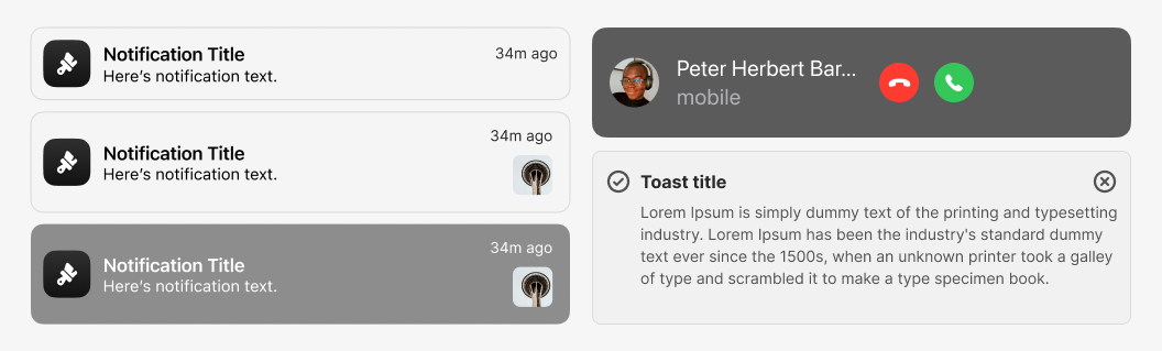
1. In-App Notifications
These messages appear within the app interface and are designed to deliver information without interrupting the workflow.
✅ Best used for: Alerts that need immediate user attention. ✅ Example: Slack’s notification badge for unread messages.
Why They Work:
Non-intrusive (user chooses when to interact).
Clear and immediate without disrupting tasks.
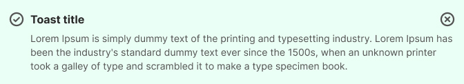
2. Toast Notifications
Toast notifications are brief pop-ups that appear and disappear automatically after a few seconds. They provide quick feedback without interrupting the user experience.
✅ Best used for: Action confirmations (e.g., “Your settings have been saved”). ✅ Example: Google Drive’s confirmation message after saving a file.
Why They Work:
Quick and non-blocking.
Ideal for low-priority messages.
⚠️ Common Mistakes:
If toast notifications disappear too fast, users may not see them. Allow users to review recent notifications (e.g., Gmail’s "Undo" pop-up after deleting an email).
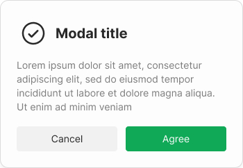
3. Modal Notifications
A modal blocks the screen until users take action.
✅ Best for: Critical system alerts, error messages. ✅ Example: "Are you sure you want to delete this file?"
Why They Work:
Forces immediate attention for urgent messages.
Ideal for security warnings or important user decisions.
⚠️ Common Mistakes:
Too many modals frustrate users. Only use modals for actions that require confirmation.
4. Top Notification Bars
Top notification bars are fixed banners that appear at the top of the screen, providing users with important information or alerts. These bars are effective for delivering messages that users need to see immediately, such as system updates, warnings, or promotional messages. They are often used in web and mobile apps to ensure that critical information is not missed.
✅ Best for: Announcements, promotions. ✅ Example: Codecademy yellow notification bar
Why They Work:
Visible without blocking content.
Great for global updates (e.g., maintenance alerts).
UI Notification Examples
Let's explore some real-world examples of effective notifications UI elements used by popular apps and websites. These examples demonstrate how well-designed notifications can enhance the user experience.
1. Example from Slack
Slack uses in-app notifications to alert users about new messages, mentions, and updates. These notifications are subtle but effective, allowing users to stay informed without interrupting their workflow. Slack's notifications are customizable, enabling users to control which alerts they receive and how they are notified.
Slack’s Notification UI Strategy
• Uses subtle in-app alerts instead of intrusive pop-ups.
• Allows users to customize notifications.
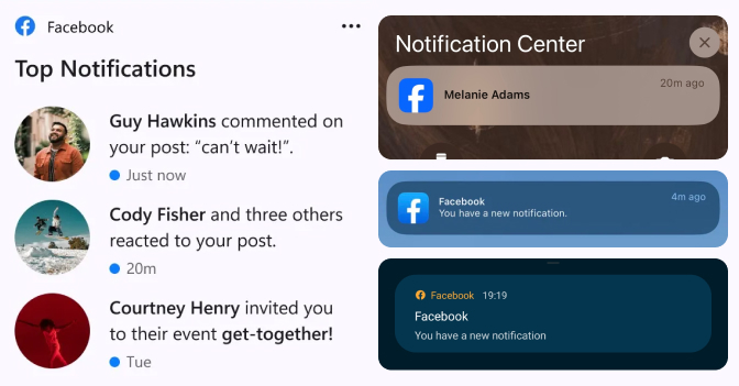
2. Example from Facebook
Facebook uses a combination of top notification bars and in-app notifications to keep users informed about friend requests, messages, and events. The top notification bar is particularly effective for highlighting important updates, ensuring that users see critical information as soon as they log in.
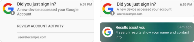
Google uses toast notifications in many of its apps, such as Gmail and Google Drive, to confirm actions like saving documents or sending emails. These notifications are brief and non-intrusive, providing users with immediate feedback without disrupting their workflow.
Google’s Push Notification System
• Google provides toast notifications that confirm you are logged in.
• Google filters important information for better engagement.
Mobile vs. Desktop Notification UI – Key Differences
Mobile notifications must be compact and time-sensitive (e.g., push notifications).
Desktop notifications allow for longer messages with richer interactions.
Example:
• Mobile: Push notifications (X alert for trending topics).
• Desktop: Floating notifications (New message).
Designing a Top Notification Bar
A top notification bar is an essential UI element that can significantly enhance the user experience when designed well. Below are some best practices for creating an effective top notification bar.
Best Practices for Top Notification Bars
When designing a top notification bar, consider the following best practices:
- Keep it Visible but Non-Intrusive: Ensure that the notification bar is easily noticeable but doesn’t obstruct the main content. Use contrasting colors to make it stand out, but avoid overly bright or distracting colors.
- Provide a Clear Call to Action: Include a clear and concise call to action in the notification bar, guiding users on what to do next. Whether it’s updating software, reading a message, or closing the notification, users should know exactly what action to take.
- Allow Dismissal: Always provide users with an option to dismiss the notification bar, especially if the message is not critical. This gives users control over their experience and prevents frustration.
- Use for Important Updates Only: Reserve the top notification bar for important messages that users need to see immediately. Overusing it for non-essential information can lead to notification fatigue and reduce its effectiveness.
UI Example: Top Notification Bar
Let’s take a closer look at some examples of top notification bars from well-known websites and apps. These examples showcase how top notification bars can be used effectively to communicate important information to users.
Example from LinkedIn
LinkedIn uses a top notification bar to alert users about new connection requests, messages, and notifications. The bar is visually distinct, using LinkedIn's brand colors, and includes a clear call to action. Users can easily interact with the notifications or dismiss them if they choose.
How to Implement a Top Notification Bar in Your Design
Implementing a top notification bar in your design can be straightforward if you follow these steps:
Start by creating a simple rectangle at the top of your design. This will serve as the background for your notification bar.
Choose a color that contrasts with the rest of your UI to make the bar stand out. Consider using brand colors for consistency.
Add text to the bar that clearly communicates the message you want to convey. Keep the text concise and to the point.
Include a call-to-action button or link if the notification requires user interaction.
Ensure that the notification bar is responsive, so it looks good on all screen sizes.
Common Mistakes to Avoid in Notifications UI
While UI notifications are powerful tools for enhancing user experience, they can also lead to frustration if not designed well. Here are some common mistakes to avoid:
Overusing Notifications: Avoid bombarding users with too many notifications. Only notify them when necessary to prevent notification fatigue.
Lack of Clarity: Ensure that your notifications are clear and easy to understand. Users should immediately know what the notification is about and what action they need to take.
No Dismiss Option: Always provide a way for users to dismiss or close notifications, especially if the message is not critical.
Ignoring Accessibility: Make sure your notifications are accessible to all users, including those with disabilities. This includes using appropriate color contrast, text size, and screen reader compatibility.
Conclusion: Enhancing User Experience with UI Notifications
UI notifications are an essential part of modern digital experiences, providing users with timely and relevant information that enhances their interaction with your app or website. By understanding the different types of notifications, following best practices for design, and avoiding common pitfalls, you can create notifications that are both effective and user-friendly. Whether you're designing a top notification bar or any other type of notification UI component, always keep the user experience at the forefront of your design process.
Cookie Settings
We use cookies to improve your experience and for marketing. Analytics cookies are essential and cannot be disabled. Visit our Privacy Policy to learn more.