

Why Consistent Typography Matters in Design Systems
What is a typographic scale and why is it important for UI design?
A typographic scale is a set of font sizes used consistently throughout a design. It helps create a visual hierarchy, making it easier for users to scan and understand content. In UI design, a clear typographic scale ensures that headings, subheadings, and body text are visually distinct and harmonious.
Using a defined scale prevents random font size choices, which can lead to a cluttered and confusing interface. It also makes it easier to maintain and update your design system as your product grows.
How does typography impact usability and brand consistency?
Typography directly affects how users read and interact with your product. Consistent heading styles guide users through content, improving readability and accessibility. When typography aligns with your brand guidelines, it reinforces your product's identity and builds trust with users.
Inconsistent typography can confuse users and weaken your brand. A well-defined typographic scale ensures that every heading and text element feels intentional and cohesive.
Common challenges when managing heading styles across breakpoints
One major challenge is keeping heading styles consistent across different screen sizes. As layouts adapt for mobile, tablet, and desktop, font sizes and line heights may need to change to maintain readability and hierarchy. Without a clear system, it's easy for styles to drift or become inconsistent.
Other challenges include:
- Duplicating styles for each breakpoint, leading to maintenance headaches.
- Forgetting to update all instances when making changes.
- Difficulty collaborating between designers and developers if naming and scaling are unclear.
Understanding Typographic Scales: From Theory to Practice
What is a modular scale and how does it relate to headings?
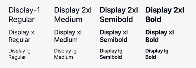
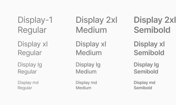
A modular scale is a sequence of font sizes based on a ratio, such as 1.25 or 1.333. Each step up or down the scale multiplies or divides the previous value by this ratio. Modular scales help create a balanced and proportional hierarchy for headings and text.
For example, if your base font size is 16px and your ratio is 1.25, your scale would be: 16, 20, 25, 31, 39, etc. This approach ensures that each heading level is distinct yet related.
How does Tailwind CSS approach typography for headings?
Tailwind CSS uses a predefined typographic scale for its heading classes, such as text-xl, text-2xl, text-3xl, and so on. Each class maps to a specific font size and line height, following a modular or semi-modular scale. This makes it easy to apply consistent heading styles in both code and design.
Tailwind's approach is practical and widely adopted, making it a great reference for building your own typographic scale in Figma.
Adapting Tailwind's scale to your own design system needs
While Tailwind's scale is a solid starting point, you may need to adjust values to fit your brand or product requirements. Consider your content density, target audience, and accessibility needs. You can use Tailwind's scale as a baseline, then customize font sizes or line heights as needed for your headings.
Document any changes clearly so both designers and developers understand the system.
Setting Up Typographic Variables in Figma
How do Figma variables work for typography?
Figma variables let you define reusable values for properties like font size, line height, and spacing. When you use variables in your text styles, you can update them in one place and see changes reflected everywhere. This is especially useful for managing heading styles across a large design system.
Variables can be grouped and organized by type, such as font sizes for headings or body text. This structure makes it easier to maintain consistency and scale your system.
Organizing font size and line height variables for headings
Start by creating variables for each heading level (H1-H6). For each, define both a font size and a line height variable. This allows you to adjust spacing and readability independently for each heading.
- Font size variables: e.g.,
heading/h1/font-size - Line height variables: e.g.,
heading/h1/line-height
Organizing variables this way ensures you can quickly update styles and maintain a clear hierarchy.

Grouping and naming conventions: Best practices for scalable systems
Creating variable groups for H1 to H6
Group variables by heading level to keep your system organized. For example:
heading/h1/font-sizeheading/h2/font-size- ...and so on through
heading/h6/font-size
This makes it easy to find and update variables for each heading.
Structuring variables by breakpoint (SM, MD, LG, XL, 2XL)
To handle responsive typography, create separate variable sets for each breakpoint. For example:
heading/h1/font-size/smheading/h1/font-size/mdheading/h1/font-size/lg
This approach mirrors how Tailwind handles responsive classes and ensures your Figma styles adapt smoothly across devices.
Step-by-Step: Defining and Applying Heading Styles in Figma
How to identify and set font sizes and line heights for each heading
Begin by referencing Tailwind's typographic scale or your own modular scale. Assign a font size and line height to each heading level (H1-H6) for each breakpoint. For example:
H1:36px (desktop)28px (mobile)H2:30px (desktop)24px (mobile)H3:24px (desktop)20px (mobile)
Adjust line heights to ensure headings are legible and have enough breathing room.
Creating and organizing variable groups for headings
In Figma, create variable groups for each heading and breakpoint. For example, group all H1 variables together, then nest by breakpoint:
heading/h1/font-size/smheading/h1/line-height/smheading/h1/font-size/mdheading/h1/line-height/md
This structure makes it easy to manage and update your heading styles as your system evolves.
Assigning variables to text styles and heading components
Applying variables to Figma components and variants
Once your variables are set up, create text styles for each heading level and breakpoint. Assign the appropriate font size and line height variables to each style. Then, use these styles in your heading components and variants.
For example, your H1 component might use the heading/h1/font-size/lg and heading/h1/line-height/lg variables for desktop, and switch to heading/h1/font-size/sm for mobile variants.
Testing and verifying heading styles across breakpoints
Test your heading components by resizing frames or switching between variants for different breakpoints. Verify that font sizes and line heights update as expected. This ensures your typographic scale works consistently across all device sizes.
Responsive Typography: Managing Breakpoints and Modes
How do you adapt heading styles for mobile, tablet, desktop, and large screens?
Responsive typography means adjusting font sizes and line heights to suit different screen sizes. In Figma, use your breakpoint-specific variables to define how each heading should look on mobile, tablet, desktop, and large screens.
For example, an H1 might be 28px on mobile, 32px on tablet, and 36px on desktop. Adjust line heights as needed to maintain readability.
What are the best practices for responsive typography in Figma?
- Use variable sets for each breakpoint to keep styles organized.
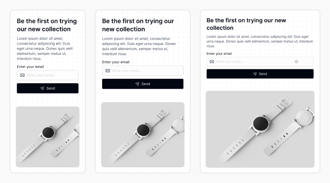
- Test headings in context-place them in real layouts to see how they behave.
- Maintain a logical progression between heading levels and breakpoints.
- Document your scale and breakpoints for easy reference.
How to ensure consistency and visual rhythm across all devices
Consistency comes from using the same variable structure and naming conventions across your design system. Visual rhythm is achieved by maintaining proportional spacing and font sizes between headings and body text.
Regularly review your heading styles on different devices and update variables as needed to keep your system balanced.
Integrating Tailwind CSS Logic with Figma Design Systems
How to use Tailwind's typographic scale as a reference in Figma
Start by reviewing the Tailwind CSS font size documentation. Use these values as a baseline for your Figma variables. This makes it easier for developers to match your designs with code, reducing friction during handoff.
For example, Tailwind's text-2xl is 24px. You can create a Figma variable heading/h2/font-size with the same value.
When should you customize Tailwind values for your product?
Customize Tailwind's scale if your brand requires unique typography or if accessibility guidelines call for larger or smaller text. Always document any changes and communicate them to your team to avoid confusion.
Consider customizing when:
- Your product targets a specific audience (e.g., children or seniors).
- Your brand identity requires distinctive typography.
- You need to meet strict accessibility standards.
Mapping Figma variables to Tailwind classes for developer handoff
Maintain a reference table that maps each Figma variable to its corresponding Tailwind class. This helps developers quickly translate design specs into code.
| Figma Variable | Tailwind Class | Font Size |
|---|---|---|
heading/h1/font-size/lg |
text-4xl | 36px |
heading/h2/font-size/lg |
text-3xl | 30px |
heading/h3/font-size/lg |
text-2xl | 24px |
This mapping ensures a smooth handoff and reduces the risk of inconsistencies between design and development.
Building Reusable Heading Components with Variants
How to create scalable heading components in Figma
Create a base heading component for each level (H1-H6). Use Figma's component system to make these headings reusable throughout your design files. Assign text styles that use your typographic variables for easy updates.
Setting up component variants for different breakpoints and contexts
Use Figma variants to handle different breakpoints and contexts. For example, create variants for mobile, tablet, and desktop. Each variant should use the appropriate font size and line height variables for its breakpoint.
You can also create variants for different contexts, such as hero headings, section titles, or card headings.
Ensuring components update automatically when variables change
By linking your heading components to text styles that use variables, any update to the variable will cascade throughout your design. This makes it easy to adjust your typographic scale without manually updating every instance.
Test your components by changing a variable value and confirming that all related headings update automatically.
Real-World Examples: Applying and Adjusting Heading Styles
Practical example: Adjusting line height for better visual breathing
Suppose your H1 heading feels cramped on mobile. Increase the heading/h1/line-height/sm variable from 1.1 to 1.3. Instantly, all H1 headings on mobile gain more breathing room, improving readability without manual edits.
Duplicating and customizing styles for H2-H6 headings
Duplicate your H1 style and adjust the font size and line height variables for H2, H3, and so on. This ensures each heading level follows your scale while allowing for fine-tuning as needed.
For example, H2 might use heading/h2/font-size/md and heading/h2/line-height/md for tablet screens.
Troubleshooting: What to do when styles don't update as expected
If a heading style doesn't update after changing a variable, check that:
- The text style is actually using the variable, not a fixed value.
- The correct variable set is applied for the current breakpoint.
- There are no overrides or manual changes on the component instance.
Regularly audit your components and styles to catch issues early.
Best Practices and Common Mistakes in Typographic Systems
How to maintain consistency across your heading styles
Document your typographic scale and variable structure. Use clear naming conventions and group variables logically. Regularly review your design files to ensure all headings use the correct styles and variables.
Why you should avoid arbitrary values in your scale
Arbitrary font sizes break visual harmony and make maintenance harder. Stick to your modular scale or Tailwind's scale to ensure every heading fits into a predictable hierarchy.
Tips for organizing and maintaining variables in large design systems
- Group variables by type (e.g., headings, body text) and breakpoint.
- Use clear, descriptive names for each variable.
- Document your variable structure and update it as your system evolves.
- Regularly audit your variables to remove duplicates or unused values.
How to prevent unnecessary duplication of styles and variables
Before creating a new variable or style, check if an existing one fits your needs. Use shared variables and text styles wherever possible. Consolidate similar styles to reduce clutter and improve maintainability.
Frequently Asked Questions About Typographic Scales in Figma
What's the difference between Figma variables and design tokens?
Figma variables are reusable values within Figma, while design tokens are platform-agnostic variables that can be exported to code. Both help maintain consistency, but design tokens are used across design and development environments.
Can you automate responsive typography in Figma?
While Figma doesn't automate responsive typography natively, you can use variable sets and component variants to simulate responsive styles. Plugins and design tokens can further streamline this process.
How do you collaborate with developers on typography using Tailwind?
Map your Figma variables and styles to Tailwind classes. Share documentation and reference tables to ensure everyone uses the same scale. Regular communication helps catch discrepancies early.
Conclusion: Elevating Your Design System with Smart Typography
Key takeaways for building adaptable heading styles
Building a consistent typographic scale for headings in Figma, inspired by Tailwind CSS, streamlines your design process and improves usability. Use variables, modular scales, and clear naming conventions to keep your system organized and adaptable.
Next steps: Scaling your typographic system for future growth
As your product grows, revisit your typographic scale and variables regularly. Involve both designers and developers in updates to ensure alignment. Consider exporting your variables as design tokens for even greater scalability.
Resources for mastering typography in Figma and Tailwind CSS
Frequently Asked Questions (FAQs)
How do I choose the right modular scale ratio for my headings?
Start with a common ratio like 1.25 or 1.333, then adjust based on your brand and readability needs. Test in real layouts to find the best fit.
Can I use Figma variables for both font size and line height?
Yes, you can create separate variables for font size and line height, assigning them to your text styles for maximum flexibility and consistency.
What should I do if my heading styles look inconsistent across breakpoints?
Ensure each breakpoint uses the correct variable set and that your scale maintains a logical progression between heading levels for consistency.
How can I ensure developers implement my Figma heading styles accurately?
Map your Figma variables to Tailwind classes and provide clear documentation or reference tables to ensure a smooth and accurate handoff.
Is it necessary to have a separate variable for each heading level and breakpoint?
Yes, this approach ensures precise control and consistency, especially in large or responsive design systems.