



Foundations first
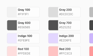
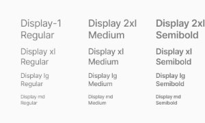
Review color, type and spacing together. These choices set the visual rhythm for every screen and make later component decisions more consistent.
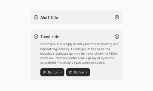
Browse the EmviUI Figma component library, from form controls and navigation to data tables and design foundations. Compare patterns and adapt them to your product.
 Free
Free
8 Variants
 Free
Free
16 Variants
 Free
Free
96 Variants
 Free
Free
1128 Variants
 Free
Free
36 Variants
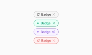 Free
Free
340 Variants
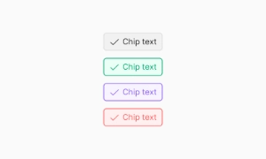
 Premium
336 Variants
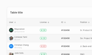 Free
Free
960 Variants
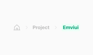 Premium
86 Variants
 Premium
70 Variants
 Free
Free
128 Variants
 Free
Free
100 Variants
 Free
Free
2404 Variants
 Free
Free
16 Variants
 Free
Free
256 Variants
 Free
Free
12 Variants
 Free
Free
20 Variants
 Free
Free
50 Variants
 Free
Free
896 Variants
 Premium
196 Variants
 Free
Free
784 Variants
 Free
Free
840 Variants
 Premium
149 Variants
 Premium
22 Variants
 Free
Free
50 Variants
 Free
Free
1792 Variants
 Free
Free
64 Variants
 Premium
6 Variants
 Premium
256 Variants
 Free
Free
64 Variants
 Premium
580 Variants
 Free
Free
144 Variants
 Premium
36 Variants
 Premium
7 Variants
 Premium
441 Variants
 Premium
8 Variants
 Free
Free
14 Variants
 Free
Free
12 Variants
 Premium
16 Variants
 Premium
32 Variants
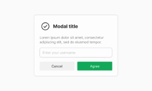
The component previews show individual building blocks of the EmviUI Figma kit. Start with a foundation, then inspect the controls and navigation your flow needs. Open a detail page to compare the visible variants before adapting them to your product.
Review color, type and spacing together. These choices set the visual rhythm for every screen and make later component decisions more consistent.
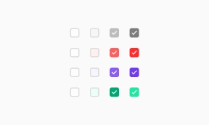
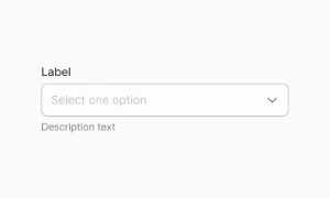
Check how primary actions, text fields and choices read in a form. Compare their labels, hierarchy and available states in the Figma preview.
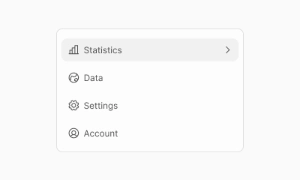
Choose navigation that fits the number of destinations, then pair it with clear progress and status patterns for longer tasks.
Need to see these pieces in context? Browse the screen library, or inspect the free Figma file before choosing a license.