Components
Alert
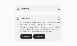
Alerts are interactive elements that convey important information, warnings, or notifications to users, helping grab attention and prompt action.
Components
Alerts are interactive elements that convey important information, warnings, or notifications to users, helping grab attention and prompt action.
 Free
Free
8 Variants
 Free
Free
16 Variants
96 Variants
 Free
Free
1128 Variants
 Free
Free
36 Variants
 Free
Free
340 Variants
336 Variants
 Free
Free
960 Variants

86 Variants
70 Variants
 Free
Free
128 Variants
 Free
Free
100 Variants
 Free
Free
2404 Variants
 Free
Free
16 Variants
 Free
Free
256 Variants
 Free
Free
12 Variants
 Free
Free
20 Variants
 Free
Free
50 Variants
 Free
Free
896 Variants

196 Variants
 Free
Free
784 Variants
 Free
Free
840 Variants

149 Variants

22 Variants
 Free
Free
50 Variants
 Free
Free
1792 Variants
 Free
Free
64 Variants

6 Variants

256 Variants
 Free
Free
64 Variants
580 Variants
 Free
Free
144 Variants

36 Variants

7 Variants

441 Variants

8 Variants
 Free
Free
14 Variants
 Free
Free
12 Variants

16 Variants

32 Variants
Alerts and toasts in Emvi UI are components designed to deliver key user messages with clarity and efficiency. Alerts provide persistent, visible messages within the interface, while toasts act as temporary notifications that auto-dismiss.
Both components support multiple levels of severity: success, error, warning, info, and neutral. Each state uses consistent color tokens, iconography, and typography to ensure clear hierarchy and accessibility.
Alerts are inline message blocks meant for contextual, important communication. Common use cases include:
- Action confirmations
- Critical warnings (e.g., potential data loss)
- Form validation errors
Variants support icons, secondary action buttons, and dismissible options for user control.
Toasts provide quick, lightweight notifications that appear in fixed screen positions (top/bottom corners) and disappear automatically after a set delay. Ideal for:
- Quick confirmations ("File uploaded successfully")
- Temporary errors ("Connection lost, retrying...")
- Status updates
They support icons, undo actions, and stacked notifications for multiple simultaneous events.
Alerts are designed to grab users' attention immediately. Whether it’s a critical warning, an important update, or a simple notification, alerts ensure that vital information doesn’t go unnoticed. By using distinct colors and prominent positioning, alerts stand out on the page, making sure users see them right away.
Alerts provide essential feedback to users regarding their actions on the site. Whether it's confirming a successful action, pointing out an error, or offering additional instructions, alerts keep users informed about what’s happening. This real-time feedback helps improve user experience by making interactions transparent and reassuring users that their actions are being processed.
Alerts are effective in prompting users to take specific actions or make informed decisions. They can include buttons or links that guide users to the next steps, such as resolving an issue, confirming a choice, or exploring further information. This functionality makes alerts not just informative but also actionable, driving user engagement and ensuring smooth navigation through the site.
Both alerts and toasts comply with WCAG standards, offering proper color contrast, semantic roles (role="alert", role="status"), and screen reader compatibility.
They are fully responsive and optimized for mobile and web applications, adapting to screen sizes without losing readability or functionality.
In Figma, alerts and toasts exist as structured variants tied to global text and color styles.
In Tailwind CSS, they are implemented using utilities such as bg-success-100, text-error-700, rounded-md, shadow-lg, with support for custom entry/exit animations.
- Use alerts for persistent messages that require user attention
- Use toasts for transient notifications that don't require action
- Maintain consistent styling across all severity levels
- Ensure proper contrast ratios for accessibility
- Limit toast duration to 4-6 seconds for optimal user experience
- Provide clear dismiss options for alerts
Alerts remain visible within the interface until dismissed by the user or replaced by navigation. Toasts, on the other hand, appear briefly and auto-dismiss after a few seconds, making them ideal for quick, transient updates.
Example: Use alerts for form errors that need correction, use toasts for success confirmations.