Components
Button group
Button groups combine multiple buttons into toolbars or split buttons, useful for creating complex components and mini “tabs” in the UI.
Components
Button groups combine multiple buttons into toolbars or split buttons, useful for creating complex components and mini “tabs” in the UI.
 Free
Free
8 Variants
 Free
Free
16 Variants
96 Variants
 Free
Free
1128 Variants
 Free
Free
36 Variants
 Free
Free
340 Variants
336 Variants
 Free
Free
960 Variants
86 Variants
70 Variants
 Free
Free
128 Variants
 Free
Free
100 Variants
 Free
Free
2404 Variants
 Free
Free
16 Variants
 Free
Free
256 Variants
 Free
Free
12 Variants
 Free
Free
20 Variants
 Free
Free
50 Variants
 Free
Free
896 Variants
196 Variants
 Free
Free
784 Variants
 Free
Free
840 Variants

149 Variants

22 Variants
 Free
Free
50 Variants
 Free
Free
1792 Variants
 Free
Free
64 Variants

6 Variants
256 Variants
 Free
Free
64 Variants
580 Variants
 Free
Free
144 Variants

36 Variants

7 Variants

441 Variants

8 Variants
 Free
Free
14 Variants
 Free
Free
12 Variants

16 Variants
32 Variants
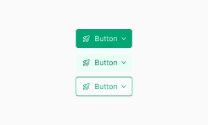
The Button Group component in Emvi UI enables the grouping of multiple buttons into a single visual and functional unit. Its main purpose is to organize related actions while maintaining consistency in spacing, alignment, and visual hierarchy.
This component is ideal for forms, toolbars, user settings, or any other context where multiple grouped actions are needed. It supports both uniform and mixed button types (primary, secondary, icon).
The system allows for horizontal or vertical orientation, compact groupings, and optional separators via icons or dividers.
Emvi UI offers several configurations for button groups, adapting to various design and interaction needs:
Classic Group (Inline): Buttons aligned horizontally with no visible spacing, sharing connected borders to simulate a unified unit.
Segmented Group: Each button maintains its own border with minimal visual spacing. Ideal for toggle-like individual options.
Vertical Group: Column-based variant, useful in side panels or mobile interfaces.
Mixed Buttons: Supports grouping different button types (e.g., primary + icon).
The system automatically handles border radius, z-index, and internal spacing to ensure visual and functional consistency. It also supports single or multiple selection logic based on the use case.
Button groups in Emvi UI inherit all interaction states defined in the base component, including hover, active, focus, disabled, and loading. These states remain consistent across individual buttons within the group.
From an accessibility perspective, each button maintains its individual role (role="button") and can be enhanced with attributes such as aria-pressed to represent selection in toggle-style groupings.
The group structure is compatible with Figma (as nested components with variants) and Tailwind CSS, using preconfigured utility classes like inline-flex, gap-x, divide-x, and more, ensuring quick and semantic implementation.
To ensure effective and consistent implementation of the Button Group component in Emvi UI, the following best practices are recommended:
Use groups only when actions are clearly related.
Avoid overcrowding groups with too many buttons (limit to 3–5 items).
Maintain consistent styling within the group, unless intentional differentiation is needed.
Apply group variants (segmented, vertical) based on available space and usage context.
Include accessible descriptions or labels (aria-label) when button content is non-textual.
These guidelines enhance usability, reinforce visual hierarchy, and ease integration across layouts and devices.