Components
Notifications
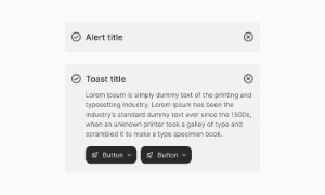
Notifications are interactive messages within an app that inform, update, or engage users with timely and relevant information, alerts, or calls to action.
Components
Notifications are interactive messages within an app that inform, update, or engage users with timely and relevant information, alerts, or calls to action.
 Free
Free
8 Variants
 Free
Free
16 Variants
96 Variants
 Free
Free
1128 Variants
 Free
Free
36 Variants
 Free
Free
340 Variants
336 Variants
 Free
Free
960 Variants
86 Variants
70 Variants
 Free
Free
128 Variants
 Free
Free
100 Variants
 Free
Free
2404 Variants
 Free
Free
16 Variants
 Free
Free
256 Variants
 Free
Free
12 Variants
 Free
Free
20 Variants
 Free
Free
50 Variants
 Free
Free
896 Variants
196 Variants
 Free
Free
784 Variants
 Free
Free
840 Variants

149 Variants

22 Variants
 Free
Free
50 Variants
 Free
Free
1792 Variants
 Free
Free
64 Variants

6 Variants
256 Variants
 Free
Free
64 Variants
580 Variants
 Free
Free
144 Variants

36 Variants

7 Variants

441 Variants

8 Variants
 Free
Free
14 Variants
 Free
Free
12 Variants

16 Variants

32 Variants
The Notifications UI component in Emvi UI manages contextual and persistent user communication by grouping multiple events into a single, structured view. Unlike alerts or toasts, notifications are often displayed in side panels, modals, or dropdowns, offering more room for text, actions, and organization.
Notifications are particularly useful in SaaS apps, e-commerce, or collaborative platforms, where users need to quickly access updates related to their account, activity, or reminders.
Each notification includes:
- Header (e.g., "New message", "System update")
- Body text describing the event
- Contextual icon indicating type (success, error, warning, info)
- Quick actions such as buttons ("view more", "dismiss", "reply")
- Optional timestamp for chronological context
- Contextual: displayed in dropdowns or side panels
- Persistent: remain visible until dismissed by the user
- Interactive: include quick-action buttons or links
- Grouped: multiple notifications shown within a tray or panel
- Semantic roles like role="status" or role="alert"
- WCAG AA contrast compliance
- Full keyboard navigation (Tab, Enter, Esc)
- On mobile, notification panels adapt to full-screen overlays
In Figma, notifications ship as modular components with style variants (light/dark, type, with/without icons, with/without actions).
In Tailwind CSS, they are implemented using utilities like flex, items-start, gap-x-*, bg-*, shadow-md, rounded-lg, and animate-in/out.
Alerts are inline, persistent messages within specific flows, while toasts are transient and auto-dismiss. Notifications, however, are often grouped in trays or panels, can persist until managed, and support more complex actions.