



Can I customize Radio button in Figma?
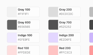
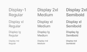
Yes. The EmviUI file is editable: adapt colors, typography, spacing, and variants to your product’s visual system.
Components
Explore editable radio button patterns for forms where one option is chosen from a visible group. Use the Figma preview to compare layouts for radio button component and review the available states before adapting the design.
 Included in free version
 Free
Free
8 Variants
 Free
Free
16 Variants
 Free
Free
96 Variants
 Free
Free
1128 Variants
 Free
Free
36 Variants
 Free
Free
340 Variants
 Premium
336 Variants
 Free
Free
960 Variants
 Premium
86 Variants
 Premium
70 Variants
 Free
Free
128 Variants
 Free
Free
100 Variants
 Free
Free
2404 Variants
 Free
Free
16 Variants
 Free
Free
256 Variants
 Free
Free
12 Variants
 Free
Free
20 Variants
 Free
Free
50 Variants
 Free
Free
896 Variants
 Premium
196 Variants
 Free
Free
784 Variants
 Free
Free
840 Variants
 Premium
149 Variants
 Premium
22 Variants
 Free
Free
50 Variants
 Free
Free
1792 Variants
 Free
Free
64 Variants
 Premium
6 Variants
 Premium
256 Variants
 Free
Free
64 Variants
 Premium
580 Variants
 Free
Free
144 Variants
 Premium
36 Variants
 Premium
7 Variants
 Premium
441 Variants
 Premium
8 Variants
 Free
Free
14 Variants
 Free
Free
12 Variants
 Premium
16 Variants
 Premium
32 Variants
Use radio button patterns to organize forms where one option is chosen from a visible group. Keep the relevant state and next action clear so the component is easy to scan. Align labels and visual priority with the screen around it.
Use radio buttons when one option must be selected, group choices under a label and identify the selected state clearly. Keep labels concise and use spacing or icon cues to reinforce the message without relying on color alone.
In Figma, compare the component variants in a real product screen. Check spacing, contrast and labels across relevant states, then adapt the pattern to the team's design system. Document the selected variant and relevant states so the pattern stays consistent across screens.
Each Radio usually includes a label that explains the option it stands for. This label provides context and clarity, helping users understand what each choice represents. Clear labeling is essential for an intuitive user experience, ensuring that users can make informed decisions quickly and easily. Our UI kit includes customizable Radio components that can be easily tailored to fit any design, providing a user-friendly way to present exclusive options.
Standard: Single radio with label.
With Sublabel: Includes helper text for contextual clarity.
Stacked: Vertically aligned for long labels or mobile screens.
Inline Group: Horizontally aligned for fast scanning or compact spaces.
Disabled: Non-interactive state for locked or unavailable options.
Variants adapt visually to light/dark themes and support design tokens like radio.bg, radio.dot, and
radio.label.
Emvi UI supports three sizes for consistent UI density:
SM – compact layouts or dense tables
MD – default for forms, flows, and settings
LG – for onboarding, highlighted selections, or touch-first interfaces
Spacing between the radio and label is handled via Figma Auto Layout and Tailwind utilities (gap,
align-center). Ensure hit areas follow accessibility standards (≥44x44px).
Radio buttons behave as part of a grouped set defined by the name attribute in HTML. Only one can be
selected at a time. States include:
Unchecked / Checked
Hover / Focus-visible
Disabled (non-selectable)
Error (used during validation)
UX-wise, radio buttons should be used when all available options are visible at once—avoid hiding or nesting
options under toggles unless strongly justified.
To ensure inclusive design:
Use <label> for clickable areas
Keep name attribute consistent across grouped radios
Use aria-describedby for helper text
Ensure visible focus ring
Don't rely solely on color to convey state
Screen reader users will benefit from proper labeling and ARIA practices (aria-checked, role="radio",
aria-labelledby).
Figma:
Component includes states: default, checked, disabled, error
Supports dark/light mode via style tokens
Uses Auto Layout: smart alignment between radio and label/sublabel
Variants for stacked/inline layouts, with/without description
Tailwind:
Layout: inline-flex items-center gap-2
Dot styling: peer-checked:bg-primary-500, rounded-full border
Focus: focus-visible:ring-2 ring-offset-2
Responsive variants: sm:gap-1, lg:w-5
Tokens are shared with other input elements for consistency.
Use when only one option should be active in a group
Always pair with labels; avoid blank states
Don't use radios for toggle behavior — use switch or button
Avoid auto-selecting unless there's a logical default
Ensure proper spacing for readability and interaction
Integrate with Figma's variant system for design consistency
Yes. The EmviUI file is editable: adapt colors, typography, spacing, and variants to your product’s visual system.
The EmviUI collection includes 16 Radio button variants. Open the Figma preview to explore the included designs.