



Can I customize Input in Figma?
Yes. The EmviUI file is editable: adapt colors, typography, spacing, and variants to your product’s visual system.
Components
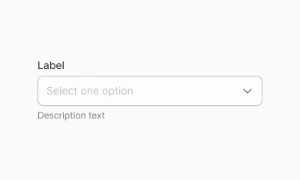
Explore editable input patterns for text, numeric, search and short-code entry. Use the Figma preview to compare layouts for input tooltip and review the available states before adapting the design.
 Included in free version
 Free
Free
8 Variants
 Free
Free
16 Variants
 Free
Free
96 Variants
 Free
Free
1128 Variants
 Free
Free
36 Variants
 Free
Free
340 Variants
 Premium
336 Variants
 Free
Free
960 Variants
 Premium
86 Variants
 Premium
70 Variants
 Free
Free
128 Variants
 Free
Free
100 Variants
 Free
Free
2404 Variants
 Free
Free
16 Variants
 Free
Free
256 Variants
 Free
Free
12 Variants
 Free
Free
20 Variants
 Free
Free
50 Variants
 Free
Free
896 Variants
 Premium
196 Variants
 Free
Free
784 Variants
 Free
Free
840 Variants
 Premium
149 Variants
 Premium
22 Variants
 Free
Free
50 Variants
 Free
Free
1792 Variants
 Free
Free
64 Variants
 Premium
6 Variants
 Premium
256 Variants
 Free
Free
64 Variants
 Premium
580 Variants
 Free
Free
144 Variants
 Premium
36 Variants
 Premium
7 Variants
 Premium
441 Variants
 Premium
8 Variants
 Free
Free
14 Variants
 Free
Free
12 Variants
 Premium
16 Variants
 Premium
32 Variants
Use input patterns to organize text, numeric, search and short-code entry. Keep the relevant state and next action clear so the component is easy to scan. Align labels and visual priority with the screen around it.
Give each field a clear label, format hint and error state; keep helper text next to the input it describes. Keep labels concise and use spacing or icon cues to reinforce the message without relying on color alone.
In Figma, compare the component variants in a real product screen. Check spacing, contrast and labels across relevant states, then adapt the pattern to the team's design system. Document the selected variant and relevant states so the pattern stays consistent across screens.
Input fields enhance the user experience by making data entry straightforward and efficient. Clear labels, placeholder text, and proper field alignment guide users through the process, reducing errors and frustration. In e-commerce, for instance, well-designed input fields ensure that users can quickly and easily complete their purchases. Our UI kit includes customizable input field components that can be tailored to fit any design, providing a seamless and user-friendly interface.
Outlined: clean border-focused style for minimalist layouts
Filled: subtle background fill for emphasis or elevated surfaces
With Icon: optional leading or trailing icon (search, clear)
Multiline (textarea): for extended user input
Disabled: non-editable state visually muted
Responsive variants: available for both light and dark themes.
SM: compact forms, dense UIs
MD: default, balance between space and readability
LG: onboarding or touch-driven contexts
Maintain consistent heights (matching primary buttons) and uniform widths. Figma Auto Layout ensures proper
alignment; Tailwind uses h-10, px-3, gap-2, etc., for spacing. Touch areas meet ≥44×44 px guidelines.
Default / Focus / Filled / Hover / Disabled / Error
Transitions and visual feedback ensure clarity (e.g., focus ring, border highlight)
Auto layout and proper label placement prevent misalignment in dynamic forms
Masks and validation indicators improve input accuracy and UX (e.g., phone, date)
Labels always visible and descriptive (avoid placeholder-only labels)
High contrast for text, borders, and background
Clear differentiation of required vs optional fields
Error messages placed below or to the right of the input and linked via ARIA (aria-describedby)
Keyboard focus use focus-visible style
Figma: Variants for default, focus, filled, disabled, error
Icon slots configurable in component variants
Auto Layout for vertical/horizontal alignment
Style tokens for text, border, fill, focus
Tailwind: Layout: block w-full rounded-md border
States: focus:border-primary-500, focus:ring, disabled:bg-neutral-100
Responsive: sm:h-8, lg:px-4
Tokens: input.border, input.focus, input.bg
Keep forms concise—minimize visible fields
Use explicit labels (top-aligned preferred for speed)
Place error messages below or right of inputs for clarity
Don't use placeholders as sole label context
Apply localized input masks for formatted data
Maintain consistent input/button heights for rhythm
Yes. The EmviUI file is editable: adapt colors, typography, spacing, and variants to your product’s visual system.
The EmviUI collection includes 256 Input variants. Open the Figma preview to explore the included designs.