



Can I customize Checkbox in Figma?
Yes. The EmviUI file is editable: adapt colors, typography, spacing, and variants to your product’s visual system.
Components
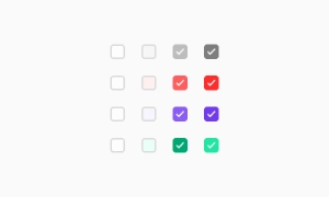
Explore editable checkbox patterns for forms and settings with multiple selectable options. Use the Figma preview to compare layouts for UI checkbox and review the available states before adapting the design.
 Included in free version
 Free
Free
8 Variants
 Free
Free
16 Variants
 Free
Free
96 Variants
 Free
Free
1128 Variants
 Free
Free
36 Variants
 Free
Free
340 Variants
 Premium
336 Variants
 Free
Free
960 Variants
 Premium
86 Variants
 Premium
70 Variants
 Free
Free
128 Variants
 Free
Free
100 Variants
 Free
Free
2404 Variants
 Free
Free
16 Variants
 Free
Free
256 Variants
 Free
Free
12 Variants
 Free
Free
20 Variants
 Free
Free
50 Variants
 Free
Free
896 Variants
 Premium
196 Variants
 Free
Free
784 Variants
 Free
Free
840 Variants
 Premium
149 Variants
 Premium
22 Variants
 Free
Free
50 Variants
 Free
Free
1792 Variants
 Free
Free
64 Variants
 Premium
6 Variants
 Premium
256 Variants
 Free
Free
64 Variants
 Premium
580 Variants
 Free
Free
144 Variants
 Premium
36 Variants
 Premium
7 Variants
 Premium
441 Variants
 Premium
8 Variants
 Free
Free
14 Variants
 Free
Free
12 Variants
 Premium
16 Variants
 Premium
32 Variants
The Checkbox UI component in Emvi UI enables users to select one or multiple options within a group. It is
one of the most common form controls, designed to be clear, accessible, and consistent across
platforms.
It leverages design tokens for color, size, spacing, and interactive states, ensuring compatibility with
both light and dark themes. It includes support for the indeterminate state, useful in partially selected
lists (e.g., nested items).
Use checkboxes for choices that can be combined, and distinguish checked, unchecked, disabled and indeterminate states. Keep labels concise and use spacing or icon cues to reinforce the message without relying on color alone.
In Figma, compare the component variants in a real product screen. Check spacing, contrast and labels across relevant states, then adapt the pattern to the team's design system. Document the selected variant and relevant states so the pattern stays consistent across screens.
Checkboxes contribute to a better user experience by making interactions straightforward. Users can quickly scan and select options without confusion, which is particularly helpful in forms or when managing lists. The clear visual feedback of a checked or unchecked box gives users immediate confirmation of their selections. Our UI kit includes a variety of customizable checkbox styles to fit seamlessly into any design, ensuring both functionality and visual consistency.
Selection box: square, with empty, checked, or indeterminate states.
Associated label: clickable text for better accessibility.
Focus area: visible when navigating with keyboard.
Optional icons: checkmark, dash (indeterminate), or custom icons.
Standard: box with label on the right.
Label-first: label placed before box, useful in horizontal layouts.
Inline: for dense forms.
Disabled: maintains sufficient contrast to indicate state.
Indeterminate: communicates partial selection.
Use these Figma states to plan the visual design. In the implemented form, prefer a native checkbox with an associated label and test keyboard focus, spacebar activation and contrast in every state.
In Figma, checkboxes are available as atomic components with variants (checked, unchecked, indeterminate,
disabled).
The Figma file does not include checkbox code. Map the chosen styles to your own Tailwind implementation and
test the finished control in the browser.
Use a checkbox when users can select multiple options at once. Use a radio button when only one option within a group should be selectable.
Yes. The EmviUI file is editable: adapt colors, typography, spacing, and variants to your product’s visual system.
The EmviUI collection includes 100 Checkbox variants. Open the Figma preview to explore the included designs.