Components
Lists
Lists are organized arrangements of items presented vertically or horizontally, commonly used to display options, features, steps, or data points clearly.
Components
Lists are organized arrangements of items presented vertically or horizontally, commonly used to display options, features, steps, or data points clearly.
 Free
Free
8 Variants
 Free
Free
16 Variants
96 Variants
 Free
Free
1128 Variants
 Free
Free
36 Variants
340 Variants
336 Variants
 Free
Free
960 Variants
86 Variants
70 Variants
 Free
Free
128 Variants
 Free
Free
100 Variants
 Free
Free
2404 Variants
 Free
Free
16 Variants
 Free
Free
256 Variants
 Free
Free
12 Variants
 Free
Free
20 Variants
 Free
Free
50 Variants
 Free
Free
896 Variants
196 Variants
 Free
Free
784 Variants
 Free
Free
840 Variants

149 Variants

22 Variants
 Free
Free
50 Variants
 Free
Free
1792 Variants
 Free
Free
64 Variants

6 Variants
256 Variants
 Free
Free
64 Variants
580 Variants
 Free
Free
144 Variants

36 Variants

7 Variants

441 Variants

8 Variants
 Free
Free
14 Variants
 Free
Free
12 Variants
16 Variants

32 Variants
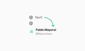
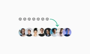
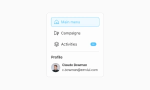
The List component in Emvi UI structures related items into a consistent, scannable vertical flow. It optimizes information density, supports rich content (leading icons, thumbnails, meta, actions), and keeps a predictable rhythm across Figma mockups and Tailwind implementations. Lists are used for navigation menus, settings, activity feeds, and data summaries—where clarity, hierarchy, and selection affordances must be unmistakable. Design tokens standardize spacing, typography, and states to ensure parity across free and premium kits.
Lists are essential for organizing information in a structured format. By presenting items vertically or horizontally, they make it easy for users to scan and understand related content. Whether listing product features, menu options, or steps in a process, lists help break down information into manageable chunks.
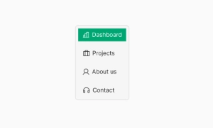
Emvi UI includes flexible list patterns:
- Simple List: text-only rows for minimal contexts.
- Media List: avatar/thumbnail + title + secondary text.
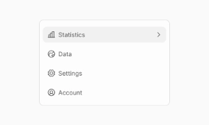
- Icon List: leading icons for quick recognition (e.g., settings).
- Navigation List: rows with chevrons, selection indicators, or badges.
- Dense/Compact: reduced paddings for data-heavy views.
- Divided/Grouped: section headers with sticky or static grouping.
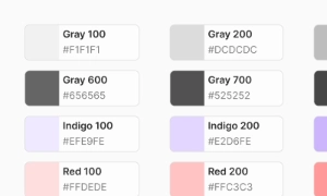
Variants are theme-aware (light/dark) and driven by tokens like list.item.gap, list.item.padding, list.divider, and list.state.selected.
List items ship in SM, MD, and LG:
- SM: dense tables, utility panels, secondary menus.
- MD: default for settings, content directories, and feeds.
- LG: touch-first, media-heavy rows, or emphasis on readability.
Vertical rhythm is set with consistent item height, internal gaps (8–12px), and divider placement. Maintain touch targets ≥44×44px and align icon/media slots on a shared baseline for visual stability across items and breakpoints.
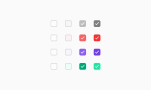
Core states: default, hover, focus-visible, pressed/active, selected, disabled. Optional: unread/new (accent bar or dot), error/warning (left accent), and loading skeletons for perceived performance. Lists can be static or interactive: make the entire row clickable (preferred) or expose explicit affordances (checkboxes, switches, overflow menus) based on task priority and density constraints.
Compose lists with semantic containers (<ul>/<ol>) and items (<li>). For interactive rows, use anchor/buttons with proper roles. Tailwind utilities (e.g., flex, items-center, gap-3, py-2, px-3) establish alignment and spacing. Keep content slots (leading, content, trailing) consistent: icon/avatar → title/meta → actions/badges. Use dividers or inset separators when grouping or emphasizing hierarchy.
Use semantic lists for static content and buttons/links for actionable rows. Ensure focus-visible rings on interactive items, keyboard navigation (Up/Down; Enter/Space to activate), and ARIA states for selection (aria-selected) or current page (aria-current). Provide text alternatives for icons/avatars, and preserve contrast on hover/selected backgrounds and dividers across themes. Avoid using only color to indicate selection—include shape or icon indication where relevant.
Figma: component with variants for size (SM/MD/LG), states, leading media (none/icon/avatar/thumbnail), content density (single/dual line), and trailing elements (badge/chevron/switch/none). Auto Layout guarantees consistent gaps and padding. Tailwind: build rows with flex layouts, tokenized paddings, and state classes (hover:bg-*, focus-visible:ring-2, aria-selected:bg-*). Tokens unify spacing and typography with other components for predictable theming and responsiveness.
- Keep rows scannable: one strong primary text, optional secondary line, and concise meta.
- Prefer row-level click targets; avoid scattered, tiny hit-areas.
- Use consistent media ratios (e.g., 40×40 avatars) and align to a common baseline.
- Control density with SM/MD/LG and avoid mixing densities in one list.
- Employ skeletons or progressive loading for long feeds.
- Communicate selection with both color and iconography; persist focus-visible styling for keyboard users.
Lists are perfect for presenting related items in a clear and concise manner. They group similar items together, making it simple for users to compare and contrast information. For instance, a list of features on a product page allows users to quickly see what a product offers without sifting through paragraphs of text.
Lists improve readability by creating a clean and organized layout. Bullet points or numbered lists provide visual separation between items, which enhances the overall user experience. This format is especially useful for highlighting key points, ensuring that important information stands out and is easily digestible. Our UI kit includes customizable list components that can be tailored to suit any design, ensuring clarity and coherence in presenting information.