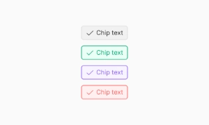
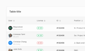
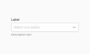
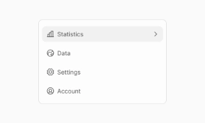
Components
Colors
Colors are the foundation of our UI kit, designed to create a visually appealing and cohesive look across your website.
Components
Colors are the foundation of our UI kit, designed to create a visually appealing and cohesive look across your website.
 Free
Free
8 Variants
 Free
Free
16 Variants
96 Variants
 Free
Free
1128 Variants
 Free
Free
36 Variants
340 Variants
336 Variants
 Free
Free
960 Variants

86 Variants

70 Variants
 Free
Free
128 Variants
 Free
Free
100 Variants
 Free
Free
2404 Variants
 Free
Free
16 Variants
 Free
Free
256 Variants
 Free
Free
12 Variants
 Free
Free
20 Variants
 Free
Free
50 Variants
 Free
Free
896 Variants

196 Variants
 Free
Free
784 Variants
 Free
Free
840 Variants

149 Variants

22 Variants
 Free
Free
50 Variants
 Free
Free
1792 Variants
 Free
Free
64 Variants

6 Variants

256 Variants
 Free
Free
64 Variants

580 Variants
 Free
Free
144 Variants

36 Variants

7 Variants

441 Variants

8 Variants
 Free
Free
14 Variants
 Free
Free
12 Variants
16 Variants

32 Variants
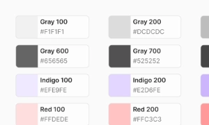
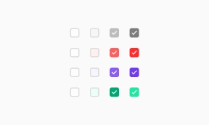
The Emvi UI color palette forms the visual foundation of the design system. Each color has been carefully selected and scaled to ensure consistency, accessibility, and adaptability across any brand context. This chromatic structure enables product teams to build cohesive, scalable, and visually harmonious interfaces.
The system includes a clear hierarchy of colors: primary, secondary, accent, neutral, and feedback states (success, error, warning, info). All colors are distributed across progressive scales (from 50 to 900), allowing seamless implementation in both design and development environments—especially those using Tailwind CSS.
This configuration promotes direct integration between design and code, eliminating ambiguity and reducing implementation time. The palette is fully compatible with Figma Styles and Tailwind Tokens, ensuring a smooth experience for cross-functional teams.
Color is a fundamental component in building brand identity. Within Emvi UI, the chromatic selection has been developed to convey visual personality in a coherent and strategic way, from major interactive elements to the most subtle interface details.
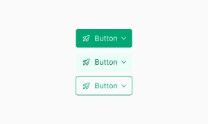
The primary color serves as the system's visual anchor, applied to prominent actions such as buttons, links, or navigation elements. Secondary and accent colors complement this role, offering flexibility to design rich and distinctive visual experiences while maintaining consistency.
Each shade serves a defined purpose within the system, allowing for consistent application across products and platforms. Organized into scales, these palettes support modular visual implementation, easily adapting to light/dark modes and specific brand requirements.
Visual accessibility is a core pillar of Emvi UI’s color system. All color combinations are designed to meet or exceed contrast standards established by the Web Content Accessibility Guidelines (WCAG), ensuring readable and usable interfaces for all users. Text styles, backgrounds, borders, and interactive components have been tested across various configurations to ensure consistent experiences in both light and dark modes. For example, the neutral color scales are calibrated to maintain legibility across visual hierarchies without compromising design. The system also includes specific variants for interaction states such as “hover,” “active,” and “disabled,” ensuring contrast is preserved across all user interactions.
Strategic color usage is key to establishing visual hierarchy and guiding user attention. Emvi UI applies a semantic approach to color assignment, enabling clear differentiation between levels of importance and content types.
Primary colors are used in key action elements, while softer or neutral tones are assigned to secondary or contextual components. This logic is consistently applied across buttons, labels, forms, and navigation systems.
Each tone within a scale represents a specific visual level, enabling the construction of clean, organized interfaces that enhance usability and reduce user cognitive load.
Emvi UI is fully aligned with the Tailwind CSS architecture. Each color is tokenized using a consistent color-name/scale convention, making it easy to map directly into custom configurations within development environments.
This structure allows components designed in Figma to be implemented immediately using Tailwind classes like bg-primary-500 or text-neutral-700, minimizing miscommunication between design and code.
The system is designed to scale across projects of any size, with built-in support for light/dark modes, theme customization, and brand-specific adaptations—without compromising visual consistency.
Neutral colors provide the structural foundation of design in Emvi UI. From backgrounds and borders to text and surfaces, each neutral tone is carefully balanced to support clear, hierarchical, and versatile visual construction.
The system also includes a full range of feedback colors: success, error, warning, and info. These shades are optimized for high visual recognition and meet required contrast levels without overwhelming the interface.
Each state includes variants for both text and backgrounds, allowing flexible use in interactive components, forms, and notifications.
To streamline implementation, all colors in Emvi UI are organized by semantic roles: blue, green, soft, gray, dark, etc. These styles are available as global Figma styles and as configurable tokens in development environments using Tailwind CSS. The naming convention follows a predictable logic, enabling designers to apply styles without worrying about hex values, and developers to use standard utility classes without redefining variables or making manual adjustments. This alignment between design and code ensures a consistent workflow, reduces errors, and accelerates product build and iteration processes.
Primary colors drive main actions, secondary colors support, and neutral grays balance the layout without drawing attention.