Components
Select
The UI-select component enables single or multiple selections from a collection of items. It can be configured in single mode (no checkboxes) or multiple mode (checkboxes displayed).
Components
The UI-select component enables single or multiple selections from a collection of items. It can be configured in single mode (no checkboxes) or multiple mode (checkboxes displayed).
 Free
Free
8 Variants
 Free
Free
16 Variants
96 Variants
 Free
Free
1128 Variants
 Free
Free
36 Variants
 Free
Free
340 Variants
336 Variants
 Free
Free
960 Variants
86 Variants
70 Variants
 Free
Free
128 Variants
 Free
Free
100 Variants
 Free
Free
2404 Variants
 Free
Free
16 Variants
 Free
Free
256 Variants
 Free
Free
12 Variants
 Free
Free
20 Variants
 Free
Free
50 Variants
 Free
Free
896 Variants
196 Variants
 Free
Free
784 Variants
 Free
Free
840 Variants

149 Variants

22 Variants
 Free
Free
50 Variants
 Free
Free
1792 Variants
 Free
Free
64 Variants

6 Variants
256 Variants
 Free
Free
64 Variants
580 Variants
 Free
Free
144 Variants

36 Variants

7 Variants

441 Variants

8 Variants
 Free
Free
14 Variants
 Free
Free
12 Variants

16 Variants

32 Variants
The UI-select component offers flexible selection options by enabling both single and multiple selections from a collection of items. This versatility makes it suitable for various use cases, from choosing a single option in a form to selecting multiple items from a list.
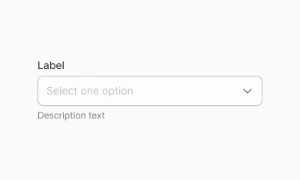
The Select component in Emvi UI provides a consistent way for users to choose one option from a predefined list. Designed with clarity, accessibility, and scalability in mind, Select is essential for forms, configuration screens, and settings panels where predefined values must be selected. Emvi UI supports free and premium variants for both Figma and Tailwind workflows, ensuring seamless design-to-code implementation.
Emvi UI includes multiple select styles to adapt across use cases:
- Standard Select: basic dropdown with label and list of options.
- Select with Placeholder: prompts users before a choice is made.
- Select with Icons: adds visual indicators alongside text labels.
- Grouped Select: organizes options into logical categories.
- Disabled Select: non-editable, visually muted for unavailable states.
Variants support light/dark modes and leverage tokens like select.bg, select.border, and select.option.active.
Select components are available in SM, MD, and LG sizes:
- SM: compact forms and dense UIs.
- MD: default, balancing legibility and density.
- LG: touch-first, onboarding flows, or critical selection tasks.
Spacing between trigger, text, and icons is handled via Figma Auto Layout and Tailwind utilities (px-3, gap-2, h-10), with touch targets ≥44×44px for accessibility.
Select UI supports all essential states:
- Default: neutral border and background.
- Hover: subtle highlight for interactivity.
- Focus-visible: clear outline ring for accessibility.
- Selected: option highlighted with active color.
- Disabled: non-interactive, muted contrast.
- Error: validation feedback through border and helper text.
The dropdown closes automatically when an option is chosen, ensuring clarity and minimal friction in user flows.
Use semantic HTML with <select> and <option> or custom div-based implementations styled with Tailwind. Example:
For accessible selects:
- Always provide a visible label linked to the field.
- Use ARIA attributes for custom components (role="listbox", aria-selected, aria-disabled).
- Ensure keyboard navigation: Tab to focus, Arrow keys to navigate, Enter/Space to select.
- Maintain high contrast and a visible focus ring.
In Figma, Select ships with variants for default, hover, focus, disabled, and error states. Auto Layout manages spacing between label, trigger, and dropdown items. In Tailwind, Select is built using utilities like rounded-md, focus-visible:ring, and peer-checked for active states. Tokens ensure consistency across light/dark themes.
- Use Select for mutually exclusive options with clear predefined choices.
- Prefer grouped selects for large option sets.
- Don’t overload users with too many visible options; consider searchable selects.
- Always use labels—placeholders alone are not enough.
- Match input heights with other form fields for consistency.
- Use error states for validation and helper text for clarity.
The UI-select component can be configured in two distinct modes to cater to different needs. In Single mode, users can select one item without checkboxes, providing a clean and straightforward interface for single selections. In Multiple mode, checkboxes are displayed next to each item, allowing users to select multiple items at once. This dual functionality ensures that the UI-select component can adapt to various application requirements.
The UI-select component extends all abstract configuration, making it highly customizable and adaptable to specific design needs. Developers can configure the component to match the look and feel of their application, ensuring a seamless integration. Our UI kit includes customizable UI-select components that can be easily tailored for single or multiple selection scenarios, providing a user-friendly way to handle item selection.