Components
Table
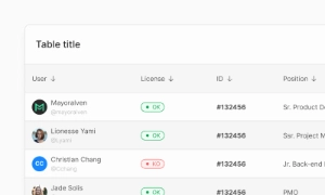
A Table UI enhances traditional data display by incorporating interactive elements like buttons, hyperlinks, and scrolling features, facilitating decision-making.
Components
A Table UI enhances traditional data display by incorporating interactive elements like buttons, hyperlinks, and scrolling features, facilitating decision-making.
 Free
Free
8 Variants
 Free
Free
16 Variants
96 Variants
 Free
Free
1128 Variants
 Free
Free
36 Variants
 Free
Free
340 Variants
336 Variants
 Free
Free
960 Variants

86 Variants
70 Variants
 Free
Free
128 Variants
 Free
Free
100 Variants
 Free
Free
2404 Variants
 Free
Free
16 Variants
 Free
Free
256 Variants
 Free
Free
12 Variants
 Free
Free
20 Variants
 Free
Free
50 Variants
 Free
Free
896 Variants

196 Variants
 Free
Free
784 Variants
 Free
Free
840 Variants

149 Variants

22 Variants
 Free
Free
50 Variants
 Free
Free
1792 Variants
 Free
Free
64 Variants

6 Variants

256 Variants
 Free
Free
64 Variants

580 Variants
 Free
Free
144 Variants

36 Variants

7 Variants

441 Variants

8 Variants
 Free
Free
14 Variants
 Free
Free
12 Variants

16 Variants

32 Variants
The Table component in Emvi UI helps organize data-dense content with semantic structure and visual clarity. It supports responsive layouts, horizontal scrolling, and precise alignment between columns and headers.
Each table cell (<td> and <th>) is optimized to host text, icons, buttons, or other components. Cells support custom alignment (start, center, end), density, borders, and background styling based on visual hierarchy.
Tables are built using semantic HTML (<table>, <thead>, <tbody>, <tr>, <th>, <td>) and are fully accessible with support for scope, aria-sort, and role="columnheader" attributes.
Variants include: Compact table, Zebra striped table, Scrollable table, and Responsive mobile-friendly table blocks.
Each table part is available as a reusable component in Figma and via Tailwind utility classes. You can combine cells with tags, buttons, badges, or chips to enrich interaction without losing structure.
Emvi UI tables use semantic HTML structure, including <table>, <thead>, <tbody>, <tr>, <th>, and <td> elements.