Component Overview
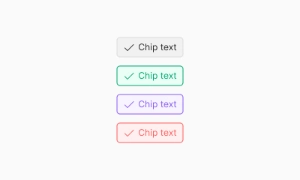
A chip UI is a compact label used to show a selected value, filter, attribute, or suggested action. It can
combine concise text with an optional icon, count, or remove affordance, making it useful in search filters,
forms, and dense toolbars.
Choose a chip when the label is brief and secondary to the surrounding content. Use a button for a standalone
action, and use a clearly labelled input when people need to enter or edit a value.
UI chips: input, filter, and action patterns
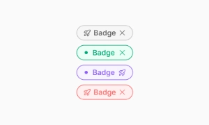
Common chip patterns include input chips, filter chips, action chips, suggestions, and removable selections.
The right pattern depends on whether the person is reviewing a value, changing a filter, or starting an
action. Keep the label short and make selected or removable states visually clear.
An input chip represents a value already entered, such as a recipient or selected category.
A filter chip communicates an active or inactive filter. An action chip should use button behavior, while a
removable chip needs a separate, clearly named remove control when removing the value is an important task.
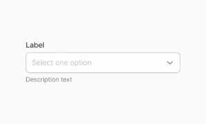
For full text-entry flows, see the related input component for Figma and select component for Figma.
States, Interactivity, and Accessibility
The Figma preview is a visual design reference; keyboard behavior and accessibility depend on the finished
implementation. Plan visible focus, selected, disabled, and hover appearances where they apply, then test
the real controls with a keyboard and assistive technology.
Use a native button for a toggle and expose its state with the appropriate semantics, such as
aria-pressed when the control represents a pressed or unpressed state. A Figma component by
itself does not provide keyboard behavior or establish WCAG conformance.
Styling, Structure, and Customization
Keep chip styles consistent by defining reusable values for spacing, border, radius, color, and type. A chip
can use:
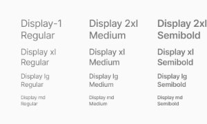
Central text with adaptive typography.
Semi-transparent or solid background depending on context.
Border and radius defined by the system.
Optional icon (start, end, or both).
Optional close button (for dismissible chips).
Translate the chosen Figma values into your project’s CSS or design tokens; this page provides a Figma design
preview rather than a shipped CSS implementation.
Chip CSS for a simple pill style
For a basic CSS chip, use inline flex layout to align the label and optional icon. CSS sets the appearance;
use a button or another suitable HTML element to provide the behavior.
.chip {
  display: inline-flex;
  align-items: center;
  gap: 0.5rem;
  padding: 0.375rem 0.75rem;
  border: 1px solid #d0d5dd;
  border-radius: 999px;
}
Best Practices
To ensure chips are used effectively and accessibly in any interface, the following guidelines are
recommended:
- Limit the number of visible chips to avoid cognitive overload.
- Use chips only when representing concise inputs, filters, or actions.
- Ensure sufficient contrast between background and text for readability.
- Avoid overusing dismissible chips; only offer them when users need control over selections.
- Include icons only if they add meaningful context or functional clarity.
These best practices support a cleaner, more focused, and user-friendly experience.
 Not included in free version





 Premium