




Can I customize Burger menu in Figma?
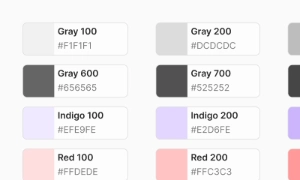
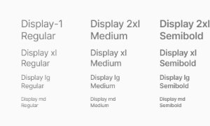
Yes. The EmviUI file is editable: adapt colors, typography, spacing, and variants to your product’s visual system.
Components
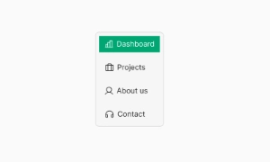
Explore editable hamburger menu patterns for compact mobile navigation and secondary destinations. Use the Figma preview to compare layouts for mobile navigation UI and review the available states before adapting the design.
 Included in free version
 Free
Free
8 Variants
 Free
Free
16 Variants
 Free
Free
96 Variants
 Free
Free
1128 Variants
 Free
Free
36 Variants
 Free
Free
340 Variants
 Premium
336 Variants
 Free
Free
960 Variants
 Premium
86 Variants
 Premium
70 Variants
 Free
Free
128 Variants
 Free
Free
100 Variants
 Free
Free
2404 Variants
 Free
Free
16 Variants
 Free
Free
256 Variants
 Free
Free
12 Variants
 Free
Free
20 Variants
 Free
Free
50 Variants
 Free
Free
896 Variants
 Premium
196 Variants
 Free
Free
784 Variants
 Free
Free
840 Variants
 Premium
149 Variants
 Premium
22 Variants
 Free
Free
50 Variants
 Free
Free
1792 Variants
 Free
Free
64 Variants
 Premium
6 Variants
 Premium
256 Variants
 Free
Free
64 Variants
 Premium
580 Variants
 Free
Free
144 Variants
 Premium
36 Variants
 Premium
7 Variants
 Premium
441 Variants
 Premium
8 Variants
 Free
Free
14 Variants
 Free
Free
12 Variants
 Premium
16 Variants
 Premium
32 Variants
Use hamburger menu patterns to organize compact mobile navigation and secondary destinations. Keep the relevant state and next action clear so the component is easy to scan. Align labels and visual priority with the screen around it.
Make open and closed menu states clear, group destinations, and offer a direct route back to the current screen. Keep labels concise and use spacing or icon cues to reinforce the message without relying on color alone.
In Figma, compare the component variants in a real product screen. Check spacing, contrast and labels across relevant states, then adapt the pattern to the team's design system. Document the selected variant and relevant states so the pattern stays consistent across screens.
The hamburger icon provides flexible navigation options. It can house a variety of menu items and links, making it adaptable to different types of content and site structures. This flexibility allows designers to include more navigation options without overwhelming the user, ensuring that the interface remains efficient and easy to use. Our UI kit includes customizable hamburger icons that integrate smoothly into any design, providing both functionality and style.
Core variants for product teams:
- Icon Only (3-bar, rounded or squared ends), with/without container.
- With Label (e.g., “Menu”), for discoverability in complex apps.
- Contained / Ghost (filled vs. transparent background for contrast control).
- Motion Variants: morph to “X”, rotate + fade lines, or drawer-coupled progress.
- Placement Variants: top-left, top-right, app bar center (with brand lockup).
Design tokens cover size, stroke, gap, and pressed/hover/active states
across light/dark themes.
Recommended scales for the icon button: 24 / 32 / 40 px (SM/MD/LG). Maintain ≥44×44 px touch target via container padding, not by thickening strokes. Use 1.5–2 px stroke for legibility on low-density screens. Provide 8–12 px spacing to the app bar edge and keep consistent alignment with logo and primary actions. When paired with a title, maintain a stable baseline to avoid layout jumps when toggling states.
States include default, hover, focus-visible, pressed, active (open), and disabled. The “open” state should be visually persistent (e.g., morph to “X” or show an active background). Couple the trigger’s state with the navigation drawer: open → drawer visible, close → drawer hidden. Motion guidelines: 150–220 ms for icon morphs, 200–280 ms for drawer slide/fade, easing out-cubic for entry and in-cubic for exit. Respect reduced motion preferences by swapping morphs for opacity/scale changes or static icon swaps.
Prioritize primary navigation (e.g., bottom nav) for frequent tasks; use the burger for secondary or overflow areas. Avoid nesting multiple burger triggers. If the app requires quick access to 2–3 top destinations, expose them on the app bar or via tabs and reserve the drawer for the long tail of links, account, and settings. For desktop breakpoints, promote the drawer to a sidebar while preserving the same information architecture to prevent disorientation across devices.
Use a clear text label alongside the icon in Figma specs (e.g., “Open menu”) and hand off as accessible name. Provide a persistent visible focus style and a large hit area. Manage focus when opening the drawer (focus the first interactive element) and when closing (return focus to the trigger). Ensure 4.5:1 contrast for icon/label against the app bar. Announce state change (expanded/collapsed) and prevent scroll bleed behind the drawer for keyboard and screen reader users.
Figma: component with properties for size (SM/MD/LG), stroke weight, corner style (round/square), label on/off, and state (default/hover/pressed/active). Include motion specs for the bar-to-X morph and drawer transitions. Tokens: nav.burger.size, nav.burger.stroke, nav.burger.bg.active, nav.drawer.overlay. Tailwind: keep implementation flexible—map tokens to utilities without hardcoding HTML in design docs; provide only state names and timing values to ensure faithful builds.
- Prefer icon + label on first-use or low-familiarity contexts to improve discoverability.
- Keep drawer content scannable: group nav, utilities (search, account), and secondary links.
- Prevent layout shifts: reserve space for active state and keep app bar height constant.
- Avoid ambiguous icons (dots or lines) that don’t map to “menu”.
- For enterprise apps, support keyboard shortcuts and display hints in the drawer header.
- Document cross-breakpoint behavior (burger → tabs/sidebar) to maintain IA consistency.
Yes. The EmviUI file is editable: adapt colors, typography, spacing, and variants to your product’s visual system.
The EmviUI collection includes 840 Burger menu variants. Open the Figma preview to explore the included designs.