Components
Avatar
An avatar is a UI element that represents a user's identity with text, icons, or images, offering consistent styling across your site.
Components
An avatar is a UI element that represents a user's identity with text, icons, or images, offering consistent styling across your site.
 Free
Free
8 Variants
 Free
Free
16 Variants
96 Variants
 Free
Free
1128 Variants
 Free
Free
36 Variants
 Free
Free
340 Variants
336 Variants
 Free
Free
960 Variants
86 Variants
70 Variants
 Free
Free
128 Variants
 Free
Free
100 Variants
 Free
Free
2404 Variants
 Free
Free
16 Variants
 Free
Free
256 Variants
 Free
Free
12 Variants
 Free
Free
20 Variants
 Free
Free
50 Variants
 Free
Free
896 Variants
196 Variants
 Free
Free
784 Variants
 Free
Free
840 Variants

149 Variants

22 Variants
 Free
Free
50 Variants
 Free
Free
1792 Variants
 Free
Free
64 Variants

6 Variants
256 Variants
 Free
Free
64 Variants
580 Variants
 Free
Free
144 Variants

36 Variants

7 Variants

441 Variants

8 Variants
 Free
Free
14 Variants
 Free
Free
12 Variants

16 Variants

32 Variants
The Avatar component in Emvi UI provides a visual representation of a user or entity within an interface. Its modular design is built to adapt to multiple contexts—from authentication systems to collaborative platforms or user lists.
The avatar can display a custom profile image, user initials, or a default placeholder. Each variation is developed to maintain visual consistency and readability, even in scenarios where no user image is available.
The system also supports additional states such as presence indicators, badges, or inactive statuses, making it a highly functional and extensible component.
The Avatar component in Emvi UI includes multiple predefined sizes that adapt to different interface hierarchies and layout constraints. Options include XS, SM, MD, LG, and XL variants, designed for use in navigation bars, cards, profile headers, or user lists.
In terms of shape, circular versions are used by default, with square alternatives available—all with softened corners to preserve visual coherence. This allows the system to integrate seamlessly into modern interface designs while retaining full functionality.
Additionally, each avatar supports image, initials, or empty (placeholder) variations, maintaining a neutral background and centered text structure when no image is available. Fonts and weights are scaled by size to ensure readability across all variants.
The Avatar component is designed to visually and accessibly represent user status. Emvi UI includes status indicators such as active, inactive, busy, offline, and custom states, applied as badges or presence dots positioned at one corner of the avatar.
Each status uses semantic colors optimized for contrast and quick recognition: green for available, red for busy, gray for inactive, among others. These elements are integrated into the token system to ensure consistency between design and development.
The position and size of indicators automatically adjust based on the avatar variant, maintaining clarity without obstructing the user image or initials. These states can also be combined with additional elements like highlighted borders or hover effects.
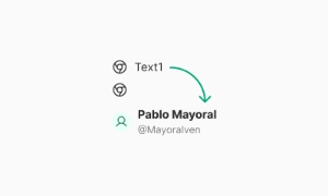
Emvi UI offers a robust solution for representing users without profile images through default avatars. These can be automatically generated using user initials or display a generic icon for anonymous or loading contexts.
The system uses a neutral color palette for backgrounds and centered typography scaled to the component size, ensuring visibility and balance across all sizes. This approach enhances readability and preserves the overall interface aesthetic—even when user data is incomplete.
Placeholders can also integrate with loading skeleton logic and image fallbacks, optimizing the user experience under unstable network conditions or partial data scenarios.
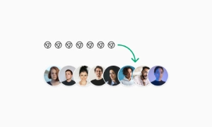
The avatar system in Emvi UI supports visual groupings to represent user sets such as teams, collaborators, or active members. These groupings are designed to integrate with components like lists, project cards, or real-time collaboration tools.
Avatars within a group can partially overlap or be aligned depending on the specific use case. Overlaps include negative margins and predefined z-index levels to maintain visual clarity without graphical collisions.
The group can also include an additional counter to indicate extra users (+3, +9, etc.), designed using the same visual system as the avatars to ensure consistency. This feature is useful in compact spaces where not all members can be displayed.
Accessibility is built into the Avatar component architecture in Emvi UI. Each variant is designed to meet contrast and readability requirements, ensuring users can visually identify avatars across all devices, color modes, and viewing conditions.
Semantic colors with appropriate contrast ratios are used for status indicators and placeholders. Initials are centered and proportionally scaled to avatar size, using fonts optimized for readability at small scales.
The component is also compatible with assistive technologies such as screen readers, through aria-label or alt attributes, enabling content identification for users with visual impairments.
The Avatar component in Emvi UI is designed to integrate seamlessly into workflows using Figma for design and Tailwind CSS for development. In Figma, each avatar variant is available as a reusable component, organized by size, shape, and state.
Color, typography, and spacing tokens used in avatars are synced with global styles, enabling quick customization or theming. This supports visual consistency and efficiency in interface building.
In development environments, avatars can be implemented directly using Tailwind utility classes like rounded-full, w-8, bg-neutral-200, and more. This direct integration between design and code minimizes errors and speeds up delivery cycles.
To ensure visual and functional consistency, it's recommended to follow best practices when using the Avatar component within Emvi UI:
Use proportional sizes based on the visual hierarchy of the context (e.g., XS in lists, LG in headers).
Keep status indicators visible and accessible in all color modes.
Apply fallback styles for users without profile images (initials or placeholders).
Avoid placing critical information solely within avatars (respect accessibility principles).
Use defined tokens for colors and typography, avoiding custom styles outside the system.
These practices ensure the component scales maintainably, reduces inconsistencies, and adapts easily to new visual or thematic contexts.
A placeholder avatar with initials or icon is displayed.