



Can I customize Mega menu in Figma?
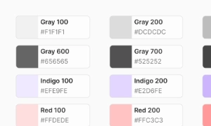
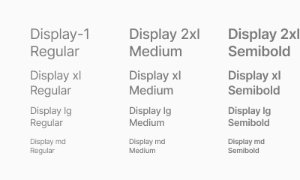
Yes. The EmviUI file is editable: adapt colors, typography, spacing, and variants to your product’s visual system.
Components
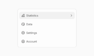
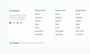
Explore editable mega menu patterns for large navigation hierarchies and grouped destinations. Use the Figma preview to compare layouts for mega menu navigation and review the available states before adapting the design.
 Included in free version
 Free
Free
8 Variants
 Free
Free
16 Variants
 Free
Free
96 Variants
 Free
Free
1128 Variants
 Free
Free
36 Variants
 Free
Free
340 Variants
 Premium
336 Variants
 Free
Free
960 Variants
 Premium
86 Variants
 Premium
70 Variants
 Free
Free
128 Variants
 Free
Free
100 Variants
 Free
Free
2404 Variants
 Free
Free
16 Variants
 Free
Free
256 Variants
 Free
Free
12 Variants
 Free
Free
20 Variants
 Free
Free
50 Variants
 Free
Free
896 Variants
 Premium
196 Variants
 Free
Free
784 Variants
 Free
Free
840 Variants
 Premium
149 Variants
 Premium
22 Variants
 Free
Free
50 Variants
 Free
Free
1792 Variants
 Free
Free
64 Variants
 Premium
6 Variants
 Premium
256 Variants
 Free
Free
64 Variants
 Premium
580 Variants
 Free
Free
144 Variants
 Premium
36 Variants
 Premium
7 Variants
 Premium
441 Variants
 Premium
8 Variants
 Free
Free
14 Variants
 Free
Free
12 Variants
 Premium
16 Variants
 Premium
32 Variants
Use mega menu patterns to organize large navigation hierarchies and grouped destinations. Keep the relevant state and next action clear so the component is easy to scan. Align labels and visual priority with the screen around it.
Group destinations under clear headings, show the active category and simplify navigation on smaller screens. Keep labels concise and use spacing or icon cues to reinforce the message without relying on color alone.
In Figma, compare the component variants in a real product screen. Check spacing, contrast and labels across relevant states, then adapt the pattern to the team's design system. Document the selected variant and relevant states so the pattern stays consistent across screens.
By offering a well-organized and detailed navigation structure, mega menus improve the overall user experience. They allow users to access a wide range of options from a single location, reducing the time and effort needed to find specific content. This is particularly beneficial for e-commerce sites and large websites with extensive content. Our UI kit includes customizable mega menu components that can be tailored to fit any design, ensuring your site’s navigation is both functional and visually appealing.
Core variants:
- Column Mega Menu: 2–6 columns with group headings and link lists.
- Grid Mega Menu: cards or icons in a responsive grid, suited for visual categories.
- Hybrid: columns + featured area (promo, image, or quick links).
- Contextual Mega Menu: menu content adapts by user role, locale, or segment.
- Dense vs. Comfortable: compact lists for utility nav; spacious for browsing.
- Open Method: click/tap to open, optional hover on desktop with intent thresholds.
Tokens drive parity across themes: mega.panel.bg, mega.panel.shadow,
mega.heading, mega.link, mega.divider, mega.promo,
nav.trigger.active.
Use the page grid as the bounding frame. Recommended baselines:
- Width: align panel to the content container; typical max 1200–1440 px.
- Columns: 2–6 columns; 16–24 px gutters; column widths 200–280 px.
- Item height: 36–44 px per link; group headings 12–14 px overline or 14–16 px label.
- Edge padding: 16–24 px inside the panel; 8–12 px between heading and first item.
- Trigger alignment: panel aligns to the trigger’s left edge or centers under the nav bar.
Keep a stable header height and ensure adequate pointer targets per Fitts’ Law.
Open/close states: default, hover (desktop), focus-visible, active, disabled. Prefer click/tap to open for reliability on touch devices; if using hover on desktop, add a small open delay (≈100–150 ms) and a slightly longer close delay (≈200–300 ms) with “forgiveness zones” to prevent accidental dismissals. Keep keyboard support: Left/Right to move between top-level triggers; Down to enter the panel; Up/Down within a column; Esc to close and return focus to the trigger. Trap focus inside the panel while open; restore on close. Reduce motion for users with prefers-reduced-motion. Avoid nested hover chains—one level only inside the panel.
IA guidelines: group links by clear, user-centric categories; put the most-used destinations in the top-left of the panel; reserve one featured area (optional) for campaigns or quick-start content. Avoid mixing too many patterns—choose list-first or card-first. For localization, keep per-column headings short to prevent wrapping. On smaller breakpoints, convert the mega menu to an accordion inside a drawer (burger) while preserving order and grouping. Document link ownership (marketing vs. product) to avoid rot and keep audits predictable.
Prefer the disclosure pattern for site navigation: a button trigger with aria-expanded
and aria-controls that shows/hides a labeled region. Use semantic lists (ul/li)
inside the panel; avoid ARIA menu roles unless you implement full application-menu behavior. Provide visible
focus outlines on triggers and links, maintain 4.5:1 contrast for text and interactive states, and ensure a
large click area for column headings and items. Announce the panel with an accessible name (e.g., “Products
menu”) and allow Esc to close from anywhere inside the panel. Keep content order logical for screen readers
(DOM order = visual order).
Figma: component set with properties for column count (2–6), density (dense/comfortable), presence of icons/thumbs, featured slot on/off, and open state. Use Auto Layout and the page grid to lock gutters and paddings; expose tokens for headings, links, dividers, and promo areas. Create Interaction details for open/close delays, hover intent, and focus outlines. Tailwind: map tokens to utilities at build time; keep documentation focused on tokens and states rather than specific HTML to ensure flexibility across frameworks.
- Keep categories stable; avoid weekly reshuffles that hurt muscle memory.
- Limit columns to 3–5 in most cases; more than 6 increases scanning cost.
- Use concise, action-oriented labels; do not rely on icons alone.
- Reserve one promotional block at most; prioritize navigation over marketing.
- Log interactions (open rate, dwell time, link CTR) and prune low-value links.
- Convert to drawer/accordion on mobile; do not recreate the desktop mega menu verbatim.
Yes. The EmviUI file is editable: adapt colors, typography, spacing, and variants to your product’s visual system.
The EmviUI collection includes 1,792 Mega menu variants. Open the Figma preview to explore the included designs.