Components
Breadcrumbs
UI breadcrumbs are a navigation aid that helps users easily move between different sections of a website or app.
Components
UI breadcrumbs are a navigation aid that helps users easily move between different sections of a website or app.
 Free
Free
8 Variants
 Free
Free
16 Variants
96 Variants
 Free
Free
1128 Variants
 Free
Free
36 Variants
340 Variants
336 Variants
 Free
Free
960 Variants
86 Variants
70 Variants
 Free
Free
128 Variants
 Free
Free
100 Variants
 Free
Free
2404 Variants
 Free
Free
16 Variants
 Free
Free
256 Variants
 Free
Free
12 Variants
 Free
Free
20 Variants
 Free
Free
50 Variants
 Free
Free
896 Variants
196 Variants
 Free
Free
784 Variants
 Free
Free
840 Variants

149 Variants

22 Variants
 Free
Free
50 Variants
 Free
Free
1792 Variants
 Free
Free
64 Variants

6 Variants
256 Variants
 Free
Free
64 Variants
580 Variants
 Free
Free
144 Variants

36 Variants

7 Variants

441 Variants

8 Variants
 Free
Free
14 Variants
 Free
Free
12 Variants
16 Variants
32 Variants
UI breadcrumbs simplify navigation by providing a clear path back to previous sections. They display the user's current location within the site's hierarchy, making it easy to understand how to return to earlier pages or higher-level categories. This reduces frustration and helps users feel more in control of their browsing experience.
Breadcrumbs enhance the user experience by making the site more intuitive and user-friendly. They provide context for where the user is within the site, which can be especially useful for large websites with complex structures. By showing the trail of pages visited, breadcrumbs help users avoid getting lost and ensure they can easily find their way back to key sections.
Breadcrumbs can also improve SEO by providing search engines with a clear structure of your site. They create internal links that help search engines understand the hierarchy and organization of your content. This can lead to better indexing and potentially higher rankings in search results. Our UI kit includes easy-to-implement breadcrumb components that enhance navigation and contribute to a more organized and accessible site structure.
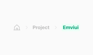
The Breadcrumbs UI component in Emvi UI provides hierarchical navigation cues that help users understand where they are and how to go back within the information architecture. It is optimized for products with deep content trees (e.g., admin panels, catalogs, documentation sites, and B2B apps) and prioritizes clarity, semantic consistency, and accessibility.
The implementation supports variable path lengths, smart truncation, responsive collapsing, and slots for icons or status elements. Visual separation uses characters like /, > or SVG icons, and clearly differentiates navigable links from the current page item (non-clickable by default). The system includes light/dark theme styles and adheres to typography, color, and spacing tokens to ensure consistency across the Design System.
A typical breadcrumb includes:
- Container (wrapping nav) with aria-label="Breadcrumb" and an ordered/unordered list (<ol>/<ul>).
- Items (<li>) representing hierarchical levels (Home → Section → Subsection → Page).
- Separators (characters or icons) between items.
- Current item, marked with aria-current="page" and non-clickable by default.
Supported patterns:
- Home icon with optional label.
- Stateful items (e.g., disabled when permissions are missing).
- Microcopy additions (short subtitles or status badges).
- Horizontal scroll for very narrow viewports.
Emvi UI ships several production-ready variations:
- Classic: text + separators.
- Icon-enhanced: icons per level (folder, product, document).
- Compact: collapses early levels into a "..." trigger with a popover menu.
- Truncated: shortens long labels depending on available width (with title/tooltip for full label).
- Responsive: switches from full to compact mode at defined breakpoints (e.g., md, sm).
All variations inherit typography, color, and spacing tokens. The current item uses a distinctive non-interactive style to avoid misleading click targets.
The component defines size tiers SM, MD, and LG. Each size includes:
- Internal spacing to prevent overlaps with icons or badges.
- Separators scaled to the typographic baseline.
- Consistent horizontal gaps between items and separators.
Separator variants (/, >, • or SVG) use a muted text color to reduce noise and keep focus on labels.
For deep paths, Emvi UI provides:
- Multi-stage truncation: shortens middle levels first, preserving the beginning and end.
- Collapsing: turns middle levels into a "..." trigger with a full-path popover.
- X-scroll: enables horizontal scrolling in narrow containers.
Truncation rules avoid stripping critical tokens (IDs, key slugs) and maintain accessibility with tooltips and descriptive aria-labels.
- nav container with aria-label="Breadcrumb"
- Semantic list <ol> or <ul>; each level as <li>
- Current item marked with aria-current="page"
- Links have visible focus states and adequate touch targets
- Keyboard support: sequential tabbing, Enter/Space activation, and Esc to close popovers in compact mode
- Contrast validated for text and separators in light/dark modes
In Figma, the component ships as a nested structure with variants: size (SM/MD/LG), separator (text/SVG), collapsed (on/off), iconized (on/off). It uses Auto Layout and global token styles.
In Tailwind, the base relies on utilities such as flex, items-center, gap-x-*, text-sm|md|lg, text-muted-foreground, and inline-flex slots for separators. Compact mode adds hidden md:flex logic and a popover with vertical menu (flex-col, divide-y). The system is theme-aware and integrates data-state attributes for active states.
- Keep essential levels visible (Home and current page); collapse middle levels for deep paths.
- Avoid ambiguous labels; prefer short, meaningful names.
- Disable current-item navigation to prevent confusion.
- Provide tooltips or title for truncated labels and descriptive aria-labels.
- Match separator styling to interface density (lighter in dense UIs).
- Test keyboard flows and screen readers; validate contrast in both themes.
Use it for hierarchical structures where users need context and return paths. Avoid it in linear flows or flat navigation where breadcrumbs add little value.
Examples: catalog → category → product (good use case) vs single-page application with tabbed navigation (unnecessary).