Components
Stepper
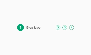
A Stepper is a UI component that guides users through a sequence of numbered steps, providing a clear indication of progress and facilitating a wizard-like workflow.
Components
A Stepper is a UI component that guides users through a sequence of numbered steps, providing a clear indication of progress and facilitating a wizard-like workflow.
 Free
Free
8 Variants
 Free
Free
16 Variants
96 Variants
 Free
Free
1128 Variants
 Free
Free
36 Variants
340 Variants
336 Variants
 Free
Free
960 Variants
86 Variants
70 Variants
 Free
Free
128 Variants
 Free
Free
100 Variants
 Free
Free
2404 Variants
 Free
Free
16 Variants
 Free
Free
256 Variants
 Free
Free
12 Variants
 Free
Free
20 Variants
 Free
Free
50 Variants
 Free
Free
896 Variants
196 Variants
 Free
Free
784 Variants
 Free
Free
840 Variants

149 Variants

22 Variants
 Free
Free
50 Variants
 Free
Free
1792 Variants
 Free
Free
64 Variants

6 Variants
256 Variants
 Free
Free
64 Variants
580 Variants
 Free
Free
144 Variants

36 Variants

7 Variants

441 Variants

8 Variants
 Free
Free
14 Variants
 Free
Free
12 Variants
16 Variants

32 Variants
The Stepper in Emvi UI organizes multi-step flows (wizards, checkouts, onboarding) into a clear, navigable sequence. It communicates progress, current context, and validation outcomes for each step while maintaining visual parity between Figma mockups and Tailwind code. Emvi UI’s stepper supports linear and non-linear journeys, numeric or icon indicators, compact and spacious densities, and theme-aware tokens—tailored for product designers and front-end teams working with stepper UI, stepper UI design, and stepper UX patterns.
The Stepper component is essential for breaking down complex processes into manageable steps within user interfaces. It visually represents progression through a series of logical and numbered steps, ensuring users have a clear understanding of their current position and the overall workflow.
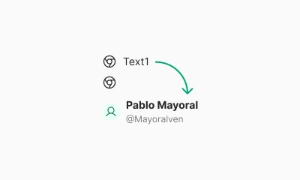
Beyond progression, Steppers can also serve as a navigation aid, allowing users to backtrack to previous steps or skip ahead to subsequent ones. This flexibility accommodates varying user needs and preferences, providing a seamless and intuitive navigation experience.
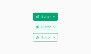
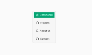
Modern Stepper components offer customization options such as step labels, icons, animations, and progress indicators. This allows designers to tailor the appearance and behavior of the Stepper to match the overall visual identity and usability requirements of their application.
Common variants include:
- Horizontal (Linear): sequential steps with connectors; Next/Back primary pattern.
- Horizontal (Non-linear): jump navigation across visited/valid steps.
- Vertical: stacked labels and content; ideal for forms and long copy.
- Compact/Dense: reduced paddings for tight UIs.
- With Numbers / With Icons: numeric counters or semantic icons per step.
- Alternative Label Placement: label below, side, or tooltip-only for narrow layouts.
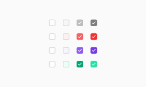
- Status Variants: current, complete (check), error (badge), optional (subtext).
Tokens drive consistency: stepper.step.size, stepper.icon, stepper.connector, stepper.state.current, stepper.state.complete, stepper.state.error, stepper.label.
Provide SM/MD/LG scales:
- Indicators: 20–24–28px with 2px connector thickness by default.
- Label spacing: 6–8–10px from the indicator; connector gaps 12–16–20px.
- Touch targets: ≥44×44px on clickable steps and controls.
- Responsive: collapse labels to tooltips or switch to vertical below critical width. Truncate long labels with ellipsis and provide full text via title or tooltip.
Consistent baselines between indicators, labels, and helper texts keep the visual rhythm intact across breakpoints and themes.
Core states: incomplete, current, complete, error, disabled, and optional. Linear steppers gate progression with validation; non-linear steppers allow jumping to visited/valid steps. Keep transitions subtle; persist completion marks only after server-acknowledged success when applicable. On async operations, show inline feedback and disable navigation until completion. Support keyboard: Arrow keys to move, Home/End to jump, Enter/Space to activate. Maintain scroll-into-view for the current step’s content on small screens.
Expose progress semantics with aria-current="step" on the active trigger, and link triggers to content via aria-controls/aria-labelledby. Use role="tabpanel" for step content and toggle hidden or aria-hidden appropriately. Provide clear error summaries per step, not just inline color. Honor reduced motion and keep focus management deterministic: move focus to the step heading/content on step change. Ensure sufficient contrast for connectors, indicators, and labels across themes.
Figma ships variants for orientation (horizontal/vertical), density (compact/comfortable), indicator type (number/icon), and state (current/complete/error/disabled). Auto Layout maintains consistent gaps and connector sizing; component properties toggle labels, helper text, and optional flags. In Tailwind, compose with flex/gap utilities, ring styles for focus-visible, and CSS variables (e.g., --step-connector, --step-current-bg, --step-complete-bg) to sync theming across light/dark modes and premium palettes.
- Keep flows between 3–7 steps; merge micro-steps into inline sections when possible.
- Use concise, action-oriented labels; add optional/required markers sparingly.
- Gate progression only on essential validations; allow Save & continue later.
- Persist state (local or server) at each step transition; guard against refresh loss.
- Prefer vertical steppers for form-heavy content; horizontal for brief tasks.
- For mobile, auto-scroll to current content and provide a summary/review step before submit.