Components
Button
Buttons are essential interactive elements in any UI, available in various shapes and sizes, used for actions like forms, sign-ups, and log-ins.
Components
Buttons are essential interactive elements in any UI, available in various shapes and sizes, used for actions like forms, sign-ups, and log-ins.
 Free
Free
8 Variants
 Free
Free
16 Variants
96 Variants
 Free
Free
1128 Variants
 Free
Free
36 Variants
340 Variants
336 Variants
 Free
Free
960 Variants
86 Variants
70 Variants
 Free
Free
128 Variants
 Free
Free
100 Variants
 Free
Free
2404 Variants
 Free
Free
16 Variants
 Free
Free
256 Variants
 Free
Free
12 Variants
 Free
Free
20 Variants
 Free
Free
50 Variants
 Free
Free
896 Variants
196 Variants
 Free
Free
784 Variants
 Free
Free
840 Variants

149 Variants

22 Variants
 Free
Free
50 Variants
 Free
Free
1792 Variants
 Free
Free
64 Variants

6 Variants
256 Variants
 Free
Free
64 Variants
580 Variants
 Free
Free
144 Variants

36 Variants

7 Variants

441 Variants

8 Variants
 Free
Free
14 Variants
 Free
Free
12 Variants
16 Variants

32 Variants
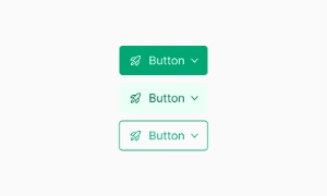
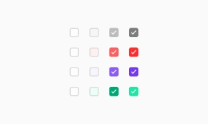
The Button component in Emvi UI is designed to be one of the most versatile and reusable elements in the design system. It plays a central role in interfaces by enabling actions, navigation, or form submission.
Each button is built on a token-based structure that allows fast customization of colors, sizes, and states without compromising visual consistency. Available variants cover a wide range of use cases: primary, secondary, tertiary, text, icon, and compound buttons.
This component is optimized for responsive environments, supports light/dark themes, and remains accessible across all devices.
The button system in Emvi UI is structured to reflect clear action hierarchies. This ensures users can visually identify the priority of each button based on its context.
Primary: Highlights the main action on a screen or flow. Uses solid color and high contrast.
Secondary: Complements the primary button, suitable for secondary actions. May use outline or less prominent background.
Tertiary: Used for less frequent or alternative actions. Typically appears as plain text with minimal visual weight.
Text Button: For non-critical actions or lightweight UI contexts.
Destructive Buttons: Reserved for critical actions (e.g., delete), using colors and messaging that alert the user.
Each type has its own configuration for background, border, shadow, and typography to ensure system-wide consistency.
Emvi UI includes a range of predefined button sizes, designed to accommodate various hierarchy levels and interface needs. Variants include XS, SM, MD, LG, and XL, each paired with specific font sizes, padding, and line heights.
Internal spacing is calibrated to maintain visual balance—even when adding elements like icons or loaders. This scale ensures proper alignment with other system components such as inputs, cards, or headers.
The spacing system follows Emvi UI's base grid, enabling smooth integration into modular designs and responsive layouts.
The Button component in Emvi UI includes interaction states designed to enhance user experience and provide clear visual feedback. These states are defined by global tokens and comply with WCAG accessibility recommendations.
Hover: Slightly increases background or border contrast to indicate interactivity.
Focus: Adds a visible focus ring for keyboard navigation.
Active: Simulates a press using subtle darkening or shadow change.
Disabled: Lowers opacity, removes interactivity, and maintains sufficient contrast for recognition.
Loading: Displays a centered loading indicator, replacing or accompanying the button label.
All states are responsive and compatible with both light and dark modes.
Emvi UI supports enhanced buttons through icons and compound content, improving usability and visual communication for key actions. Icons can be placed to the left or right of the label and are automatically aligned based on the button size.
The system allows for:
Icon + text buttons.
Icon-only buttons (for dense or mobile UIs).
Compound buttons with secondary labels, descriptions, or badges.
All icons scale relative to the button size and respect predefined padding, ensuring legibility and consistency. They are also integrated with the token system to maintain color and style synchronization.
Buttons in Emvi UI are designed with accessibility as a top priority. Each variant meets the contrast requirements set by WCAG AA/AAA for both active and disabled states.
Interactive elements include appropriate aria attributes and roles (button, aria-disabled, aria-busy) to ensure compatibility with screen readers. Buttons are fully keyboard-navigable and include visible focus indicators to enhance usability on pointerless devices.
Button text maintains a minimum font size and touch-friendly padding, complying with mobile accessibility standards.
The Button component in Emvi UI is built for seamless integration with modern design and development tools. In Figma, each button is available as an atomic component and reusable variant (by type, size, state, and icon), linked to global text, color, and effect styles.
In Tailwind CSS, buttons are implemented using predefined utility classes such as bg-primary-500, rounded-md, px-4, hover:bg-primary-600, and more. Tokens and variants can be extended through configuration in the tailwind.config.js file.
This direct design-to-code integration ensures visual consistency, reduces style duplication, and enhances productivity across multidisciplinary teams.
To maintain the visual and functional consistency of the button system in Emvi UI, the following best practices are recommended:
Use appropriate semantic variants based on action hierarchy.
Avoid overcrowding buttons with multiple icons or overly long text.
Use disabled states only when the action must not be performed—not as an indicator of temporary inactivity.
Include loading indicators on asynchronous actions to improve perceived responsiveness.
Ensure all buttons have accessible labels (aria-label) when content is not text-based.
These practices enhance the user experience, reinforce accessibility, and support maintainability across the system.