



Can I customize Badge in Figma?
Yes. The EmviUI file is editable: adapt colors, typography, spacing, and variants to your product’s visual system.
Components
Explore editable badge patterns for compact status labels, counts and categories. Use the Figma preview to compare layouts for tag component and review the available states before adapting the design.
 Included in free version
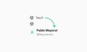 Free
Free
8 Variants
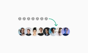 Free
Free
16 Variants
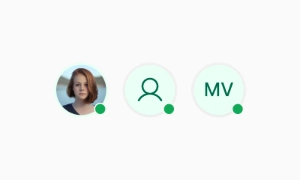 Free
Free
96 Variants
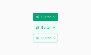 Free
Free
1128 Variants
 Free
Free
36 Variants
 Free
Free
340 Variants
 Premium
336 Variants
 Free
Free
960 Variants
 Premium
86 Variants
 Premium
70 Variants
 Free
Free
128 Variants
 Free
Free
100 Variants
 Free
Free
2404 Variants
 Free
Free
16 Variants
 Free
Free
256 Variants
 Free
Free
12 Variants
 Free
Free
20 Variants
 Free
Free
50 Variants
 Free
Free
896 Variants
 Premium
196 Variants
 Free
Free
784 Variants
 Free
Free
840 Variants
 Premium
149 Variants
 Premium
22 Variants
 Free
Free
50 Variants
 Free
Free
1792 Variants
 Free
Free
64 Variants
 Premium
6 Variants
 Premium
256 Variants
 Free
Free
64 Variants
 Premium
580 Variants
 Free
Free
144 Variants
 Premium
36 Variants
 Premium
7 Variants
 Premium
441 Variants
 Premium
8 Variants
 Free
Free
14 Variants
 Free
Free
12 Variants
 Premium
16 Variants
 Premium
32 Variants
The Badge and Tag components in Emvi UI allow you to label, classify, and highlight UI elements in a
compact, accessible manner. While they serve similar purposes, their use cases differ:
Badge: Indicates count, status, or notification. Commonly used alongside another component (button, icon,
avatar).
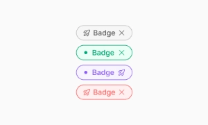
Tag: Represents a category, label, or filter. Can be interactive (editable, dismissible) or static.
Both components are designed to natively integrate into responsive interfaces, with support for color
variants, icons, sizes, and interactive behaviors.
Reserve badges for short statuses, counts or categories, and pair color with a readable label. Keep labels concise and use spacing or icon cues to reinforce the message without relying on color alone.
In Figma, compare the component variants in a real product screen. Check spacing, contrast and labels across relevant states, then adapt the pattern to the team's design system. Document the selected variant and relevant states so the pattern stays consistent across screens.
Badges are also great for marking events or special conditions. They can denote new features, limited-time offers, or any event that requires attention. Placing a badge next to an item can draw users’ focus to it, ensuring they notice and engage with important content. Our UI kit includes versatile badge components that can be customized to fit various needs, enhancing both functionality and aesthetics of your design.
Emvi UI offers multiple variants for Badge and Tag components, tailored to various use cases and visual
hierarchy needs:
Badge:
Numeric Counter: Displays quantities or notifications (e.g., 3, +99), commonly used in buttons or icons.
Status Badge: Indicates statuses like "Active", "New", "Pending" using semantic colors.
Dot Badge: Signals presence or connectivity via a small colored dot.
Tag:
Static Label: Shows categorical text (e.g., Marketing, Beta).
Interactive Tag: Includes a close button or supports multi-selection.
Tag with Icon: Adds contextual icons on the left or right side.
Each variant is available in XS, SM, and MD sizes, with full token-based customization for typography,
padding, colors, and border-radius.
Badge and Tag components in Emvi UI can be either static or interactive depending on the context.
Interactive variants respond to events like hover, focus, click, or dismiss, and are designed to enhance
user experience while maintaining accessibility.
Supported States:
Hover / Focus: Background or outline changes to indicate interactivity.
Active / Pressed: Visual feedback when pressed or selected.
Disabled: Dimmed appearance and non-interactive.
Dismissible: Option to remove a Tag via close icon.
Behavior aligns with WCAG standards, and aria-* attributes can be applied to enhance screen reader support.
Badge and Tag components are available as reusable variants in Figma, organized by type, size, color, and
state. Each is linked to global typography, color, and spacing styles, enabling controlled customization
without losing visual consistency.
In development environments, they're easily implemented using Tailwind classes such as:
inline-flex, items-center, px-2, rounded-full
bg-primary-100 text-primary-700
hover:bg-primary-200 (for interactive variants)
The system also supports icon slots and data-* or aria-* attributes for extended functionality and
accessibility.
To maximize the visual and functional effectiveness of Badge and Tag components in Emvi UI, the following
guidelines are recommended:
- Use badges only when necessary to highlight status, count, or alerts.
- Avoid tags that are too long or break responsive layouts.
- Don't rely on tags for critical information not reflected elsewhere.
- Maintain semantic color consistency based on their role (status, category, notification).
- Include accessible labels (aria-label) for tags with icons or interactive functionality.
These practices ensure a clear, accessible user experience that aligns with the overall system design.
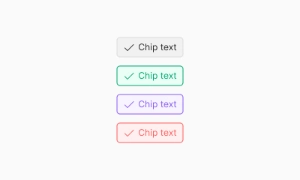
Badge = status/count. Tag = categorization. Chip = interactive input.
Yes. The EmviUI file is editable: adapt colors, typography, spacing, and variants to your product’s visual system.
The EmviUI collection includes 340 Badge variants. Open the Figma preview to explore the included designs.