30% OFF
🎁EmviUI Premium Access
The biggest Figma UI kit on the internet
🚀 Unlock 10k+ premium components variants and transform your design workflow today!
✨ Instant access
If you're searching for the best UI kits application 2025, this guide brings together the top Figma UI kits to level up your design process.
As the design industry evolves, the demand for high-quality UI kits continues to grow. Figma, one of the most popular design tools today, offers a variety of UI kits that can help streamline your workflow, maintain consistency, and elevate the quality of your designs. In this article, we'll explore the top Figma ui kits in 2025, including our very own EmviUI, and discuss the importance of UI kits and design systems in modern product design.

A UI kit is a collection of pre-designed components, such as buttons, icons, and forms, that designers can use to build user interfaces quickly and efficiently. These kits often come with a variety of styles and variations, allowing for customization and consistency across different projects. By using a UI kit, designers can save time, reduce repetitive work, and ensure that their designs adhere to a consistent visual language.
A design system is a comprehensive guide that defines the visual language, components, and principles used across a brand or product. Unlike UI kits, which focus on specific elements, design systems encompass the entire design process, providing a framework for consistency, scalability, and collaboration. Design systems often include UI kits as part of their components, making them a critical resource for maintaining a cohesive brand identity across various platforms.
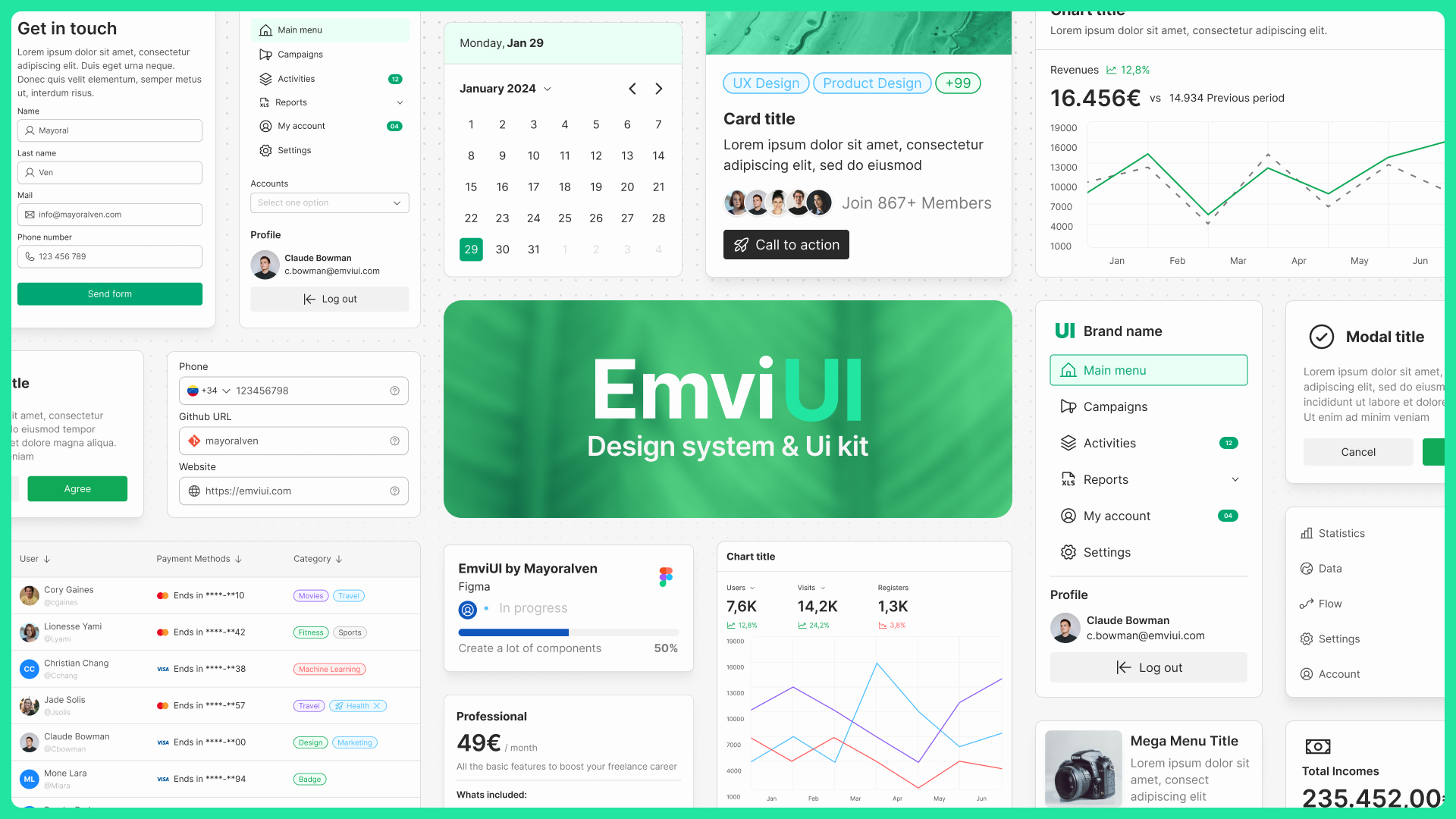
EmviUI is not just another Figma UI kit; it's one of the best ui kits application 2025, a comprehensive design powerhouse that equips designers with everything they need to create high-quality, consistent, and visually stunning user interfaces. With over 10,000 meticulously crafted components, 100+ pre-built screens, and 150+ customizable local variables, EmviUI stands out as the go-to resource for both novice and experienced designers alike.
Key Features:
- Extensive Component Library: EmviUI offers a vast range of components, including buttons, forms, icons, and navigation elements, all designed to work seamlessly together. This makes it easier for designers to maintain consistency across their projects.
- Pre-built Screens: The kit includes over 100 pre-built screens that cater to various use cases, from login pages to complex dashboards. These screens are fully customizable, allowing you to quickly adapt them to your specific needs.
- Customizable Variables: With over 150 local variables, EmviUI enables designers to adjust colors, typography, and spacing across all components with ease. This flexibility ensures that your designs remain consistent with your brand's identity.
- Responsive Design: EmviUI is designed with responsiveness in mind, ensuring that your interfaces look great on all devices, whether it’s a mobile phone, tablet, or desktop.
- Ease of Use: Despite its extensive features, EmviUI is user-friendly and intuitive, making it easy for designers to get started and quickly integrate it into their workflow.
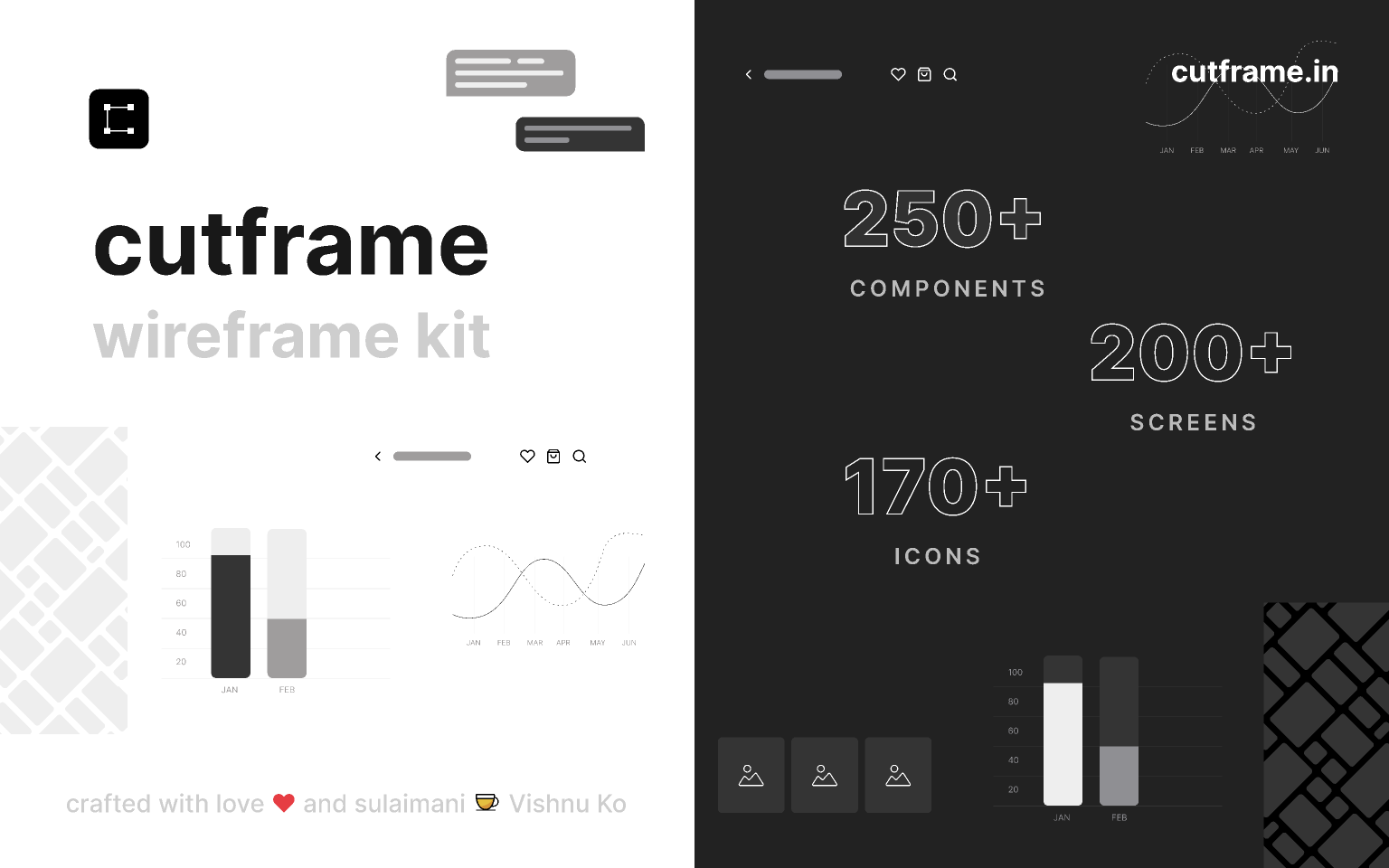
Cutframe is a powerful open-source wireframe kit designed specifically for mobile projects. Whether you're designing an app or mobile-friendly website, Cutframe provides the foundation you need to bring your ideas to life. This kit includes over 250 components, 200+ screens, and 170+ premade mobile icons, all meticulously designed to meet the needs of modern mobile design.
Key Features:
- Comprehensive Component Library: Cutframe’s components cover a wide range of UI elements, from navigation bars and buttons to form elements and modals. This variety allows you to quickly assemble functional prototypes without having to design from scratch.
- Dark and Light Mode: The kit is available in both light and dark modes, making it adaptable to different design needs and user preferences.
- Community-Driven: As an open-source project, Cutframe is continually updated and improved by a community of designers, ensuring it remains relevant and up-to-date with the latest design trends.
- Free Access: Available for free via the Figma community, Cutframe is an excellent resource for both new designers looking to learn and experienced designers seeking to streamline their workflow.
Moon is a robust and comprehensive design system that has become a favorite among UX/UI designers globally. Created by the Yolo Group, Moon offers a vast array of components, including avatars, buttons, drop-down menus, and more, all designed to optimize your design workflow. This design system is perfect for those looking to maintain a high level of consistency across their projects while leveraging a resource that is trusted by over 10,000 active users.
Key Features:
- Extensive Component Set: Moon's components are designed with a focus on usability and consistency, covering everything from basic UI elements to more complex components like forms and navigation menus.
- Scalability: Moon is designed to scale with your projects, making it ideal for both small startups and large enterprises looking to maintain consistency across their product lines.
- Detailed Documentation: Moon comes with comprehensive documentation that guides designers through the process of implementing the design system into their projects, ensuring that they can take full advantage of its capabilities.
- Active Community: With a large community of users and contributors, Moon is constantly being updated and improved, providing designers with a living, breathing resource that evolves with the industry.
Headspace is a flexible and highly adaptable UI kit designed to meet the needs of a wide range of projects. It features over 200 top-notch components, each designed with multiple variants to ensure maximum flexibility and customization. Whether you're designing for web, mobile, or desktop applications, Headspace provides the building blocks you need to create polished and professional user interfaces.
Key Features:
- Versatile Components: The components in Headspace are designed to be used across different types of projects, from simple landing pages to complex application interfaces. Each component is fully customizable, allowing you to tweak the design to fit your specific needs.
- Multiple Variants: Headspace’s components come with multiple variants, giving designers the flexibility to create different styles and interactions without starting from scratch. This feature is particularly useful for maintaining consistency across large projects.
- Documentation and Templates: Headspace includes detailed documentation and ready-to-use templates, making it easy for designers to get started and quickly integrate the kit into their workflow.
- Responsive Design: All components in Headspace are designed to be fully responsive, ensuring that your designs look great on all devices, from mobile phones to large desktop screens.
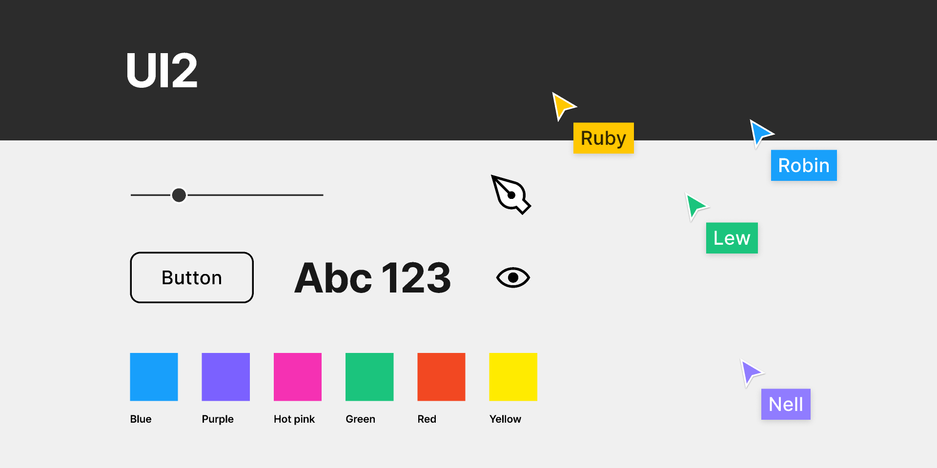
UI2 is a comprehensive design system developed by Figma itself, offering a unique insight into how the Figma team designs their own software. This design system includes all the styles, components, and variants used by Figma’s internal design team, providing an unparalleled resource for designers who want to align their projects with Figma’s own design language.
Key Features:
- Official Figma Components: UI2 includes the exact components and styles used by Figma's design team, giving you access to the tools and techniques that power the Figma platform.
- Highly Customizable: Although UI2 is designed to reflect Figma’s design language, it is also highly customizable, allowing you to adapt the components to fit your own brand’s identity.
- Comprehensive Documentation: UI2 comes with detailed documentation that explains how to use each component effectively, ensuring that you can make the most of this powerful design system.
- Community-Driven: With over 18,000 users, UI2 is a popular choice among designers who want to leverage Figma’s internal design practices. The community around UI2 is active and supportive, providing a wealth of resources and inspiration.
Atlassian ADS Components is a design system created by Atlassian, the company behind popular tools like Jira, Trello, and Confluence. This design system offers access to Atlassian’s extensive components library, which includes everything you need to maintain a consistent design across multiple platforms and products. It is an invaluable resource for teams working on large-scale projects who need to ensure consistency and efficiency in their design process.
Key Features:
- Comprehensive Components Library: Atlassian ADS includes a wide range of components, from buttons and forms to navigation elements and modals. These components are designed to work seamlessly together, ensuring that your designs maintain a cohesive look and feel.
- Integration with Atlassian Tools: ADS Components are fully integrated with Atlassian’s suite of products, making it easier for teams to create designs that align with their development processes. This integration is particularly beneficial for teams using Jira or Confluence as their primary project management tools.
- Scalable Design System: ADS is designed to scale with your project, making it ideal for both small teams and large enterprises. The design system is regularly updated by Atlassian, ensuring that it remains relevant and up-to-date with the latest design trends.
- Documentation and Support: Atlassian provides comprehensive documentation and support for ADS Components, helping teams to quickly implement the design system into their workflow and make the most of its features.
AWS Amplify UI is a powerful design system that integrates seamlessly with AWS services, allowing designers and developers to build cloud-connected applications with ease. This design system includes over 40 pre-made components and provides tools for managing applications, connecting UIs to backends, and hosting frontends through Amplify Hosting. With its comprehensive tutorials and beginner-friendly approach, AWS Amplify UI is a valuable resource for designers and developers looking to integrate cloud-based services into their projects.
Key Features:
- Cloud Integration: AWS Amplify UI is designed to work seamlessly with AWS services, making it easy for designers to connect their user interfaces to cloud-based backends. This integration allows for more dynamic and scalable applications.
- Comprehensive Component Library: The design system includes over 40 pre-built components, such as buttons, forms, and modals, which can be easily customized and integrated into your projects.
- Beginner-Friendly Tutorials: AWS Amplify UI comes with a wealth of tutorials and documentation, making it accessible even to those who are new to cloud-connected design and development.
- Scalable Solutions: The design system is built to scale, making it suitable for both small projects and large enterprise-level applications. It’s an excellent choice for teams looking to leverage AWS’s powerful cloud services in their design workflow.
Backstage is an open-source platform created by Spotify, designed to streamline the management of developer portals and the infrastructure behind them. It is used by major companies like Netflix and Expedia Group, making it a proven solution for managing complex microservices and developer tools. Backstage allows developers to create plugins, share code, and manage infrastructure efficiently, making it a valuable resource for large-scale projects and teams.
Key Features:
- Developer-Centric Design: Backstage is designed specifically for developers, providing tools that help manage the complexities of modern software development, including microservices, APIs, and infrastructure.
- Plugin Architecture: Backstage’s plugin architecture allows teams to create custom plugins that can be shared and reused across projects, making it easier to maintain consistency and efficiency in the development process.
- Open-Source and Community-Driven: As an open-source platform, Backstage is continually being improved by a global community of developers. This ensures that it remains relevant and up-to-date with the latest developments in software infrastructure.
- Scalability: Backstage is built to scale, making it suitable for both small startups and large enterprises. It provides the tools needed to manage complex infrastructure and development processes efficiently.
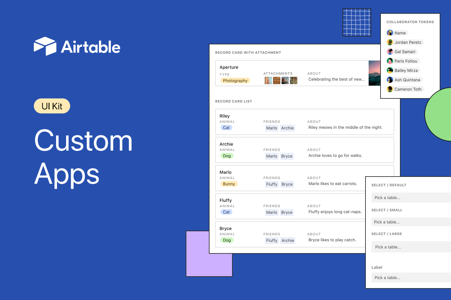
The Airtable Apps UI Kit is designed to help you build custom apps using the same components that Airtable’s design team uses. This UI kit integrates seamlessly with Figma, allowing you to create custom apps and extensions with ease. It’s an excellent choice for designers and developers who want to extend Airtable’s functionality and create tailored solutions for their workflows.
Key Features:
- Official Airtable Components: The UI kit includes all the components used by Airtable’s own design team, ensuring that your custom apps maintain the same level of quality and consistency as the official Airtable interface.
- Seamless Integration with Figma: Designed to work seamlessly with Figma, this UI kit allows you to quickly prototype and build custom apps that integrate smoothly with Airtable’s platform.
- Customizable and Extensible: The Airtable Apps UI Kit is fully customizable, allowing you to create tailored solutions that meet your specific needs. Whether you’re building a simple extension or a complex app, this kit provides the tools you need to get started.
- Step-by-Step Tutorials: The kit comes with detailed tutorials that guide you through the process of building custom apps, making it accessible even to those who are new to app development.
Chakra UI is a popular open-source UI kit for React applications, known for its simplicity and flexibility. This design system includes a large collection of components, styles, and templates, making it an ideal choice for designers and developers who want to create responsive and accessible applications. The Chakra UI kit is available for free on the Figma community website, making it accessible to all.
Key Features:
- Simplicity and Flexibility: Chakra UI is designed to be simple to use yet highly flexible, allowing you to create custom designs that are both beautiful and functional.
- Extensive Component Library: The kit includes a wide range of components, from basic UI elements like buttons and forms to more complex components like modals and navigation menus. Each component is designed to be fully customizable.
- Responsive Design: Chakra UI is built with responsiveness in mind, ensuring that your designs look great on all devices, from mobile phones to large desktop screens.
- Accessibility: Chakra UI places a strong emphasis on accessibility, with components that adhere to best practices for inclusive design. This makes it an excellent choice for designers who want to ensure that their applications are usable by everyone.
Evergreen by Segment is a versatile and flexible UI framework kit that is widely used in the design community. Based on the React UI framework, Evergreen includes ready-to-use components for typography, colors, and icons, making it an essential resource for designers looking to create polished, high-quality designs. This design system is particularly well-suited for web applications, where consistency and scalability are crucial.
Key Features:
- Ready-to-Use Components: Evergreen’s components are designed to be used out-of-the-box, with minimal customization required. This makes it easy to create consistent and professional-looking designs quickly.
- React-Based Framework: As a React-based design system, Evergreen is fully compatible with React applications, making it an ideal choice for developers working in this ecosystem.
- Scalable and Flexible: Evergreen is designed to scale with your project, whether you’re building a small website or a large web application. Its components are highly customizable, allowing you to create unique designs while maintaining consistency across your project.
- Strong Community Support: With a large and active community, Evergreen is constantly being updated and improved, ensuring that it remains a relevant and valuable resource for designers and developers alike.
The GOV.UK Design System is a comprehensive UI kit used to create designs with the official styles, patterns, and components of the UK Government. Developed by Joe Horton, this design system is designed to ensure that government-related projects maintain a consistent and professional appearance across all platforms. The GOV.UK Design System includes extensive documentation and tools, making it an essential resource for designers working on public sector projects.
Key Features:
- Official Government Components: The GOV.UK Design System includes all the official components and styles used by the UK Government, ensuring that your designs meet the required standards for public sector projects.
- Comprehensive Documentation: The design system comes with extensive documentation that guides designers through the process of implementing the official styles and components, making it easy to create consistent and compliant designs.
- Scalable and Adaptable: While designed for government projects, the GOV.UK Design System is flexible enough to be adapted for use in other sectors, making it a versatile resource for a wide range of projects.
- Proven and Trusted: As the official design system of the UK Government, this kit is a trusted resource that has been used to create some of the most important public-facing websites and applications in the UK.
Choosing the right UI kit can make a significant difference in your design workflow. Whether you're looking for a comprehensive design system like EmviUI or a specialized toolkit like AWS Amplify UI, the options listed here represent some of the best resources available in 2025. By integrating these UI kits into your Figma projects, you can streamline your design process, ensure consistency, and create high-quality user interfaces that stand out.