
Building a Design System in Figma
Introduction to Design Systems
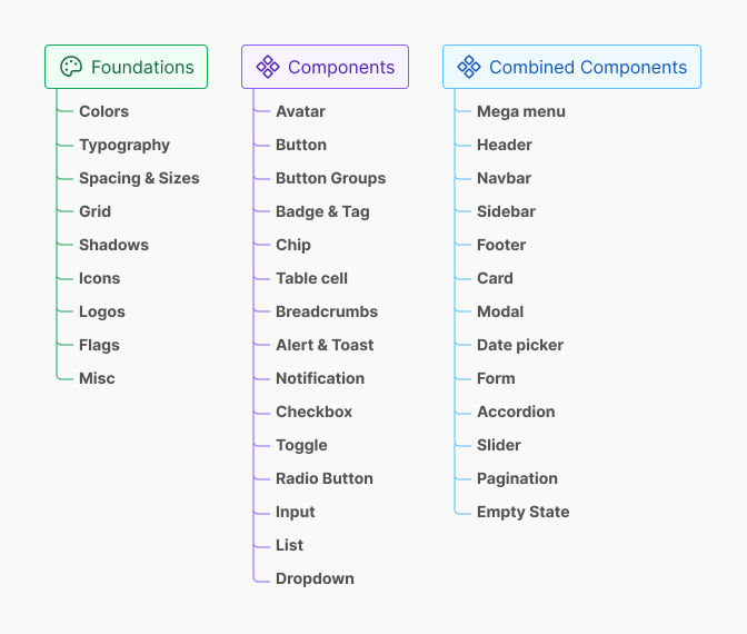
A design system serves as a comprehensive guide that provides consistency and efficiency in product design. It encompasses a collection of reusable components, guidelines, and design principles that enhance collaboration among designers and developers. A well-structured design system promotes clarity, fosters creativity, and encourages best practices in design, ensuring that all team members are aligned.
Design systems can be particularly beneficial when working on large projects or across multiple platforms. They provide a single source of truth, minimizing discrepancies in design and promoting a cohesive user experience. Understanding the fundamentals of building a design system in Figma is crucial for designers looking to streamline their workflow.
| Key Elements of a Design System | Description |
|---|---|
| Components | Reusable elements like buttons, inputs, and cards. |
| Style Guide | Documentation outlining design principles, colors, and typography. |
| Design Tokens | Variables that store design attributes such as spacing, colors, and typography. |
Benefits of Implementing a Design System in Figma
Integrating a design system into the design workflow can yield numerous advantages. Below are some key benefits:
| Benefit | Explanation |
|---|---|
| Consistency | A design system ensures uniformity across products, which enhances brand recognition and user experience. |
| Efficiency | Reusable components and templates save time, allowing designers to focus on creativity and innovation. |
| Collaboration | A centralized system improves communication among team members, reducing misunderstandings and fostering teamwork. |
| Scalability | As projects grow, a design system provides a framework that can easily adapt to new requirements and updates. |
| Usability | By implementing established guidelines, teams create intuitive interfaces that enhance user satisfaction. |
Utilizing resources like Figma design system templates can help kickstart the process. Components can be further defined using design tokens in Figma to ensure precision and consistency. For those looking to enhance their design system, exploring various Figma design system plugins can provide additional functionality. The implementation of Figma design system best practices is essential for maintaining a robust and effective design system.
Planning Your Design System
Creating a successful design system in Figma starts with careful planning. This phase involves defining style guidelines and establishing design tokens, both of which are essential for a cohesive and efficient design process.
Defining Style Guidelines
Style guidelines serve as the foundation of a design system. They ensure consistency across all design elements and communication within the team. These guidelines cover numerous aspects, including typography, color usage, spacing, and imagery.
The following table outlines key components commonly included in style guidelines:
| Style Element | Guidelines |
|---|---|
| Typography | Define font families, sizes, weights, and line heights. |
| Color Usage | Specify primary, secondary, and accent colors. |
| Spacing | Establish rules for margins, paddings, and layout grids. |
| Imagery | Provide instructions for image style and usage. |
| Iconography | Define styles for icons, including size and color usage. |
By clearly articulating these elements, designers create a reliable reference that can be used throughout the design and development processes. For additional support, designers can explore figma design system templates to find inspiration or starting points for their guidelines.
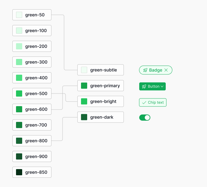
Establishing Design Tokens
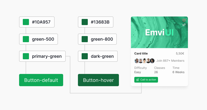
Design tokens are a collection of visual design attributes that can be stored and reused across a design system. They simplify the implementation of style changes and ensure that the design scales effectively. Commonly, design tokens include color values, typography styles, spacing units, and border radii.
Here's a table illustrating typical design token categories:
| Token Category | Examples |
|---|---|
| Color | Primary Color: #FF5733 |
| Typography | Font Size: 16px, Line Height: 1.5 |
| Spacing | Small: 4px, Medium: 8px |
| Border Radius | Small: 2px, Large: 8px |
In Figma, designers can utilize design tokens to ensure that updates to the style elements are uniformly applied. For insights on managing design tokens effectively, refer to design tokens figma.
Establishing these foundational elements sets the stage for a well-organized and cohesive design system. A well-implemented design system will not only streamline the design process but also enhance collaboration among team members. Designers can also explore figma design system best practices for further strategies on building and maintaining an efficient system.
Setting Up Figma for Your Design System
Creating an effective design system in Figma requires careful setup and organization. This section delves into the essential steps of creating a design library file and organizing components and styles.
Creating a Design Library File
The first step in setting up a design system is creating a dedicated design library file. This file serves as the foundation for all design assets, making it easy for team members to access and utilize shared components.
To create a design library file in Figma, follow these steps:
- Open Figma and create a new file.
- Name the file appropriately, indicating it is a design library.
- Begin adding components like buttons, icons, and input fields to this file.
- Ensure that each component is labeled clearly for easy identification.
As the design library grows, it is essential to maintain a structured approach to organization. This will facilitate seamless collaboration among team members.
| Step | Action |
|---|---|
| 1 | Open Figma and create a new file |
| 2 | Name the file as the design library |
| 3 | Add components like buttons and icons |
| 4 | Label each component clearly |
Organizing Components and Styles
Once the design library file is created, the next step is to organize components and styles effectively. This organization can enhance usability and ensure consistency in design elements.
Components should be grouped logically based on their functionality. For example, buttons, form elements, and navigation items can be categorized separately. This categorization helps designers locate assets quickly when working on projects.
In addition to components, defining styles such as colors, typography, and effects is crucial for maintaining visual consistency throughout the design system. Utilizing design tokens is highly beneficial in this process. To learn more about design tokens in Figma, read our article on design tokens figma.
| Component Category | Examples |
|---|---|
| Buttons | Primary, Secondary, Tertiary |
| Forms | Input Fields, Checkboxes, Radio Buttons |
| Navigation | Menus, Breadcrumbs |
Design styles should also be listed and organized in a manner that makes them easy to reference. Figma allows for the creation of text styles and color styles that can be reused. This feature streamlines the design process and ensures designers adhere to published guidelines.
Lastly, to enhance efficiency, consider implementing plugins that assist in developing and managing design systems. For a comprehensive guide on tools, check out our article on design tokens.
By establishing a properly structured design library and organizing components and styles, designers can streamline their workflow while ensuring consistent application of their design system across various projects. For insights into best practices, refer to our article on figma design system best practices.
Designing Consistent Components
Creating a compelling user interface requires consistent components that align with the overall design language. In Figma, this process involves both building common UI elements and establishing reusable components that enhance efficiency and maintain visual harmony.
Building Common UI Elements
Common UI elements serve as the building blocks for a cohesive design system. These elements, such as buttons, input fields, and navigation bars, should follow established style guidelines for typography, spacing, and color. This ensures a unified look and feel across the product.
When designing these elements, it is important to focus on functionality and aesthetics. The following table outlines essential common UI elements and their key attributes:
| UI Element | Key Attributes | Usage Example |
|---|---|---|
| Button | Size, shape, hover state | Call to action (CTA) buttons |
| Input Field | Border radius, label placement | Text entry fields |
| Navigation Bar | Height, icon size, dropdown style | Main site navigation menu |
| Checkbox | Size, checkmark design | Selection options |
Once defined, these components should be added to a designated component library within Figma. For more on structuring your design assets, refer to our article on figma design system templates.
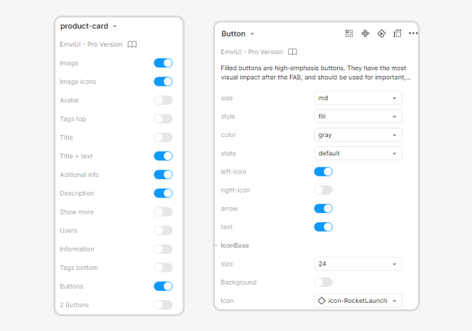
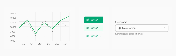
Creating Reusable Components
Reusable components are designed to be flexible yet consistent. By creating these elements, designers can easily implement them across various projects without needing to recreate them each time. This practice not only saves time but also minimizes inconsistencies.
To build reusable components in Figma:
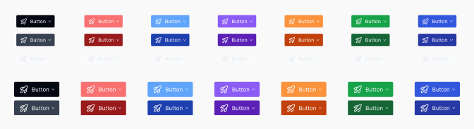
Define Variants: Use Figma's variant feature to create different states of a component (e.g., a button can have default, hover, and disabled states).
Utilize Auto Layout: This allows elements to resize and adapt based on content, making components more versatile.
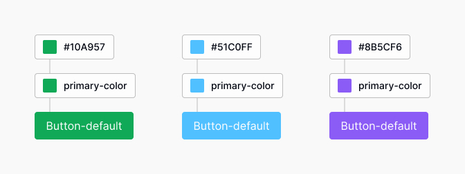
Implement Design Tokens: By employing design tokens within the components, designers can ensure that aspects like colors and typography are consistently applied according to the style guidelines.
Organize Components: Use descriptive naming conventions and categorize components within your design library to facilitate easy retrieval. This supports collaboration among team members and contributes to a simpler workflow.
Creating a robust set of reusable components enhances the efficiency of the design process. Consider referencing our piece on figma design system best practices for additional insights into effective component management.
By focusing on building common UI elements and creating reusable components, designers can set a solid foundation for a design system that brings clarity and efficiency to their workflow.
Implementing Typography and Color Styles
Creating a cohesive design system in Figma involves more than just components; it also requires careful consideration of typography and color styles. This section outlines how to define typography rules and set up color palettes to ensure a consistent visual identity.
Defining Typography Rules
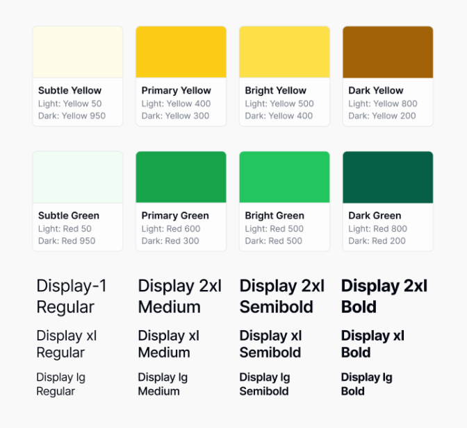
Typography plays a crucial role in the overall design aesthetic. Establishing clear typography rules helps maintain consistency across the design system.
Font Selection: Choose a primary font for headings and a complementary font for body text. Consider legibility and brand identity when making selections.
Hierarchy: Define a hierarchy of text styles to ensure clarity and ease of navigation in the designs.
| Text Element | Font Size (px) | Weight | Line Height (px) |
|---|---|---|---|
| Heading 1 | 32 | Bold | 40 |
| Heading 2 | 24 | Semi-Bold | 32 |
| Body Text | 16 | Regular | 24 |
| Caption | 12 | Light | 16 |
Responsive Typography: Implement responsive typography by defining styles for various screen sizes, ensuring optimal readability.
Accessibility: Ensure text contrasts well with background colors to meet accessibility standards. Use tools to check color contrast ratios.
For more on organizing these elements, explore design tokens figma.
Setting up Color Palettes
A well-defined color palette enhances brand recognition and maintains visual coherence across designs. Here's how to establish an effective color palette.
Primary Colors: Select a limited set of primary colors that reflect the brand's identity. Generally, three to five colors work best.
Secondary Colors: Choose a few secondary colors to complement the primary colors. These can be used for accents and highlights.
| Color Type | Color Code | Usage |
|---|---|---|
| Primary Color 1 | #FF5733 | Buttons, Links |
| Primary Color 2 | #C70039 | Accents, Alerts |
| Secondary Color 1 | #FFC300 | Backgrounds, Highlights |
| Secondary Color 2 | #581845 | Text, Headers |
Neutrals: Include a set of neutral colors for backgrounds, borders, and other UI elements to provide balance and structure.
Color Usage Guidelines: Establish guidelines on how each color should be used within the design, including suggestions for backgrounds, fonts, and UI elements.
Testing Accessibility: Use tools to check color contrasts and ensure that color choices meet accessibility standards.
For more examples and recommendations, check out our article on figma design system best practices.
By implementing defined typography rules and organized color palettes, designers can create a unified and professional appearance throughout their design system in Figma.
Collaboration and Maintenance
Sharing the Design System with the Team
Effective collaboration is a crucial component of building a design system in Figma. Designers should ensure that the design system is accessible to all members of the team, including UX/UI designers, product designers, and front-end developers. Sharing the design system encourages consistency and alignment across all projects.
To share the design system, consider the following methods:
| Sharing Method | Description |
|---|---|
| Figma Team Libraries | Enable the team to use shared components and styles easily. |
| Presentation Files | Create documents demonstrating use cases and guidelines for the system. |
| Internal Workshops | Conduct training sessions to familiarize the team with the design system. |
Leveraging Figma's Team Libraries allows everyone to utilize the same components and styles, fostering collaboration. To enhance understanding, promoting internal workshops can further engage team members in the design process. For additional resources, explore our article on figma design system best practices.
Updating and Evolving the Design System
Maintaining a design system is an ongoing process that requires regular updates and iterations. As design trends and user needs evolve, so should the design system. Teams should establish a clear process for incorporating feedback and making necessary changes.
Key considerations when updating the design system include:
| Update Component | Frequency | Responsible Party |
|---|---|---|
| Component Review | Quarterly | Design Lead |
| Style Guide Revisions | Biannually | UX/UI Designers |
| Feedback Incorporation | Ongoing | All Team Members |
Open communication channels ensure that all team members can contribute to the evolution of the design system. Utilizing tools like design tokens can aid in keeping the library organized and up to date. Regular review sessions can help identify any components that need revising, while ongoing feedback loops foster a culture of continuous improvement. Visit our article on design tokens figma for more insights on managing design tokens effectively.
By prioritizing collaboration and consistent updates, teams can create a sustainable and relevant design system in Figma that meets their evolving design needs.
Testing and Feedback
Testing and feedback are critical components in the process of building a design system in Figma. These steps help ensure that the design is user-friendly, functional, and aligned with the needs of both designers and users.
Conducting Usability Testing
Usability testing involves observing real users as they interact with the design components built within the Figma design system. This testing can help identify usability issues, understand user behavior, and gather insights on how components function in practical applications.
A straightforward approach to conduct usability testing includes the following steps:
- Define Goals: Establish specific objectives for what the testing should achieve.
- Select Participants: Choose a diverse group of users who represent the target audience.
- Prepare Tasks: Create tasks for users to complete that directly relate to the design system.
- Conduct Observations: Watch users as they perform tasks, noting any difficulties or confusion.
- Analyze Results: Gather data and insights from the testing to make informed design decisions.
| Testing Phase | Key Activities |
|---|---|
| Preparation | Define goals, select participants, prepare tasks |
| Execution | Conduct testing sessions, observe user interactions |
| Analysis | Gather data, analyze findings, document insights |
Gathering Feedback for Iteration
Collecting feedback is an essential part of refining the design system. It involves soliciting opinions and suggestions from team members, stakeholders, and users. This feedback can guide improvements and foster collaboration.
Methods for gathering feedback include:
- Surveys: Distributing surveys or questionnaires to collect quantifiable data.
- Focus Groups: Conducting focus group discussions to get in-depth insights.
- One-on-One Interviews: Engaging in individual conversations with key individuals to gather detailed input.
- Review Sessions: Holding regular review meetings with the design team to discuss component effectiveness.
| Feedback Method | Purpose | Considerations |
|---|---|---|
| Surveys | Collect quantitative data | Ensure questions are clear and concise |
| Focus Groups | In-depth insights | Facilitate an open environment for discussion |
| One-on-One Interviews | Detailed input | Select representative participants |
| Review Sessions | Team alignment | Encourage constructive criticism and collaboration |
Iterative improvement based on testing and feedback ultimately enhances the overall quality and usability of the design system. For a deeper understanding of best practices in Figma, refer to our article on figma design system best practices and explore useful tools in the process through figma design system templates and design tokens. You can also learn more about utilizing design tokens in Figma for efficient styling management in your design system.