Introduction to Figma Design Systems
What is a Design System?
A design system is a comprehensive guide that includes UI patterns, components, and design principles for creating interfaces. It provides a unified set of standards and guidelines to ensure consistency in design across various projects and platforms. A well-established design system allows designers and developers to collaborate effectively, enabling them to create cohesive and user-friendly experiences.
Design systems typically consist of several key elements:
| Key Elements | Description |
|---|---|
| Components | Reusable design elements like buttons, cards, etc. |
| Style Guide | Documentation outlining typography, colors, and spacing. |
| Design Tokens | Variables defining design decisions such as colors and spacing (see design tokens in Figma). |
| Accessibility Guidelines | Best practices to ensure designs are usable for everyone. |
Benefits of Using Design System Templates in Figma
Utilizing design system templates in Figma offers several advantages for UX/UI designers and product teams. These templates streamline the design process and enhance collaboration. Some of the notable benefits include:
| Benefits | Explanation |
|---|---|
| Consistency | Ensures uniformity in design elements across products. |
| Speed | Reduces time spent on creating components from scratch. |
| Collaboration | Facilitates teamwork and communication among designers. |
| Scalability | Allows for easy updates and addition of new components. |
| Reusability | Promotes the use of pre-designed elements to enhance efficiency. |
By adopting Figma design system templates, design teams can focus on creativity and functionality rather than repetitive tasks. Integrating templates into workflows can lead to a more efficient design process and superior end products. For more guidance, consider exploring a components list in a design system.
Getting Started with Figma
Figma serves as a powerful design tool that facilitates the creation and management of design systems. Understanding its features is essential for designers aiming to utilize Figma design system templates.
Understanding Figma as a Design Tool
Figma is a collaborative interface design application that enables users to create designs, prototypes, and design systems effectively. It operates directly in the browser, which means that updates occur in real-time, allowing teams to work simultaneously regardless of their locations. This accessibility promotes continuous collaboration and feedback, which is vital for design iterations.
Figma's design environment comprises various tools and functionalities that are specifically tailored for user experience (UX) and user interface (UI) design. Understanding how to navigate and utilize these features is fundamental for any designer looking to streamline their workflow and enhance the quality of their projects.
Key Features for Design System Creation
Figma's offerings include several key features that make it ideal for developing and implementing design systems. These features ensure that teams can create, share, and maintain consistent designs across various projects.
| Feature | Description |
|---|---|
| Components | Reusable design elements that can be updated globally, ensuring consistency throughout the design system. Learn more about creating components in Figma. |
| Styles | Easily implementable styles for typography, colors, and effects that allow for uniform branding and design language. Explore our typography guide. |
| Auto Layout | A feature that enables responsive design by automatically adjusting elements based on their content and layout hierarchy. |
| Prototyping | Tools for creating interactive prototypes that can simulate user interactions and experiences. |
| Plugins | Additional capabilities through community-contributed integrations to enhance design workflows. Check out the best plugins for Figma. |
| Design Tokens | Centralized variables for colors, spacing, and typography that streamline updates across different design elements. See more in design tokens in Figma. |
Importance of Design System Templates
Utilizing design system templates in Figma offers significant advantages for designers. These benefits center around consistency, efficiency, and scalability, all of which contribute to a streamlined design process.
Consistency in Design Elements
One of the core strengths of design system templates is their ability to maintain consistency across design elements. By utilizing predefined styles, components, and layouts, designers ensure that all parts of a project align with the established aesthetic and functional standards. This uniformity helps create a cohesive user experience, which is vital for user engagement and brand recognition.
Learn more about how to maintain consistency in your designs by exploring pre-built screens for design systems.
Efficiency in Design Workflow
Design system templates streamline the workflow for teams by providing ready-to-use assets. This efficiency allows designers to focus on creativity and problem-solving rather than repetitive tasks. By leveraging templates, teams can significantly reduce the time spent on initial setup and adjustments, leading to faster project completion.
For efficiency tips, check out our guide on speeding up your design projects.
Scalability and Reusability
The scalable nature of design system templates allows for easy expansion of design projects. As new features or components are introduced, templates can be modified and reused across different projects. This reusability not only saves time but also fosters a more organized design process, ensuring that all team members are on the same page regarding design decisions.
Learn about reusable elements like shadows and navbars to scale your designs efficiently.
Types of Figma Design System Templates
Figma design system templates can significantly enhance the design process by providing structured resources. This section will explore the key types of design system templates available in Figma, enabling designers to create consistent and efficient designs.
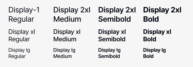
Typography Styles
Typography is a crucial aspect of any design. A well-defined typographic style not only enhances readability but also contributes to the overall aesthetic of a project. Figma design system templates often include a set of typography styles, which may consist of headings, body text, and captions.
| Typography Style | Font Family | Weight | Size (px) |
|---|---|---|---|
| Heading 1 | Sans-serif | Bold | 32 |
| Heading 2 | Sans-serif | Semi-Bold | 24 |
| Body Text | Serif | Regular | 16 |
| Caption | Sans-serif | Regular | 12 |
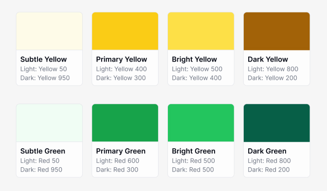
Color Palettes
Color palettes are vital for establishing a brand identity and ensuring visual coherence in design. Figma templates typically include a standardized set of colors that can be consistently applied throughout a project. These palettes usually incorporate primary, secondary, and neutral colors, along with their hex codes for accurate implementation.
| Color Role | Color | Hex Code |
|---|---|---|
| Primary | Blue | #0056D2 |
| Secondary | Yellow | #FFC107 |
| Neutral Light | Light Gray | #F8F9FA |
| Neutral Dark | Dark Gray | #343A40 |
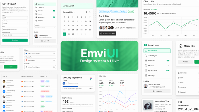
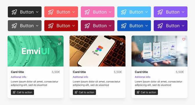
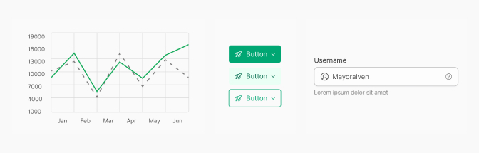
Component Libraries
Component libraries facilitate reusability across different design projects. Figma design system templates often contain a variety of pre-built components, such as buttons, input fields, and cards. These components can be easily customized and incorporated into designs, saving time and ensuring consistency.
| Component | Usage |
|---|---|
| Button | Call-to-action |
| Input Field | User data entry |
| Card | Content display |
Layout Grids
Layout grids help designers maintain alignment and consistency in their designs. Templates in Figma often provide default grid systems, which can be adjusted to fit specific project needs. These grids ensure that elements are placed uniformly, contributing to an organized design.
| Grid Type | Column Count | Gutter Width (px) | Margin (px) |
|---|---|---|---|
| Standard | 12 | 16 | 24 |
| Modular | 8 | 12 | 20 |
| Asymmetrical | Custom | Varies | Varies |
By utilizing these various types of Figma design system templates, designers can streamline their workflow and create visuals that adhere to brand guidelines effectively.
Customizing Design System Templates in Figma
Customizing design system templates in Figma allows designers to tailor their projects to specific branding requirements and user experiences. The following sections detail how to effectively edit typography and color styles, create and modify components, and implement layout grids.
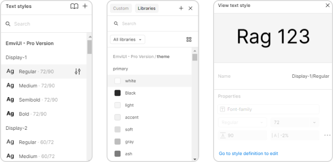
Editing Typography and Color Styles
Figma provides users with the ability to customize typography and color styles to suit their design needs. This can be accomplished through the following steps:
- Accessing Styles: Navigate to the "Styles" panel to manage typography and color settings.
- Editing Text Styles: Click on text elements to adjust font family, weight, size, and line height. These adjustments can be formalized in various styles for consistency.
- Adjusting Color Palette: Access the color styles menu to modify existing colors or create new palettes. It is beneficial to use a consistent color palette throughout the design.
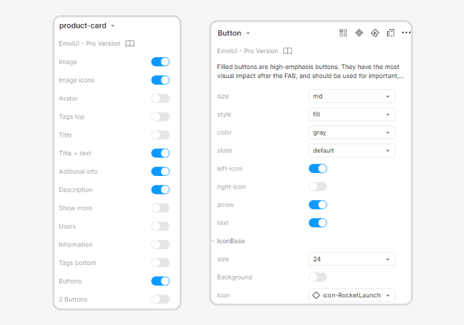
Creating and Modifying Components
Creating components in Figma allows designers to build reusable design elements. This section covers how to craft and enhance components:
- Creating Components: Select any design element and use the shortcut to create a component. This action encapsulates the element, allowing for reuse across the project.
- Modifying Components: To edit a component, select it and make adjustments. Changes are automatically reflected in all instances of that component across different frames.
- Using Variants: Designers can create variants of components to represent different states (e.g., hover, active, disabled). This feature enhances interactivity and visual representation.
For more guidance, explore Figma design system components.
Implementing Layout Grids
Applying layout grids ensures that designs are structured and visually coherent. The following steps outline how to implement layout grids in Figma:
- Adding a Layout Grid: Select your frame and go to the layout grid settings to add a grid system. Choose between columns, rows, or a custom grid based on the design requirements.
- Configuring Grid Settings: Adjust the number of columns, gutter width, and margin sizes to fit the layout needs.
- Responsive Grids: Consider using adaptive grid settings to accommodate different screen sizes, ensuring designs remain functional across devices.
Collaborating on Figma Design Systems
Sharing and Collaborating with Team Members
Figma simplifies the process of sharing and collaboration among team members. Users can easily invite colleagues to view or edit the design system by sharing a link. This feature enables designers to work simultaneously on the same file, ensuring that changes and updates are visible to all in real-time.
Version Control and Feedback Integration
Maintaining version control is crucial when multiple designers are involved in a project. Figma provides a built-in version history feature that allows users to see who made specific changes and when. This transparency facilitates accountability and allows teams to navigate back to earlier iterations if necessary.
Best Practices for Utilizing Figma Design System Templates
Incorporating best practices ensures your design system templates are fully optimized for scalability, collaboration, and consistent branding. From documenting design guidelines to onboarding new team members, attention to detail is key for success.