
Introduction to Design Tokens in Figma
What are Design Tokens?
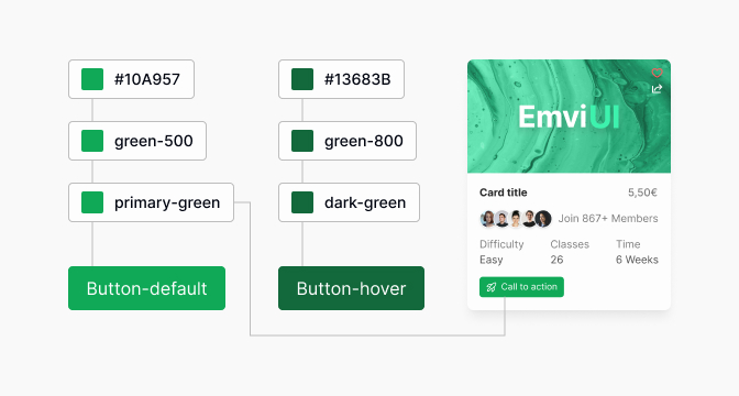
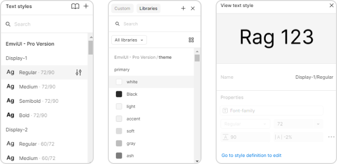
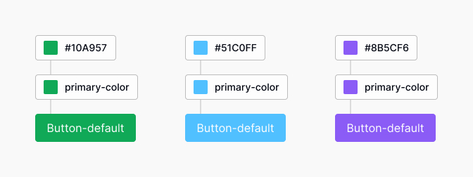
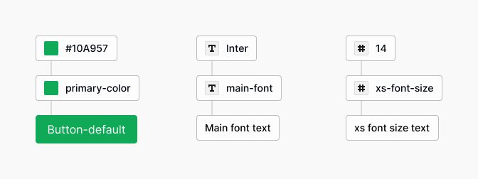
Design tokens represent the visual design elements in a digital system. They serve as a bridge between design and development by defining colors, typography, spacing, and other attributes in a platform-independent way. Design tokens in Figma are the foundational units of a design system, allowing designers to ensure consistency across various platforms and products. By utilizing design tokens, they can simplify updates and maintain a cohesive look throughout different interfaces.
| Token Type | Description |
|---|---|
| Color | Defines color values for elements |
| Font | Specifies typography settings like size and weight |
| Spacing | Sets consistent margins and paddings |
| Sizing | Establishes widths and heights for components |
Importance of Design Consistency
Design consistency is crucial in creating a user-friendly experience. It enhances usability, strengthens branding, and reduces confusion for users. When designers implement a consistent design language, it fosters trust and familiarity with the product.
Maintaining consistency involves using design tokens effectively. With these tokens, designers can quickly reference styles and update them across the entire design system in Figma. This not only saves time but also ensures that any changes are reflected uniformly, reducing discrepancies that can arise from manual updates.
For further insight into developing a cohesive design approach, explore figma design system templates, and figma design system best practices. For a comprehensive overview of creating a robust design system, check our article on building a design system in figma.
Leveraging Figma for Design Tokens
Integrating design tokens in Figma allows designers to maintain consistency across their design systems. Design tokens serve as a bridge between design and development, ensuring that the visual elements are replicable and scalable.
Integrating Design Tokens in Figma
To effectively integrate design tokens in Figma, designers can follow these steps:
Define Tokens: Identify the key design properties such as colors, typography, spacing, and shadows.
Create Styles: Utilize Figma's styles for colors, text, and effects. These will serve as design tokens.
Organize Layers: Group related styles into frames or components for easier management.
Use Variables: Leverage Figma's variable system to simplify updates and adjustments to tokens.
The integration of design tokens can significantly enhance collaboration among team members, allowing them to understand and utilize the established design guidelines effectively.
Benefits of Using Design Tokens in Figma
Using design tokens in Figma provides various advantages for UX/UI designers and front-end developers, including:
| Benefit | Description |
|---|---|
| Consistency | Tokens ensure uniformity in design elements, reducing discrepancies across different screens and components. |
| Efficiency | Tokens streamline the design process, allowing for quicker updates and iterations without losing quality. |
| Collaboration | Teams can work together seamlessly, as design tokens provide a common language for design decisions. |
| Scalability | Design systems can grow without becoming unwieldy, as tokens simplify the addition of new elements. |
| Documentation | Tokens help in creating clear documentation, enhancing understanding of design decisions and processes. |
By incorporating Figma design system templates or utilizing a designers can optimize their workflow and maintain design standards with ease. Understanding the figma design system best practices will also aid in the effective use of design tokens within Figma.
Creating a Design System in Figma
Creating a design system in Figma is essential for maintaining design consistency and efficiency across projects. A well-structured design system utilizes design tokens to standardize styles and components, facilitating collaboration among team members.
Establishing a Design System
To establish a design system, designers should start by defining the objectives and scope of the system. This involves identifying the components needed, such as buttons, typography, and colors, and considering how these elements will function within various applications.
A successful design system requires clear documentation and organization, ensuring that all team members understand and can easily access the design resources. This can include a centralized location for styles, components, and guidelines. To further aid organization, using a Figma design system plugin can streamline the creation and management of design tokens and components.
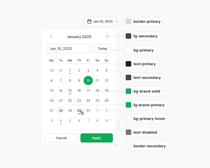
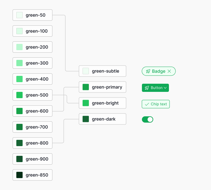
Defining Design Tokens for Consistency
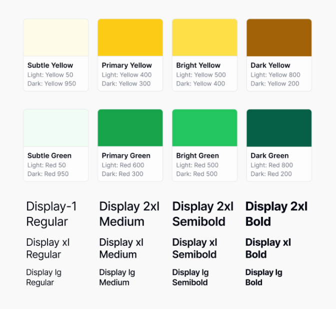
Design tokens are the foundation of a consistent design system and can include variables for colors, spacing, typography, and shadows. By defining these tokens, designers ensure that any changes to the design are automatically reflected across all components using those tokens. The table below outlines common design tokens:
| Design Token | Purpose | Example Value |
|---|---|---|
| Color | Define color palette | #FF5733 (Primary Color) |
| Font Size | Set typography styles | 16px (Body Text) |
| Spacing | Maintain consistent spacing | 8px (Small Margin) |
| Border Radius | Define rounded corners | 4px (Small Rounded) |
Defining these tokens ensures consistency throughout the design and development process. For detailed information on implementing design systems, designers can refer to resources like building a design system in figma.
Integrating design tokens in a design system enhances collaboration and streamlines workflows, allowing for faster updates and maintaining a harmonious visual language within the design framework. For best practices, designers can consult our article on figma design system best practices.
Implementing Design Tokens in Figma
Implementing design tokens in Figma can enhance design consistency and streamline the design process. This section outlines practical steps for integration and best practices to follow.
Practical Steps to Implement Design Tokens
Define Your Design Tokens Start by identifying the design attributes that will be tokenized. Common tokens include colors, typography, spacing, and shadows.
Create a Token Library Organize the tokens into a library within Figma. This can be done by creating separate styles for colors, text, and effects.
Use Figma's Styles When defining colors and typography, utilize Figma's Styles feature. This allows for easy updates across all components when changes are made.
| Token Type | Example Token Name | Value |
|---|---|---|
| Color | Primary Color | #007bff |
| Typography | Heading Font | 'Roboto Bold' |
| Spacing | Small Padding | 8px |
| Shadow | Card Shadow | 0px 4px 6px rgba(0, 0, 0, 0.1) |
Apply Tokens in Components When building components, apply the defined tokens. This ensures that components are consistently styled and easy to modify as updates occur.
Document Token Usage Create documentation that outlines how and when to use each token. This resource is essential for onboarding new team members and maintaining consistency.
Best Practices for Using Design Tokens in Figma
Consistency is Key Ensure that the same tokens are used throughout the project. This avoids discrepancies and enhances the visual integrity of the design.
Keep It Simple Limit the number of tokens to avoid complexity. Focus on essential elements that impact the design most significantly.
Leverage Figma Plugins Utilize tools such as the figma design system plugin to manage and implement design tokens more efficiently.
Regularly Review Tokens Schedule regular reviews of the design tokens to ensure they remain relevant and effective as the design evolves. Outdated tokens should be updated or removed.
Collaborate and Gather Feedback Involve team members in the token creation process and solicit feedback. This collaboration can lead to more robust token definitions and better design outcomes.
By following these practical steps and best practices, designers can effectively implement design tokens in Figma, leading to improved consistency and efficiency in their design systems. For more insights, refer to our articles on figma design system best practices and building a design system in figma.
Automating Design Consistency
Tools for Automating Design Tokens
Automating the management of design tokens in Figma can significantly enhance design consistency and streamline the design process. Various tools and plugins can assist designers in automating the application of design tokens throughout a project. These tools often integrate seamlessly with Figma, allowing for easy access and implementation of design tokens.
| Tool/Plugin | Description |
|---|---|
| Figma Design System Plugin | This plugin helps in managing design tokens, allowing designers to quickly apply styles consistently across components. |
| Style Guide Manager | A tool designed to automate the extraction and implementation of design tokens from a style guide directly into Figma. |
| Themer | A plugin that allows users to create themes by managing design tokens, enabling quick theme switching for project variations. |
Utilizing these tools helps designers ensure that their projects maintain a high level of design consistency.
Streamlining Workflow with Design Tokens
Incorporating design tokens into the workflow can drastically improve the efficiency of the design process in Figma. Here are ways design tokens streamline the workflow:
Centralized Management: Design tokens allow for a single source of truth for styling properties such as colors, typography, and spacing. This central management reduces errors and facilitates consistent updates across the design.
Faster Iteration: Designers can implement changes quickly by updating a single design token, which automatically reflects in all instances where that token is used. This speeds up the feedback loop and enhances collaboration among team members.
Improved Collaboration: By using design tokens, collaboration becomes easier, as all team members can reference the same design values. This ensures that everyone is aligned on the design specifications, enhancing teamwork and reducing discrepancies.
Easy Adaptation: Design tokens can easily adapt to different platforms (web, mobile, etc.) by adjusting the underlying values for each context. This adaptability simplifies cross-platform design.
For more insights on establishing effective workflows, check out our guide on figma design system best practices. Implementing these strategies will lead to a more organized and efficient design process, ultimately resulting in a more cohesive design system.
Collaborating with Design Tokens
Effective collaboration in design projects hinges on clarity and consistency. Design tokens play a significant role in achieving this, as they facilitate a shared understanding of design elements across teams.
Collaborating on Design Projects with Tokens
When teams use design tokens in Figma, they create a common language that helps streamline collaboration. By defining design elements such as colors, typography, spacing, and effects as tokens, team members can easily access and apply these elements across various projects.
A well-organized token library enables designers to work efficiently, as changes to a token automatically reflect across all instances where that token is used. This ensures that all team members remain aligned, regardless of their location or area of focus.
| Action | Result |
|---|---|
| Update a color token | Reflects across all components using that color |
| Change font size in a token | Updates everywhere the size is applied |
| Modify spacing token | Changes the spacing in all relevant designs |
Ensuring Consistency Across Design Teams
Maintaining consistency across multiple design teams is critical, especially in larger organizations. Design tokens help achieve this by serving as the central source of truth for all design elements. With a robust design system in Figma, teams can ensure that every designer follows the same guidelines, reducing discrepancies in design outputs.
To enhance consistency, it is essential to establish clear figma design system best practices. Regular reviews of the token library and updates based on user feedback can help keep the design system relevant and effective. Teams can use tools such as a figma design system plugin to automate updates and collaborate more seamlessly.
Utilizing shared libraries in Figma allows teams to pull in design components and tokens from a centralized source. This practice fosters collaboration, as all team members have access to the same tools and resources, leading to more cohesive design projects. For further insights on setting up a cohesive framework, explore building a design system in figma and discover how to create an efficient environment for teamwork.
Scaling Design Systems with Figma
Scaling a design system is essential for managing larger projects and maintaining consistency across multiple teams. Leveraging design tokens in Figma provides a structured approach that enhances the efficiency and effectiveness of design practices.
Scaling Design Tokens for Larger Projects
When scaling design tokens for larger projects, it is important to standardize and categorize tokens systematically. This allows teams to maintain clarity as the complexity of the project increases. Typically, design tokens can be grouped into categories such as color, typography, spacing, and effects.
| Token Category | Description | Example |
|---|---|---|
| Color | Defines palette used across the design | Primary Color: #FF5733 |
| Typography | Specifies font styles and sizes | Heading Font: 16px Arial |
| Spacing | Establishes consistent padding and margins | Small Spacing: 8px |
| Effects | Contains shadows, borders, and other visual effects | Shadow: 0px 2px 4px rgba(0,0,0,0.1) |
Organizing tokens in such a manner ensures that they can be efficiently updated and modified when necessary. As projects scale, tracking changes to design tokens is crucial for maintaining coherence in the design system. Utilizing a Figma design system plugin can augment this process by automating updates across all design files.
Managing and Evolving Design Systems
Managing and evolving design systems requires a commitment to continuous improvement and user feedback. Design teams should periodically review design tokens to identify areas for enhancement or simplification. Regular audits help ensure that the design system remains relevant and effective.
A few essential practices to manage and evolve design systems include:
Documentation: Maintaining thorough documentation on design tokens and their intended use helps onboard new team members effectively. Resources should include guidelines on using tokens for both design and implementation.
Version Control: Implementing version control for design tokens allows teams to track changes over time. This can facilitate reverting to previous versions if new updates cause inconsistencies.
User Testing: Conducting user testing sessions can provide valuable insights into how effectively the design system meets user needs. Feedback can guide necessary adjustments in design tokens.
Collaboration: Encouraging collaboration between UX/UI, product designers, and front-end developers ensures that the design system evolves to meet technical requirements while fulfilling design goals.
In summary, effectively scaling design tokens is vital for large projects, while proper management ensures that design systems remain functional and aligned with user expectations. Utilizing resources like building a design system in Figma can further facilitate the creation and evolution of robust design systems. Moreover, adopting Figma design system best practices can streamline processes for cross-functional teams.
Future of Design Tokens in Figma
As design tokens continue to gain traction in the design community, it's essential for UX/UI and product designers to stay updated on emerging trends and evolving practices within Figma. Understanding these aspects can enhance their workflow and ensure design consistency across projects.
Trends in Design Token Usage
The application of design tokens in Figma reflects broader trends within the design industry. Key trends include:
| Trend | Description |
|---|---|
| Increased Adoption | More design teams are incorporating design tokens to streamline their workflows and maintain consistency across projects. |
| Cross-Platform Compatibility | Design tokens are becoming essential for creating a cohesive experience across various platforms, from web to mobile. |
| Automation and Efficiency | The rise of tools that automate the integration of design tokens in workflows is reshaping how designers approach projects. |
| Community Collaboration | Growing communities centered around sharing and developing design tokens and systems are leading to collaborative efforts and knowledge sharing. |
These trends demonstrate a shifting landscape towards a more standardized design approach that prioritizes efficiency and consistency.
Evolving Design Practices with Figma's Design Tokens
As designers continue to explore the capabilities of design tokens in Figma, several evolving practices are emerging. These practices enhance productivity and improve design outcomes.
Standardization of Design Elements: Designers are increasingly using design tokens to standardize colors, typography, spacing, and other design elements across projects, ensuring a unified look and feel.
Dynamic Theme Switching: With the use of design tokens, designers can seamlessly switch between themes (such as light and dark modes) in Figma. This capability not only enhances user experience but also allows for greater flexibility in design.
Version Control: Designers are adopting practices that involve maintaining version control of design tokens. This ensures that changes can be tracked and rolled back when necessary, contributing to a more secure design process.
User-Centric Design: By integrating design tokens, teams can better align their design efforts with user needs and preferences. This ongoing adaptability helps maintain relevance in a rapidly changing design landscape.
These evolving practices supported by design tokens in Figma position designers to create more cohesive, accessible, and user-friendly experiences. For more information on establishing effective design systems, explore our articles on building a design system in figma, figma design system templates, and figma design system best practices.