

Introduction to Figma Design Systems
Importance of Design Systems
Design systems play a crucial role in creating consistent and efficient user experiences. They serve as a cohesive collection of design standards, components, and guidelines that enable designers to maintain uniformity across projects. By implementing a design system, teams can streamline their workflow, improve collaboration, and ensure a seamless experience for users.
A well-structured design system reduces redundancy and clarifies design decisions, making it easier for designers and developers to align on project goals. This enhances productivity and allows teams to focus on innovation rather than re-inventing the wheel for every project.
| Benefits of Design Systems | Description |
|---|---|
| Consistency | Maintains uniform aesthetics and functionality across products. |
| Efficiency | Reduces redundant work, saving time and resources. |
| Collaboration | Facilitates better communication and collaboration among team members. |
| Scalability | Supports growing product lines and teams effectively. |
Figma as a Design Tool
Figma has emerged as a leading tool for designing user interfaces and creating design systems. Its cloud-based platform promotes real-time collaboration, allowing multiple team members to work simultaneously on a design. This feature supports a more agile design process, enabling quick iterations and timely feedback.
Figma provides various functionalities that are essential for developing an efficient design system. Designers can leverage Figma's component system to create reusable elements, ensuring that design standards are easily adhered to. Additionally, Figma supports the use of plugins that can enhance the design process, such as Figma design system templates, which allows users to integrate design tokens and automate certain tasks.
Figma's versatility also enables the creation of prototypes, allowing teams to visualize and test their designs before development. This capability leads to better user experiences and informs design decisions based on user feedback.
For those looking to harness Figma's potential for their design systems, resources such as figma design system templates and guides on building a design system in figma can provide valuable insights and frameworks.
Establishing a Solid Foundation
Creating a strong foundation is essential for a successful Figma design system. This involves defining clear design principles and effectively setting up Figma libraries, both of which contribute to the overall coherence and usability of the design system.
Defining Design Principles
Design principles serve as guiding values that inform decision-making during the design process. They provide consistency and a framework for aligning the visual and functional aspects of designs. Each principle should be clear, actionable, and easy to communicate to the team involved in the design process.
| Principle | Description |
|---|---|
| User-Centric | Designs should focus on user needs and experiences. |
| Consistency | Maintain uniform styles and components across products. |
| Accessibility | Create inclusive designs that cater to all users. |
| Flexibility | Allow designs to adapt easily to changes and advancements. |
These principles help ensure that everyone on the team shares a common understanding and approach to design, which enhances collaboration and results in a more cohesive final product. For a practical guide on implementing these principles, consider exploring our article on building a design system in figma.
Setting Up Figma Libraries
Figma libraries are collections of design assets that can be shared across projects and teams. Setting up these libraries effectively can significantly improve efficiency and consistency.
- Creating a Library: Design teams should create a library file that contains all components, styles, and assets relevant to the design system.
- Organizing Assets: Assets in the library should be categorized clearly, such as buttons, typography, icons, and colors. This organization makes it easy for designers to find and use the necessary elements.
| Asset Type | Description |
|---|---|
| Components | Reusable UI elements like buttons and alerts. |
| Styles | Text styles and color palettes for consistency. |
| Icons | A set of graphical icons for various functions. |
- Using Figma's Library Feature: Enable library sharing in Figma so that all team members can access the design assets. This promotes uniformity across different projects and reduces redundancy. Teams can learn more about utilizing libraries through the Figma design system templates.
Setting up well-organized Figma libraries is a crucial step in laying the groundwork for a robust design system, ensuring that all designers can easily access and utilize the shared resources effectively.
Consistent Design Elements
Maintaining consistent design elements is crucial for any effective Figma design system. Two key components to focus on for achieving this consistency are utilizing components and creating design tokens.
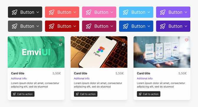
Utilizing Components
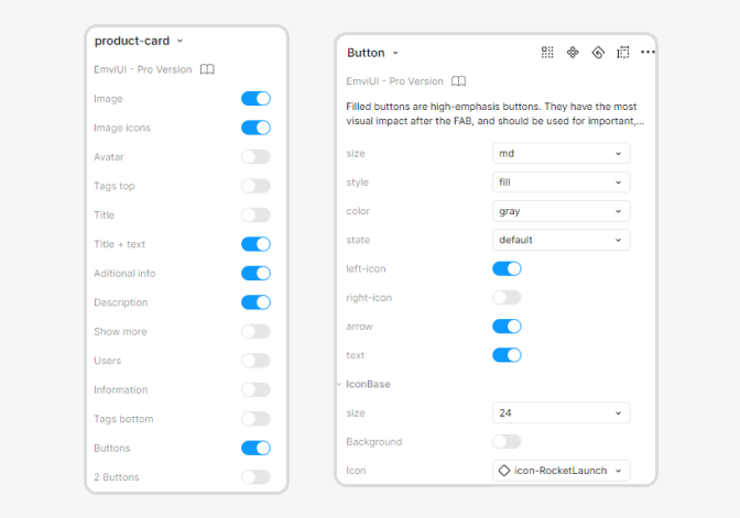
Components in Figma allow designers to create reusable design elements, ensuring uniformity across various designs. By turning standard UI elements into components, teams can make their design process more efficient. When a component is updated, all instances of that component automatically reflect the changes, saving time and minimizing discrepancies.
| Component Type | Example Usage | Benefits |
|---|---|---|
| Buttons | Primary, secondary, and ghost buttons | Consistency in style |
| Icons | Social media icons, action icons | Scalability across projects |
| Form Fields | Input, dropdown, and checkbox elements | Seamless integration in designs |
| Navigation Menus | Sidebars and top navigation bars | Uniform user experience |
Creating well-defined components is essential not only for visual cohesion but also for collaborative work, ensuring that team members adhere to the same design standards. Explore how to utilize components effectively by referring to our article on building a design system in Figma.
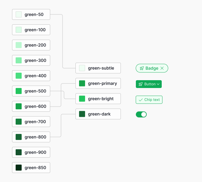
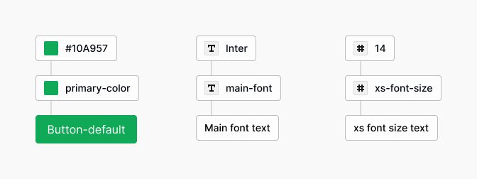
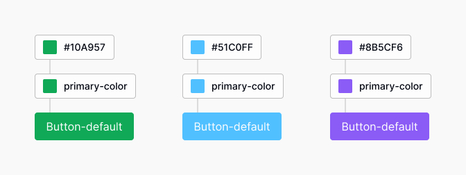
Creating Design Tokens
Design tokens are a powerful method for managing design decisions and guiding the development of a design system. They represent the core visual aspects of a design system, such as color, typography, spacing, and more. By storing these tokens in a centralized manner, designers can ensure that design elements remain consistent over time.
| Token Category | Attributes | Example Token Name |
|---|---|---|
| Color | Primary, secondary, and accent colors | --color-primary |
| Typography | Font size, line height, and font family | --font-body-size |
| Spacing | Margin, padding, and gaps | --spacing-medium |
| Sizing | Width, height, and border radius | --size-button |
Implementing design tokens within a Figma design system facilitates easy updates and scalability. When a token is modified, its changes propagate throughout all instances where it is used. This practice enhances collaboration between design and development teams, ensuring a smoother handoff of design specifications. Learn more about creating design tokens in Figma by checking out our article on design tokens figma.
Collaboration and Workflow
Collaboration and effective workflow are essential components in creating a successful design system within Figma. The platform offers various features that facilitate teamwork and streamline design processes, which can greatly benefit UX/UI designers and product teams.
Team Collaboration in Figma
Figma excels in enabling real-time collaboration among team members. Multiple users can work on the same design project simultaneously, allowing for immediate feedback and adjustments. This feature fosters an environment where designers can communicate ideas, improve designs, and stay aligned on project goals.
Key collaboration features include:
- Comments: Team members can leave comments directly on the design, providing context and feedback that can be quickly addressed.
- Version Control: Figma tracks changes, allowing teams to revisit previous iterations of their designs and ensuring that everyone is on the same page.
- Sharing: Designs can be easily shared with stakeholders, facilitating discussions and approvals without the need for extensive back-and-forth communications.
| Feature | Benefit |
|---|---|
| Real-time editing | Collaborative design in a shared space |
| Commenting | Direct feedback on design elements |
| Version history | Access to and restore previous designs |
| Sharing links | Easy distribution of designs for review |
For further insights on setting up efficient workflows, refer to our article on building a design system in figma.
Streamlining Design Processes
Streamlining design processes is crucial for enhancing efficiency and productivity. Figma provides several tools and features that can simplify workflows.
- Components and Assets: Using components allows designers to create reusable elements that can be easily updated across multiple pages or projects. This ensures consistency and speeds up the design process.
- Design Tokens: Implementing design tokens facilitates the management of design decisions, such as color and typography, in a centralized way. This increases flexibility and keeps styling consistent across various screens.
- Plugins: Utilizing Figma plugins can enhance functionality, automate repetitive tasks, or integrate design systems more seamlessly into existing workflows. Consider exploring the design tokens figma for enhanced efficiency.
| Tool/Feature | Purpose |
|---|---|
| Components | Create and manage reusable design elements |
| Design Tokens | Centralize and manage design choices |
| Plugins | Enhance functionality and automate tasks |
By leveraging these tools, teams can improve their workflows, allowing designers to focus more on creativity and less on logistical challenges. Emphasizing collaboration and efficient processes is vital for implementing the best practices of a Figma design system.
Accessibility and Inclusivity
Creating an inclusive Figma design system ensures that all users can interact with and benefit from designs. This aspect is critical for UX/UI and product designers, as it impacts usability and user satisfaction.
Designing for All Users
Designing for all users involves considering different abilities, backgrounds, and contexts to ensure a positive experience for everyone. This approach follows several best practices.
Color Contrast: Ensure sufficient contrast between text and background colors. Use tools to check color accessibility.
Text Legibility: Utilize clear fonts and maintain appropriate font sizes to enhance readability for users with vision impairments.
Keyboard Navigation: Ensure that all interactive elements can be accessed and navigated using a keyboard. This is essential for users with mobility impairments.
Flexible Layouts: Create layouts that can adapt to different screen sizes, orientations, and accessibility settings.
The table below outlines various considerations for designing inclusively:
| Consideration | Details |
|---|---|
| Color Contrast | Use high contrast ratios (at least 4.5:1 for text) |
| Font Size | Minimum 16px for body text; use resizing options |
| Accessibility Labels | Provide labels and alternative text for non-text content |
| Keyboard Navigation | Ensure all UI elements are accessible via keyboard |
Implementing Accessibility Features
Implementing accessibility features in a Figma design system contributes to a more inclusive user experience. This involves leveraging tools and techniques that support accessibility.
Use of Design Tokens: Utilize design tokens to standardize sizing, spacing, and color values related to accessibility across your design system.
Incorporating Feedback: Gather feedback from users with disabilities to understand practical challenges and integrate their insights into the design process.
Testing for Accessibility: Employ tools and plugins such as the Figma design system templates to analyze designs for accessibility compliance. Automated checks help identify potential issues early in the design process.
Documentation: Clearly document the accessibility standards within your design system. This ensures that all team members understand and implement the best practices effectively. Reference guides and Figma design system templates can aid in maintaining consistency.
By focusing on accessibility, designers not only enhance usability but also demonstrate a commitment to inclusivity within their design systems. This proactive approach is one of the essential figma design system best practices.
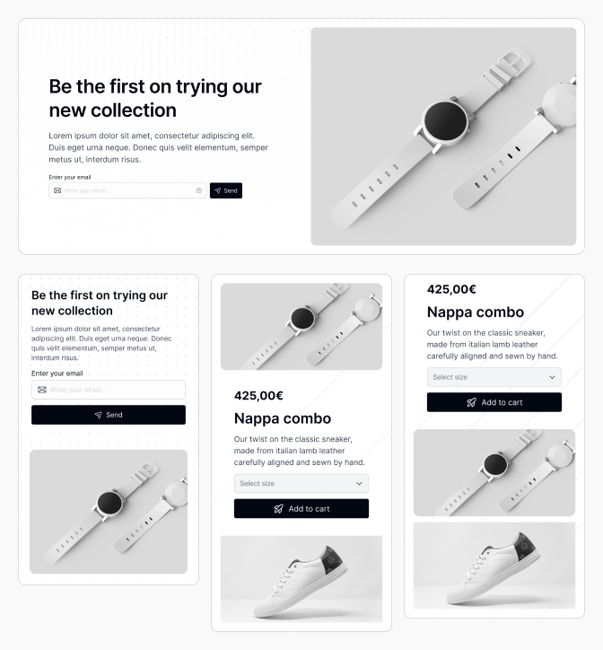
Responsive Design
Responsive design ensures that digital products function well across a variety of devices. This section explores best practices for designing for multiple devices and effectively using constraints in Figma.
Designing for Multiple Devices
Designing for a range of devices involves considering different screen sizes and resolutions. It is essential to create adaptable layouts that provide a consistent user experience.
When designing for multiple devices, the following aspects should be taken into account:
| Device Type | Common Screen Resolutions |
|---|---|
| Mobile | 360 x 640 px, 375 x 667 px |
| Tablet | 768 x 1024 px, 800 x 1280 px |
| Desktop | 1280 x 800 px, 1366 x 768 px, 1920 x 1080 px |
Utilizing Figma's responsive design features allows designers to create flexible layouts that can automatically adjust based on the screen size. Adopting grid systems can also help maintain consistency across different devices. For more insights, refer to our guide on building a design system in figma.
Using Constraints Effectively
Constraints in Figma are powerful tools that control how elements behave when the frame resizes. By effectively using constraints, designers can ensure that components remain aligned and appropriately scaled.
There are several types of constraints available in Figma:
| Constraint Type | Description |
|---|---|
| Scale | Element scales proportionally when the frame is resized. |
| Left | Element stays fixed to the left edge of the frame. |
| Center | Element stays centered within the frame. |
| Right | Element stays fixed to the right edge of the frame. |
| Top | Element stays fixed to the top edge of the frame. |
| Bottom | Element stays fixed to the bottom edge of the frame. |
Setting the right constraints allows designers to create dynamic components that will function well on various devices. This practice is critical for maintaining a coherent design system. For further details on design tokens, check out design tokens figma.
By focusing on responsive design and utilizing constraints effectively, designers can enhance the functionality and aesthetics of their digital products, making them accessible and enjoyable for users across different devices. Integrating these practices into a Figma design system is an essential aspect of achieving design excellence.
Documentation and Maintenance
Documentation and maintenance are critical components of a successful Figma design system. Thorough and clear documentation ensures consistency, aids collaboration, and serves as a valuable resource for both current and future team members.
Documenting Design System Guidelines
Effective documentation outlines the principles, components, and standards of the design system. This includes guidelines on typography, color palettes, UI elements, and other design specifications. A well-documented design system helps in maintaining uniformity across various projects.
Key Elements of Documentation
| Element | Description |
|---|---|
| Overview | Summary of the design system's purpose and goals. |
| Design Principles | A set of guiding principles that inform design decisions. |
| Components Library | Detailed descriptions and usage examples for each component. |
| Accessibility Standards | Guidelines ensuring designs meet accessibility requirements. |
| Updates Log | Record of changes and improvements made to the design system. |
Utilizing a central repository for all documentation, such as Confluence or Notion, can help in keeping resources organized and accessible. Linkage to relevant articles, such as building a design system in figma, can enhance understanding.
Regular Updates and Maintenance
A design system is a living entity that requires regular maintenance. Updates are crucial to adapt to changing design trends, user needs, and technological advancements. Teams should set a schedule for reviewing and refreshing their design system.
Maintenance Practices
| Practice | Frequency |
|---|---|
| Review Guidelines | Quarterly |
| Update Components | Bi-annually |
| Gather Team Feedback | After major projects or releases |
| Training Sessions | Annually |
Incorporating feedback from users and stakeholders can lead to significant improvements in the design system. Tools like the Figma design system templates can assist in managing components and keeping libraries up to date.
By prioritizing thorough documentation and regular maintenance, teams can establish a robust Figma design system that supports efficiency and innovation within their design processes. For further insights on utilizing design elements, refer to our article on Figma design system templates.
Feedback and Iteration
Establishing an effective design system in Figma involves a continuous process of feedback and iteration. This ensures that the design elements remain relevant and useful for the team.
Gathering Feedback from Stakeholders
Feedback is a vital component in maintaining a dynamic design system. Engaging stakeholders, including team members, product managers, and developers, allows for diverse perspectives that can enhance design quality. It is crucial to create structured methods for collecting feedback to ensure all voices are heard.
| Feedback Method | Description | Frequency |
|---|---|---|
| Surveys | Anonymous questionnaires for users | Quarterly |
| Design Reviews | Scheduled meetings to discuss designs | Bi-weekly |
| Usability Testing | Observing users interacting with designs | As needed |
| Informal Check-ins | Casual conversations about ongoing projects | Weekly |
Using these methods, teams can gather insights on usability, aesthetics, and functionality, which can help identify areas for improvement within the Figma design system.
Iterating and Improving the Design System
After collecting feedback, the next step is to iterate on the design system. This requires analyzing the input received and determining actionable changes. Iteration can involve updating components, adjusting design tokens, or revising documentation to better suit user needs.
When iterating, it's essential to prioritize changes based on their impact and feasibility. A common approach is to utilize a prioritization matrix that evaluates changes based on user needs and development effort.
| Change Type | Impact Level | Effort Level | Priority |
|---|---|---|---|
| Update Design Tokens | High | Medium | High |
| Revise Component Usage | Medium | Low | Medium |
| Enhance Documentation | High | High | Low |
By following this structured approach to feedback and iteration, teams can ensure that their design system evolves and remains effective. For more insights on setting up design systems, explore our article on building a design system in figma. For those looking to implement systematic updates efficiently, consider using a Figma design system templates to facilitate adjustments seamlessly.