
What is Figma in simple terms?
Figma is a cloud-based interface design tool that allows individuals and teams to design, collaborate, and share UI/UX projects in real time. Think of it as the "Google Docs" of design - multiple people can open the same file, work on it together, and leave feedback instantly, without sending endless file versions back and forth.
It's platform-agnostic, meaning it works on Mac, Windows, Linux, and even in a web browser without installation. Figma stores everything online, so your designs are always up-to-date, accessible from anywhere, and safe from file corruption or version conflicts.
What exactly is Figma used for?
Figma is incredibly versatile and can be used for every stage of the product design process:
- Wireframing - Rapidly sketching low-fidelity layouts to test ideas.
- UI design - Building detailed, high-fidelity visuals for websites, apps, and software.
- Prototyping - Adding interactivity, animations, and user flows without leaving Figma.
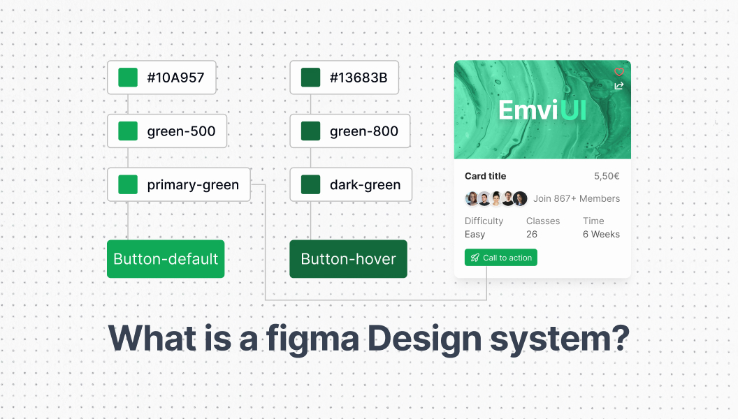
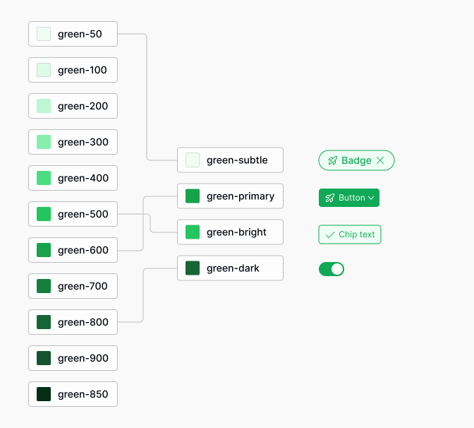
- Design system creation - Building reusable libraries of components, styles, and tokens.
- Developer handoff - Sharing inspectable designs, assets, and code snippets directly with dev teams.
With the right setup, Figma can replace a combination of older tools like Photoshop, Illustrator, InVision, and Sketch. And with EmviUI installed, you get 10,000+ component variants and 100+ prebuilt screens ready to plug into any project, turning Figma into a design powerhouse.
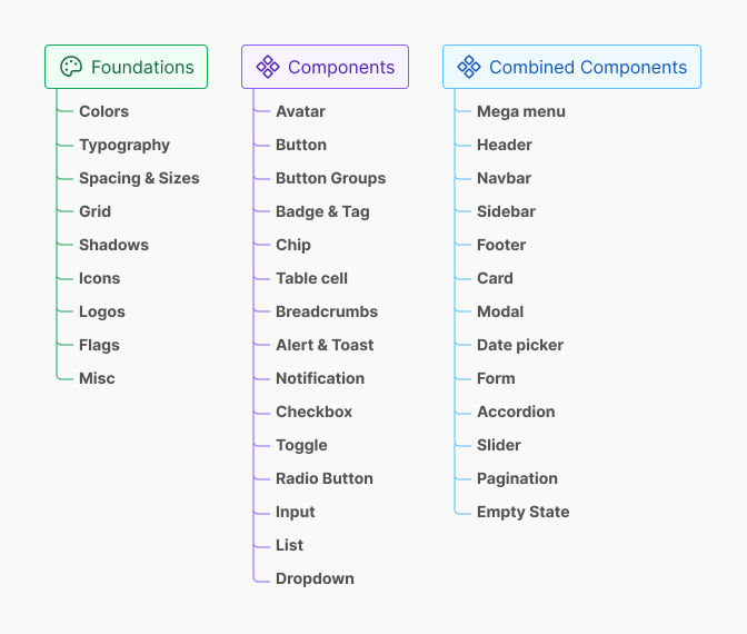
What is a design system?
A design system is a structured collection of reusable components, design tokens, and usage guidelines that together define the visual and functional language of a product. Unlike a UI kit - which is essentially a static library of elements - a design system is dynamic, documented, and intended for long-term scalability.
It includes:
- Components - Buttons, form fields, modals, cards, navigation bars, etc.
- Design tokens - Standardized variables for colors, typography, spacing, shadows, and more.
- Patterns - Prebuilt layouts like pricing tables, hero sections, and login forms.
- Guidelines - Rules for how to use components consistently and accessibly.
- Documentation - Instructions for designers and developers to ensure consistent application.
In Figma, a design system acts as your single source of truth, ensuring every designer and developer works with the same building blocks and styles.
How design systems work in Figma
Figma has built-in features that make managing design systems straightforward:
- Libraries - Store your components, styles, and variables in a central file and publish them for others to use.
- Variables - Create reusable values for colors, text, numbers, and more. Change them once and watch them update everywhere.
- Variants - Group component states (e.g., hover, pressed, disabled) into a single, manageable unit.
- Auto layout - Make components flexible and responsive to content changes.
EmviUI leverages all of these features - with TailwindCSS-compatible variables and perfectly organized component sets - so you can start with a production-ready system instead of building one from scratch.
How to find design systems in Figma
If you want to use an existing design system, Figma's Community is the first place to look. Here's how:
- Open Figma and navigate to the Community tab.
- Search for "design system."
- Filter results by "Files" to see public systems you can duplicate.
- Preview the file to assess component quality, style consistency, and variable usage.
- Click "Duplicate" to add it to your drafts.
While free systems are great for learning, they often lack the scale, documentation, and refinement needed for professional work. EmviUI solves this by delivering a comprehensive, developer-friendly design system from day one.

Step-by-step: Building your own Figma design system
Creating a design system in Figma can be broken down into these steps:
- Establish foundations - Define your brand colors, typography, spacing scale, and grid system.
- Build core components - Start with buttons, form inputs, cards, and navigation elements.
- Organize with auto layout - Ensure components are flexible and adapt to various screen sizes.
- Add variants - Include states, sizes, and alternative versions in the same component.
- Set up variables - Link colors, spacing, and text styles to variables for quick theme changes.
- Document everything - Add notes, usage guidelines, and do's/don'ts for each element.
- Test with real screens - Apply your components to actual designs to ensure they work together.
Building from scratch can take weeks or months. Starting with EmviUI lets you skip directly to step 6, because everything else is already built and optimized.
Real-world examples of Figma design systems
- SaaS Startup: Uses Figma + EmviUI to launch their MVP in under a month with a fully branded UI.
- E-commerce Brand: Maintains consistent product cards, filters, and checkout flows using a shared design system file.
- Mobile App Team: Implements responsive navigation bars, tab bars, and form components directly from their Figma library.
Benefits of using a Figma design system
- Speed - Design in days instead of weeks.
- Consistency - Every component looks and behaves the same.
- Scalability - Easily add new components without breaking the system.
- Collaboration - Everyone works from the same library.
- Developer efficiency - Handoff is clean, clear, and accurate.
According to feedback from EmviUI users, teams can save over 100 hours per project by starting with a prebuilt design system.
Common mistakes to avoid
- Overcomplicating the system too early.
- Failing to document usage rules.
- Ignoring accessibility (contrast, font sizes).
- Not involving developers in the setup process.
- Neglecting regular updates and audits.
Maintaining and scaling a design system
- Set update cycles (monthly or quarterly).
- Use consistent naming conventions.
- Archive outdated components.
- Document new additions immediately.
- Regularly sync with developers to ensure parity with code.
How EmviUI elevates your Figma design system
EmviUI isn't just a UI kit - it's a full TailwindCSS-based design system built for Figma. It includes:
- 10,000+ component variants
- 150+ editable variables for colors, typography, and spacing.
- 100+ prebuilt screens for dashboards, landing pages, forms, and more.
- Dark mode support out of the box.
- One-click global edits to update colors, fonts, and styles instantly.
Frequently Asked Questions (FAQs)
What is a Figma design system?
A structured set of components, tokens, and guidelines built in Figma to maintain visual and functional consistency across a product.
How is it different from a UI kit?
A UI kit is a static set of elements; a design system includes rules, tokens, and patterns for scalable use.
Can I download a design system in Figma?
Yes, from the Figma Community. Search for "design system" and duplicate one to your workspace.
Is EmviUI a design system?
Yes, EmviUI is a TailwindCSS-based Figma design system with thousands of components and variables ready for use.
Do small projects need design systems?
While not required, even small projects benefit from consistent styles and reusable components.
Is Figma better than Sketch for design systems?
Yes for most teams, because Figma offers real-time collaboration and cloud storage, while Sketch is file-based.
Can I add dark mode to a Figma design system?
Yes. Use Figma variables or a system like EmviUI, which includes dark mode by default.
How often should I update my design system?
At least quarterly, or whenever major brand or product changes occur.
Can beginners build a design system?
Yes, but starting with a prebuilt system like EmviUI accelerates the process.