
TL;DR: Mastering advanced Figma workflows elevates your UX/UI design skills, enabling you to build scalable systems, create responsive layouts, and collaborate seamlessly with developers. This guide covers essential techniques and real-world applications to take your Figma expertise to the next level.
Why Level Up Your Figma Skills? Understanding the Value of Advanced Workflows
Figma has become the go-to tool for UX/UI designers, but many only scratch the surface of its capabilities. Mastering advanced Figma workflows can transform your design process, making you faster, more consistent, and more valuable to your team. Whether you're freelancing, working in a startup, or part of a large product team, advanced Figma skills set you apart in a competitive field.
Who Should Take an Advanced Figma Course?
Advanced Figma training is ideal for designers who already know the basics-like frames, shapes, and simple prototyping-but want to push further. If you're building design systems, collaborating with developers, or aiming for pixel-perfect responsive layouts, advanced skills are essential. Product designers, UX/UI specialists, and even front-end developers can benefit from deepening their Figma expertise.
What Sets Advanced Figma Techniques Apart from the Basics?
Basic Figma skills cover drawing, arranging layers, and simple prototyping. Advanced techniques go beyond, focusing on:
- Auto Layout for flexible, responsive designs
- Component and variant systems for scalable UI kits
- Variables for theme and layout management
- AI-powered plugins for faster ideation
- Advanced prototyping with animations, masking, and video
- Team libraries and developer handoff workflows
These skills help you build professional, production-ready designs that scale with your projects.
How Can Mastering Figma Boost Your Design Portfolio?
When you showcase advanced Figma workflows in your portfolio, you demonstrate not just creativity, but also efficiency and technical skill. Employers and clients look for designers who can build robust design systems, create responsive layouts, and collaborate smoothly with development teams. Mastery of Figma's advanced features shows you can handle complex projects and deliver high-quality results.
Essential Advanced Figma Concepts Every Designer Should Know
To unlock Figma's full potential, it's important to understand its most powerful features and how they fit into modern UX/UI design.
What Are the Most Powerful Features in Figma for UX/UI Design?
Some of Figma's standout features for advanced designers include:

- Auto Layout: Automatically adjusts frames and components as content changes.
- Components & Variants: Create reusable UI elements with multiple states.
- Variables: Manage themes, spacing, and layout options globally.
- Interactive Prototyping: Add advanced animations, overlays, and micro-interactions.
- Team Libraries: Share and update design assets across projects.
- Dev Mode: Streamline developer handoff with code-ready specs.
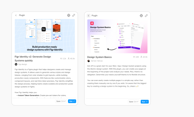
How Does AI Integration in Figma Accelerate Your Workflow?
AI-powered plugins and features in Figma can automate repetitive tasks, suggest design improvements, and even generate content. For example, AI can help you quickly create placeholder text, generate color palettes, or suggest layout adjustments. This speeds up ideation and lets you focus on creative problem-solving.
Why Are Auto Layout and Constraints Crucial for Responsive Design?
Auto Layout and constraints let your designs adapt to different screen sizes and content changes. With these tools, you can:
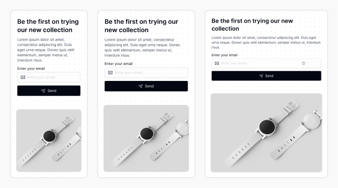
- Build buttons that grow with their labels
- Create cards that adjust to dynamic content
- Design layouts that work on both mobile and desktop
Responsive design is a must for modern apps and websites, and Figma's Auto Layout makes it much easier to achieve.
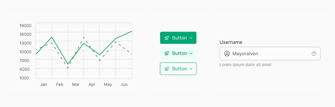
How Do Components and Variables Improve Consistency in Design Systems?
Components ensure that UI elements like buttons, forms, and icons stay consistent across your project. Variants allow you to manage different states (like hover, active, or disabled) within a single component. Variables let you control colors, spacing, and other properties globally, making it easy to update your design system or switch themes (like light and dark mode) with minimal effort.
Step-by-Step Guide: Building Professional App Designs in Figma
Let's walk through a practical workflow for designing a professional app interface in Figma, using advanced features to ensure flexibility, consistency, and efficiency.
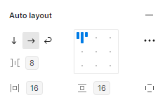
How to Use Auto Layout and Constraints for Flexible Interfaces
Auto Layout is the backbone of responsive design in Figma. It lets you create frames and components that adapt to content and screen size changes.
Setting Up Responsive Frames and Containers
- Select the frame or group you want to make responsive.
- Click "Auto Layout" in the right sidebar.
- Adjust padding, spacing, and alignment to control how child elements behave.
- Use constraints (top, bottom, left, right, center, scale) to define how elements resize within their parent frames.
- Test by resizing the frame to see how elements adapt.
Example: A navigation bar with Auto Layout will automatically space links evenly and adjust padding as you add or remove items.
Troubleshooting Common Auto Layout Mistakes
- Over-nesting: Too many nested Auto Layout frames can make updates difficult. Keep your structure simple.
- Incorrect constraints: Double-check constraints to ensure elements resize as expected.
- Fixed sizes: Avoid setting unnecessary fixed widths or heights; let Auto Layout handle sizing when possible.
How to Create and Manage Robust Components and Variants
Components and variants are key to scalable, maintainable design systems. They help you build a UI kit that's easy to update and expand.
Building a Scalable Figma UI Kit
- Identify common UI elements (buttons, inputs, cards, etc.).
- Create base components for each element.
- Add variants for different states (e.g., primary, secondary, hover, disabled).
- Use Auto Layout within components for flexibility.
- Organize components in a dedicated library file for easy reuse.
This approach ensures your UI stays consistent as your project grows.
Using Variables for Light/Dark Modes and Layout Options
Variables in Figma let you manage colors, spacing, and other properties globally. To set up light and dark modes:
- Create color variables for backgrounds, text, and accents.
- Define values for both light and dark themes.
- Apply variables to your components and styles.
- Switch between modes by toggling variable collections.
This makes theme switching fast and error-free, especially in large projects.
How to Apply Visual Enhancements: Effects, Typography, and Micro-Interactions
Advanced Figma workflows include fine-tuning visual details. Use effects like shadows and blurs for depth, set up consistent typography scales, and add micro-interactions (like button feedback) in prototypes. These touches elevate your designs and improve user experience.
How to Leverage AI Tools in Figma for Faster Design Iterations
AI plugins can generate placeholder content, suggest color palettes, or even create icons. For example, use an AI text generator to fill mockups, or an AI-powered layout tool to quickly explore new arrangements. This reduces manual work and helps you iterate faster.
Advanced Prototyping, Animation, and Collaboration in Figma
Beyond static designs, Figma supports advanced prototyping, animation, and team collaboration features that streamline the entire product design process.
How to Add Advanced Animations, Masking, and Video to Prototypes
Figma's prototyping tools let you create realistic, interactive experiences. You can:
- Animate transitions between frames (e.g., slide, dissolve, smart animate)
- Use masking to reveal or hide content dynamically
- Embed video files for richer prototypes
These features help you communicate your vision clearly to stakeholders and developers.
What Are the Best Practices for User Testing and Interactive Prototyping?
For effective user testing, keep prototypes focused and interactive. Use hotspots and overlays to simulate real app flows. Share prototypes with testers and collect feedback directly in Figma. Always test on multiple devices to ensure your design works everywhere.
How to Use Figma Dev Mode for Seamless Developer Handoff
Figma's Dev Mode bridges the gap between design and development. In Dev Mode, developers can:
- Inspect design specs (sizes, colors, spacing)
- Copy CSS, iOS, or Android code snippets
- Download assets in the right formats
This reduces back-and-forth and ensures your designs are implemented accurately. For more, see the Figma Dev Mode documentation.
How to Organize and Maintain Team Libraries for Consistent Design
Team libraries let you share components, styles, and variables across projects. To keep libraries effective:
- Organize assets by category (e.g., buttons, forms, icons)
- Document usage guidelines for each component
- Regularly review and update assets to avoid bloat
- Assign library managers to oversee changes
Well-maintained libraries ensure everyone on your team designs with the same building blocks.
Common Pitfalls and Best Practices in Advanced Figma Workflows
Even experienced designers can run into trouble with advanced Figma features. Here's how to avoid common mistakes and keep your workflow smooth.
What Mistakes Do Designers Make with Auto Layout and Constraints?
- Overcomplicating frame hierarchies, making updates hard
- Mixing fixed and flexible sizing incorrectly
- Forgetting to test layouts at different breakpoints
Best practice: Keep structures simple, use flexible sizing, and always test responsiveness.
How to Avoid Inconsistencies with Components and Variables
Inconsistencies often happen when components are detached or variables are overridden locally. To avoid this:
- Always use components from the library, not local copies
- Apply variables at the component level, not per-instance
- Document component usage and variable guidelines
Why Is Regular Asset and Style Management Essential?
Outdated or duplicated assets clutter your files and confuse your team. Regularly audit your libraries, remove unused components, and consolidate styles. This keeps your design system lean and easy to use.
How to Ensure Accessibility and Effective Team Collaboration
Accessibility should be built into your workflow. Use color contrast checkers, label interactive elements, and test with screen readers. For collaboration, use Figma's comment and version history features, and set clear roles for team members.
Real-World Examples: Applying Advanced Figma Techniques to Portfolio Projects
Let's see how advanced Figma skills translate into real portfolio value.
How to Build a Complete App Design from Persona to Prototype
- Start with user personas and journey mapping.
- Sketch wireframes and define key flows.
- Build responsive layouts using Auto Layout and constraints.
- Create a UI kit with components, variants, and variables.
- Apply visual styles, effects, and micro-interactions.
- Prototype user flows with advanced animations and overlays.
- Test with users and iterate based on feedback.
This process demonstrates your ability to handle end-to-end product design using advanced Figma workflows.
How to Document Design Decisions for Team Success
Good documentation explains why you made certain design choices. Use Figma's built-in comment and note features, or create dedicated documentation pages in your files. Document component usage, variable logic, and accessibility considerations. This helps your team understand, maintain, and scale your designs.
EmviUI and Advanced Figma: Boosting Productivity and Design Quality
EmviUI is designed to supercharge your Figma workflow, especially when building design systems and front-end interfaces.
Why Choose EmviUI for Your Figma Design System?
EmviUI offers a robust set of pre-built components, variables, and templates optimized for Figma. It's built for scalability, accessibility, and rapid iteration, making it a great choice for teams who want to move fast without sacrificing quality.
How Does EmviUI Solve Common Design System Challenges?
Common challenges like inconsistent components, slow updates, and poor developer handoff are solved by EmviUI's:
- Well-organized component libraries
- Consistent use of variables for themes and spacing
- Detailed documentation and usage guidelines
- Integration with Figma's Dev Mode for smooth handoff
For more on design system best practices, see our EmviUI design system guide.
What Are the Key Benefits of Integrating EmviUI with Tailwind Components?
Combining EmviUI with Tailwind CSS components bridges the gap between design and development. You get:
- Design tokens that map directly to Tailwind utility classes
- Faster prototyping and implementation
- Consistent styles from Figma to production code
- Reduced friction in designer-developer collaboration
This integration ensures your designs are not only beautiful, but also ready for real-world development.
Conclusion: Taking Your Figma Skills from Proficient to Expert
Mastering advanced Figma workflows is a game-changer for UX/UI designers. From responsive layouts and scalable components to AI-powered tools and seamless developer handoff, these skills help you build better products, faster. With resources like EmviUI, you can streamline your workflow and deliver consistent, high-quality designs at scale.
What's Next on Your Advanced Figma Learning Journey?
Keep exploring new Figma features, experiment with plugins, and contribute to your team's design system. Share your knowledge, seek feedback, and stay updated with the latest best practices.
How Can Investing in Advanced Figma Skills Elevate Your Career?
Advanced Figma skills make you a more valuable designer. They open doors to bigger projects, leadership roles, and collaborations with top-tier teams. Start mastering these workflows today to future-proof your career in UX/UI design.
Frequently Asked Questions (FAQs)
What are the most important advanced Figma features for UX/UI designers?
Auto Layout, components and variants, variables, advanced prototyping, and team libraries are essential for building scalable and responsive designs.
How can I make my Figma designs more responsive?
Use Auto Layout and constraints to ensure your frames and components adapt to different screen sizes and content changes.
What's the best way to organize a Figma design system?
Group components by category, use variables for themes, document usage guidelines, and maintain a clean team library for easy access.
How do I avoid inconsistencies in my Figma components?
Always use components from your library, avoid detaching instances, and apply variables at the component level for consistency.
Why should I integrate EmviUI with Tailwind CSS in my workflow?
This integration ensures design tokens match code, speeds up prototyping, and improves consistency between design and development.
How does Figma Dev Mode help with developer handoff?
Dev Mode provides code-ready specs, asset downloads, and clear design details, making it easier for developers to implement your designs accurately.