How to Use Figma to Design a Logo: A Practical Workflow
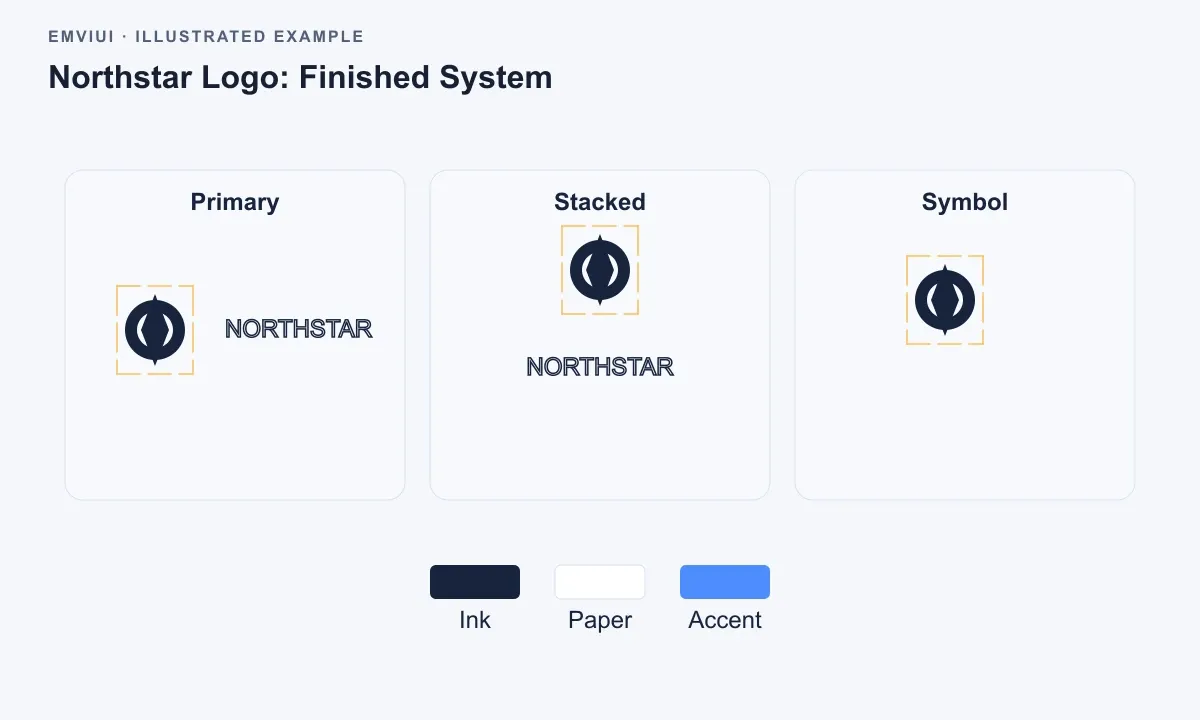
To design a logo in Figma, start with a clear brief, build the mark from simple vector geometry, refine it at multiple sizes, and test it in realistic brand contexts. Use Boolean operations, grids, components, and carefully named exports so the final logo works for product UI, websites, print, and handoff.
How to use Figma to design a logo is less about finding a single magic tool and more about building a repeatable vector workflow. Figma gives you the essentials: precise paths, Boolean operations, grids, components, constraints, and export presets. The quality of the result depends on how deliberately you use them.
This tutorial takes one logo from an initial brief to a verified, production-ready asset. The example is a simple geometric mark for a fictional product called Northstar, but the process applies equally to a startup identity, a product sub-brand, or an icon system inside a design system. You will finish with a primary mark, responsive variants, color definitions, and export guidance that a frontend engineer can use without guessing.
Start with a logo brief and a clean Figma file
Before opening the Pen tool, define what the logo must communicate and where it must work. A logo that looks excellent in a large presentation frame can fail as a 16-pixel favicon or a monochrome mark in a navigation bar. Write constraints first so visual decisions have something concrete to answer to.
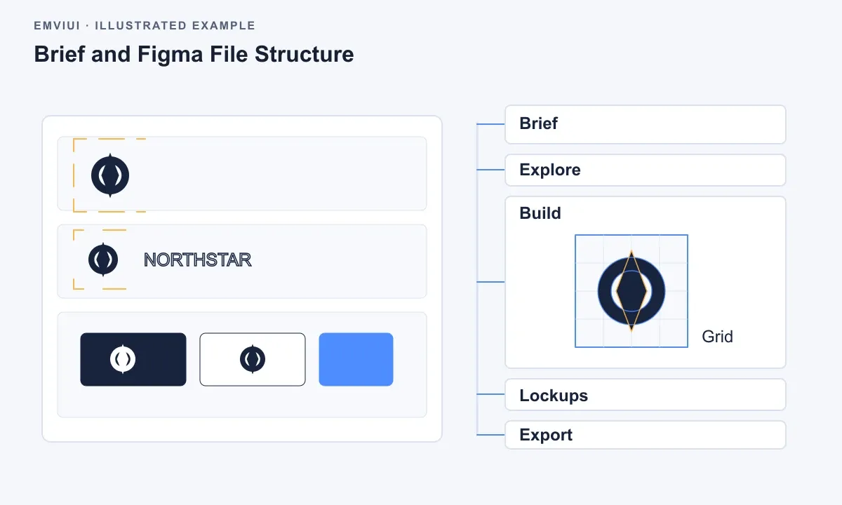
For the Northstar example, the brief might say: create a compact symbol that suggests direction and reliability; pair it with a readable wordmark; use a dark and light version; make the symbol recognizable at small sizes; and deliver SVG, PNG, and monochrome assets. This is enough direction to begin without pretending that a logo can be designed from adjectives alone.
Set up the Figma file so exploration does not become irreversible clutter. Create pages named Brief, Exploration, Construction, Lockups, and Exports. Keep discarded sketches, references, and approved artwork separate. On the Construction page, use one frame for the master mark and nearby frames for tests. Do not draw directly inside a presentation layout; the working file should preserve geometry and decisions.
Define a small set of variables or styles before refining color. A logo usually needs fewer tokens than a product interface, but consistent naming still matters. For example:
- Logo / Ink for the primary dark mark.
- Logo / Paper for the reversed light mark.
- Logo / Accent for an optional brand color.
- Logo / Clearspace as a measurement reference, not a visible export.
Use a square construction frame with a visible layout grid or column grid. The grid is not a claim that every logo must be mathematically modular. It is a way to notice inconsistent proportions, off-center shapes, and accidental tangencies. Turn it off before exporting.
One practical rule: keep the master logo as vector geometry, not a flattened image. Raster references can help with mood or competitive context, but they should never become the source asset. If you import a reference, place it on a locked, reduced-opacity layer and redraw only what you have the right to use.
Build the first mark from simple vector geometry
The fastest route to a strong first concept is usually a small set of primitives. In Figma, create circles, rectangles, polygons, and straight line segments before reaching for freehand curves. Simple geometry makes proportion changes faster and gives the mark a coherent visual language.
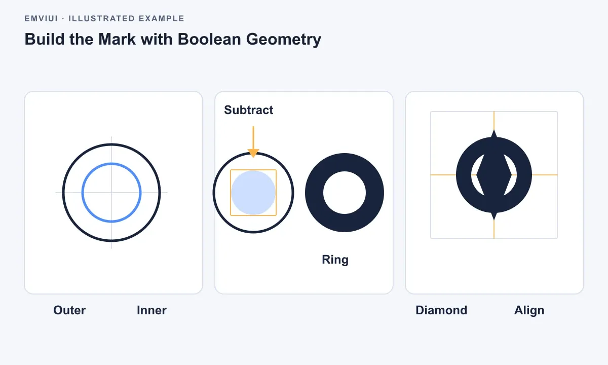
For Northstar, begin with a circle and a four-point diamond. Duplicate the circle, scale the duplicate down, and subtract it from the larger shape to create a ring. Place the diamond above the ring, rotate it 45 degrees, and use alignment tools to center both shapes. At this stage, do not obsess over the final corner radius. Establish the silhouette first.
Use Boolean operations intentionally:
- Union selection combines overlapping shapes into one visible form.
- Subtract selection cuts the top shape from the shapes beneath it.
- Intersect selection retains only the overlapping region.
- Exclude selection removes the overlapping region while retaining the outer areas.
Boolean layers are useful during exploration because they preserve editable source shapes. When the construction is approved, you can flatten or outline the final result where appropriate. Keep a duplicate of the editable Boolean version before making destructive changes. A logo file should not force the next designer to rebuild the concept from scratch.
Use Figma’s alignment and distribution controls instead of nudging every object by eye. Select the relevant layers, align their horizontal and vertical centers, then inspect the result at 100 percent. Mathematical centering and optical centering are not always identical. A pointed shape may look too high even when its bounding box is exactly centered, so make optical adjustments only after the underlying geometry is sound.
Pay attention to negative space. The opening inside a ring, the gap between a symbol and its wordmark, and the counters in a custom letterform all become part of the identity. Zoom out regularly. If the mark is only convincing at 800 percent, it is not ready. If its internal gaps collapse at a small size, simplify the shape rather than adding detail.
Keep a copy of each meaningful direction rather than creating dozens of tiny variations. Name explorations by the decision they test, such as wide counter, rounded terminals, or reduced tilt. This makes critique specific. A reviewer can react to a visible hypothesis instead of saying that one of twenty nearly identical frames feels better.
Use the Pen tool for refinement, not as a starting ritual
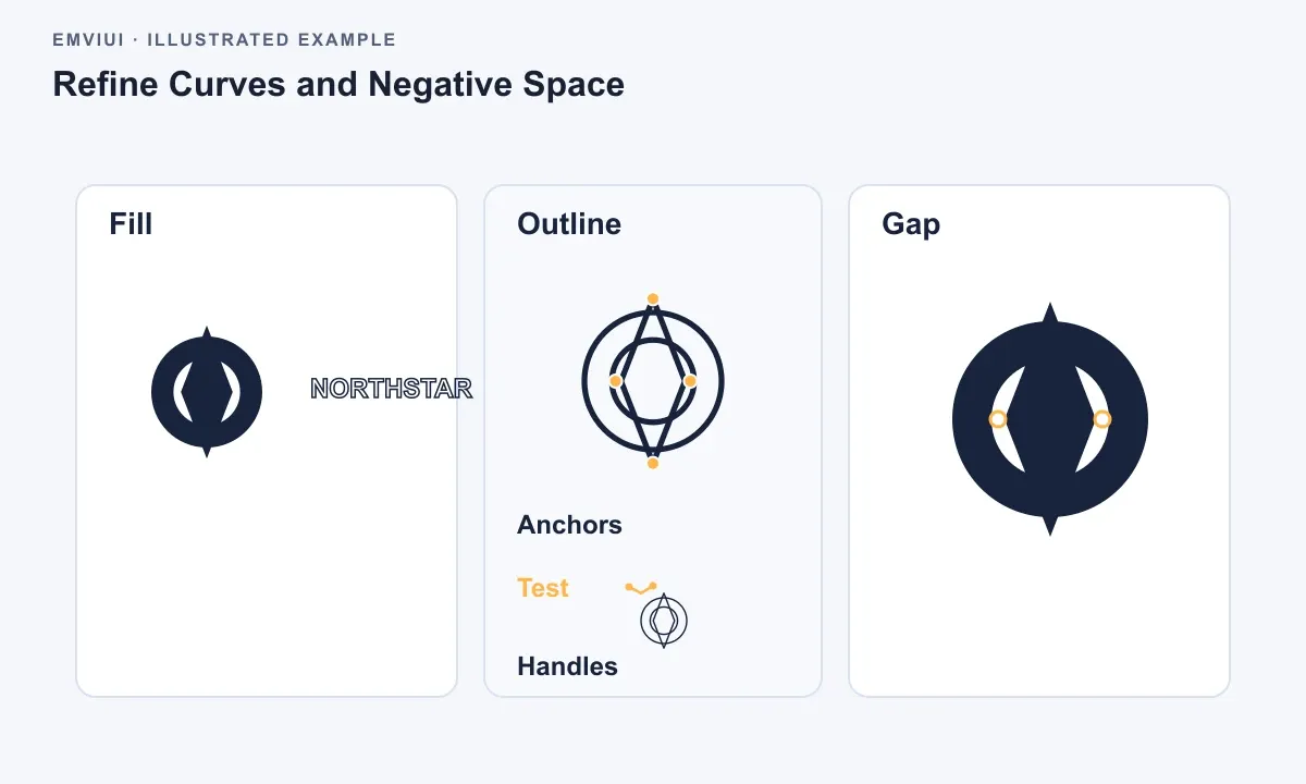
The Pen tool becomes valuable when primitives can no longer express the intended silhouette. Use as few anchor points as possible. Every extra point introduces another opportunity for a lumpy curve, inconsistent tangent, or accidental cusp. Place points at meaningful changes in direction, then adjust handles to create smooth transitions.
When you edit a curve, inspect both the outer contour and the negative space it creates. A technically smooth curve can still feel uneven if its visual weight changes abruptly. Toggle between filled view and outline view while refining. Outline view helps reveal overlapping paths, open endpoints, and redundant points that are invisible in the filled silhouette.
Do not automatically round every corner. Rounded corners communicate softness but can weaken a mark that needs precision. Conversely, sharp corners can create fragile points when reproduced at small sizes. Test a few radius values and compare them at the actual sizes the product will use.
Make the mark responsive across sizes and contexts
A logo is not one file at one size. It is a family of related assets. The primary lockup may combine a symbol and wordmark, while a compact lockup uses only the symbol. A favicon may require an even simpler silhouette. Treat these as intentional variants, not emergency crops made at the end of the project.
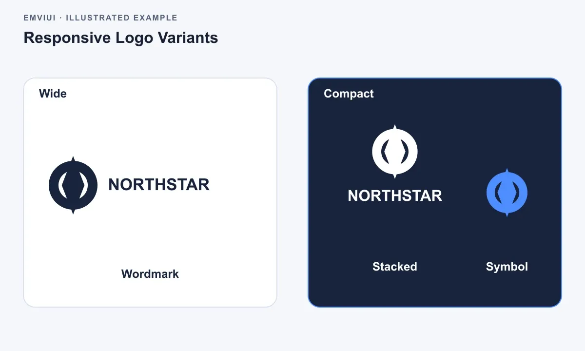
Build the primary lockup first. Set the symbol height as the reference measurement, then establish the gap to the wordmark as a proportion of that height. Create the wordmark using a licensed typeface or custom lettering that has been approved for the identity. Do not casually convert a popular interface font into a logo without checking licensing, spacing, and distinctiveness.
Then create three test frames: a wide lockup, a stacked lockup, and a symbol-only lockup. The stacked version is useful for social avatars, app splash screens, and narrow website headers. The symbol-only version should not simply be the first letter or a cropped edge unless that behavior is part of the concept.
| Context | Recommended asset | What to verify |
|---|---|---|
| Website navigation | Horizontal lockup or compact symbol | Legibility beside menus and adequate clearspace |
| App icon or favicon | Symbol-only variant | Recognizable silhouette at small sizes |
| Dark hero section | Reversed light lockup | Contrast and no muddy color interaction |
| Product UI | Monochrome symbol or wordmark | Works without relying on brand color |
| Print or large display | Primary vector lockup | Clean curves, correct type, and scalable geometry |
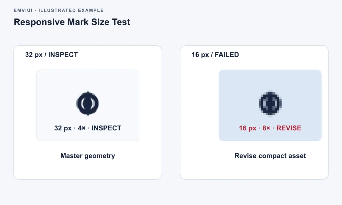
For each variant, define a minimum size based on testing rather than a universal rule. A detailed symbol may remain clear at a larger minimum size than a solid geometric mark. Place each variant on neutral, light, dark, and busy background samples. These test frames should be part of the design review because they expose failures that a white artboard hides.
Clearspace is another practical requirement. Choose a repeatable unit from the logo, such as the width of an internal counter or a fraction of the symbol height. Add a non-exported clearspace boundary around each lockup and label it clearly. This is not decoration; it gives product designers and engineers a measurable rule for placing the logo beside navigation, cards, partner marks, and legal text.
When considering how to use Figma to design a website, remember that the logo must survive responsive layouts. A desktop header may have room for the full lockup, while a mobile header may need the symbol only. Create both states in the file and show the transition point as a design decision. This prevents implementation teams from shrinking the full lockup until the wordmark becomes unreadable.
Apply color, type, and spacing without weakening the identity
Color should clarify the logo, not compensate for an uncertain shape. First review the mark in black and white. If the silhouette and negative space are not convincing without color, return to the geometry. A gradient, shadow, or outline can create temporary polish while making the core form harder to evaluate.
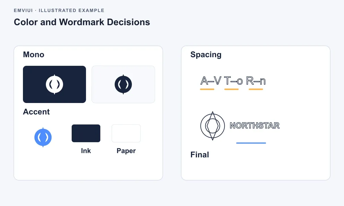
Create color styles or variables with semantic names rather than names tied to a specific hex value. Logo / Ink remains meaningful if the brand palette changes. Include the actual values in the asset documentation, but do not make every component depend on an undocumented local color.
Test contrast against the backgrounds where the logo will appear. The full logo may need a dark version for light surfaces and a light version for dark surfaces. An accent-colored version can be useful, but it should not be the only approved form. Product interfaces often place logos inside states, banners, navigation bars, or loading screens where the original brand background is unavailable.
For the wordmark, inspect letter spacing at the final display scale. Auto-spacing from a font is only a starting point. Logo lettering often needs small optical corrections around diagonals, rounded letters, and pairs such as A-V or T-o. Convert text to outlines only after type choices and licensing are settled. Keep a live-text reference labeled with the font name and weight so the construction remains understandable.
Do not combine too many visual ideas. If the symbol already uses a distinctive cutout, keep the wordmark quieter. If the wordmark is custom and expressive, a simple symbol may create a better system. The goal is not to maximize novelty; it is to create a recognizable, reproducible identity that behaves consistently inside a product.
Verify the logo before handing it to engineering
Verification is where a promising concept becomes a reliable asset. Review the logo at realistic sizes and in the environments where it will be implemented. Figma’s zoomed canvas is useful for construction, but it is not a substitute for a browser header, an app shell, a social avatar, or a printed page.
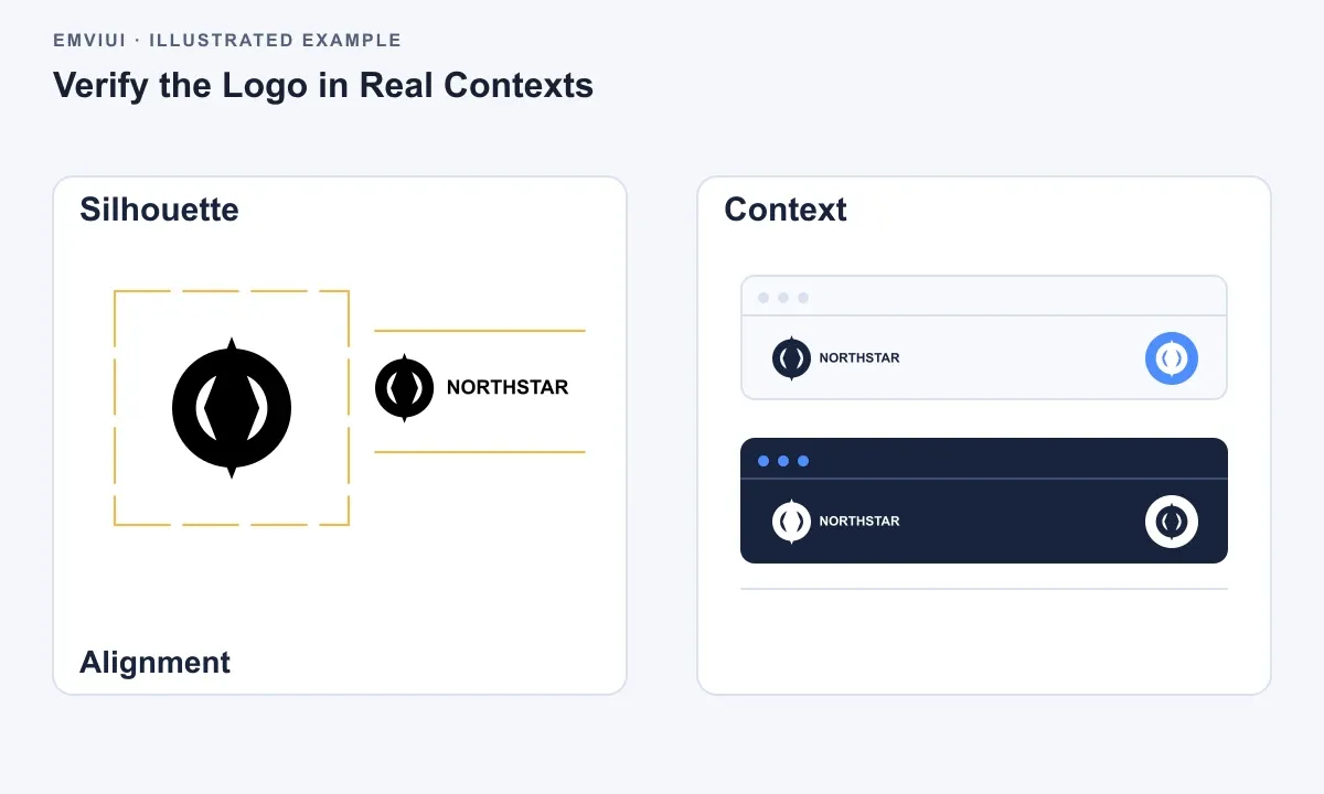
- Check the silhouette. Hide color and inspect the mark in solid black. Look for uneven weight, accidental bumps, open paths, and shapes that become ambiguous when reduced.
- Check alignment. Use guides or measurement overlays to confirm the symbol, wordmark, and clearspace. Then make an optical review at 100 percent.
- Check small sizes. Test the symbol and lockups at representative interface sizes. If counters close or thin strokes disappear, use the approved simplified variant.
- Check contrast. Place every approved colorway on the light and dark backgrounds specified in the brief. Remove any colorway that is only readable on one convenient frame.
- Check scalability. Inspect the vector at a large size and compare it with a raster preview. Curves should remain smooth and no effect should depend on a fixed pixel dimension.
- Check handoff. Confirm that layers are named, hidden construction guides are excluded, fonts are documented, and export names are unambiguous.
Use Figma’s prototype mode only when behavior needs explanation, such as switching from a full lockup to a symbol in a responsive header. For static logo approval, side-by-side frames are usually clearer than an elaborate prototype. A reviewer should be able to compare variants without clicking through a maze.
When you are learning how to use Figma to design a logo, this verification step is the difference between a visually attractive exercise and a usable identity system. Ask a frontend engineer to place the exported SVG in a real header or landing-page hero. Ask a product designer to use the compact mark in a navigation state. Implementation feedback often identifies spacing and scale problems that are invisible in the design file.
Export clean assets and document the handoff
Prepare exports from dedicated frames, not from a casually selected group on the exploration page. Name frames by variant, theme, and format intent. Examples include northstar-logo-horizontal-dark, northstar-logo-symbol-light, and northstar-logo-stacked-mono. Consistent names make asset libraries searchable and reduce accidental misuse.
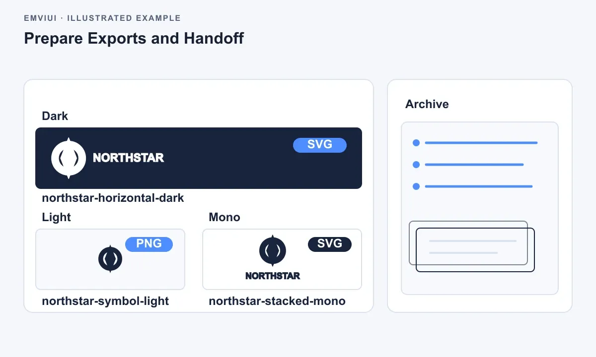
Use SVG for scalable web and product assets when the implementation environment supports it. Check the exported SVG for unnecessary hidden layers, embedded raster images, and text that depends on a font unavailable to the consumer. For PNG, export the sizes required by the product rather than producing an arbitrary pile of duplicates. Include a transparent background when the logo must sit on variable surfaces.
Before delivery, duplicate the final page and make an archive copy of the editable master. The final page should contain only approved variants, color references, clearspace guidance, minimum-size tests, and export frames. The archive can retain rejected directions and exploratory geometry. This separation lets engineers find the answer quickly without destroying the historical record.
Write a short handoff note directly in Figma. State which variant is preferred, when the compact mark should replace the full lockup, which backgrounds require the reversed version, and whether the wordmark may be typeset again. Mention any restrictions, such as do not recolor the symbol independently or do not place the logo inside an additional container unless the container is part of the approved asset.
Useful shortcuts make the workflow faster without replacing judgment. Use R for rectangles, O for ellipses, P for the Pen tool, and Shift while scaling when you need to preserve proportions. Use Alt or Option to duplicate objects quickly, and use Cmd or Ctrl plus G to group related construction elements. Shortcuts vary slightly by operating system, so verify them in your Figma menu if a command behaves differently.
Troubleshoot the common failure points
The logo looks balanced only when zoomed in. Reduce it to the smallest important context and inspect the silhouette. Remove fine details, widen narrow gaps, or create a compact variant. Small-size clarity is a design requirement, not a later export problem.
Boolean operations create unexpected holes. Check the layer order and confirm which shape is acting as the subtracting object. Keep source shapes separate until the result is correct. If a Boolean stack becomes difficult to understand, duplicate it, flatten the duplicate, and label the editable original.
The wordmark feels too far from the symbol. Measure the gap relative to the symbol height, then inspect optical spacing. A rounded symbol may need a slightly different gap than a sharp symbol because its visual edge is perceived differently from its bounding box.
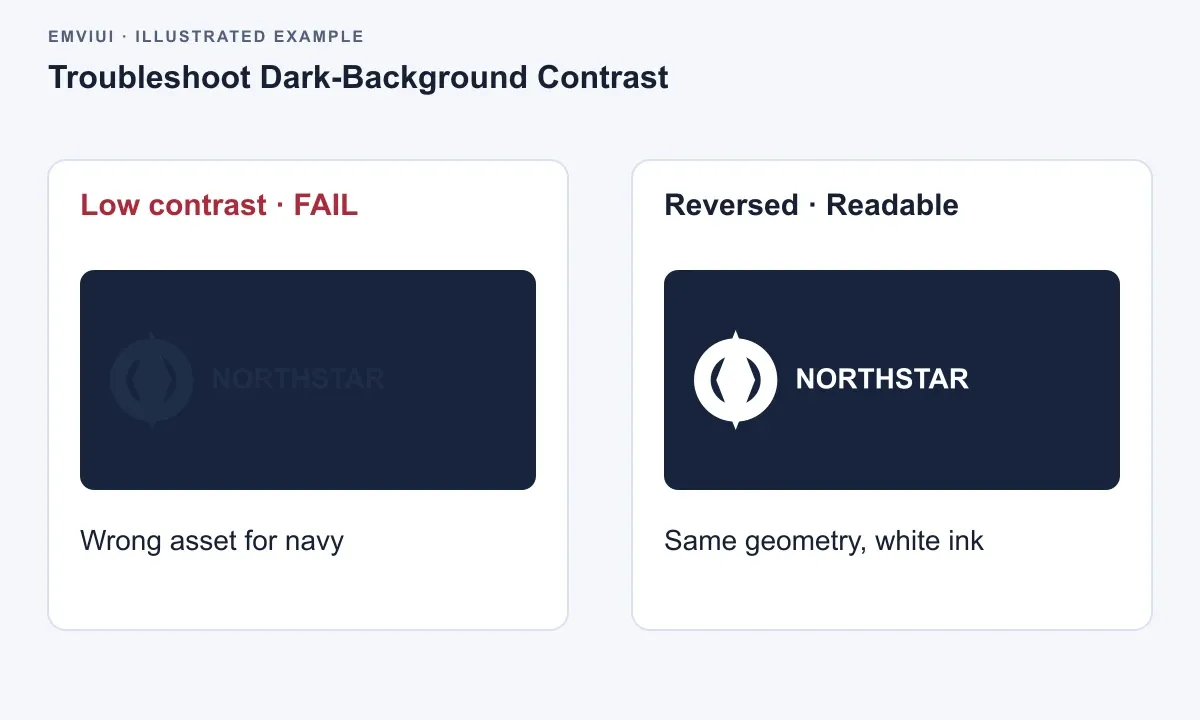
The logo fails on dark backgrounds. Do not solve this with a quick white stroke unless that treatment is part of the system. Create a deliberate reversed colorway or simplify the mark so its contrast survives. Test the actual background colors used by the website and product, including surfaces with overlays or images.
Engineers cannot tell which asset to use. Reduce the final page to approved variants and add a decision note. Show the horizontal, stacked, symbol-only, dark, light, and monochrome versions with clear names. A clean handoff is part of logo design because the identity is judged by its repeated use, not only by the original presentation.
The exported SVG renders differently. Inspect the export for strokes, masks, clipping paths, and live text. Outline critical lettering, avoid unnecessary effects, and test the SVG in the target browser or application. If the implementation pipeline transforms SVGs, coordinate with engineering before approving the final file.
The complete workflow is straightforward: clarify the brief, construct with simple vectors, refine curves sparingly, create responsive variants, verify in realistic contexts, and export with explicit documentation. Figma is especially effective when the file becomes a small source of truth rather than a gallery of disconnected experiments. That discipline helps the logo work equally well in a product header, a website, and the smallest interface surface where the brand appears.

Pablo Mayoral
Senior UX/UI & Web Designer with 10+ years of experience. Creator of EmviUI (10k+ components Figma design system), UImand, and Vitamin Bootstrap. Currently designing digital products at CQMRewards.