

Master Figma design by building a strong foundation, adopting systems thinking, and leveraging reusable components to create scalable, consistent design systems.
Why Do Designers Feel Overwhelmed When Starting with Figma?
Figma has become the go-to tool for modern interface design, but many designers feel lost when they first open it. The interface is packed with features, and the possibilities can seem endless. This initial overwhelm is common, especially for those transitioning from other tools or just starting their design journey.

Understanding the Figma Interface: What Are the Key Challenges?
The Figma interface brings together design, prototyping, and collaboration in one place. For beginners, this can be confusing. Key challenges include:
Recognizing these challenges is the first step to overcoming them.
How Can You Build Confidence with Design Tools as a Beginner?
Building confidence in Figma starts with small, consistent practice. Instead of trying to learn everything at once, focus on:
- Exploring the interface and experimenting with basic shapes and text.
- Following beginner tutorials to create simple UI elements.
- Joining Figma communities for support and inspiration.
- Setting achievable goals, like recreating a favorite app screen.
Remember, mastery comes from regular use and curiosity, not just memorizing features.
From Beginner to Design Leader: What Does the Journey Look Like?
Every designer starts as a beginner, but the journey to design leadership involves more than just learning tools. It's about developing a mindset, workflow, and strategic approach to design problems.
What Skills Separate a Tool User from a Design Leader?
Tool users know how to operate Figma, but design leaders:
- Understand design principles and apply them consistently.
- Think in systems, not just screens.
- Communicate ideas clearly to teams and stakeholders.
- Mentor others and share knowledge.
- Adapt workflows to changing project needs.
Leadership is about vision and collaboration, not just technical skill.
Why Is Layered Learning More Effective Than Isolated Tips?
Layered learning means building knowledge step by step. Instead of collecting random tips, focus on:
- Mastering core concepts (like frames and components).
- Applying them in small projects.
- Gradually adding complexity (like prototyping and design systems).
This approach helps you see how concepts connect, making your skills more robust and adaptable.
How Does Systems Thinking Transform Your Design Workflow?
Systems thinking means viewing your UI as a set of interconnected parts. Instead of designing isolated screens, you create reusable elements and patterns. This shift:
- Speeds up design and iteration.
- Ensures consistency across products.
- Makes collaboration smoother with developers and other designers.
- Reduces errors and rework.
Adopting systems thinking is key to building scalable design systems in Figma.
Getting Started: Building a Strong Foundation in Figma
Before you can build complex design systems, you need to master Figma's foundational concepts. This section covers the basics that every designer should know.
What Are Frames in Figma and Why Are They Essential?
Frames are the backbone of Figma layouts. They act like artboards in other tools, defining the boundaries of screens, components, or sections. Frames help you:
- Organize your work visually.
- Set up responsive layouts for different devices.
- Group related elements logically.
Using frames correctly is crucial for scalable, organized design files.
How Should You Organize Layers, Groups, and Files for Scalability?
Good organization saves time and prevents confusion as your project grows. Here are some best practices:
- Name your layers and groups clearly (e.g.,
Button/Primary). - Use frames to separate screens, sections, or components.
- Group related elements (like icons or form fields) for easier editing.
- Structure files by feature, platform, or workflow stage (e.g.,
Components,Pages,Prototypes).
Consistent naming and grouping make collaboration and handoff much smoother.
Setting Up Your Workspace for Multi-Device Design
Modern products run on many devices. In Figma, you can set up frames for different screen sizes (mobile, tablet, desktop) and design responsively. Tips for multi-device design:
- Start with common device presets (iPhone, Android, Web).
- Use constraints and auto layout to make elements adapt to different sizes.
- Preview designs on various devices using Figma's mirror app or browser preview.
Planning for multiple devices from the start ensures your UI is flexible and future-proof.
Moving Beyond the Basics: Creating Cohesive UI Frameworks
Once you're comfortable with Figma's basics, it's time to build frameworks that ensure consistency and scalability. This means setting up systems for typography, color, and layout.
How to Build Responsive Typography Systems in Figma
Typography is a core part of any design system. A responsive typography system adapts to different devices and contexts. Here's how to set one up:
Step-by-Step: Setting Up Text Styles for Consistency
- Define your font families, weights, and sizes for headings, body text, captions, etc.
- Create text styles in Figma for each type (e.g.,
Heading 1,Body,Caption). - Apply these styles consistently across your designs.
- Adjust styles for different breakpoints if needed (e.g., larger headings on desktop).
Using text styles makes updates easy and keeps your UI visually unified.
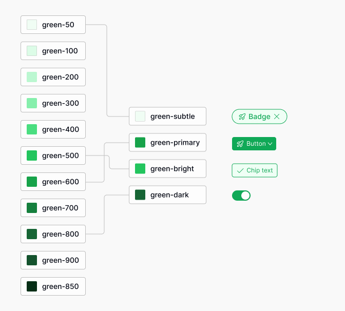
What's the Best Way to Develop Strategic Color Palettes?
A strategic color palette supports branding, accessibility, and usability. Start by selecting primary, secondary, and accent colors, then define neutrals and semantic colors (like error or success).
Using Color Styles and Accessibility Considerations
- Create color styles in Figma for each palette color (e.g.,
Primary/500,Gray/100). - Test color combinations for sufficient contrast using accessibility tools.
- Document usage guidelines (when to use each color).
Accessible color palettes ensure your UI works for everyone. For more, see the Figma accessibility guide.
How to Use Grids and Auto Layout for Flexible, Consistent Layouts
Grids and auto layout are powerful tools for creating structured, responsive designs. Grids help align elements, while auto layout makes components adapt to content changes. To use them effectively:
- Set up column grids on frames for consistent spacing.
- Apply auto layout to buttons, cards, and lists so they resize automatically.
- Combine grids and auto layout for complex, responsive layouts.
This approach saves time and ensures your UI looks great at any size.
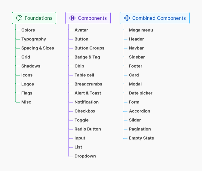
Systems Thinking in UI: Designing with Components and Atomic Design
Design systems thrive on reusable components and clear structure. Atomic Design is a popular methodology that helps break down UIs into manageable parts.
What Is Atomic Design and How Does It Apply in Figma?
Atomic Design organizes UI elements into five levels: atoms, molecules, organisms, templates, and pages. In Figma, this means:
- Atoms: Basic elements like buttons, inputs, icons.
- Molecules: Groups of atoms, like a search bar (input + button).
- Organisms: Complex components, like navigation bars or cards.
- Templates: Page-level structures using organisms.
- Pages: Final screens with real content.
This structure makes your design system scalable and easy to maintain.
Atoms, Molecules, Organisms: Practical Examples in UI Kits
- Atom: A single icon or button.
- Molecule: A labeled input field (label + input + icon).
- Organism: A complete navigation bar with logo, links, and search.
Organizing your Figma components this way helps teams understand and reuse elements efficiently.
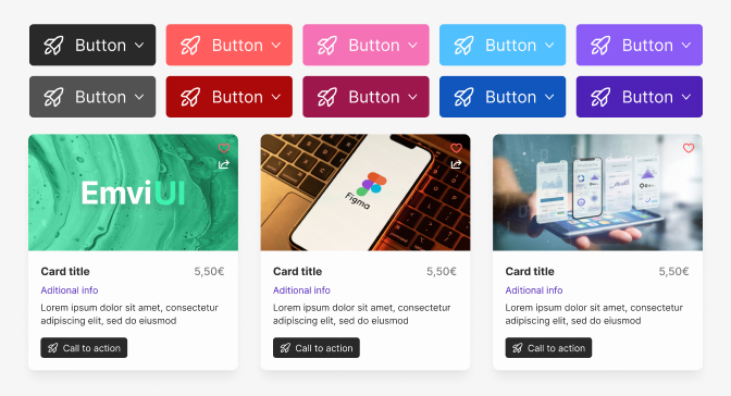
How to Create Reusable Components and Variants in Figma
Reusable components are the heart of a scalable design system. In Figma, you can create components for buttons, inputs, cards, and more. Variants let you group similar components (like different button states) into one master component.
Building buttons, input Fields, and Navigation Elements
- Design the base element (e.g., a primary button).
- Select it and choose Create Component.
- Duplicate and adjust for different states (hover, disabled, etc.).
- Combine these into a variant set for easy switching.
- Repeat for inputs, navigation bars, and other UI elements.
Components and variants make updates fast and keep your UI consistent.

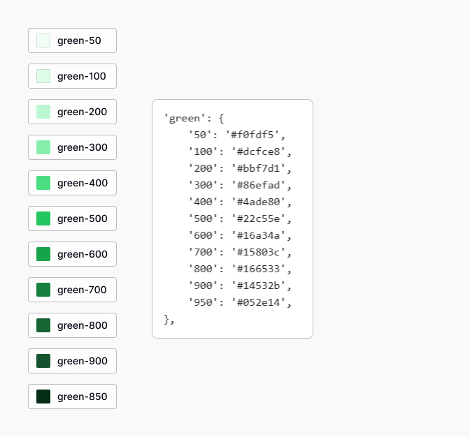
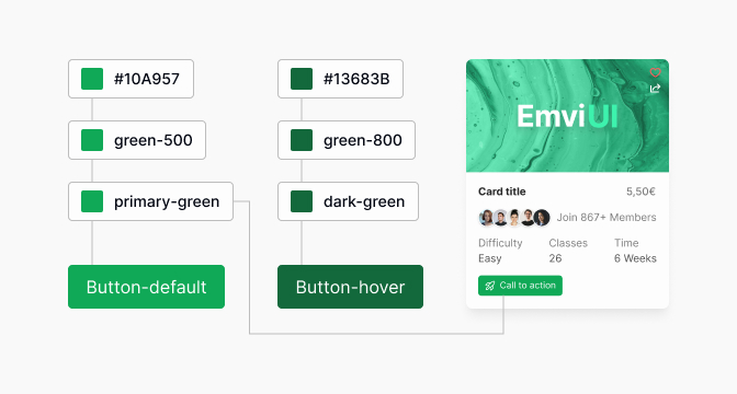
What Are Design Tokens and How Do They Power Your Design System?
Design tokens are named variables for colors, typography, spacing, and more. They centralize your design decisions, making it easy to update styles across your UI.
Centralizing Colors, Typography, and Spacing for Consistency
- Define tokens for colors (
color-primary), font sizes (font-size-lg), and spacing (space-md). - Apply these tokens in your Figma styles and components.
- When a token changes (like a brand color), all linked components update automatically.
This approach ensures design consistency and speeds up large-scale changes.

Real-World Workflow: Building and Maintaining a Scalable Design System
Creating a design system is only the beginning. Maintaining and evolving it requires clear workflows and collaboration between designers and developers.
How to Organize Your Figma Files for Team Collaboration
Organized files make teamwork efficient. Best practices include:
- Separate files for foundations (colors, typography), components, and product screens.
- Use clear naming conventions and file structures.
- Document usage guidelines and update logs within Figma.
- Leverage Figma's team libraries to share components across projects.
This setup reduces confusion and keeps everyone on the same page.
Connecting Figma Components with Tailwind CSS Workflows
Many teams use Tailwind CSS for front-end development. Aligning Figma components with Tailwind classes streamlines handoff:
- Map Figma design tokens (colors, spacing) to Tailwind variables.
- Name Figma components to match Tailwind utility classes where possible.
- Document Tailwind equivalents in your design system documentation.
This integration bridges the gap between design and code, reducing inconsistencies.
How Do Design Tokens Enable Rapid Updates Across Your UI?
When you centralize styles with design tokens, updating a token (like a primary color) instantly updates every component that uses it. This is especially powerful for:
- Brand refreshes or theme changes.
- Accessibility improvements (like increasing contrast).
- Scaling to new platforms or products.
Design tokens make large-scale updates fast and reliable.
Prototyping Interactions: Making Your Designs Interactive and Testable
Figma's prototyping tools let you add interactions, transitions, and animations to your designs. This helps you:
- Test user flows before development.
- Share interactive demos with stakeholders.
- Identify usability issues early.
Interactive prototypes bring your design system to life and support better decision-making.
Best Practices and Common Mistakes in Figma Design Systems
Even experienced designers can fall into common traps when building design systems in Figma. Knowing what to avoid will save you time and frustration.
What Are the Most Common Pitfalls When Organizing Files and Layers?
- Using generic or unclear layer names (like
Rectangle 1). - Mixing components, screens, and assets in the same file.
- Not grouping related elements, leading to cluttered layers.
- Failing to document changes or usage guidelines.
Clear organization and documentation are essential for scalable systems.
How to Avoid Designing Isolated Screens Instead of Systems
Designing one-off screens may seem faster, but it leads to inconsistency and rework. Instead:
- Start with reusable components and templates.
- Apply atomic design principles to every new feature.
- Regularly audit your files for duplicate or inconsistent elements.
This mindset shift ensures your work scales as products grow.
Why Should You Prioritize Communication Over Visual Aesthetics?
Beautiful visuals matter, but clear communication is more important for design systems. Prioritize:
- Documenting how and when to use each component.
- Sharing rationale for design decisions.
- Encouraging feedback and collaboration across teams.
Effective communication prevents misunderstandings and supports long-term success.
How to Practice Updating Components and Managing Cascading Changes
Design systems are living documents. Practice updating components and observing how changes cascade across your UI. Tips include:
- Use Figma's Instance Swap and Component Update features.
- Test updates in multiple contexts before publishing.
- Communicate changes to your team and update documentation.
Regular practice makes you comfortable with system-wide updates and reduces risk.
Practical Examples: Applying Atomic Design and Tokens in Figma
Let's look at how atomic design and tokens work in real Figma projects. These examples show how small changes can scale across your entire UI.
Example: Designing a Button and Propagating Changes Across the UI
- Create a base button component with your primary color and text style.
- Use variants for different states (default, hover, disabled).
- Apply this button across multiple screens and components.
- If you update the button's color token, every instance updates instantly.
This saves time and ensures brand consistency everywhere.
Example: Building a Search Bar Molecule and Navigation Organism
- Combine an input field (atom) and button (atom) to create a search bar (molecule).
- Add the search bar to a navigation bar with logo and links (organism).
- Use these components across different pages and layouts.
- Update the input style or button once, and the change appears everywhere.
This modular approach makes your design system flexible and easy to maintain.
How to Prototype Real User Flows and Interactions in Figma
- Link screens using Figma's prototyping tools (e.g., button click navigates to search results).
- Add animations or transitions for feedback (like loading spinners).
- Test the flow with users or stakeholders to gather feedback.
- Iterate on your components and flows based on real usage.
Prototyping with real components ensures your design system supports actual user needs.
Conclusion: How Can You Become a Strategic, System-Oriented Designer?
Mastering Figma and design systems is a journey, not a destination. By focusing on systems thinking, reusable components, and clear communication, you can move from tool user to design leader. This approach not only improves your workflow but also creates better products for users.
What Are the Long-Term Benefits of Mastering Figma and Design Systems?
- Faster design and development cycles.
- Consistent, high-quality user interfaces.
- Better collaboration with developers and stakeholders.
- Scalable products that adapt to new needs.
- Increased confidence and leadership in your design career.
Investing in these skills pays off for both individuals and teams.
Next Steps: Resources and Practice Tips for Advancing Your Skills
- Explore the Figma Learn Design resources.
- Join design communities and participate in challenges.
- Practice building and updating your own design system in Figma.
- Collaborate with developers to connect design tokens with code.
- Stay curious and keep learning from real projects.
With dedication and practice, you'll become a strategic, system-oriented designer ready for any challenge.
Frequently Asked Questions (FAQs)
What is the best way to start learning Figma as a beginner?
Start with small projects, explore the Figma interface, and follow step-by-step tutorials to build confidence and foundational skills.
How do design tokens improve consistency in a design system?
Design tokens centralize styles like colors and typography, so updates automatically apply across all components for consistent UI.
How can I keep my Figma files organized for team collaboration?
Use clear naming conventions, separate files by purpose, group related elements, and document guidelines within Figma for effective teamwork.
What are common mistakes to avoid when building a design system in Figma?
Avoid unclear layer names, mixing components with screens, skipping documentation, and designing isolated screens instead of reusable systems.
How do I connect Figma components with Tailwind CSS in development?
Map Figma design tokens and components to Tailwind classes, document equivalents, and collaborate closely with developers for a smooth handoff.