What Is Figma MCP? Design Context to Code Explained
What is Figma MCP? Learn how it exposes Figma design context for implementation, token mapping, and file workflows without running product UI.
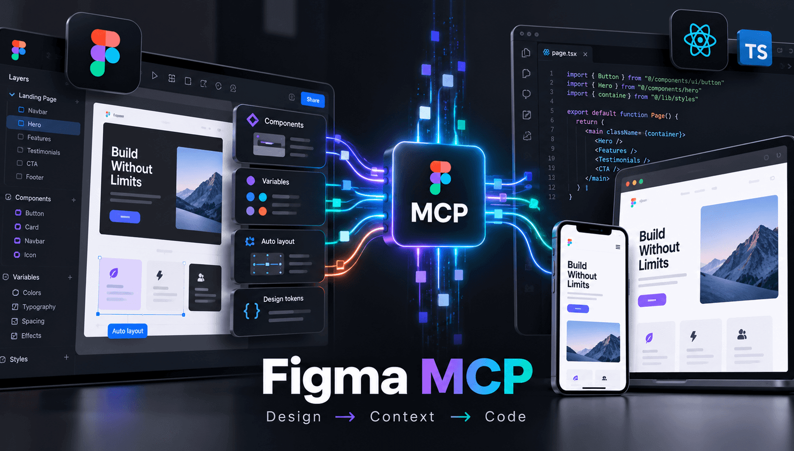
Figma MCP is a tool interface that exposes design context from Figma so an AI or development workflow can read designs, relate them to code, and write changes into Figma. It is not a runtime for games or product UI. The implementation team still maps context into code and runs that code separately.
What is Figma MCP? Figma MCP is a tool interface for working with Figma design context and Figma files inside a connected development workflow. Figma’s documentation describes capabilities for reading designs, writing to Figma, connecting designs to a codebase, and building generative plugins or shaders. The useful mental model is not “Figma exports a finished app.” It is “a connected tool makes design intent available to implementation.”
For a product designer or frontend engineer, that distinction matters. MCP can help expose structure such as components, variables, layout relationships, content, and states. A person or coding agent then interprets that context and maps it to implementation code. The browser, mobile app, game engine, or other runtime executes the resulting code later. In the worked example below, an EmviUI onboarding callout is a design reference for this handoff—not evidence that MCP operated on the actual EmviUI file.
Overview: from Figma context to code
Start with the complete conceptual flow before examining individual actions. Imagine an onboarding callout with a centered white panel, a mint-green mark, a bold “Start using EmviUI” heading, supporting text, four checkmarked benefits, and two actions: a pale “Schedule a call” button and a green “Start now” button with a rocket icon.
- Read: identify the callout’s hierarchy, copy, components, variables, and layout relationships in Figma.
- Interpret: turn those observations into implementation requirements rather than treating them as finished code.
- Map: relate named design variables such as a success color to code tokens and component props.
- Connect: apply the agreed mapping in a codebase or write a design change back into the Figma workflow.
- Run: let the application runtime execute the implementation and verify behavior independently.
The sequence prevents a common category error: design context is information about a product, while runtime behavior is what the product actually executes.
What is Figma MCP: the mental model
Think of MCP as a structured handoff layer between a Figma file and tools that need design information. The Figma file remains the source of design context. MCP exposes relevant context from that file. Implementation code consumes an interpreted version of that context. A runtime then turns code into behavior.
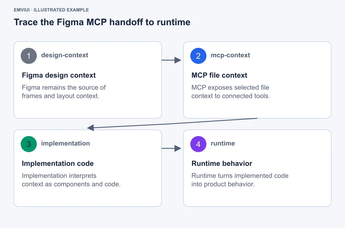
| Stage | What it contains | What it does not mean |
|---|---|---|
| Figma design context | Frames, components, variables, content, states, and layout relationships | Not a running application |
| MCP file context | Context exposed from the Figma file to connected tools | Not automatic proof that every design decision is production-ready |
| Implementation code | Components, styles, tokens, interactions, and data behavior | Not necessarily a one-to-one export of the file |
| Runtime behavior | The product executing the implementation | Not something Figma MCP itself runs |
In the sequence diagram for the callout, the four named nodes are deliberately explicit: Figma design context is gray #6B7280; MCP file context is blue #2563EB; Implementation code is green #059669; and Runtime behavior is purple #7C3AED. The connections are ordered n1 → n2 → n3 → n4. That ordering says MCP exposes context before implementation; it does not say MCP replaces implementation or runtime.
Read the design context
Reading design context means identifying what the interface is made of and how its parts relate. The EmviUI onboarding callout gives a concrete inspection target. Its white rounded panel is centered on a white page, with a mint-green logo above the heading “Start using EmviUI.” The supporting line reads “Start creating amazing apps with EmviUI.” Four checked items state “+1000 components,” “Figma variables,” “Fully customizable,” and “Light & Dark mode.” The bottom row contains a pale “Schedule a call” action with a calendar icon and a green “Start now” action with a rocket icon.
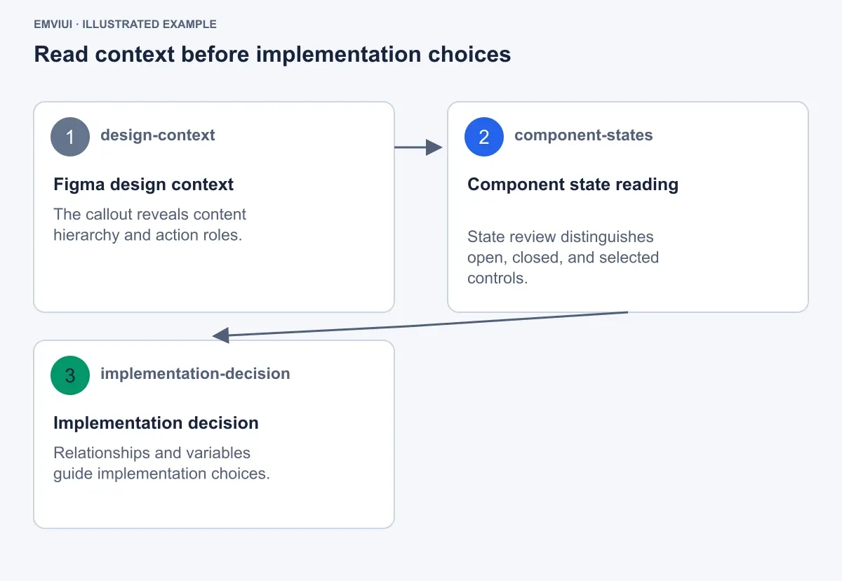
For a handoff, do not describe this only as “a white card with buttons.” Record meaningful structure:
- Content: heading, supporting copy, four benefits, and two action labels.
- Roles: the primary action advances onboarding; the secondary action schedules contact.
- States: each action needs at least enabled, hover, focus, and disabled interpretations if the product supports them.
- Relationships: the logo precedes the heading, benefits support the call to action, and the action row closes the panel.
- Dependencies: colors and spacing should come from named variables or tokens where the system provides them.
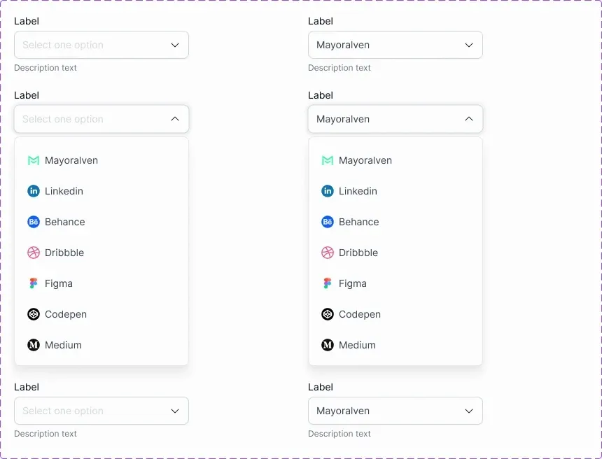
The paired EmviUI select specimen extends the same reading exercise. It shows four labeled select fields arranged in two columns and three rows. Closed controls display either “Select one option” or the selected value “Mayoralven,” with chevrons and “Description text” beneath. Two middle controls are expanded into white menus. Their options include Mayoralven, Linkedin, Behance, Dribbble, Figma, Codepen, and Medium, each paired with a recognizable colored icon. Rounded corners and soft shadows distinguish the open menus. Those details are useful context because an implementation needs to know whether a field is closed, open, selected, labeled, or supported by helper text.
Use a design-system vocabulary while reading. A component name, variant name, variable alias, and content value are not interchangeable. Keeping them separate makes the eventual implementation reviewable.
Map variables and aliases into code
Mapping does not mean claiming that MCP performs a universal, automatic token export. It means making the relationship between a design value and an implementation token explicit enough for a person or tool to inspect.
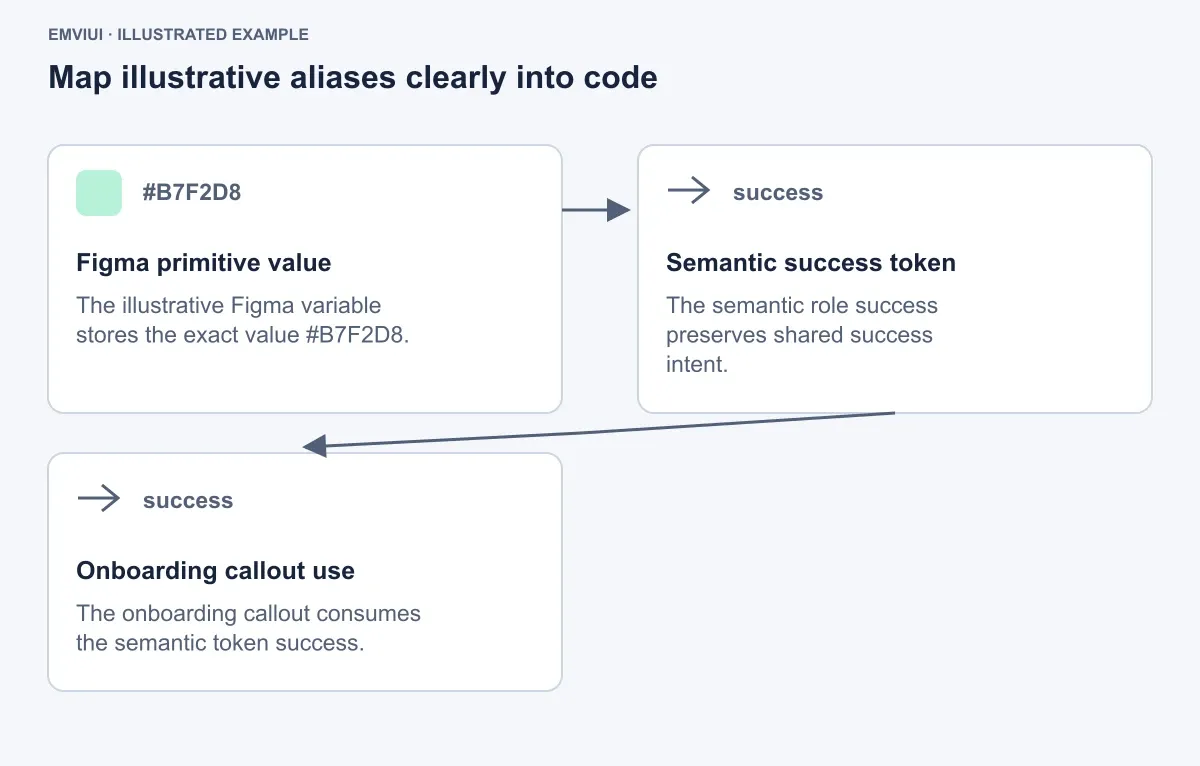
In the worked example, the illustrative token relation has three nodes. The first is Figma primitive value, with the value #B7F2D8 and the same mint color. It connects to the second node, Semantic success token, whose technical name is success and whose meaning is shared success intent. That connects to the third node, Onboarding callout use, which consumes success. All three nodes use #B7F2D8 in the specimen, and the named relationships are primitive value → success → onboarding callout use.
A code-side representation might look like this illustrative mapping:
const tokens = {
  color: {
    success: "#B7F2D8"
  }
};

const
  accent: "color.success",
  primaryAction: "Start now"
};
This snippet is not presented as generated MCP output. It shows the level at which an engineer can preserve intent: the callout consumes a semantic token instead of hard-coding an unexplained color at every usage. If the design later changes its primitive value, the semantic relationship remains visible. If the codebase uses a different naming convention, document that translation rather than silently assuming the names match.
For larger systems, inspect aliases in both directions. Ask which primitive supplies a semantic token, where that semantic token is used, and whether a component state should consume a different semantic role. This is more reliable than copying hex values from a visual surface.
Inspect component states
Design context becomes more valuable when it includes state, not just the default frame. The EmviUI select example makes this visible: a closed field with “Mayoralven” communicates a selected value, while an expanded white menu communicates an open state with options and icon treatment. The same component has different layout and interaction requirements depending on state.
For the onboarding callout, inspect the “Start now” action as a four-state component. The state specimen keeps geometry constant: height 48px, corner radius 10px, horizontal padding 20px, no icon in this button-state comparison, and an icon-size reference of 16px with 12px gap available for icon-bearing variants. The label is “Start now.”
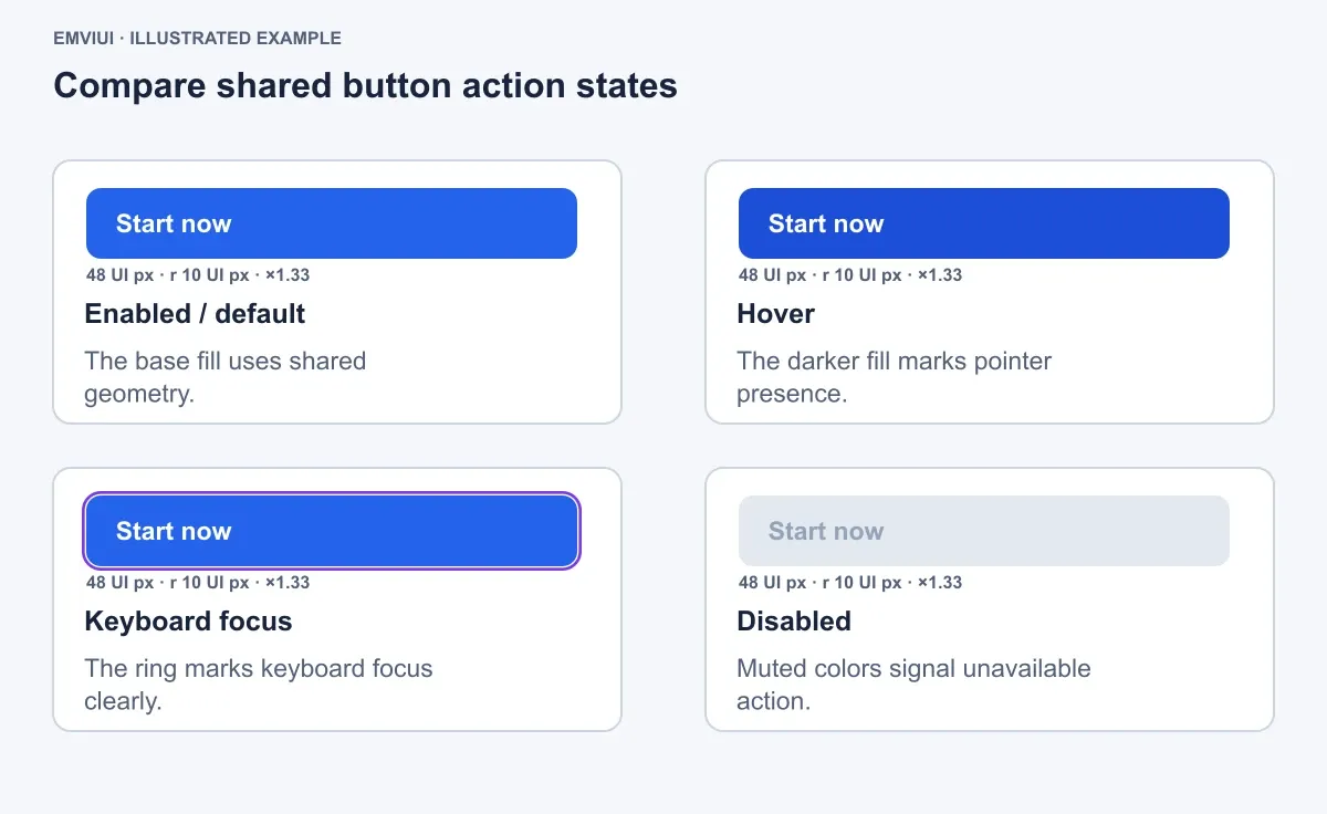
| State | Fill | Text | Required signal |
|---|---|---|---|
| Enabled / default | #2563EB | #FFFFFF | Base action |
| Hover | #1D4ED8 | #FFFFFF | Darker fill marks pointer presence |
| Keyboard focus | #2563EB | #FFFFFF | Focus ring #7C3AED, 2px wide, 2px offset |
| Disabled | #E2E8F0 | #94A3B8 | Muted contrast signals unavailable action |
The exact values are illustrative design specifications for this example, not universal accessibility rules. The point is to expose the implementation questions: does hover alter only fill, does focus add an external ring, does disabled remove interaction, and does geometry remain stable? MCP can provide design context for those questions; the engineer still validates contrast, keyboard behavior, hit area, and application logic.
State inspection checklist
- Identify the component and variant name.
- Record geometry shared across states.
- Record visual differences such as fill, border, text, and focus ring.
- Record behavioral expectations separately from appearance.
- Confirm whether the runtime implementation actually supports each state.
Write or connect a design change
Once the callout’s context and tokens are understood, describe one change narrowly. For example: replace the primary action’s illustrative success-green treatment with the explicit blue action state above while preserving the panel structure, copy, and secondary action. The request should identify the target component, property, value, and scope.

- Target: the onboarding callout’s primary action labeled “Start now.”
- Geometry: preserve 48px height, 10px radius, and 20px horizontal padding.
- State mapping: use
#2563EBby default,#1D4ED8on hover, and a#7C3AEDfocus ring at 2px width and 2px offset. - Content: preserve the “Start now” label and the surrounding four benefit items.
- Destination: either update the relevant Figma design context or connect the decision to the implementation code, depending on the team’s workflow.
Figma’s documentation includes writing to Figma and connecting designs to a codebase among the server’s described workflow areas. That does not remove review. A designer should confirm that the change matches the intended hierarchy; an engineer should confirm that the component API, tokens, focus behavior, and tests remain coherent.
The EmviUI callout is a reference specimen for explaining this request. It is not an MCP result, and the prose does not claim that MCP read or modified that asset. Keeping that distinction visible is important when communicating examples to stakeholders.
Separate context from runtime
The final boundary is practical: Figma MCP supplies design context and Figma-file workflow capabilities, while runtime systems execute product behavior. The supplied Figma documentation describes the MCP server as providing Figma context and being language- and framework-agnostic. Therefore, it is not accurate to describe it as a system that runs a Roblox game or Roblox UI. It also would be inaccurate to claim that a Figma export is a working Roblox interface. Geometry can be a design specification; implementation belongs in Roblox Studio or the relevant product environment.
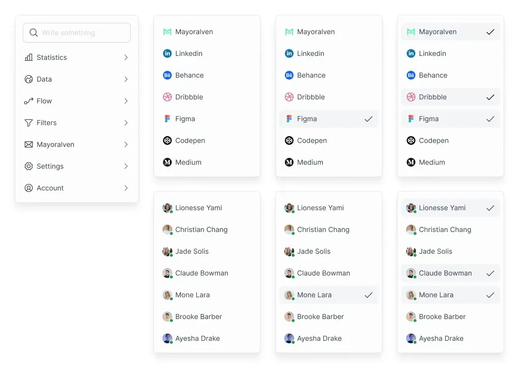
Apply the same boundary to the callout. Figma can describe the panel, variables, labels, action states, and relationships. MCP can make that design context available through its supported workflow. A frontend engineer then writes the component, maps the token names, implements focus and disabled behavior, and connects the action to an application route or service. The browser executes those decisions. None of those later runtime facts should be inferred merely because a design context was available.
A good handoff therefore ends with two separate acceptance lists:
- Design-context acceptance: the callout structure, values, aliases, content, component states, and intended relationships are understood.
- Runtime acceptance: the implemented component renders correctly, responds to input, exposes keyboard focus, handles unavailable states, and passes the team’s product tests.
That is the durable answer to “what is Figma MCP”: a bridge for design context and Figma-file workflows, not a magic export and not a product runtime. Teams get the most value when they preserve the chain from named design intent to reviewed implementation.
References

Pablo Mayoral
Senior UX/UI & Web Designer with 10+ years of experience. Creator of EmviUI (10k+ components Figma design system), UImand, and Vitamin Bootstrap. Currently designing digital products at CQMRewards.