Why Use Sections in Figma: Organize a Focused Design Review
Organize a focused Figma review with clear section boundaries, shared context and deliberate prototype destinations.

Use sections to name and share related canvas areas. Give each area a clear review question, keep screen layout inside frames, and test the links and prototype destinations your collaborators will use.
Use sections in Figma to give related designs a named place on the canvas, share that group with collaborators and make the scope of a review easier to understand. A useful section answers “what are we deciding here?” before anyone opens an individual screen. Use it when several frames need context together.
This guide organizes a proposed member-removal review for Fieldnote, a fictional workspace. The section names, review notes and acceptance checks are recommendations you can adapt. They are not measured productivity results. The goal is a navigable working file, with a clear distinction between exploring alternatives, testing a route and handing off an agreed design.
Give each section one review question
Start with a question that needs a decision. For Fieldnote, use “Member removal / decision review.” Put the member list, confirmation screen and resulting list together. Keep unrelated billing experiments in another area. Reviewers should see the relevant before-and-after context without assuming every nearby design is part of the proposal.
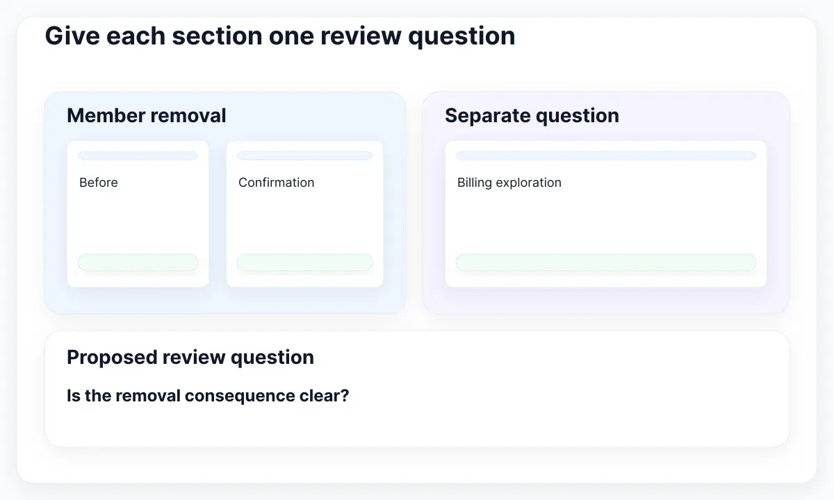
Figma documents sections as labeled areas for organizing related designs. Create the area with the Section tool or select existing objects and choose Wrap in new section. Inspect the Layers panel after wrapping: your intended frames should belong to that section. Visual proximity alone is a poor way to communicate scope.
Write a proposed decision beside the frames: “Confirm whether the person’s name and loss of access are clear before removal.” This is more useful than “Latest designs.” Add the reviewer role and the unresolved issue. Avoid calling an area Approved simply because someone rearranged it. A section label is a navigation aid; your team must define what its status words mean.
Keep screen frames inside a canvas map
Think of the section as the map around the screens. The screen frame still needs its own dimensions, layers and layout decisions. In Figma’s guide to design files, frames and sections serve different organizational purposes. Keep your product interface in frames and use the surrounding section to explain how those screens belong together.
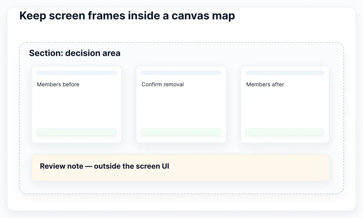
For the exercise, place three screen frames across the review area: members before, removal confirmation and members after. Put supporting notes below them with enough space to distinguish notes from interface copy. A reviewer should never wonder whether “Needs legal review” is text displayed to the customer. If necessary, prefix notes with “Review note.”
Do not try to repair an overflowing dialog by resizing the section around it. Check the screen’s own bounds and its internal layout. The frame bounds and clipping guide addresses that separate task. Use a smaller section when the review scope shrinks, and fewer sections when multiple boundaries add no useful meaning. A tidy map should preserve the actual screen structure.
Build a review set with EmviUI specimens
Use a real component specimen to make the review concrete. The local EmviUI image below shows two modal arrangements: actions alongside each other and actions stacked vertically. It is a visual reference for comparing action placement, not a screenshot of Figma’s Section tool or proof of working modal behavior.
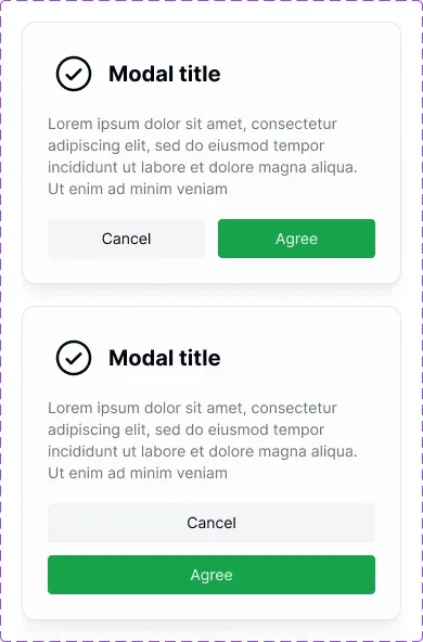
EmviUI provides editable Figma components and screen templates. In your own working file, use suitable kit instances as a starting point for the proposed confirmation screens, then replace generic text with the task’s actual content. For this exercise, write “Remove Mina from Fieldnote?” and explain the intended access consequence. Verify that consequence with the product team before using it in a real design.
Place the two proposed arrangements in the same decision area and label their difference. Ask which arrangement keeps the action labels readable with the longest expected translation. Record the observation, not an unsupported claim that one layout converts better. The supplied image establishes visible structure only; it does not establish native section setup, keyboard behavior or whether a downloaded component already has your desired properties.
Name and share the decision boundary
Choose names that remain useful after the meeting. “Member removal / decision review” describes the task and purpose. “Option 7 final new” describes the author’s editing history. When an option is abandoned, label it as a historical alternative and keep it outside the active review boundary if it could be mistaken for the current proposal.
Select the section and use Share to copy a link to that area, following the documented section-sharing workflow. Test the copied link with a colleague who has the intended file access. Confirm that it opens the right location and that the person can identify the question without asking for a canvas tour. A link is not a substitute for checking access.
Send the link with a short written request in your normal review process: “Review the removal wording and action arrangement; billing permissions are outside this decision.” Include an owner and a due date when the task needs them. Do not depend on pastel background colors to convey status: the section title and note should still explain the task when the color distinction is missed.
Make a section reviewable without a tour
Give the review area a small reading order. At the top, state the question. Below it, show the proposed screens. At the bottom, list unresolved points and the evidence still needed. This arrangement is an editorial recommendation for the exercise, not a Figma requirement. It helps a late-arriving reviewer separate what they can decide now from work that remains open.
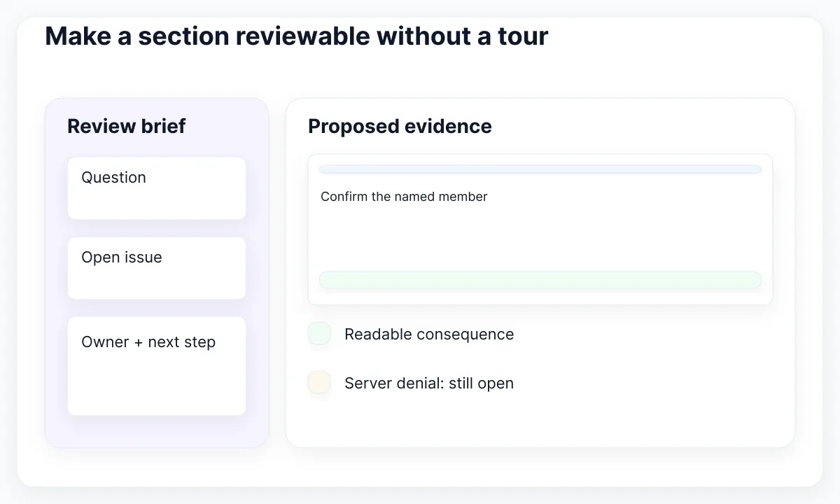
Use concrete review prompts. Can the reviewer identify the member being removed? Does cancel preserve the current situation in the proposed route? Is the resulting screen consistent with the stated consequence? If the answer depends on implementation, write a verification task for that implementation instead of treating a static frame as evidence.
Keep component-library browsing separate from this product decision. Figma’s portfolio lesson demonstrates sections for organizing main components; that is useful on a component page. In our review area, show the instances needed for the decision. For reusable configuration questions, continue with the component content-contract guide. Reviewers need the smallest complete set of evidence, not every possible library variant.
Use section destinations deliberately
A section can also be a prototype destination. Figma documents returning to the last-visited frame within that section. Use this deliberately when a route should return to the place the person came from. It changes the meaning of the connection compared with always targeting one specific screen.
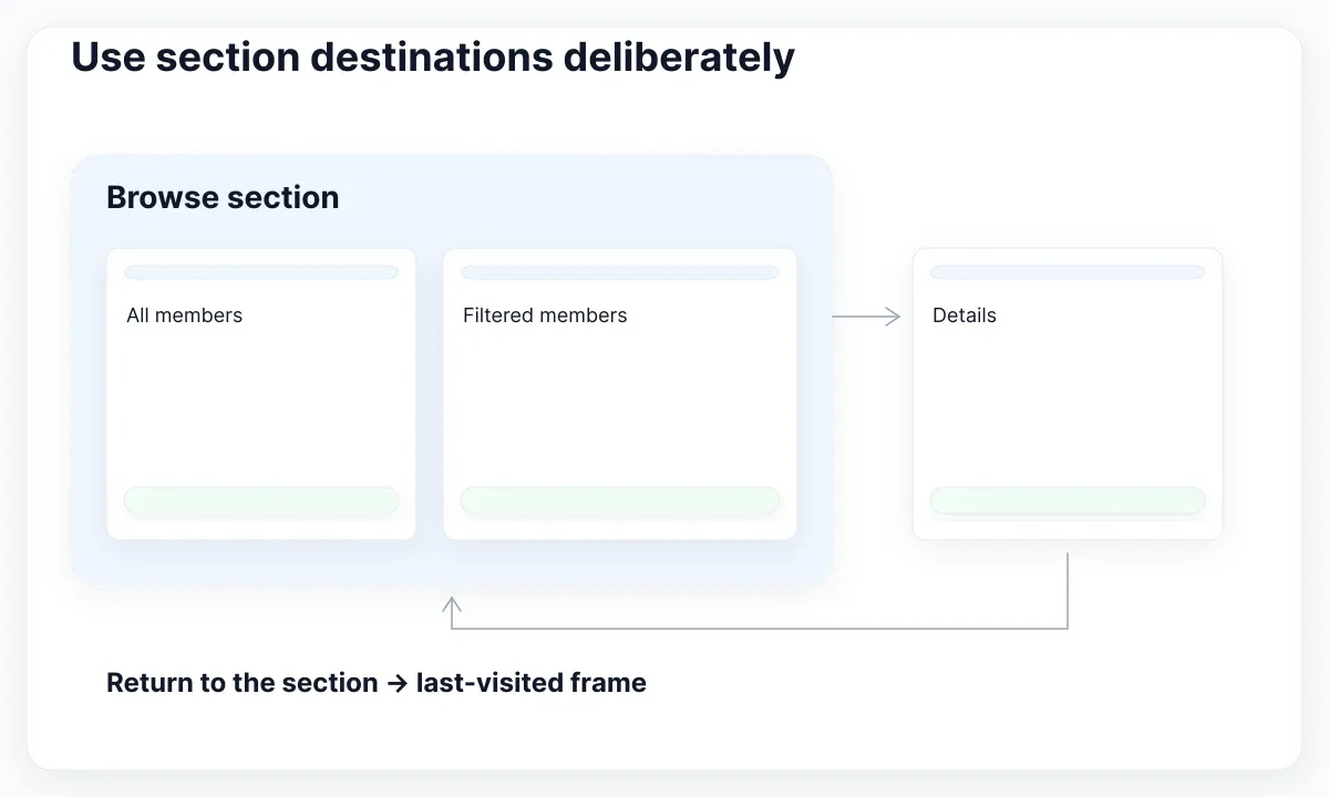
For a proposed directory exercise, create a Browse section with an all-members frame and a filtered-members frame. Visit the filtered frame, go to a separate details area, then use a return connection targeting Browse. Observe which frame appears. Repeat after visiting the all-members frame. Record both paths; a single successful click does not explain the behavior.
Keep a fixed-frame destination when the review requires a specific screen regardless of previous navigation. Prototype flows have their own starting points and share links; naming a canvas section does not replace configuring a test entry. For a wider task-based testing plan, use the prototype recovery examples. In this article the section’s job is to group and target the relevant area; it does not implement navigation history in your production application.
Separate readiness from approval
Use a separate readiness check before handing an area to developers. Ask whether wording, narrow-width examples and known exceptions are sufficiently clear for the specific implementation task. If an issue remains open, name it. A well-organized section can still contain an incomplete design, and a complete design may still need engineering validation.
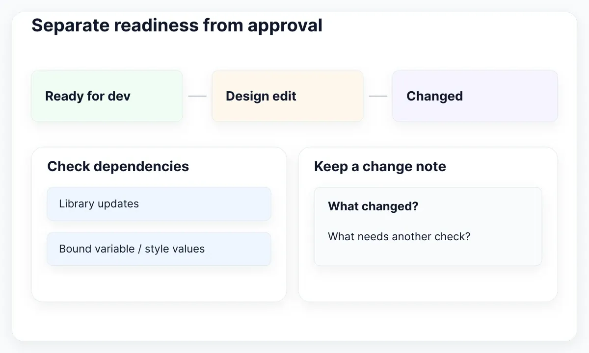
Dev Mode statuses and notifications have plan and seat requirements. Check your team’s current access before depending on that workflow. Figma also documents exceptions to automatic Changed detection, including updates from a shared library or changes to already-bound variable and style values. Do not treat the absence of a Changed indicator as proof that every dependency stayed identical.
For our proposed review, keep a short handoff note: “Member name wraps; confirm remains explicit; server denial still needs an implementation test.” Link the active section and identify the relevant design checkpoint in the team’s records. Marking readiness communicates a stage of work. Approval of wording, completion of code and observed accessibility behavior need their own evidence.
Distinguish webpage content from canvas organization
A webpage section and a Figma canvas section solve different problems. The EmviUI specimen below shows a content listing with a featured article, a card grid and a later group of posts. These are visible parts of a proposed webpage, not evidence that the file contains native Figma sections.
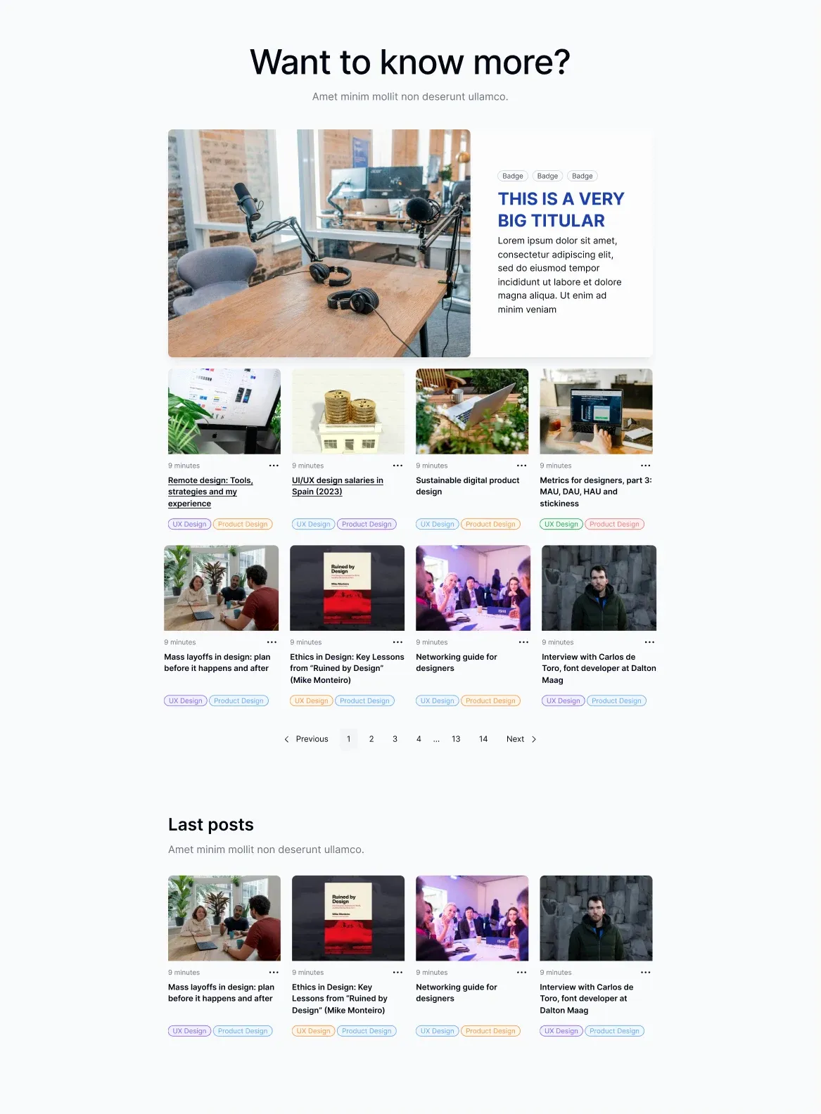
If your next review concerned that page, keep its design inside a screen frame. You could place the full frame and a narrow-width alternative in one canvas section named “Content listing / reading order.” The review question might be whether the featured story, list and pagination remain understandable together. Do not wrap individual website headings in canvas sections to simulate the page layout. Use the section boundary to collect the evidence for the decision, while the frame and its internal layout continue to describe the website.
Maintain the map after the meeting
After the meeting, resolve the map as well as the comments. Update the decision note, record what changed and identify the next reviewer. Move rejected alternatives only when their location is likely to confuse people. Keeping a small, clearly labeled history can be useful; leaving several apparently current proposals usually makes the next review harder.
For Fieldnote, suppose the team chooses stacked actions only at the narrow layout. Record that decision beside both frame examples and state which question remains open. Do not rewrite the section title to claim the full removal flow is complete if the server-denial state still needs design. Names should describe the scope people can actually rely on.
Before reorganizing a heavily shared area, open the important links and test the prototype routes you intend to preserve. Use a safe working copy for structural experiments when the file is active. The useful outcome is continuity: reviewers can find the current proposal, understand why it changed and reach the right evidence without searching through disconnected screenshots.
Check whether sections are helping
Test the file with a colleague who did not arrange it. Ask them to find the active member-removal proposal, explain the decision being requested and locate the unresolved issue. Watch where they hesitate. Rename or merge areas when the boundaries force extra explanation. Avoid measuring success by the number of colored containers on the canvas.
- Confirm that the relevant screens belong to the intended section in the Layers panel.
- Read the title and note without opening a screen. They should explain the task and unresolved question.
- Open the copied section link with the intended file access and confirm its destination.
- Test prototype return paths from different previously visited frames, when the review uses section destinations.
- If handoff depends on Dev Mode, confirm access and status meaning with the people receiving the design.
For a small exploration with one frame, a section may add little. Add structure when it helps someone understand several designs together. The strongest reason to use sections is a clearer shared decision: people can find the proposal, see its context and tell what still needs work.

Pablo Mayoral
Senior UX/UI & Web Designer with 10+ years of experience. Creator of EmviUI (10k+ components Figma design system), UImand, and Vitamin Bootstrap. Currently designing digital products at CQMRewards.