How to Fix a Frame in Figma: Bounds, Clipping and Export
Identify the selected container, confirm its children, test clipping on a duplicate and preview the intended export target. Separate frame geometry from proportional scaling and downstream image display.

Identify the selected container, confirm its children, test clipping on a duplicate and preview the intended export target. Separate frame geometry from proportional scaling and downstream image display.
To fix a frame in Figma, first identify the actual container and the symptom: wrong bounds, missing content, unexpected resizing or an incorrect export. Check layer nesting before changing dimensions, inspect clipping before moving supposedly missing objects, and preview the exact export selection before rebuilding the design. A frame is a container with its own geometry; its visible contents do not always describe that geometry.
Use the following diagnostic workflow on a duplicate of the affected screen. We will work through a login-page example with a form card, an illustration region and a page shell. The suggested checks are an editorial troubleshooting method, not a claim that Figma has one universal frame-repair command. Record the expected width, height and visible content before making changes so you can tell whether a repair actually resolved the problem.
Identify the frame you are changing
Select the object from the Layers panel and read its type and name before dragging an edge. A card surface, a group of fields and the outer page may overlap visually while representing different objects. A selection mistake can look like a broken frame when you are simply editing the wrong boundary.
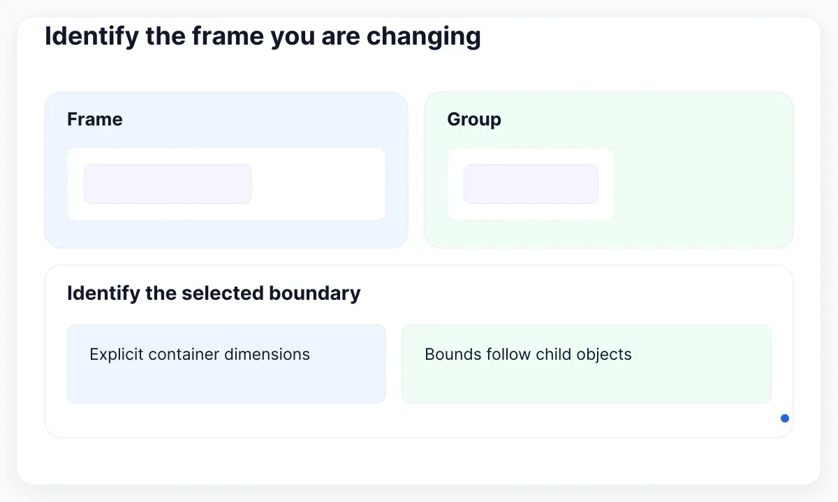
Figma’s frames and groups guide explains that a group’s bounds follow its children, while a frame has explicitly set dimensions. If moving a small label makes the selected boundary expand, verify that you selected a group. Converting or recreating a container should be a deliberate structural choice, not the first response to a confusing selection.
Rename the relevant containers in your working copy: Login page, Form card and Illustration. Expand each one and trace the layer that looks wrong. Your names should describe their jobs, even if your production naming convention differs. Keep a screenshot of the original arrangement so you can compare it with the modified version without relying on memory.
Create a small symptom note: “The form card is correct, but the outer page export includes too much space on the right.” That directs investigation to the page geometry and export target. “The help message is present in Layers but disappears below the card” points toward visibility and bounds. Distinguishing those observations prevents a sequence of unrelated edits that makes the original problem harder to reproduce.
Confirm nesting before changing bounds
An object can sit visually above a frame without being its child. Check the indentation in Layers rather than assuming that everything inside a screen-shaped rectangle belongs to the screen. This matters when moving, resizing or exporting the container: the intended content must have the intended relationship.
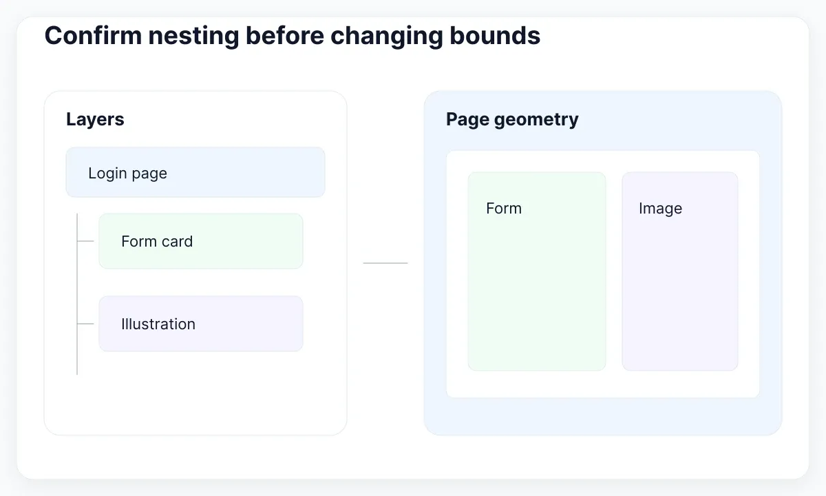
The official parent, child and sibling guide describes reparenting and notes that object size influences automatic parenting when you move objects on the canvas. A large illustration may not be nested where you expect. In your duplicate, identify its current parent and explicitly place it under the intended container in Layers, then compare its position before and after the move.
Use a three-object test before reorganizing a large page. Select the form title, its card and the outer page in turn. Write down which object should own the title and which should own the card. The same logic applies to a dashboard chart inside a panel inside a page. You are testing membership, not just visual proximity. Do not flatten an entire screen to make its layer tree look simpler.
After correcting membership, select the parent and make a small reversible movement in the working copy. Check whether the expected children travel with it, then undo the move. Inspect any object that stayed behind. This is a practical confirmation step rather than a substitute for reading the tree. Keep the test small enough that you can distinguish a membership problem from an accidental movement of another layer.
Separate cropping from missing content
A clipped child has not necessarily been deleted. Inspect the child’s position and the bounds of its ancestors before creating a replacement. For example, a supporting message below a form can exist in the file but fall outside the card or page boundary that currently determines what is visible.
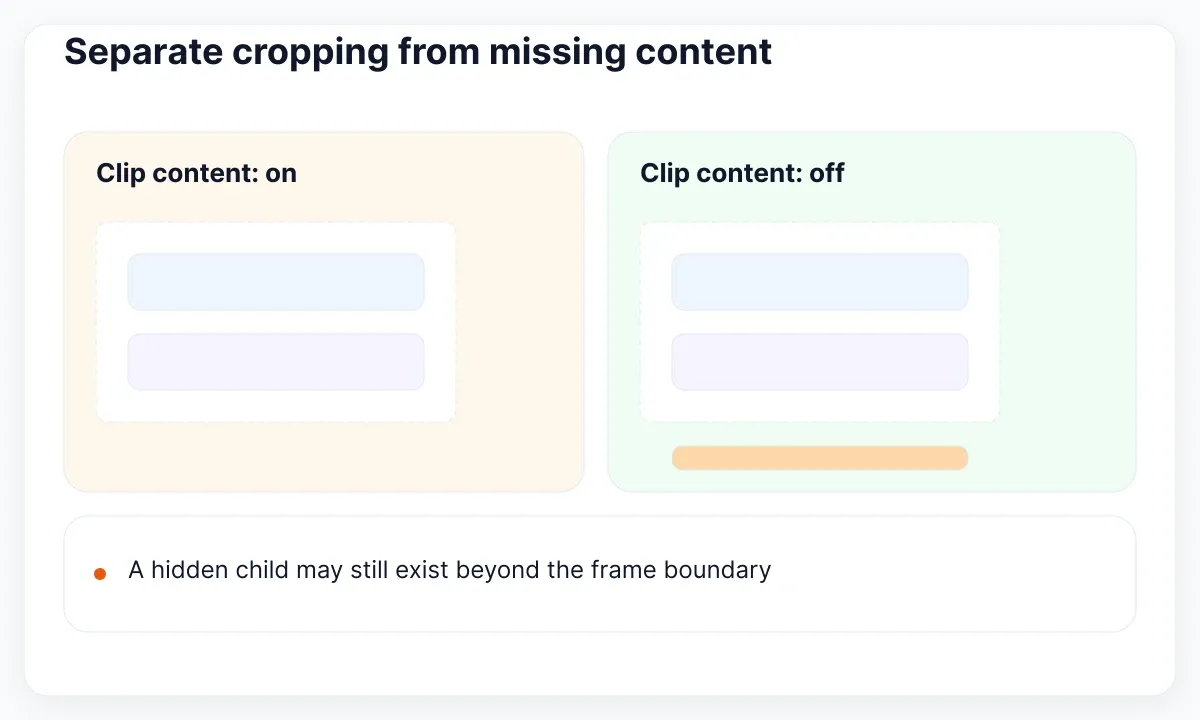
Figma’s frame documentation defines Clip content as hiding child content beyond the frame’s bounds. In the duplicate, toggle that setting on the suspected ancestor and compare the result. If the object becomes visible, you have evidence about the clipping boundary. Next decide whether the frame should grow, the child should move, or the crop is intentional.
Do not leave clipping off merely because it reveals a missing button. For a card with a deliberately cropped illustration, overflow may be part of the intended composition. For a required form message, hiding the message is usually a design defect to resolve. State the desired behavior in the repair note: “The message remains inside the card after copy expansion” is a testable outcome; “Looks fine now” is not.
If changing one ancestor does not explain the symptom, trace the selected child upward through the next container. Change one setting at a time and restore it when the test is uninformative. This keeps the diagnostic result interpretable. Also verify that you are looking at the intended design state rather than another duplicated screen with a similar name. The goal is to locate the boundary responsible for the symptom.
Choose resizing instead of accidental scaling
Decide whether you want a different container size or a proportionally larger version of the whole design. Those are different editing operations. A login page made wider for review should not automatically acquire larger labels, thicker strokes and enlarged controls just because you want more room beside the form.
Figma’s Scale tool guide says scaling preserves proportions and scales properties such as strokes and blurs. Use that deliberately for a proportional asset change. For layout investigation, select the intended frame and inspect its width and height instead. In a copied example, compare what happens to a button label when the outer container changes: it should follow your intended layout rule, not an accidental tool choice.
If Auto Layout is involved, inspect the parent and child settings together. The auto layout documentation distinguishes fixed dimensions, Hug contents and Fill container. Diagnose which layer owns the unwanted dimension before changing the entire hierarchy. The dedicated Fill Container guide develops that sizing workflow; here, use it only after confirming the frame and its membership.
Avoid turning this check into a full responsive redesign. Reproduce the reported symptom at the original size, make one correction and test a second review size. If that reveals a separate layout weakness, record it separately. A clear repair should explain both why the original result failed and what changed. Enlarging everything until the screenshot appears balanced does not establish a reliable container rule.
Use an EmviUI screen to inspect boundaries
The EmviUI login-page specimen below is a useful visual exercise because the form card, illustration region and overall page have different extents. Identify each visible region before inspecting the corresponding layers in your working file. The image demonstrates composition; it cannot reveal nesting, clipping settings or export configuration.
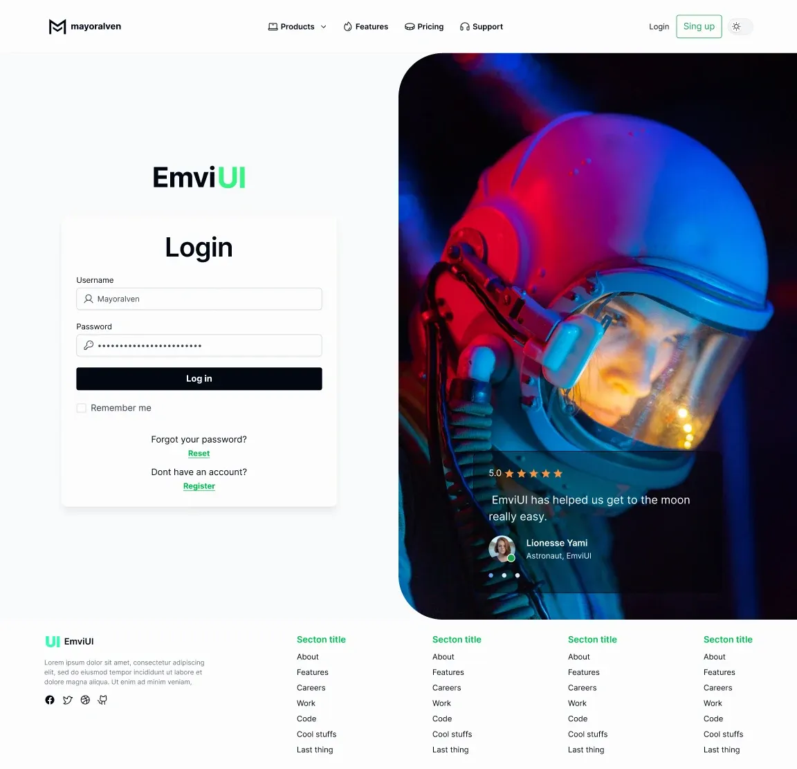
The live EmviUI catalogue provides Figma components including inputs, buttons and cards that can supply realistic content for a diagnostic page. Use approved components rather than anonymous rectangles when testing whether longer labels still fit. The screenshot’s illustrative copy and decorative content are not evidence of a live login service or product performance. Verify the actual component file before making claims about its internal layout behavior.
For a concrete exercise, keep the form card unchanged and draw the intended page boundary in your duplicate. Compare three selections: the card alone, the illustration region and the outer page. Predict what each export should include, then preview it. That comparison makes it easier to recognize when you selected a child container instead of the complete deliverable. Use the responsive web-design walkthrough when you want to turn the corrected structure into a broader page design.
Change the supporting form copy to a realistic longer message and repeat the boundary check. This is more informative than testing only the original short labels. Record any content that crosses the card boundary and decide whether the card should grow or the layout needs a separate adjustment. Do not infer a specific failure from the pool image itself: it is a reference specimen, not a screenshot of a broken Figma file.
Preview the exact export target
When the canvas looks correct but the file looks wrong, inspect the selected export target and its configuration. The page frame, a nested card and a slice can describe different output regions. Choose the object that represents the requested deliverable before changing the source design to compensate for a mistaken selection.
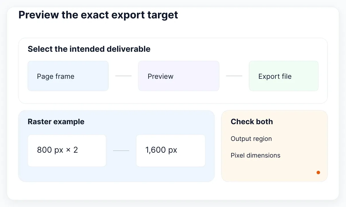
The static export guide documents exporting selected objects and using a slice for a defined canvas region. It also provides an export preview. Select one target at a time, preview it, and compare the visible edges against your expected result. For a handoff screenshot, agree whether the deliverable includes the full page, one panel or a specific cropped region.
Check scale and format separately from composition. Figma’s export formats and settings guide explains multipliers and fixed-width or fixed-height export sizes. As a simple arithmetic example, an 800-pixel-wide raster target at 2x produces 1,600 pixels of output width. Increasing resolution does not repair an incorrectly selected region. Keep your test export’s dimensions and filename in the repair note so another person can reproduce the check.
Inspect the actual exported file after the preview. Verify its pixel dimensions, visible content and intended background in an image viewer. A file can be sharp and still be the wrong crop. If the problem exists only in a destination application, compare that application’s display dimensions with the exported file’s dimensions before editing the Figma frame again. Separate source geometry from downstream display behavior.
Close the repair with a reproducible check
A useful repair record contains the affected frame, the original symptom, the changed property or relationship, and the verification result. For example: “The illustration was a sibling of Login page. It now belongs to that page, and the selected-page preview includes both the form and illustration.” That describes a concrete cause and outcome.
| Symptom | First check | Evidence to retain |
|---|---|---|
| Boundary follows a moved label | Frame versus group | Selected layer type |
| Visible content is absent from the container selection | Parent membership | Layer tree before and after |
| Content disappears at an edge | Ancestor clipping and bounds | Controlled visibility comparison |
| Export has the wrong region | Export target and preview | Actual file and dimensions |
If the reported problem happens only during prototype scrolling, record that distinction and move to the position and scrolling diagnostic guide. The workflow here establishes container geometry, membership, visible bounds and export selection. End by returning to the original reproduction and confirming that the same steps now produce the intended result. Keep the working copy until the person reviewing the repair can repeat the verification.

Pablo Mayoral
Senior UX/UI & Web Designer with 10+ years of experience. Creator of EmviUI (10k+ components Figma design system), UImand, and Vitamin Bootstrap. Currently designing digital products at CQMRewards.