Set Up Auto Layout Fill Container: Nested Buttons, Text & Icons
A practical sizing guide for buttons, fields, and nested components that must handle longer content and narrower frames.

Use Hug for frames that should follow their contents, Fill for children that should use space offered by an Auto Layout parent, and Fixed for dimensions with a real constraint. Add min/max bounds where needed, test long and localized text, and verify the resulting behavior in code at narrow widths.
To make nested buttons, text, icons, and variable-length content resize well in Figma, give each frame a clear job: use Hug contents where the component should follow its content, Fill container where a child should take the space its parent offers, and Fixed only where the dimension has a real product constraint. Then add min/max bounds where expansion needs a limit, check the parent-child sizing chain, and test long labels at narrow widths. Auto Layout provides responsive design behavior on the canvas; it does not decide your breakpoints, guarantee a usable mobile layout, or generate production CSS by itself.
This guide walks through a reliable setup for a button inside a toolbar, a card with flexible text, and a form row that must survive localization. It also shows what to inspect when Fill container disappears, a parent stops hugging, or a layout looks fine in one frame and breaks in another.
Build the frame tree around content
Start with the smallest meaningful object, then add its containers. For a button with an icon and label, make the icon and text siblings inside a horizontal Auto Layout frame. Give that frame horizontal and vertical padding, a gap, and a Hug width and height. If the label changes from “Save” to “Save changes,” the frame should grow around it while preserving its padding. Figma’s button lesson demonstrates this behavior and calls out longer labels and translation as useful checks.
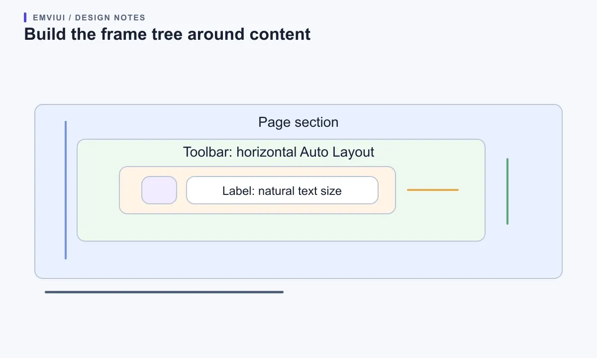
Keep the icon’s dimensions fixed if its drawing should not stretch, and center it on the text’s visual line. Let text use its natural height; a fixed-height label can clip when the font, line height, or language changes. The outer button can itself be a child in a toolbar frame. In that relationship, the button may Hug its contents while the toolbar controls the button’s position and spacing. Each layer has one sizing responsibility, which makes debugging easier.
Auto Layout follows the frame tree, not the visual impression of a screenshot. A layer that looks centered may be positioned absolutely; a row that appears evenly spaced may use a fixed gap. Before changing sizes, inspect the layer panel and identify which frame is the layout parent. Apply Auto Layout to that parent, then check direction, alignment, spacing, and padding. Figma’s guide covers horizontal, vertical, and grid flows, plus wrap behavior.
Choose Hug, Fill, or Fixed by responsibility
Think of the three sizing choices as a contract between a layer and its parent. Hug means “measure my contents and wrap around them.” Fill means “use the remaining space my Auto Layout parent provides.” Fixed means “keep this dimension at the value I set.” They are not quality levels, and no one setting should be applied to every nested layer.
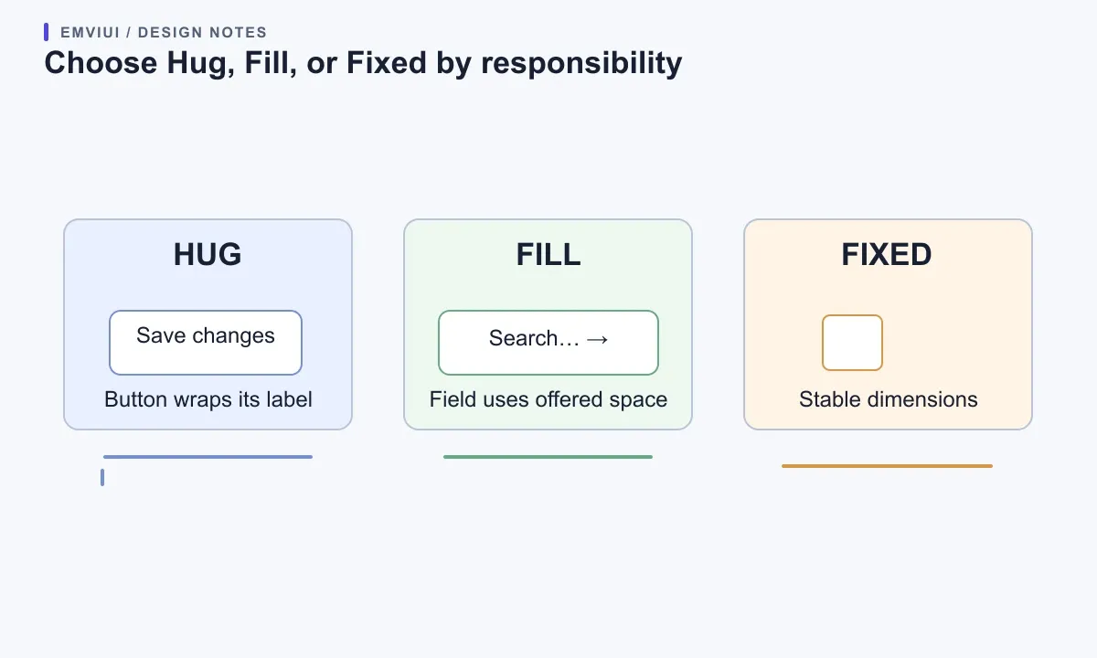
For a call-to-action button in a toolbar, Hug usually preserves a compact control. For a search field beside that button, Fill can use the remaining horizontal room while the button stays Hug. For an icon, a thumbnail, or a control that must meet a known dimension, Fixed can be appropriate. A card title may Hug vertically, while the card’s text column fills the card’s inner width. The right combination follows the content and the parent’s job.
Fill only applies to children of Auto Layout frames, and Figma’s current guide says a parent cannot Hug on an axis when a child fills that same axis: the parent becomes Fixed there. This is a common source of confusing resizing menus. When a choice is missing, trace upward and ask whether the child is inside an Auto Layout parent and whether the parent has a determinate size on that axis. Do not solve the symptom by forcing a random fixed width; first make the sizing chain coherent.
Set up the frame tree before tuning the details
Use a vertical outer frame for a page section, a horizontal frame for a toolbar, and a smaller horizontal frame for each icon-and-label control. This structure makes it possible to change the page width without manually moving every child. The Figma controls shown below are from the local EmviUI content pool and illustrate the Auto Layout sizing and spacing panel used during this setup.
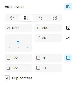
When the hierarchy is clear, set each parent’s width behavior before tuning child widths. A section may Fill the page frame; a content container inside it may have a maximum width and remain centered; a toolbar may Fill that container; and its search field may Fill the free space between fixed or Hug controls. This separates page-level responsiveness from component-level behavior. Avoid adding extra nested frames solely to imitate visual spacing when the parent’s padding or gap already describes the relationship.
Figma’s responsive-page tips recommend Fill for sections that should track a parent and min/max widths where content must not grow without limit. That guidance is written for Figma Sites, so treat its examples as canvas design principles rather than a guarantee about how your own coded layout will behave.
Make text and icons survive variable content
Variable-length text is the best stress test for a flexible component. Try a short label, a realistic long label, and a translation that is substantially longer than English. For a button that should grow with the label, let the inner frame Hug and preserve consistent padding. For a form field, let the field expand within its parent while the label can wrap or move above it. Avoid fixing the width to the first sample string. A UI that only fits the shortest copy has not been designed for real content.
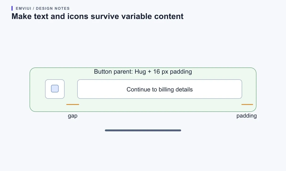
Separate the text box from its background shape when the shape needs to follow content. In Auto Layout, the parent frame can own the fill, border, radius, and padding; the text remains a child. This is more reliable than stretching a decorative rectangle behind an unrelated text layer. If an icon sits next to text, keep its size fixed and define the gap in the parent. If the icon is optional, test both versions so the remaining text does not inherit a stale manual offset.
Use minimum and maximum dimensions as guardrails, not as substitutes for layout. A field can fill available space down to a sensible minimum, then move to a stacked arrangement when the parent becomes too narrow. A content column can fill on a phone but stop growing on an ultrawide canvas. Figma’s Auto Layout guide documents minimum and maximum dimensions alongside Hug, Fill, and Fixed. Choose values from the actual component use case and test the transition, rather than choosing familiar device widths by habit.
Compose responsive rows without overfitting breakpoints
Test the component at the widths where its behavior changes, not only at standard phone and desktop presets. A toolbar might keep its search field beside a button at a wide width, then stack controls when the search field reaches its minimum usable width. A form row might show label and input side by side in a roomy panel but move the label above the input in a narrow panel. The useful breakpoint is where the task becomes cramped, not a number copied from another product.
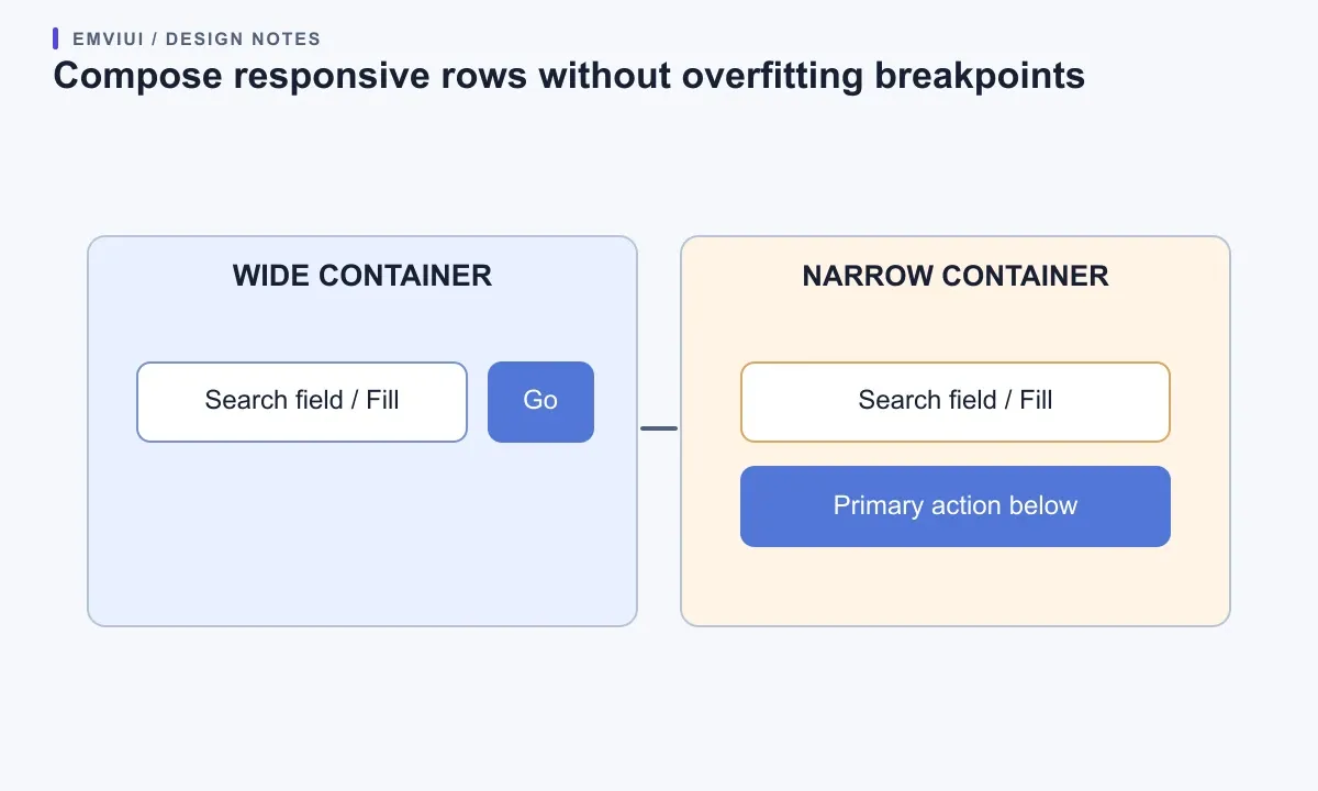
Auto Layout can distribute and wrap children, but wrapping alone does not guarantee a good hierarchy. If a row of actions wraps into a second line, consider whether the order still makes sense and whether the primary action remains easy to find. If the layout changes to a column, check reading order, alignment, and touch spacing. For more structured layouts, Figma’s Grid Auto Layout may model rows and columns more clearly than a long chain of nested horizontal frames; choose the flow that describes the actual relationship.
A design frame is a prototype of responsive behavior. Your web implementation still needs CSS constraints and breakpoints that match its content. In CSS Flexbox, items can grow or shrink according to their basis and available space, and their minimum content size can affect the result; see MDN’s Flexbox explanation. During handoff, record which elements may shrink, which should wrap, and where the structure changes. The Figma-to-Tailwind workflow is a useful next read for mapping a design decision into maintainable frontend code.
Check the failure modes in the parent-child chain
If a child will not Fill, confirm that it is nested inside an Auto Layout frame and that the parent has available space on the relevant axis. If a parent unexpectedly stops Hugging, inspect its children for Fill on that axis. If a label clips, check the text layer’s width and height behavior, then inspect whether an ancestor has a fixed height or clips content. If a gap looks inconsistent, make sure it is owned by the parent’s spacing rules rather than a mixture of gap and manual child positioning.
When an icon, text, and button background drift apart, reduce the problem to one small component and test one change at a time. Temporarily lengthen the label; hide the icon; increase the frame width; then narrow it. Observe which boundary fails first. A useful debug order is child sizing, parent sizing, padding and gap, then constraints higher in the frame tree. This prevents “fixing” a child that is correctly responding to an incorrectly sized ancestor.
Also distinguish a design-canvas issue from an implementation issue. Figma Auto Layout defines how design layers resize; it does not automatically ensure that a React component has the right flex rules, intrinsic sizing, or mobile interaction. If the Figma frame is sound but the browser differs, compare the coded container and child constraints with the design contract. The handoff should explain intent, not just copy dimensions.
Validate narrow layouts and accessible reflow
Check the finished screen at a narrow viewport and at enlarged zoom. WCAG 2.2’s Reflow criterion expects most vertically scrolling content to fit a width equivalent to 320 CSS pixels without requiring two-dimensional scrolling; there are exceptions for content whose meaning requires a two-dimensional layout. Read the W3C understanding document for the criterion and its limits. This is a web-content requirement, not a claim that a Figma frame by itself is conformant.
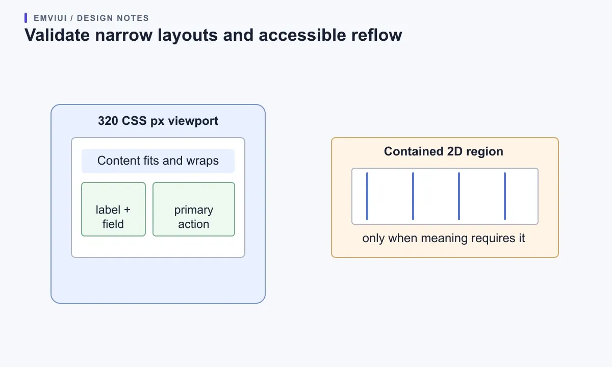
For ordinary forms and toolbars, test whether labels wrap, fields remain usable, controls stay visible, and the reading order still makes sense. Do not shrink text until it fits. If a table or other genuinely two-dimensional control needs horizontal scrolling, keep that region intentional and contained, while surrounding content reflows. Check focus order in the coded page as well: a visually rearranged layout should not create a confusing keyboard sequence.
Use EmviUI as a set of examples for component anatomy, then apply the sizing rules to your own task. Its component library includes buttons, inputs, navigation, cards, and other interface patterns that can help a designer compare component shapes and states. A Figma kit can speed up the visual starting point; you still need to choose the layer hierarchy, test localized content, and verify the resulting CSS and accessibility in the product.
Run a repeatable resize test before handoff
Make a small test matrix rather than relying on one “looks good” frame. Include the intended wide layout, the narrowest expected container, a long text case, a missing optional icon, and a localized label. Resize the parent through the point at which the layout should change. Check the component’s minimum and maximum behavior, then compare with the coded result at the same constraints. Record the expected state at each point: side by side, wrapped, stacked, or horizontally scrollable.
For a button, verify that Hug keeps padding stable as the label changes. For an input beside an action, verify that Fill consumes only the offered space and does not push the button outside the frame. For a card, verify that content wraps before the overall component overflows. A design system should define these behaviors once for shared components, but product screens still need realistic content and their own responsive composition.
For more on organizing component states, see Figma variants for interface states. For a complete screen exercise, continue with a responsive landing page in Figma. If the next step is implementation, use the Figma-to-Tailwind handoff workflow. Together these guides cover neighboring tasks; this article’s focus remains the sizing contract inside Auto Layout.
Frequently asked questions

Pablo Mayoral
Senior UX/UI & Web Designer with 10+ years of experience. Creator of EmviUI (10k+ components Figma design system), UImand, and Vitamin Bootstrap. Currently designing digital products at CQMRewards.