Figma for Web Design: Build a Responsive Landing Page
Figma for web design, explained through a responsive EmviUI landing page workflow with Auto Layout, tokens, components, states, and QA.
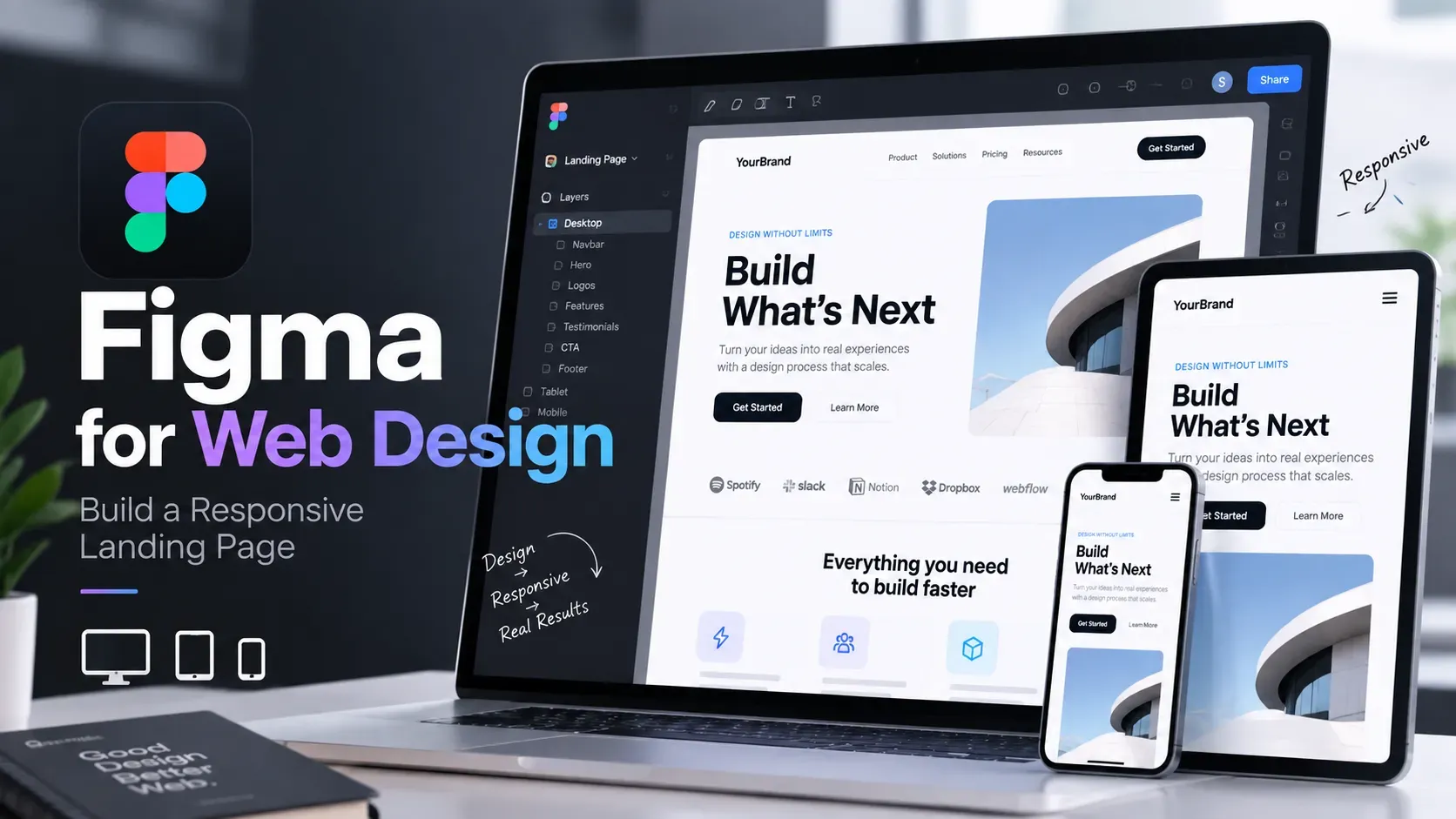
Use Figma for web design by building a responsive page as nested Auto Layout frames, then connect spacing, color, and component states to reusable tokens. This tutorial constructs an EmviUI marketing page with benefits, customer cards, an email form, CTA, and notification card across desktop and mobile widths, ending with a practical verification checklist.
To answer “how to use Figma for web design,” do not begin by drawing isolated rectangles. Begin with a page structure that can survive different viewport widths, copy lengths, and interaction states. In this tutorial, the concrete outcome is a responsive EmviUI marketing page: a “Why EmviUI?” benefits section, customer-list cards, an email field, and a dark “I want the kit” CTA.
The finished reference uses a white page with green, charcoal, and blue content panels. On desktop, the main frame is 1440px wide with 32px page padding, a prominent benefits area, alternating content blocks, and a card group. On mobile, the same content becomes one vertical column. The visual goal is not to reproduce a screenshot mechanically; it is to model the relationships so a developer can implement the page without guessing.
Keep the working file organized into four pages or sections: Exploration, Layout, Components, and Prototype. Name frames by purpose rather than appearance: Marketing / Why EmviUI, Section / Benefits, and Card / Customer are more useful than Frame 12.
1. Inspect the target before opening Auto Layout
First, describe the page as a hierarchy. The reference composition has a page shell, a navigation or introductory region, a “Why EmviUI?” section, benefit copy, customer cards, an email capture area, and a CTA. The desktop version can place text beside an illustration or card group. The mobile version should preserve reading order rather than squeeze both columns into unusable widths.
For the worked example, create two top-level frames:
- Desktop / 1440: width 1440px, height 1748px, white fill.
- Mobile / 390: width 390px, height 1200px as an initial working height, white fill.
Inside each, use a page content frame with 32px left and right padding on desktop. For the mobile example, use 20px horizontal padding. The exact values are illustrative; their purpose is to make the responsive decision visible. The desktop content width is therefore 1376px, while the mobile content width is 350px.
Write the content order before styling:
- Intro label and “Why EmviUI?” heading.
- Supporting paragraph and three checkmarked benefits.
- Customer-list or feature card group.
- Email field and dark “I want the kit” button.
- Supporting sections such as “Comprehensive Component Library,” “Light & Dark Mode,” and “The Power of Figma Variables.”
This is the first responsive test. If the order is unclear in the layer panel, it will also be unclear in implementation. A useful Figma UI design tutorial can supplement the interface basics, but this workflow focuses on turning a page composition into a resilient layout.
2. Build Figma for web design with responsive containers
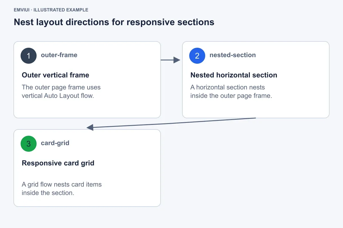
Auto Layout is the structural engine for this page. Figma documents that Auto Layout makes frames respond dynamically to content changes; you can add it by selecting layers and using Shift + A or the sidebar command. Use vertical flow for stacked page content, horizontal flow for side-by-side groups, and grid flow for repeated cards.
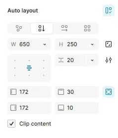
Start at the outside and work inward. Select the desktop content frame and apply vertical Auto Layout. Set its width to Fill container inside the desktop frame, its height to Hug contents, and its horizontal padding to 32px. Set the vertical gap between major sections to 64px. On mobile, keep vertical flow, change horizontal padding to 20px, and reduce the section gap to 48px.
Now create the hero or intro group as another vertical frame:
- Width: Fill container.
- Alignment: left.
- Item gap: 16px.
- Eyebrow label: 14px text.
- Heading: 48px line height 56px on desktop; 36px line height 44px on mobile.
- Supporting paragraph: maximum illustrative width 560px.
The text frame should hug its contents, while the surrounding section fills the available width. This distinction matters: a fixed-width text block can create an artificial overflow, while a text block that hugs content can grow when a translator or content editor changes the copy.
| Frame | Desktop behavior | Mobile behavior | Reason |
|---|---|---|---|
| Page content | Fill, 32px side padding | Fill, 20px side padding | Controls the readable canvas |
| Intro group | Vertical, 16px gap | Vertical, 16px gap | Preserves hierarchy |
| Benefits and cards | Horizontal section | Vertical stack | Prevents narrow columns |
| Customer cards | Grid, three illustrative columns | Grid, one column | Keeps card content legible |
Do not use fixed dimensions everywhere. Fixed dimensions are appropriate for a controlled control, such as a 44px-high button, but not for a paragraph or a section that must respond to content. Use minimum and maximum dimensions when you need a section to expand within a deliberate range.
3. Nest vertical, horizontal, and grid flows
Complex web sections become manageable when each frame has one clear responsibility. Nesting Auto Layout frames lets you combine vertical, horizontal, and grid arrangements. In the EmviUI page, the outer page is vertical, the benefits section is horizontal on desktop, and the customer cards use a grid.
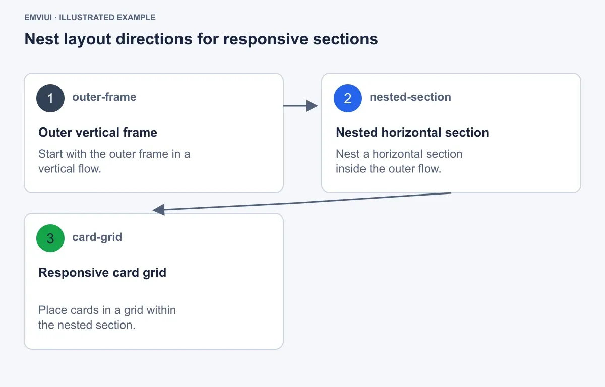
Construct the benefits section in this order:
- Create
Section / Benefitswith horizontal Auto Layout, 24px gap, and Fill container width. - Add
Benefits / Copywith vertical flow, a 16px item gap, and a flexible width allocation. - Add
Benefits / Cardswith grid flow, 16px card gap, and the remaining width. - Place three customer cards in the grid. Each card is 220px wide on the 1440px example, with a 16px internal gap and 24px padding.
- At the mobile breakpoint, change the section to vertical flow and let each child fill the 350px content width.
Each customer card can contain an avatar circle, name, location, and dollar value. Keep the geometry repeatable: 40px avatar, 12px gap between avatar and identity text, 8px gap between identity and value, and a 12px corner radius. Use real-looking but clearly illustrative content such as “Maya Chen,” “London,” and “$2,400”; the values are design specimen content, not business data.
For the form, nest a horizontal frame containing an email field and CTA on desktop. Set the field to Fill container and the button to Fixed width 148px, height 44px. On mobile, switch the form to vertical flow: the field fills 350px and the button fills 350px. This is preferable to allowing a 148px button to sit beside a field that has become too narrow.
Layer recipe for the worked example
Marketing / Why EmviUI → Page content → Section / Benefits → Benefits / Copy and Benefits / Cards → Card / Customer. Give every repeated card the same internal frame structure so edits remain predictable.
4. Turn visual spacing into measurable rules
Spacing should be recorded as relationships, not impressions. In this example, use a compact illustrative scale: 12px between a label and its field, 16px between controls inside a card, 24px between a section and its cards, and 32px between the page edge and major content.
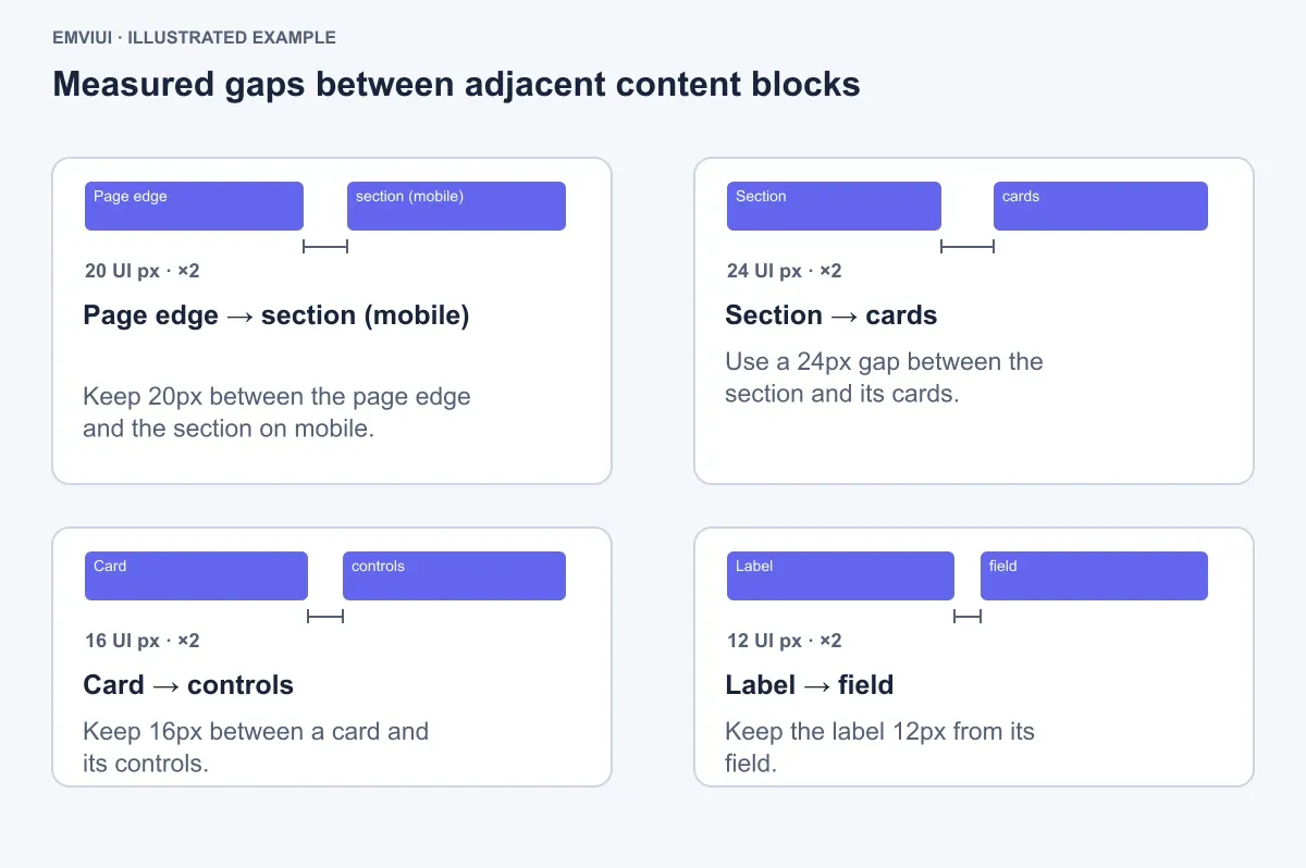
| Relationship | Value | Apply it to |
|---|---|---|
| Page edge → section | 32px desktop; 20px mobile | Content frame padding |
| Section → cards | 24px | Benefits section gap |
| Card → controls | 16px | Card internal spacing |
| Label → field | 12px | Email form stack |
| Button padding | 20px horizontal | CTA text container |
Apply these values through Auto Layout gaps and padding rather than manually positioning layers. If the “Why EmviUI?” heading gains a second line, the paragraph should move down automatically. If the email label changes, the field should retain its 12px relationship. That is the practical difference between designing a web page and drawing a poster at a browser-shaped size.
5. Connect color roles to reusable tokens
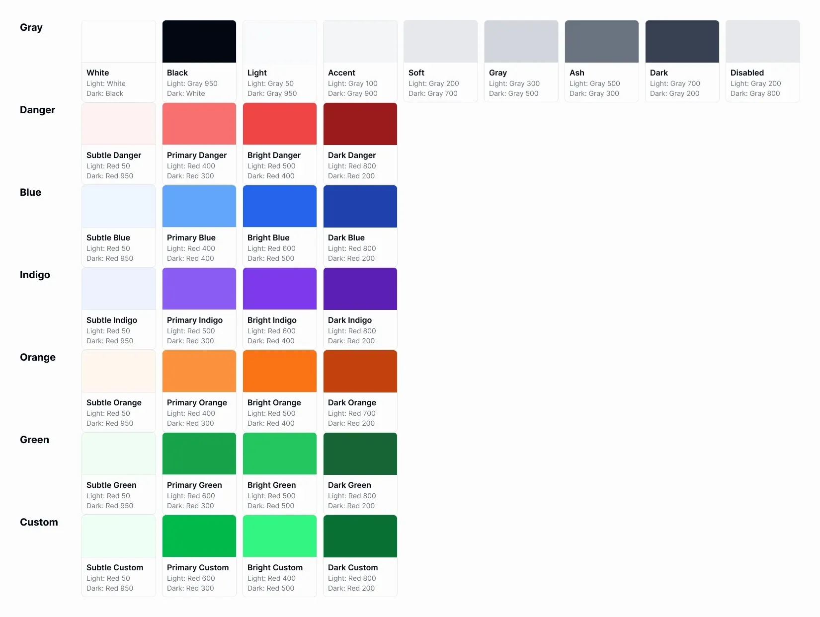
Once geometry works, assign color by role. Do not name a layer “green button” if the same action might appear in a dark theme. Name the role action/primary, then map it to a base color token. For this specimen, use white #FFFFFF for the page surface, charcoal #1F2937 for the primary CTA, blue #2563EB for focus and informational accents, green #16A34A for custom positive accents, while #22C55E is reserved for the success status role, and neutral gray values for secondary text and disabled controls.
Create a small token board beside the page:
surface/default→#FFFFFFtext/primary→#1F2937text/secondary→#6B7280action/primary→#1F2937focus/ring→#2563EBstatus/success→#22C55Esurface/disabled→#E5E7EB
Use the semantic role in the component, not the base palette name. This makes a later theme exercise a controlled remapping rather than a search for every charcoal rectangle. The EmviUI reference also demonstrates light and dark presentation, so keep the token names independent from a single visual theme. For a deeper token workflow, see how to use Figma variables for design systems and prototyping.
6. Verify the CTA and prototype-ready states
Before connecting prototype interactions, make the CTA a component with explicit variants. Use one shared geometry: 44px height, 8px corner radius, 20px horizontal padding, no icon, and a 16px text size. Then create four visual states:
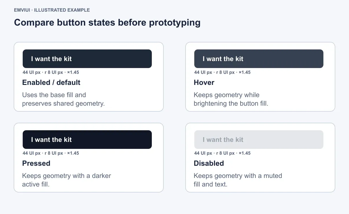
- Enabled/default: charcoal
#1F2937fill and white#FFFFFFtext. - Hover: darker or slightly changed charcoal, while retaining the same dimensions.
- Pressed:
#111827fill, same radius and padding. - Disabled:
#E5E7EBfill and#9CA3AFtext.
Add a 2px blue focus ring using #2563EB, with a 2px offset. The state review should ask one question: what changes, and what must not change? Color may change; the button’s label position, radius, and overall geometry should remain stable. This makes the interaction understandable before the prototype flow is wired. For the distinction between static layouts and connected flows, read how Figma prototypes work.
Build the email capture as a component too. Give the field a 48px height, 12px radius, 16px horizontal padding, and a visible label above it. Include default, focused, error, and filled examples if the page requires them. Keep the worked example focused: the default field and the “I want the kit” CTA are enough to verify the primary path.
7. Add completion feedback and run a responsive QA pass
After the CTA action, show a notification card rather than leaving the user to infer what happened. Construct it as a vertical card with 16px padding, 12px radius, and four parts: a green checkmark icon, the title “Prototype saved,” supporting text such as “Your responsive page is ready for review,” and a blue “Continue” action. Keep the icon, title, supporting copy, and action in separate layers so the card can be reused.
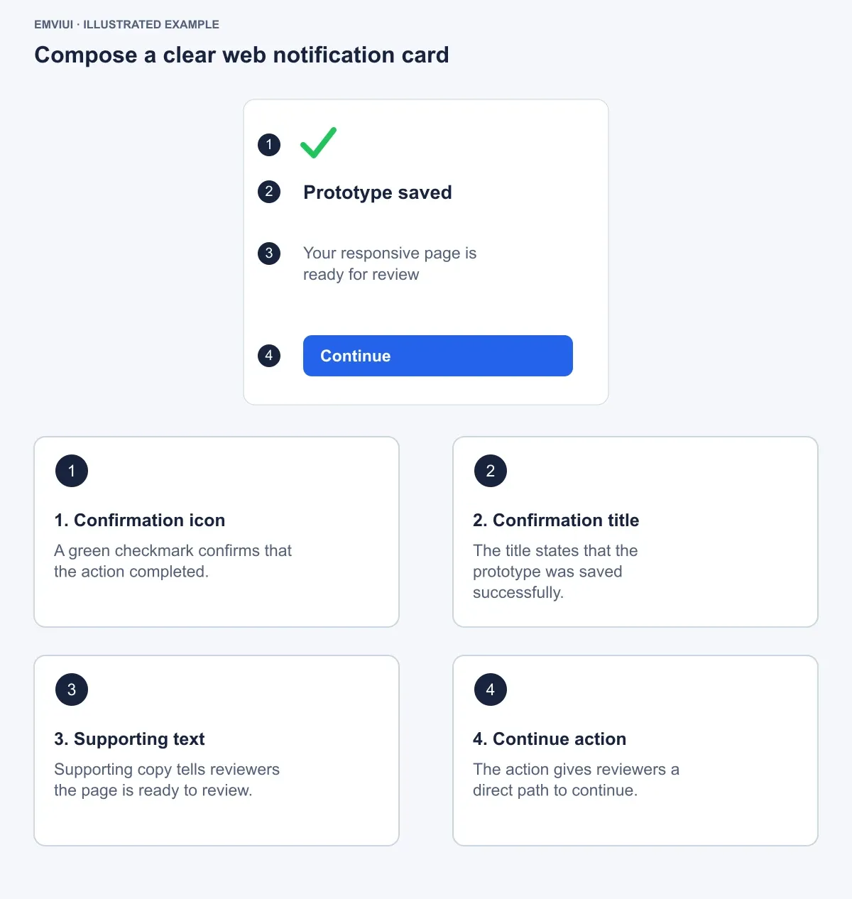
Test the final page at the two working widths and at an intermediate width such as 768px. Resize the parent frames, change the heading to two lines, and replace the email placeholder with a longer string. Watch for four failure modes:
- Unexpected clipping: check whether a fixed-height parent or clipping setting hides expanded text.
- Compressed controls: change a horizontal form to vertical flow when the field can no longer maintain a useful width.
- Uneven card heights: use a consistent internal structure and let card content hug rather than forcing arbitrary heights.
- Detached styling: replace local colors and one-off spacing with the semantic tokens and documented gaps.
Use this final checklist before handing the file to engineering:
- Desktop content uses 32px side padding and mobile content uses 20px in the specimen.
- Major sections use vertical or horizontal Auto Layout intentionally.
- Customer cards use grid flow on desktop and one column on mobile.
- Text, cards, and form controls respond to content changes.
- CTA states share 44px height, 8px radius, and 20px horizontal padding.
- Tokens identify roles such as
text/primaryandaction/primary. - The notification card confirms completion and provides a next action.
The result is a Figma web design file that communicates behavior, not just appearance. Engineers can inspect the frame hierarchy, spacing values, colors, and states; designers can revise content without rebuilding the page; and reviewers can evaluate desktop and mobile behavior from the same structural model.
References
Figma’s Auto Layout guide documents responsive content behavior, vertical, horizontal, and grid flows, resizing settings, and nested Auto Layout frames.

Pablo Mayoral
Senior UX/UI & Web Designer with 10+ years of experience. Creator of EmviUI (10k+ components Figma design system), UImand, and Vitamin Bootstrap. Currently designing digital products at CQMRewards.