Tailwind CSS Font Size: Readable Type, Zoom and Reflow
Choose Tailwind CSS font size and line height with practical UI examples, then review responsive text, 200% resizing, reflow and user spacing.
Use text-base or another reviewed size as the base, pair it with a deliberate line height, add responsive changes where needed and test enlargement, reflow and user text spacing in the implemented interface.
Tailwind CSS font size is controlled with utilities such as text-base and text-xl. Choose a readable size for the smallest layout, pair it with a deliberate line height, and add responsive changes only where the content benefits. Then check real browser resizing, wrapping and user text-spacing overrides before treating the typography as finished.
This guide builds a fictional account-settings panel with a heading, an explanatory paragraph, an email field and a save action. The proposed classes and review cases are starting examples, not universal accessibility thresholds. The deliverable is readable content that survives change, rather than a perfect copy of one static screenshot.
Choose font size and line height together
Start with three jobs: a heading that identifies the panel, body text that explains the consequence of a change, and a label that identifies a field. Give each job a repeatable treatment. A compact panel rarely needs every step in a type scale, and using more sizes can make hierarchy harder to maintain.
The Tailwind font-size reference lists named utilities and their default line heights. In an unmodified theme, text-base uses 1rem. Its familiar 16px equivalent assumes a 16px root size; it is not a fixed promise across user settings or customized themes. Inspect the computed style in your application before copying a conversion into documentation.
For our proposed panel, begin with text-2xl/8 for the heading, text-base/6 for the paragraph and text-sm/6 for the label. These choices express size and line height together. The line-height documentation explains the slash syntax. With the default spacing value, /6 produces 1.5rem of line height; it does not mean six times the font size.
Read the paragraph over several lines with the actual font loaded. Check accents, descenders and inline links. If it looks crowded, compare a more generous line height while keeping the size and width unchanged. That isolates the decision. Do not enlarge everything simultaneously and lose the evidence about which adjustment helped.
<h1 class="text-2xl/8 font-semibold">Account settings</h1>
<p class="mt-3 text-base/6">Choose where we send account updates.</p>
<label class="block text-sm/6 font-medium" for="email">Email address</label>
Change type at meaningful widths
Use the smallest useful layout as the starting condition. On a narrow settings panel, the heading should remain recognizable without pushing the explanation and first field far down the page. Test longer headings before deciding whether a larger desktop treatment is useful. A breakpoint is a place to change a rule, not an instruction to increase every text role.
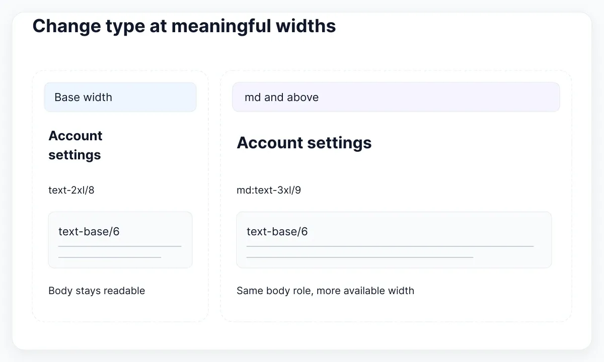
Tailwind applies unprefixed utilities at all widths and breakpoint-prefixed utilities at their minimum width and above. Its responsive design guide documents that mobile-first model. In the example below, text-2xl/8 is the base and md:text-3xl/9 changes the heading at the default md breakpoint. Body text can remain text-base/6 in both cases.
Review the same paragraph at narrow, intermediate and wide widths. Keep its text container deliberately bounded on a large display so the result does not become one exhausting line. A maximum-width choice is a design recommendation to review with your content, rather than a guarantee of a particular character count for every language and font.
Try the Spanish heading “Preferencias de comunicación de la cuenta” alongside the English version. Let both wrap naturally and confirm that the next block moves down. Avoid assigning a fixed heading height merely to align two mockups. For the surrounding card layout, continue with responsive Tailwind card grids.
<section class="mx-auto w-full max-w-2xl p-6">
  <h1 class="text-2xl/8 font-semibold md:text-3xl/9">Account settings</h1>
  <p class="mt-3 max-w-prose text-base/6">Choose where we send account updates.</p>
</section>
Check enlarged text and narrow reflow
Separate enlargement from reflow in your review record. Enlarging text asks whether content and actions remain available as text becomes bigger. Reflow asks whether ordinary reading content can fit the required narrow presentation without forcing someone to pan horizontally for every line. A single attractive mobile screenshot answers neither question completely.
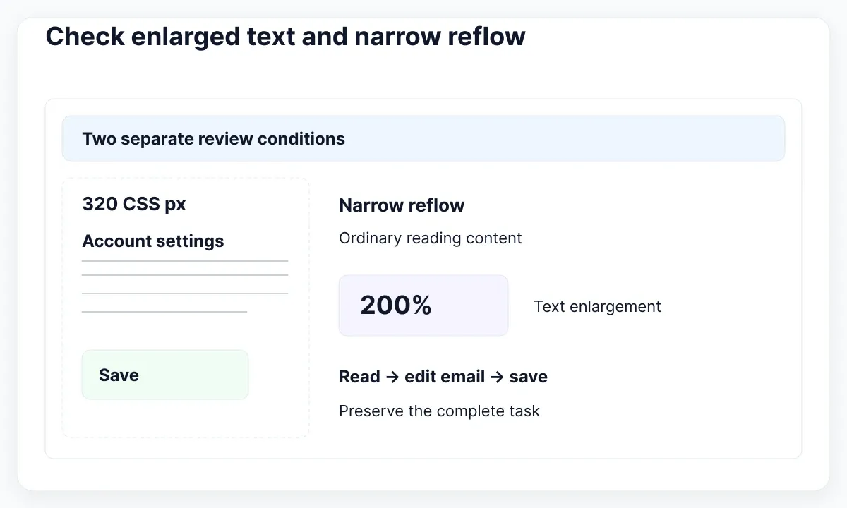
WAI’s Resize Text explanation describes the requirement to support resizing text up to 200 percent without losing content or functionality, with stated exceptions. Its Reflow explanation describes vertical reading content at an equivalent width of 320 CSS pixels, with exceptions for content whose meaning or use needs two-dimensional layout. Record which condition you tested.
For our panel, enlarge the page to 200 percent in a browser that supports it and try reading the explanation, changing the email and reaching Save. Then examine the narrow reflow case separately. Browser page zoom and text-only resizing can affect layouts differently; include the mechanisms relevant to your supported browser and user settings.
When something disappears, inspect the containing box before shrinking the text. A fixed-height control, clipped panel or forced single line may be the actual cause. Let an explanatory paragraph grow and allow actions to move below it. The search and action overflow guide covers related layout decisions when controls compete for width.
Allow user spacing without losing content
Keep a disposable copy of the panel for user-spacing checks. Increase line, paragraph, letter and word spacing together, then inspect the actual text and controls. The purpose is to reveal content that the layout silently assumes will always occupy one line or one fixed-height box. Take a before-and-after capture and retain the failing label.
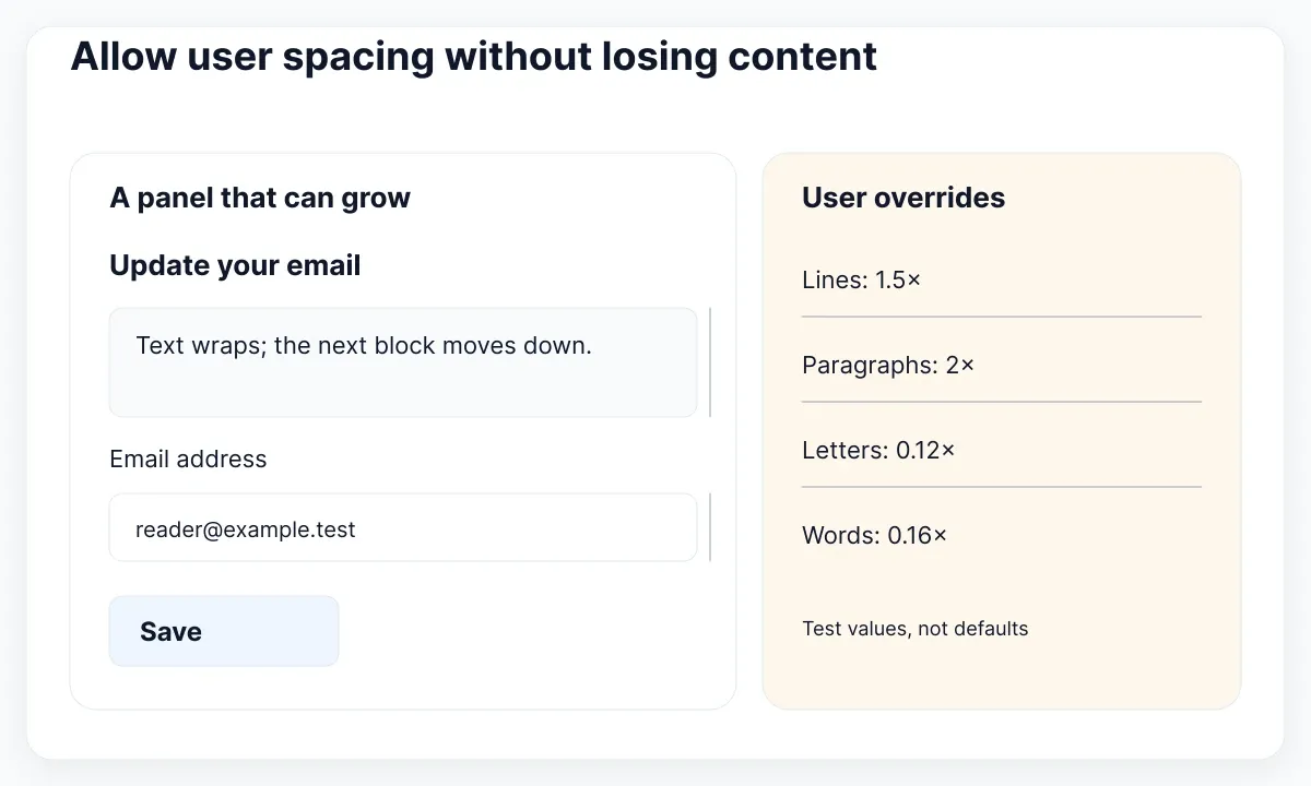
The WAI Text Spacing explanation specifies override values of at least 1.5 times the font size for line height, twice the font size after paragraphs, 0.12 times for letter spacing and 0.16 times for word spacing. These are an adaptation test, not compulsory default typography settings. Relevant language and script exceptions are documented there.
In our example, the field label must remain associated with its input when it wraps. The supporting paragraph should push the field down instead of covering it. The save action should still have its complete text. Changing the panel height is acceptable in this proposed design; hiding the last sentence to preserve the old silhouette defeats the task.
Run the override on the smallest layout and at a wider width. Undo it afterward and confirm that the ordinary design still works. Keep the override method, browser, viewport and observed failure in the review record. “Passed a spacing test” is too vague when another person needs to reproduce the same condition next month.
Use the EmviUI specimen as a visual starting point
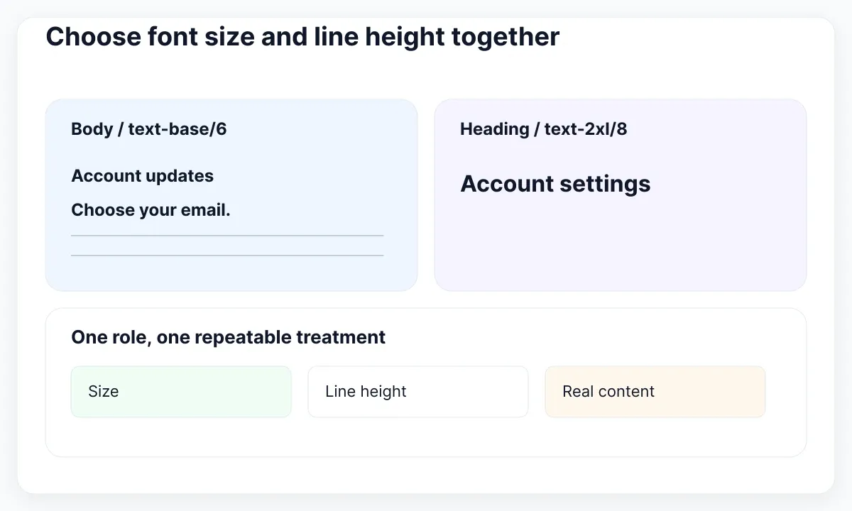
The real EmviUI specimen below shows Inter characters and a series of display and text treatments across different weights. It is useful for comparing visual hierarchy before applying classes. The EmviUI site describes an editable Figma UI kit and design system with Tailwind mapping. Use its editable design to establish the intended role, then verify the implementation in the browser.
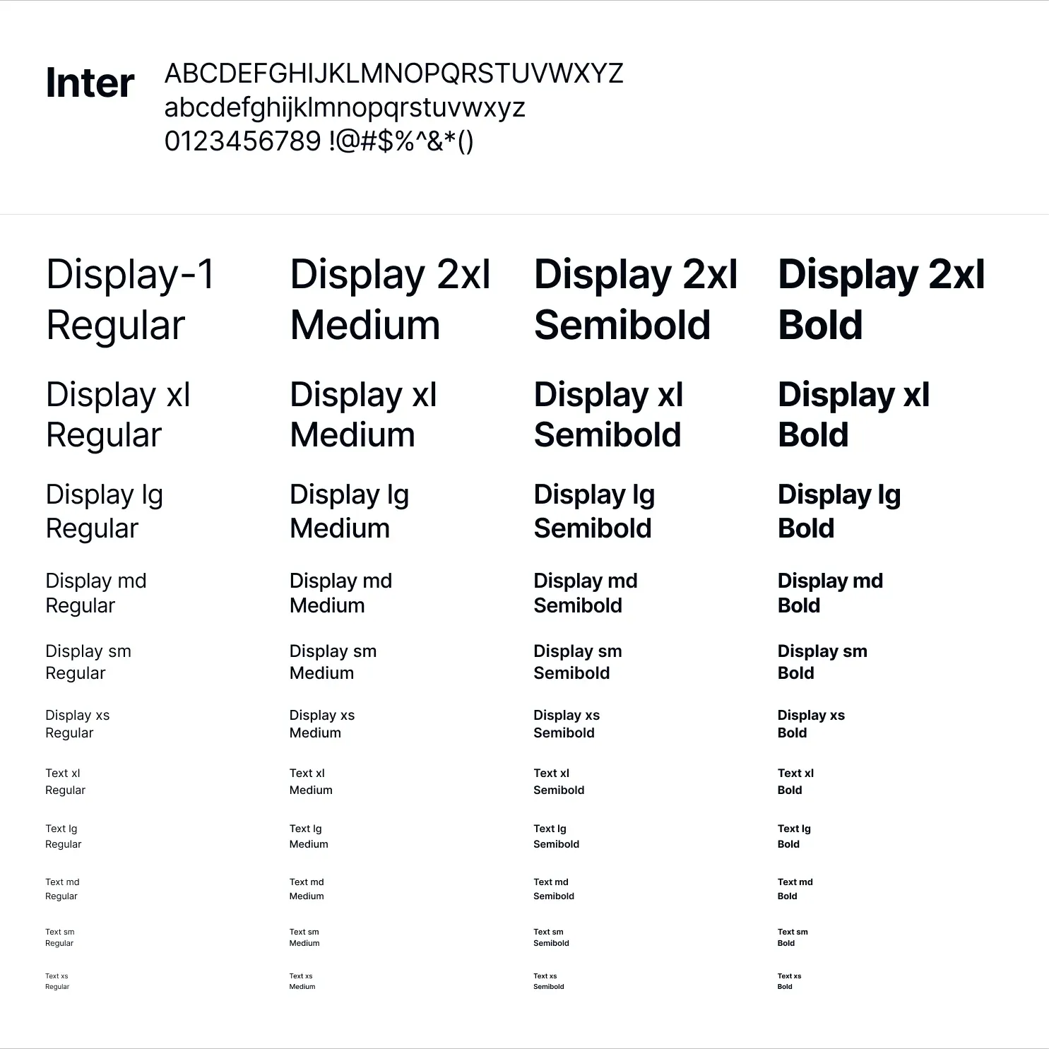
The image does not expose computed CSS, root font size or the behavior of a live form. Its specimen labels are not proof that a particular Tailwind class is assigned to a particular text layer. Our proposed text-base/6 recipe is independent of the screenshot. Inspect the editable file and your theme instead of inferring a class map from pixels.
Select one body treatment and one heading treatment for the settings task. Write down the role, chosen class, line height and the longest content sample reviewed. If the design team needs reusable Figma text definitions, the typography-variable guide addresses that separate authoring job. Here the acceptance decision belongs to the rendered interface.
Diagnose a wrong size before adding exceptions
If text-xl appears smaller than expected, first inspect the computed font size and the rule that supplies it. Confirm the actual element you selected, the active responsive condition and whether the project customizes its type scale. A screenshot mismatch is a symptom; adding another arbitrary size before identifying the winning rule can make the next component less predictable.
If size is correct but the text looks different, compare the loaded font, weight, line height and container width. Keep the content identical while doing this. A fallback font may wrap differently even with the same numerical size. Record the cause you observed rather than blaming Tailwind or the design file without a controlled comparison.
If one label is cut off, inspect its box height and overflow. If an entire paragraph becomes too wide, inspect its container and wrapping. If only the larger viewport changes unexpectedly, inspect breakpoint rules. This small classification lets you repair the responsible relationship without turning a local defect into a global reduction of the body size.
Once a correction works, apply it to a second panel with different copy. Ask someone to repeat the enlargement and spacing checks using the written instructions. A shared typography decision is ready when another consumer behaves predictably, not merely when the first screenshot resembles the reference.
Record a repeatable typography acceptance check
Use a short review table with columns for content sample, viewport, text setting, expected behavior and observed result. Include the ordinary English panel, the longer Spanish heading, a two-line field label and a paragraph with an inline link. These are proposed test fixtures, not evidence of research participants or measured reading performance.
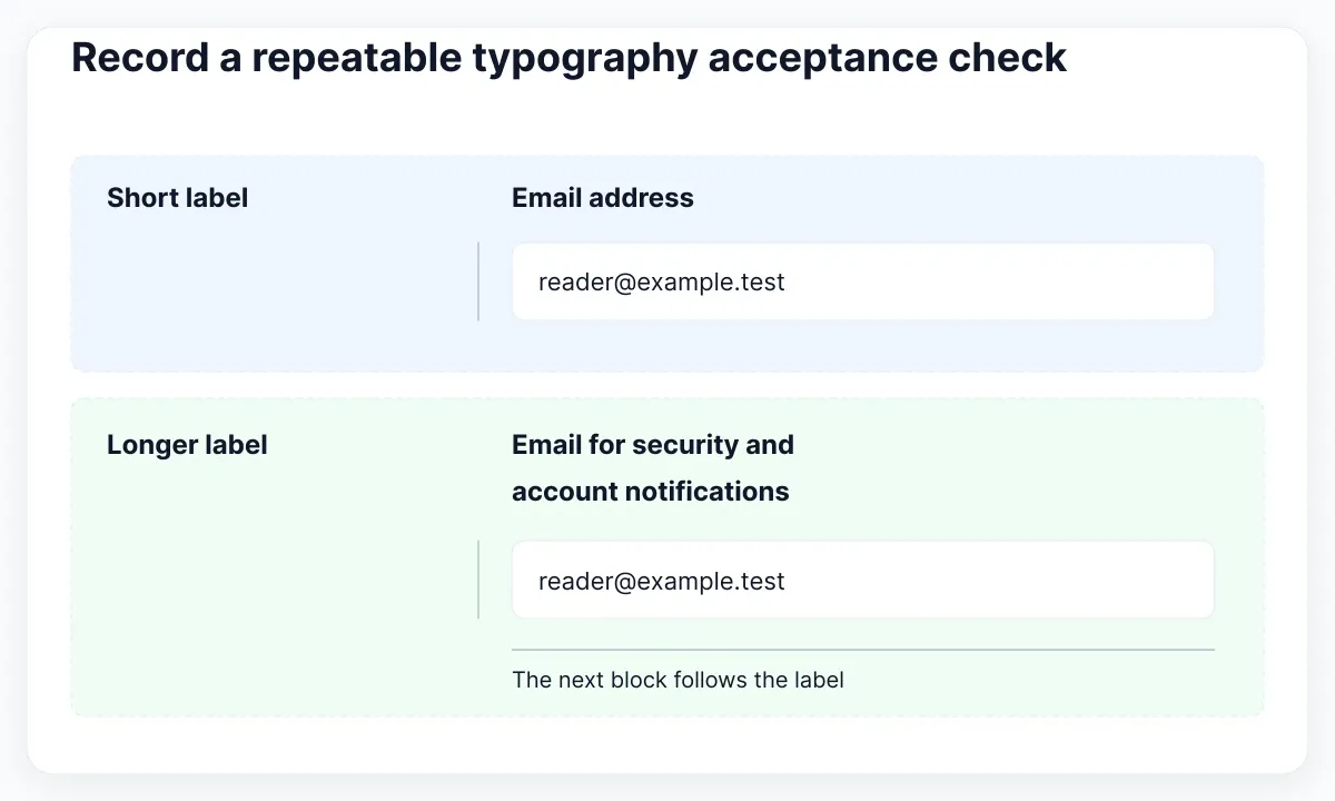
Give the reviewer one concrete task: change the notification address and save it. At each condition, they should still identify the heading, read the consequence, locate the field label and reach the action. If one step fails, record the missing content or blocked action and the smallest layout correction that restores it.
Keep the accepted specimen with the component documentation. Revisit it when the font, language, container or type scale changes. A new font weight alone may be a small edit, but a new family or a narrower panel changes the conditions under which the previous review was meaningful.
Reproduce and repair one clipped label
Make a disposable version of the settings panel with a deliberately long label: “Email address used for security and account notifications.” Give its label container a fixed height in this exercise, then apply the user-spacing overrides. Observe whether the second line remains visible and whether it collides with the input. This is a proposed fault-injection exercise; it is not a defect reported in EmviUI.
Write the failure as an observable result: “The second label line is hidden after the spacing override.” Record the computed font size, line height, box height and overflow rule. Keep the selected class unchanged while removing the fixed label height in the working copy. Run the same condition again. If the second line now appears and the input moves down, you have evidence that the box constraint caused this particular failure.
Check the correction with an ordinary short label too. The fix should support both samples without leaving an unexplained empty reservation under every one-line label. Next repeat the long label in Spanish, using “Correo electrónico para avisos de seguridad y notificaciones de la cuenta.” Accept a different line count when the content needs it; preserve the relationship between label, input and supporting explanation.
Finally compare the panel before and after the correction at the original viewport and without overrides. Keep only the smallest justified change. If removing the height exposes an unrelated alignment dependency in the surrounding row, record that dependency explicitly and repair the layout relationship. Reducing the font to hide the symptom would undermine the very enlargement and spacing conditions the panel must accommodate.
Attach the two content samples and the passing review condition to the component note. That gives the next developer a reproducible reason for allowing the label to grow, rather than an undocumented exception that may be removed during a later visual cleanup.

Pablo Mayoral
Senior UX/UI & Web Designer with 10+ years of experience. Creator of EmviUI (10k+ components Figma design system), UImand, and Vitamin Bootstrap. Currently designing digital products at CQMRewards.