Figma Plugins for Icons: From SVG to Clear UI Actions
A small icon-import exercise that connects source identity with action meaning, target boundaries and implementation checks.
Use Iconify as one documented route for importing SVG icons into Figma. Start with a small action inventory, keep asset identifiers, and review the glyph inside its control. Define the target, accessible name and states separately; verify behavior in implementation.
Use Figma plugins for icons to import a consistent set of editable assets, then review those icons inside real controls. Iconify is one documented option for finding and importing SVG icons. The useful result is a clear action with a traceable asset, a deliberate target area and an implementation name. A large icon catalogue alone cannot settle those decisions.
Choose icons for actions, not decoration
Write the action before searching for its picture. An icon that looks familiar to the designer can still communicate the wrong operation to someone using the product. Start with the verb and the object, then decide whether a visible label should accompany the shape.
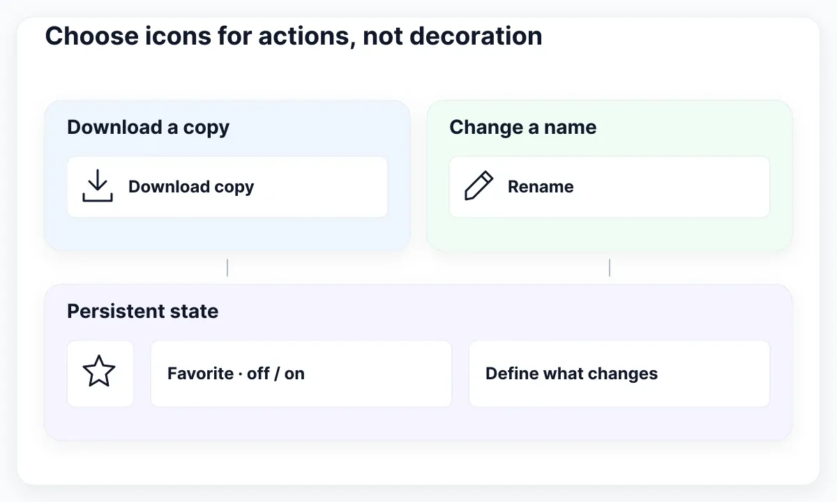
This guide proposes an exercise for Alder, a fictional document workspace. Its document row needs three actions: download a copy, rename the document and mark it as a favorite. These examples are design recommendations, not results from a usability study or a plugin benchmark. No plugin was run to produce the article.
Keep a three-column inventory: intended action, proposed visible wording and candidate metaphor. For download, use “Download copy” before deciding which arrow-and-tray drawing fits. For rename, “Rename” may be clearer than a pencil by itself. For favorite, decide whether the control changes a persistent state or immediately performs a separate operation.
| Alder action | Proposed treatment | Question to resolve |
|---|---|---|
| Download copy | Icon and visible words | Which file is downloaded? |
| Rename | Labeled button | Does editing open in place? |
| Favorite | Stateful star control | Can the person recognize its state? |
Avoid adding a symbol simply because the component has an empty icon slot. Remove the slot when the words already do the job and the picture contributes nothing useful. Conversely, keep a visible label for an unfamiliar or consequential action, especially when the same metaphor might mean upload, share or download in adjacent software.
The next step is a bounded import trial, not a search for a universal winner. Choose one family that covers these three actions. Collect alternatives only for a specific unresolved meaning. This keeps the review about the interface task instead of turning it into an untestable ranking of plugin catalogues.
Import a small, traceable icon set
Import a few candidates into a separate working area and preserve their identity. You need enough information to find the same asset again, explain its origin and replace it consistently. Importing dozens of attractive shapes makes that review harder without improving the toolbar.
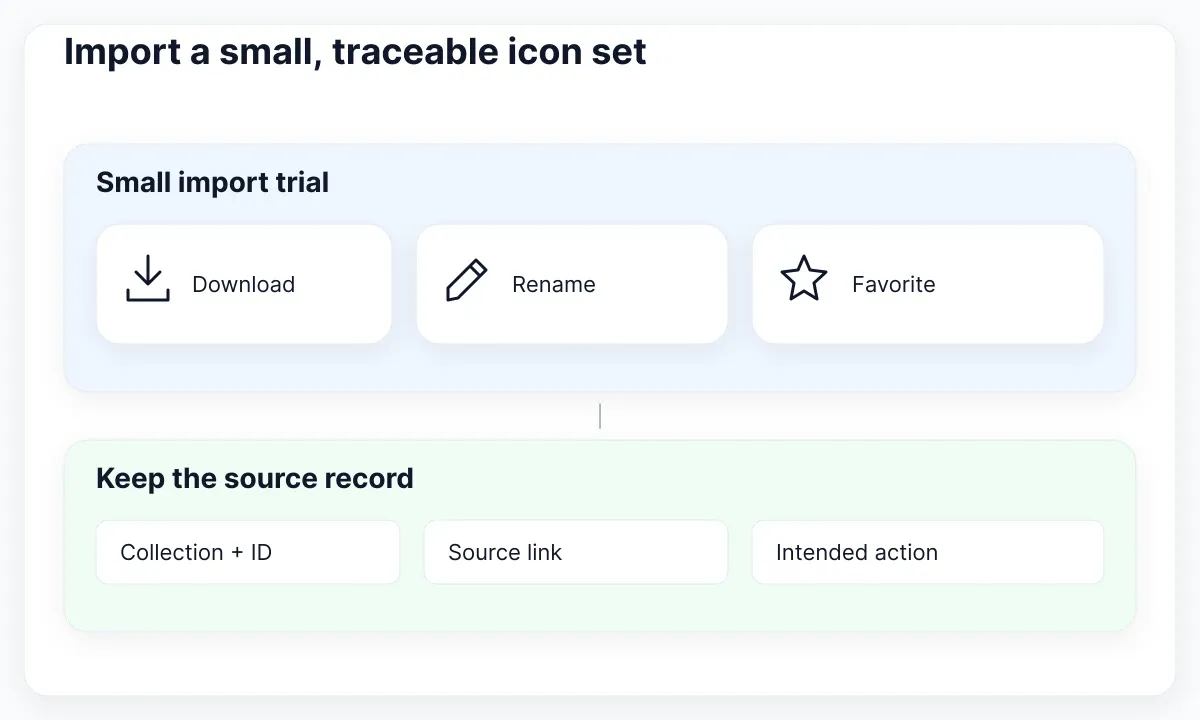
The official Iconify Figma guide documents browsing or searching an icon set and importing SVG icons by selection or drag. It also describes an information view with the icon name, author and license. Use that information to record the chosen collection and exact icon identifier; check the collection’s actual terms before distribution.
For Alder, create a proposed asset record with four fields: collection, identifier, source link and intended action. Keep the original import beside a working copy. If a designer changes the arrow or removes a detail, add a short note. An edited shape should not silently inherit a claim that it is the original upstream asset.
Compare the three candidates together at their intended display size. Look for similar visual weight, corner treatment and internal spacing. Choosing one collection is a useful starting constraint, but it does not guarantee that every member looks equally balanced inside your particular control. Check the combination rather than approving each thumbnail in isolation.
Color deserves its own inspection. Iconify’s icon guidance distinguishes monochrome icons using currentColor from assets with a fixed palette. Do not assume every imported vector can be recolored by applying one fill. Inspect whether the visible paths use fills or strokes, and preserve details that carry meaning.
Figma’s stroke documentation explains that stroke weight is separate from the layer’s overall dimensions. When a drawing appears heavier or clipped, inspect its paths and enclosing frame before changing every size. Keep this article’s review focused on the small icon set; use the asset export guide when you need a broader delivery manifest.
Separate the glyph from its target
The visible glyph and the clickable target are separate design decisions. A small drawing can sit inside a larger button. Review both boundaries explicitly, because a visually generous gap between pictures does not reveal where the actual controls begin or end.
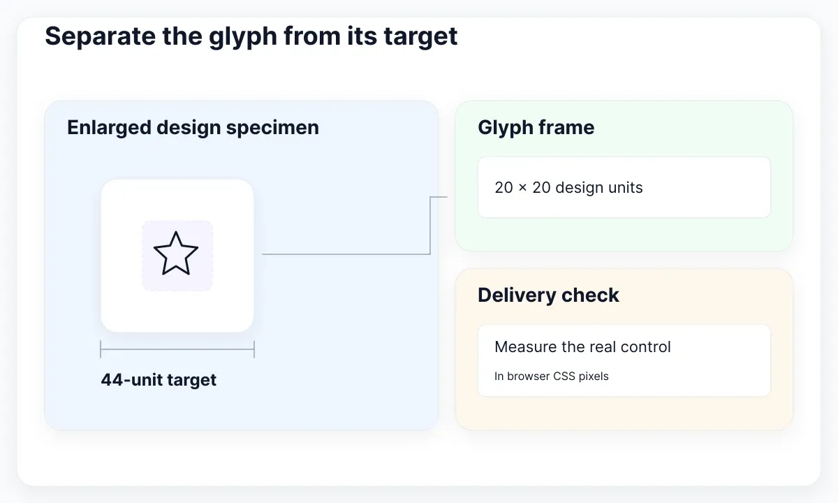
For the proposed Alder favorite button, use a 20-unit icon frame centered in a 44-by-44-unit control. These are illustrative design dimensions, not a universal size prescribed for every interface. Draw the control boundary in the review file and keep it separate from the icon’s frame so a developer can identify the intended activation area.
WCAG 2.2 Target Size (Minimum) specifies 24 by 24 CSS pixels for pointer targets, subject to defined exceptions including spacing. It does not require the icon artwork itself to occupy that area. Treat the Figma dimensions as a design proposal and check the actual rendered target in the browser.
Place two adjacent controls in the exercise. Test a comfortable default layout first, then the narrow layout the product expects to support. If the row becomes crowded, move a secondary labeled action to another line or an appropriate disclosure. Shrinking every target until the row fits should not be the automatic response.
Also compare the visible center of the shape with the frame’s geometric center. A diagonal pencil can feel uneven next to a symmetrical star despite matching frame dimensions. Make small documented optical adjustments in a working copy when necessary; preserve the source and avoid distorting the icon to fill every available pixel.
Ask the reviewer to activate the intended control near each edge in a real implementation. The result should match the boundary in the handoff. A static frame cannot demonstrate pointer behavior, keyboard operation or overlap with a neighboring hit area. Record those as implementation checks rather than claiming that a tidy Figma layout proves them.
Give every action a clear name
Name the action in the interface contract, even when its visual treatment contains only a shape. The asset’s file name is useful for maintenance; the control’s accessible name must communicate what activation does. Those names serve different audiences and may need different wording.
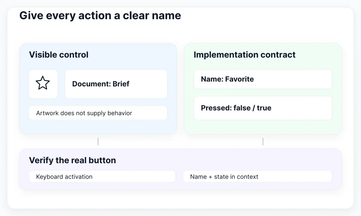
The WAI button pattern describes accessible labels, Enter and Space activation, and toggle state. For Alder’s persistent favorite control, a proposed stable name is “Favorite,” paired with aria-pressed in implementation. Keep the state explicit in the handoff rather than expecting a developer to infer it from a filled star.
A button with a download drawing and visible “Download copy” wording already gives the reviewer a concrete action to assess. WAI’s decorative image guidance explains avoiding redundant descriptions for pictures that repeat nearby text. In a web implementation, prevent the decorative graphic from producing a second, confusing announcement while preserving the button’s name.
Here is a proposed semantic sketch for the favorite action. It shows the relationship between a real button, its name and its state. The icon is supplied separately; this snippet does not install a plugin, implement persistence or certify a finished component.
<button type="button" aria-label="Favorite" aria-pressed="false">
  <svg aria-hidden="true" viewBox="0 0 24 24">
    <!-- Insert the reviewed icon paths here. -->
  </svg>
</button>
For a repeated document list, ensure people can determine which document the control affects from its available context. Review the result with the implementation team using the actual list, not a detached button alone. Distinguish a stateful favorite from a command such as “Add to collection,” which may open a different interaction.
Translate the action wording with the rest of the interface. Keep the original icon identifier in the asset record while giving the Spanish control a natural Spanish name. If you need help deciding which parts of the component are configurable, use the component content-contract guide as the next step.
Review meaning across control states
Review an icon in its destination across the states the action actually needs. A recognizable default thumbnail is only one sample. Put the glyph on the real surface, beside its label and alongside neighboring controls before accepting the visual treatment.
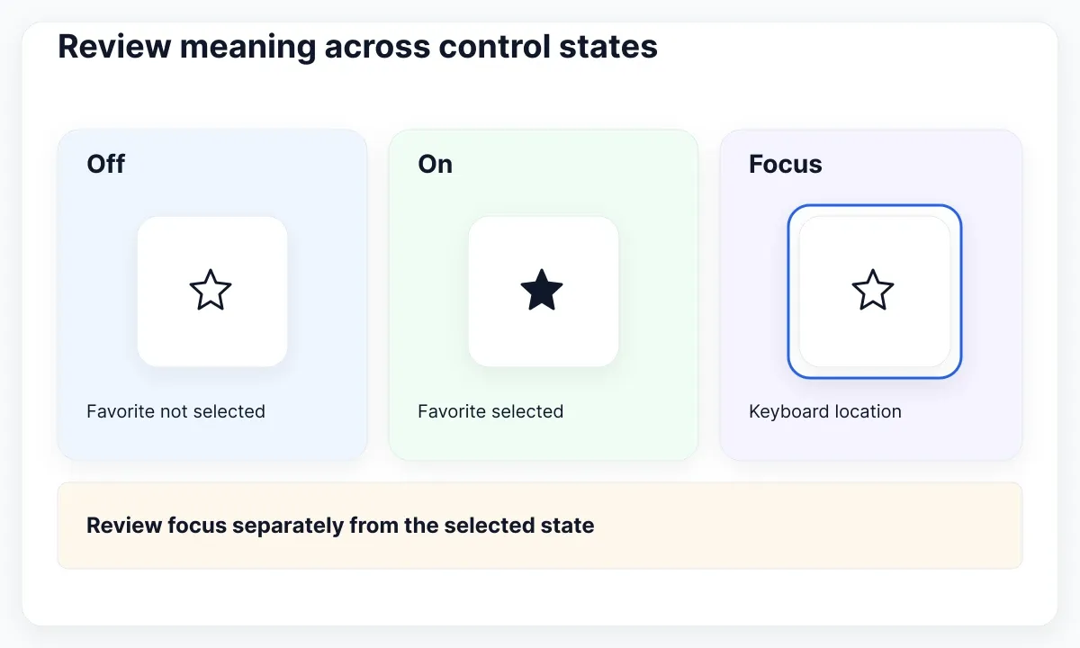
For Alder, compare favorite off, favorite on and keyboard focus. Keep the focus treatment separate from the favorite state: focus answers where keyboard interaction is happening, while the selected state answers whether the document is a favorite. One blue outline should not be the only explanation for both conditions.
WCAG non-text contrast guidance requires 3:1 contrast against adjacent colors for visual information needed to identify components and states, with stated exceptions. Check the meaningful icon or state indicator against its actual background. Do not claim compliance from a screenshot or apply the ratio indiscriminately to every decorative mark.
Use a simple review sheet: state, visible treatment, intended name, expected result and unresolved question. For favorite off, the expected result is that activation adds the document to favorites. For favorite on, activation removes it. For focus, record where the visible indicator sits and whether it stays visible on the surrounding surface.
Consider what happens when the action is unavailable or waiting for a response. If the design proposes replacing a download symbol with a progress indicator, specify how the person still knows which operation is underway. Avoid replacing meaningful wording with an unexplained spinner. Treat the exact waiting behavior as a product decision requiring implementation review.
- Compare the default and active controls at intended size.
- Check the meaningful shape against each adjacent surface.
- Review focus independently from selected state.
- Verify the real button’s name and keyboard behavior.
- Record one accepted treatment and any remaining delivery work.
This sequence produces a concrete review artifact. It does not require a large variant matrix for every icon. Start with the three Alder actions and expand the state inventory only when a real task or behavior introduces another requirement.
Apply the review to an EmviUI specimen
Use the EmviUI button specimen to inspect the relationship between a leading icon, visible wording and a trailing indicator. Its repeated rocket shape makes the distinction useful: the shape is visually consistent, but the generic word “Button” still needs task-specific replacement before a product review.
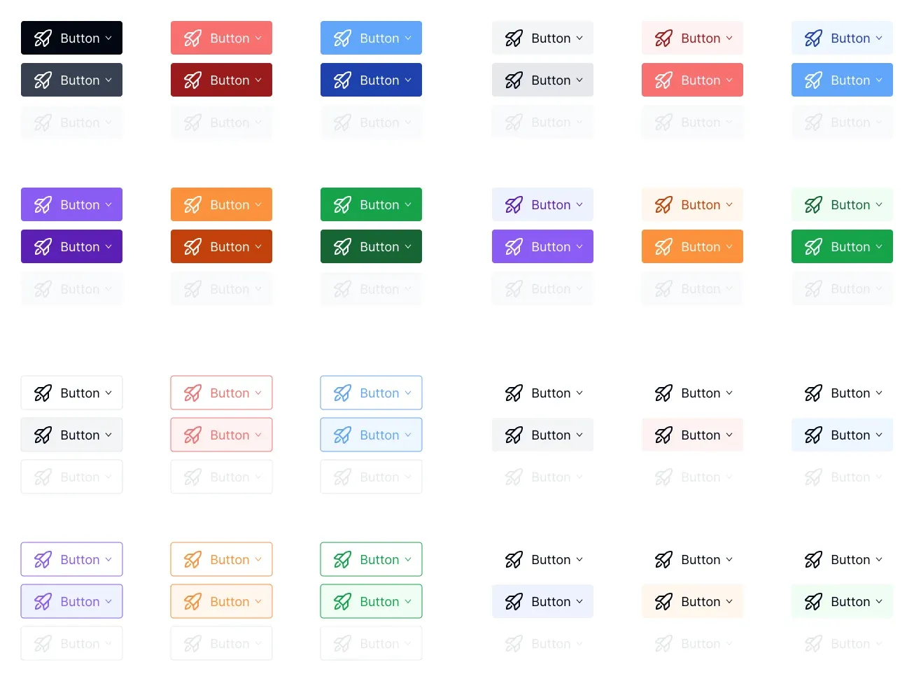
EmviUI’s current site presents an editable Figma UI kit and design system. For this exercise, use its button patterns as a starting reference for spacing and visual hierarchy. The screenshot is an EmviUI specimen, not the Iconify interface, proof of a particular icon collection or evidence of implemented accessibility behavior.
Replace the proposed download control’s generic wording with “Download copy.” Compare the leading drawing with the actual download candidate selected earlier. Remove the trailing chevron unless the action really opens choices. If it does open choices, define those choices and their interaction separately. Decorative consistency should not invent a menu that the product does not need.
For handoff, attach the chosen asset record, target dimensions, translated action name and state sheet. Keep a clear distinction between the editable Figma reference and the runtime component. The implementation still needs its own semantic button, event handling and browser verification. An imported vector does not deliver those behaviors automatically.
Finish the exercise by asking a colleague to explain each action without seeing the asset names. If “Download copy” is clear but the star remains ambiguous, keep the label or revise that control before expanding the icon set. This is a proposed qualitative review, not evidence that a particular metaphor is universally understood.
The accepted result is small: three identified assets, three explicit actions and a short list of implementation checks. That is a more useful stopping point than an oversized icon page whose meanings, state changes and delivery requirements remain undecided.

Pablo Mayoral
Senior UX/UI & Web Designer with 10+ years of experience. Creator of EmviUI (10k+ components Figma design system), UImand, and Vitamin Bootstrap. Currently designing digital products at CQMRewards.