Why Choose Us Section in Tailwind CSS: Benefits With Proof
Build a why choose us section in Tailwind CSS with clear benefits, evidence links and responsive cards. Review a real EmviUI specimen and release checks.
Write a specific benefit, explain its product mechanism and provide a descriptive link to inspect real evidence. Build the narrow layout first, preserve heading and reading order, and review truthful claims, destinations and keyboard behavior before release.
A why choose us section in Tailwind CSS needs more than three attractive cards. Give each card a specific reader benefit, an explanation of how the product delivers it and an honest way to inspect the evidence. Build the narrow layout first, preserve a useful heading structure and make every evidence link describe its destination.
This walkthrough designs a proposed section for Fieldnote, a fictional project workspace. The example benefits, document names and review tasks are editorial exercises, not measured results or claims about an existing service. The deliverable is a small marketing interface whose content and behavior can be reviewed together. Tailwind supplies styling utilities; the team supplies truthful product evidence.
Start with a benefit and its evidence
Start by writing the question a prospective customer is trying to resolve. For Fieldnote, it is whether a project handover will leave the next person guessing. This is more concrete than asking how to fill three columns. Our proposed first card says Keep decisions beside the work, explains that a project can contain a decision log, and points to a sample log for inspection.
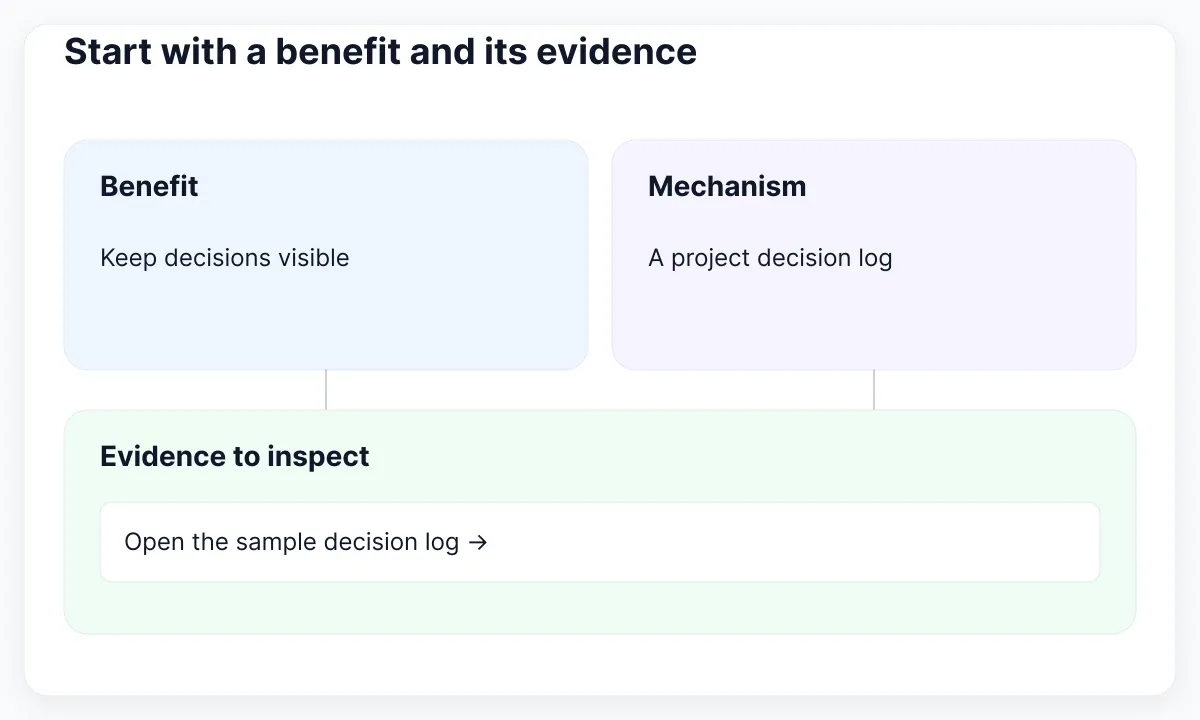
Use a three-column working document: benefit, supporting mechanism and evidence destination. A benefit describes a useful outcome; a mechanism explains what makes it plausible; evidence gives the visitor something to examine. If the third column is empty, narrow the claim or remove it. Do not substitute a decorative checkmark for the missing material. This is an editorial review method, not a statistical validation procedure.
For a second card, propose Make ownership visible and link to a sample responsibility view. For a third, propose Prepare the next handover and link to a checklist preview. These are content fixtures awaiting confirmation by the fictional product team. Avoid adding faster, guaranteed or effortless merely to make headings sound different. Distinct cards should resolve distinct uncertainties, rather than repeat one vague promise three ways.
Keep any quantified claim in a separate evidence review. A statement about time saved needs a defined measurement and context; a card design cannot create that information. A customer quote needs a real source and permission appropriate to its use. In this exercise we use neither. The section remains useful because a visitor can inspect concrete examples instead of being asked to accept invented performance figures.
Give the section a readable hierarchy
Place the section after enough product context for the benefits to make sense. Give it one heading that names the shared concern, then let each card explain one part. Our example section heading is Handover with a clear next step. Card headings name the three benefits. The introductory sentence explains who the section is for, without repeating the entire page headline.
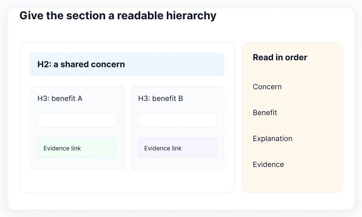
The MDN section reference describes a thematic section and the usual role of its heading. The WAI headings tutorial explains how headings expose page organization. For a landing page with an H1, use an H2 here and H3 headings for its cards when that reflects the actual structure. Choose heading levels for the outline, then style their appearance independently.
Sketch the reading sequence as section heading, short introduction, first benefit, its explanation and its evidence link, followed by the next benefit. Read that sequence aloud with all graphics hidden. If the second card makes no sense without the first card’s icon, rewrite its text. Our proposed design keeps each benefit understandable as a small unit while the shared introduction explains why the units belong together.
Set a modest content budget before polishing: a short heading, two explanatory sentences and one evidence link per card. Treat that as an initial editing constraint, not a fixed word-count law. A technical product may need more explanation. Review the complete text before deciding whether all cards should share a height; equal rectangles are less valuable than complete, legible meaning.
Inspect the real EmviUI feature section
The real EmviUI specimen below places four feature cards under one shared heading. Each card combines a small icon, a title and supporting text. This is a useful reference for grouping related benefits with consistent spacing. The displayed wording includes demonstration copy, so use the image to examine composition rather than as evidence for current feature totals or product results.
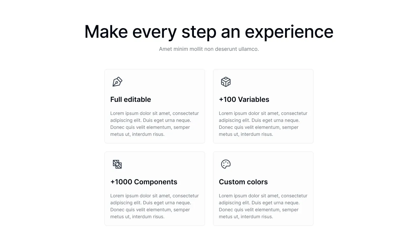
The live EmviUI Figma kit provides editable components and page material that can serve as a starting point for this design exercise. Replace the specimen’s copy with the benefit, mechanism and evidence inventory before adjusting colors. Add a real evidence destination to each retained claim. The kit can help establish visual consistency; it cannot supply your product’s customer proof or validate a marketing assertion.
In our adaptation, keep three cards because there are three supported content fixtures, rather than preserve four just because the reference uses four. Retain the visual rhythm but allow the longer explanation to wrap. Compare the adapted frame with the original to show what changed. For the broader visual planning step, continue with planning a responsive page in Figma.
Build a layout that follows the content
Begin with one column so the reading order remains obvious. Add columns only after the real benefit titles, explanations and links fit comfortably. A proposed starting list uses grid grid-cols-1 gap-6 lg:grid-cols-3. This is a simple implementation choice for the exercise, not a universal breakpoint recipe. The content should decide whether the wider arrangement is ready.
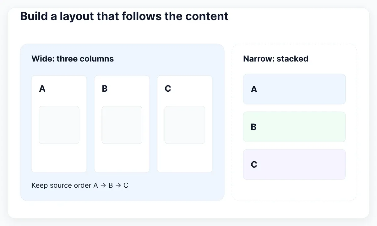
Tailwind’s grid column reference documents equal-width column utilities, and its responsive design guide explains that unprefixed styles apply generally while breakpoint variants apply from their configured threshold upward. Check your project theme before interpreting a breakpoint name as a specific width. A card can still have insufficient text space inside a wide viewport if its parent container is narrow.
Use a bounded outer container, generous section padding and cards that grow with their content. Put the cards in a list when they form a collection of peer benefits. A card can use flex flex-col, with its evidence link placed after the explanation. If you align links with mt-auto, inspect the resulting whitespace rather than forcing a fixed height that clips a longer translation.
Keep the source order equal to the intended reading sequence. Avoid moving the most important benefit visually with an ordering utility while leaving it last in the markup. For this task, the decision-log card remains first at every width. Our separate guide to responsive cards and reading order develops the layout mechanics when the composition needs more complex spans.
Implement one complete benefit before duplicating it
Build a single card with its final text and a real, supplied destination. The following outline demonstrates structure and static utility names. Its sample path must be supplied by the product team before deployment. Reuse the structure for the remaining approved benefits; do not generate extra cards simply because the grid has room.
Keep content separate from decorative details during review. The heading should still explain the benefit after removing the icon and border. If a card only looks meaningful because of a badge such as Most trusted, ask what source supports that badge. Our exercise uses a plain icon with no implied certification and a descriptive link to the relevant sample.
<section aria-labelledby="handover-title" class="px-6 py-16">
  <div class="mx-auto max-w-6xl">
    <h2 id="handover-title" class="text-3xl font-semibold">
      Handover with a clear next step
    </h2>
    <ul class="mt-8 grid grid-cols-1 gap-6 lg:grid-cols-3">
      <li class="flex flex-col rounded-2xl border border-slate-200 p-8">
        <h3 class="text-xl font-semibold">Keep decisions beside the work</h3>
        <p class="mt-3">Give the next owner a readable decision log.</p>
        <a href="/examples/decision-log"
           class="mt-6 underline underline-offset-4 focus-visible:outline-2">
          Inspect the sample decision log
        </a>
      </li>
    </ul>
  </div>
</section>
Make evidence links easy to understand
An evidence link should tell the visitor what they can examine. Prefer Inspect the sample decision log to Learn more when several cards lead to different materials. Keep the explanation and link close enough that their relationship is clear. If no usable sample exists, provide an honest explanation without a pretend control; do not ship a link that merely jumps to the top of the page.
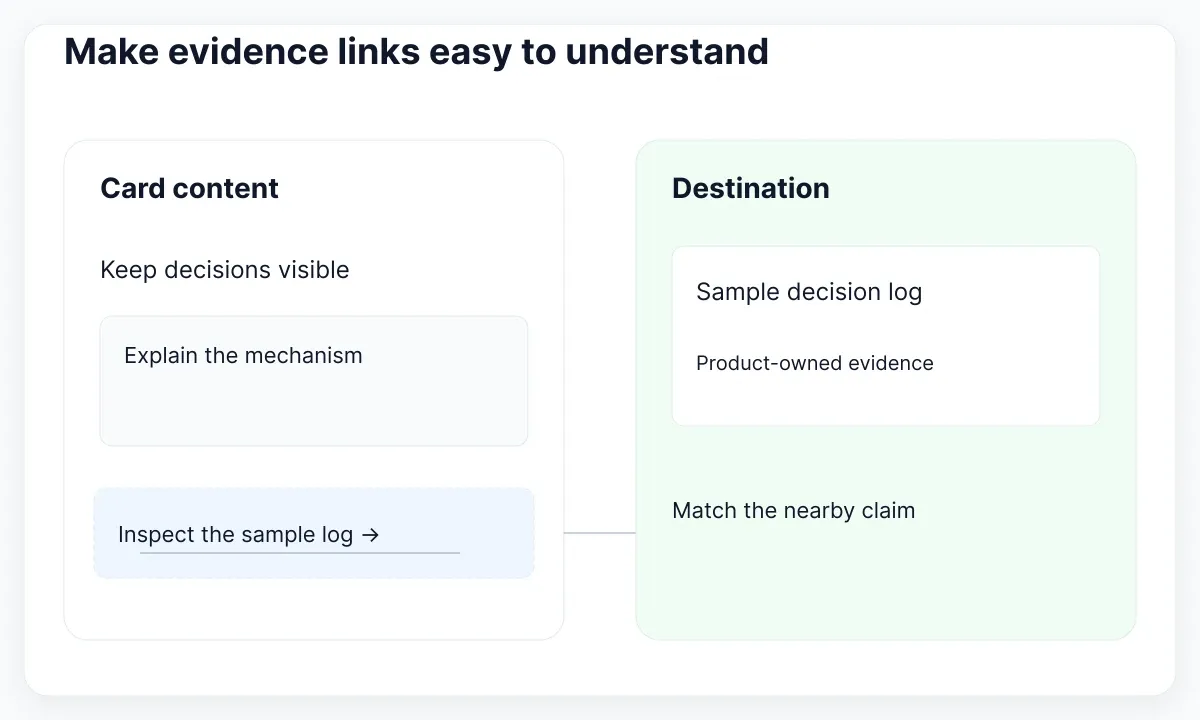
The WAI link-purpose explanation supports understandable destinations through link text or associated context. In this proposed design, use an anchor for navigation and a button only for an action in the current interface. Avoid making the entire card clickable while also nesting several controls inside it. One clearly named destination is easier to review than several overlapping activation areas.
Review keyboard focus as well as pointer hover. Tailwind’s state variant documentation describes focus-visible and other state utilities. In the example, the underline makes the evidence link recognizable and the focus treatment provides a visible review target. Check the actual outline against the rendered background and ensure another stylesheet has not removed it. The class name alone is not a complete accessibility test.
When an icon repeats the adjacent heading, treat it as decoration. The WAI decorative-image guidance explains empty alternative text for decorative images. An inline decorative SVG can be hidden from assistive technology instead. If an image contains unique evidence, give it an appropriate text equivalent. Do not hide a meaningful chart under the same rule just because it occupies an icon-sized space.
Review the section before release
Use a small release rehearsal with two reviewers. Ask one person to identify the main concern, summarize the benefits and choose the sample they would inspect first. Ask the other to follow every destination and confirm that the linked material supports the nearby statement. These tasks test comprehension and evidence continuity in this particular section; they do not establish a conversion uplift.
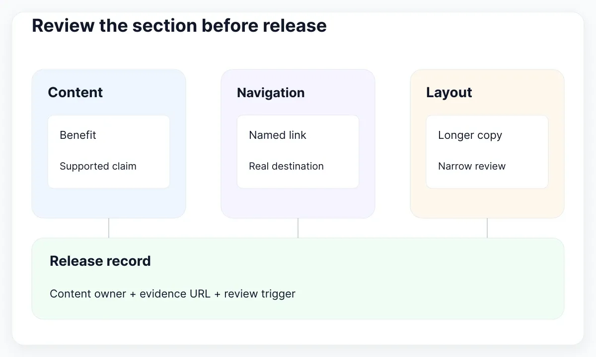
Replace the first heading with a longer Spanish version and expand one explanation to three sentences. Inspect a narrow browser, an intermediate width and the wide layout. Look for cropped text, detached links and awkward gaps. Review keyboard navigation in the real page. If the composition breaks, let cards grow or delay the extra columns before shortening useful information solely to preserve symmetry.
For a repeatable content check, temporarily remove one evidence destination from the review fixture. The reviewer should flag the affected claim instead of replacing the link with a generic CTA. Restore the sample, then change its title and verify that the link text still identifies it accurately. This small exercise exposes maintenance responsibilities that a screenshot review would miss.
Record a content owner, evidence destination and next review trigger for each card. A changed product capability should trigger a copy and destination review together. For visual values shared with the rest of the page, use the existing design decisions rather than introduce a new palette for this one section; the introduction to named design values explains that foundation. Release when the claims, links and layout survive the agreed checks.
Assign the evidence review to a named owner
For each card, record who can confirm that its sample still represents the product. In our fictional exercise, the project owner maintains the decision-log sample and the support lead maintains the handover checklist. These assignments are proposed responsibilities, not claims about an existing organization. If a sample becomes unavailable, review the nearby promise before leaving a broken destination visible.
Compare the card text with the actual destination in the same review session. A link named Inspect the sample decision log should open that material, rather than an unrelated contact form. When the destination changes, update its label and supporting explanation together. This creates a small maintenance contract that can survive a redesign without relying on one designer remembering why each card was added.
Distinguish evidence from a general resource library
The real EmviUI editorial-board specimen below groups a featured story with a collection of article previews. It illustrates a different destination type from a specific sample decision log. A general resource collection can support exploration, but its presence alone does not verify a nearby benefit. Choose the destination according to the question the card promises to answer.
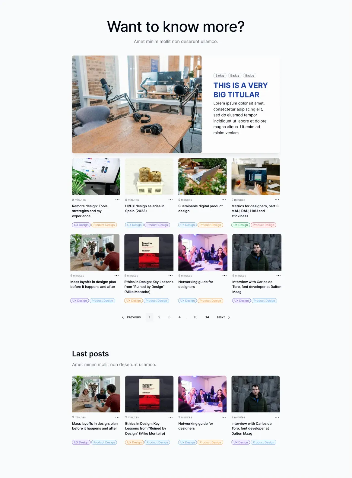
If a benefit links to a library like this, identify the exact relevant item or change the link label to describe the broader collection honestly. Do not label a resource index as a customer case study unless it actually contains that evidence. The specimen contains demonstration article content and is shown to compare destination scope, not to endorse its sample claims or dates.

Pablo Mayoral
Senior UX/UI & Web Designer with 10+ years of experience. Creator of EmviUI (10k+ components Figma design system), UImand, and Vitamin Bootstrap. Currently designing digital products at CQMRewards.