What Are Tokens in Web Design? A Practical Guide
Understand design tokens through practical palette, semantic-role, Figma-variable, CSS, and theme examples.

Design tokens are named, reusable design decisions such as color roles, spacing, or type values. Separate raw palette values from semantic roles, map Figma variables to web styles deliberately, and review every theme and state. Tokens do not automatically sync tools or guarantee accessibility.
What are tokens in web design? They are named, reusable design decisions—such as a color role, spacing step, or type size—that let a team refer to an intention instead of repeating an unexplained value. A token can connect a design file to styles in a website, but the connection needs a clear naming model and an implementation path; creating a variable alone does not automatically synchronize every tool.
Think of a token as a named design decision
A raw value tells you what something is numerically: a color such as #FACC15, a spacing value such as 16px, or a type size such as 14px. A token adds a human-readable name that tells the team why the value exists or where it belongs. The Design Tokens Community Group format describes a token as information associated with a human-readable name, with at least a name and value.
For example, yellow-500 can name a palette step. A semantic token such as surface/notice can refer to that palette value for a warning or notice surface. A component then uses the semantic role rather than hard-coding a yellow. If the visual language changes, the role can point to a different value without changing the component’s meaning.
Move from palette values to useful tokens
Start with a small scale of raw values, then add semantic names only where they help people make consistent choices. Common roles include page background, raised surface, primary text, muted text, border, focus ring, primary action, and status. These are examples, not a universal schema; name roles around the decisions your product actually repeats.
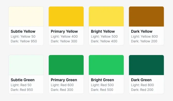
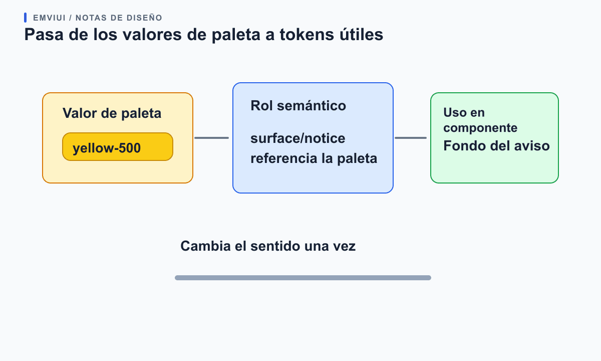
The supplied image shows palette swatches with light, primary, bright, and dark color labels. It illustrates a set of raw color choices, not a complete token map or an accessibility review. The next step is to decide which interface role each color serves and whether that role changes across themes.
A practical chain might be green-700 → action/primary → primary button background. The first name describes a color scale position; the second describes a semantic role; the component uses the role. Keep these levels separate when the same color may serve different purposes, or when one purpose may need a different color in another theme.
Use tokens for consistency without hiding context
Tokens make repeated decisions easier to update and review. If several pages use the same action color, changing the semantic action token gives the team one named place to inspect. If a component requires a special value, avoid adding a token just to replace one literal; create one when the value carries a reusable decision or supports a context the system needs to handle.
Trace one token through the interface
When one role appears in several places, list its consumers before changing the value. A small map makes it easier to notice a banner, validation message, or empty state that would otherwise keep an old color or use a different semantic name.
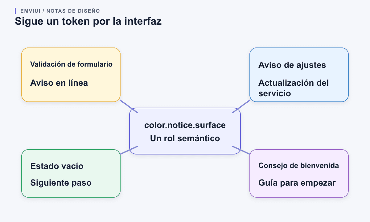
Names should help a designer or developer choose correctly. A name like blue-600 may be useful for a raw scale, but does not explain whether the color belongs to a link, a selected state, or a border. Names like text/link or border/strong communicate a role, provided those roles are defined in documentation and used consistently.
Do not mistake tokens for a full design system. Tokens cover named values and relationships. Components define interface structure and behavior; guidance explains when to use those components; accessibility testing checks whether the result works for people. A tokenized color palette by itself does not make a page accessible or ensure its contrasts are sufficient.
Map Figma variables to web styles deliberately
Figma variables are reusable values that can be applied to design properties. Figma explains that aliasing one variable to another can implement design tokens, and that collections and modes organize values for different contexts such as light and dark themes. A useful Figma setup might keep raw palette variables in one group and semantic roles in another, with aliases connecting the two.
In CSS, custom properties provide named values that can be reused in stylesheets and changed through the cascade. For instance, a site may define --color-action-primary and reference it in a button style. That is an implementation choice; a Figma variable does not become a CSS custom property unless your team exports, maps, or re-creates it through a tooling workflow.
The Design Tokens Community Group published its 2025.10 format module as a stable exchange specification for sharing tokens between tools. It is a Community Group specification, not a W3C Standard. Treat it as an interoperability format, not a promise that two products will interpret every extension or workflow in exactly the same way. Check the current support and mapping rules of each tool you use.
Use modes for real design contexts
A mode is useful when the same semantic decision needs different values under a context such as light or dark theme. Keep the semantic name stable—such as surface/default—and provide an appropriate value for each mode. The component can continue using the same role while the design context changes.
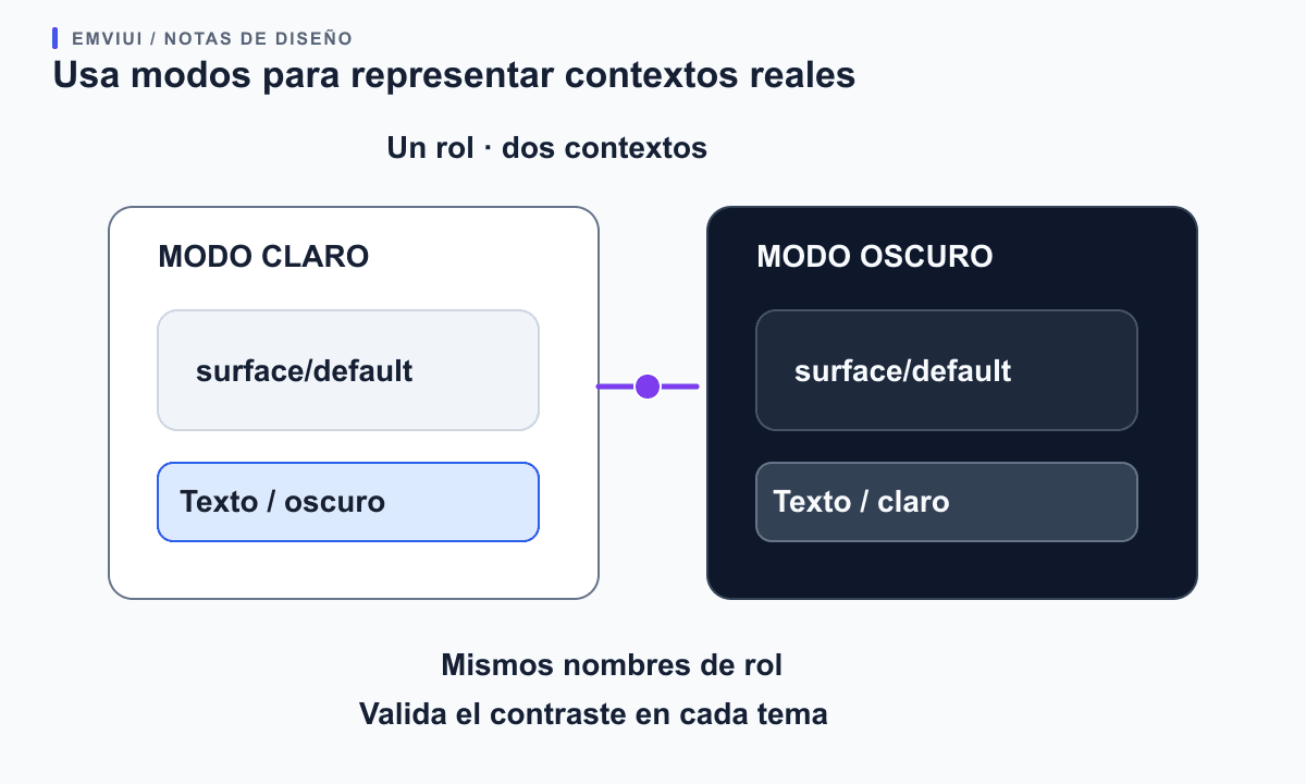
Figma also describes using modes for language and device-size contexts. Those options can help teams explore how a design changes, but they do not replace responsive rules in the website or translation review. For color themes, inspect the actual foreground and background combinations in every mode, including hover, disabled, and focus states. Do not infer accessibility from the token name or from a palette swatch.
Avoid multiplying modes for every possible situation. Add a context when the product has a real need and the team can explain which frame, page, or component selects it. If a value should not vary with a theme, keep it fixed rather than adding a mode for symmetry.
Keep the token set small enough to maintain
Start by listing repeated decisions visible across a few representative screens. Group related values, document what each semantic role means, and point to the components that use it. Ask a developer to confirm that names can map cleanly to the codebase and that the update path is understood before expanding the set.
Review whether a proposed token is actually reused, whether its name describes its role, and whether changing it would have a predictable impact. Remove stale aliases and unused values through an intentional migration: rename, update consumers, and then remove the old name. Blindly replacing values can cause a subtle theme or state regression.
EmviUI’s Figma UI kit includes variables and reusable components, so it can give a team concrete examples to inspect or adapt. It does not decide the names or code mapping for a particular product. For the Figma-specific use of tokens, see our guide to design tokens in Figma. For handoff into a coded interface, read our Figma-to-Tailwind workflow; for structuring the screen before styling, see our Figma and wireframes guide.
Build a token path your implementation can preserve
Choose names that keep raw values separate from the role a component needs. A small model might use palette.yellow.500 for a source color, color.notice.surface for a semantic role, and a component token only when a particular component truly needs a different decision. This lets a team change the notice surface without renaming the raw palette or searching for every place that copied its hex value.
See how a token name reaches CSS
A useful handoff records the primitive value, the semantic property that points to it, and one component that consumes it. That makes it easier to review the path from a Figma variable to the rendered interface without assuming the tools synchronize automatically.
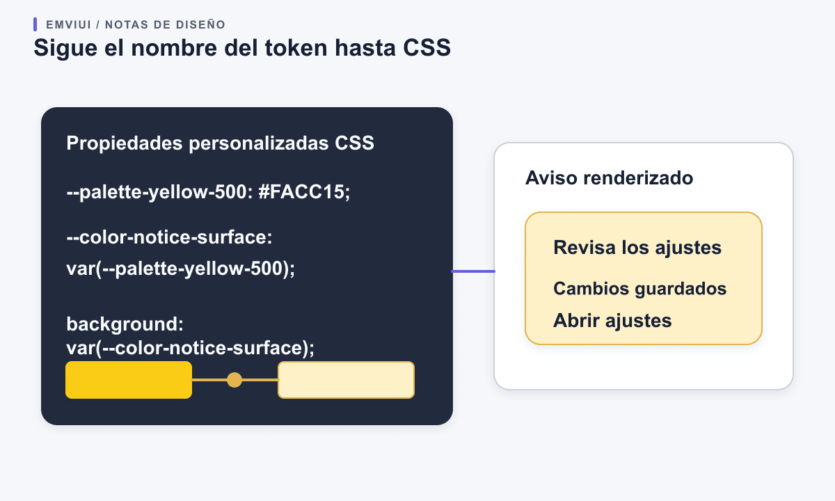
The same separation works in CSS. A semantic custom property can refer to a primitive while the interface uses the semantic name:
:root { --palette-yellow-500: #facc15; --color-notice-surface: var(--palette-yellow-500); }
.notice { background: var(--color-notice-surface); }
In Figma, create a variable for the value and use a clear collection and mode structure when the product has distinct contexts. Then document how those names map to the codebase. Figma variables, a design-token exchange format, and CSS custom properties are related parts of a workflow, but they are not the same storage system and do not synchronize themselves. A file export, transform step, or deliberate manual mapping still needs an owner and a review process.
For a growing system, agree on a short naming grammar before multiplying tokens. Decide whether names follow platform, role, component, and state; keep the order consistent; and record when a component-specific token is justified. A predictable path helps designers find the right variable and helps developers trace a rendered property back to its source.
Decide which values deserve a token
A value is a strong token candidate when it carries a shared meaning, appears in multiple places, or is expected to change as one decision. Brand colors, spacing steps, typography roles, surface levels, and focus indicators often meet one or more of those tests. A one-off illustration offset or a unique measurement used once may be clearer as a local style than as a permanent token in the shared vocabulary.
Before adding a token, ask what a teammate should understand from its name and who will maintain it. If the answer is only “this is the value on this screen,” a token may add ceremony without reuse. If the answer is “this is the surface for a warning across forms and settings,” the role is easier to share and review. Keep raw primitives available for controlled composition, but avoid using them directly throughout components when the product needs a stable semantic layer.
Component tokens become useful when a component has a real requirement that the general semantic role cannot express, such as a button label that needs its own state behavior. Do not create a component namespace for every property by default: every alias adds another relationship the team must understand. Start with a small semantic set, find repeated exceptions, then promote only those exceptions that need stable names.
Review token changes in the interface
Tokens centralize decisions; they do not prove that the resulting interface is usable. Before shipping a palette or mode change, inspect the actual foreground and background combinations for body text, controls, borders, error messages, focus indicators, and disabled states. The WCAG contrast guidance applies to rendered content combinations, so a token name such as text/subtle cannot certify contrast by itself. Test the combinations that appear in the product, including every supported theme.
Use a focused change review: list the semantic tokens changed, identify the components that consume them, compare the Figma modes with the CSS output, and check representative screens at narrow and wide widths. A color token may affect more than a static card; it can change hover, focus, selected, and error states that were not visible in the original palette sample. Catching those effects in context is more useful than approving a color swatch alone.
EmviUI can help a designer inspect how shared values appear across a Figma UI kit and its component examples. Use the component and design-system patterns to see where a role repeats, then map the chosen variable deliberately to the product code. The kit can provide a useful design reference; your project still owns the naming contract, exports, theme decisions, and accessibility checks.
Sources and further reading

Pablo Mayoral
Senior UX/UI & Web Designer with 10+ years of experience. Creator of EmviUI (10k+ components Figma design system), UImand, and Vitamin Bootstrap. Currently designing digital products at CQMRewards.