Figma to Tailwind Code: Responsive React Workflow
A reliable handoff preserves the design decisions that matter: reusable structure, content behavior, tokens, states and responsive rules.
The best Figma-to-Tailwind workflow is to define reusable components and responsive behavior in Figma, inspect dimensions and variables in Dev Mode, map agreed tokens to Tailwind theme variables, implement semantic React components, then verify multiple content, state and viewport combinations in a browser. Auto Layout describes relationships that can guide flex or grid choices, but it does not guarantee an automatic or maintainable code conversion.
Figma to Tailwind code means translating design intent into maintainable components, not copying a frame pixel by pixel. Treat Figma as a specification of reusable structure and behavior, inspect that specification in Dev Mode, implement it in semantic React with Tailwind, and verify it in a browser using real content and several viewport widths. Auto Layout can suggest CSS relationships, and variables can inform tokens, but neither feature guarantees production code by itself.
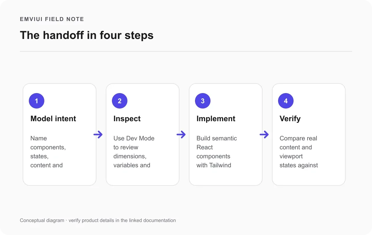
The handoff in four steps
Use a short repeatable sequence: clarify behavior, inspect the design, implement the component, then verify it in a browser. The diagram summarizes these stages; each still needs human review.
This distinction saves time. The goal is not to copy every pixel coordinate into a class list; it is to preserve the decisions that make the interface understandable and resilient: hierarchy, spacing rules, reusable components, interaction states, token meaning and adaptation when the viewport or content changes. Teams that need a screen-design refresher can start with our guide to responsive web design in Figma, then follow this handoff workflow for implementation.
A dependable Figma-to-React handoff
Start by making the Figma file readable to someone who did not create it. Use clear frame and layer names, component properties for meaningful variants, and representative copy rather than placeholder labels. Show the states that affect implementation: default, hover or focus where relevant, disabled, loading, empty and error. If a layout changes between widths, document the rule or show the important breakpoint states. Figma's Dev Mode guide describes how developers can inspect designs, measurements and related context.
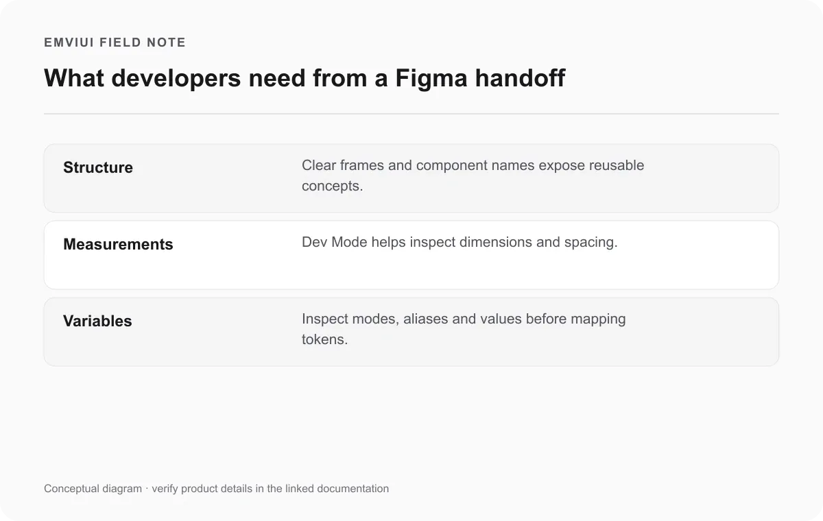
Next, inspect rather than infer. In Dev Mode, review dimensions, spacing, typography, colors and variable references. Ask the designer when the file leaves a behavior ambiguous. Is a card allowed to grow with its content? Does a button stay beside a label or move below it? Is an image cropped, contained or allowed to set the row height? Those are product decisions, not details a code generator can reliably guess from a static frame.
Then implement the component boundary before polishing every value. A reusable React component should represent a repeated interface concept with a clear API, not every rectangle in a canvas. Use semantic elements, accessible labels and predictable state props. Tailwind classes are an implementation tool; they should express the layout and visual system without replacing sound component structure. For more context on design context and developer tooling, see what Figma MCP does in a design-to-code workflow.
Finally, review the browser output with the designer or product owner. Compare the hierarchy and behavior, not just a single screenshot. Record decisions that affect many components in the shared system so the next implementation does not invent another local convention.
Translate layout intent, not pixel coordinates
Figma Auto Layout arranges items according to properties such as direction, spacing, padding, alignment and sizing. Figma describes it as a way to make frames respond to content changes. In implementation, that information can guide layout choices: a row of controls may be a flex container, a stack may be a column with a gap, and a repeated two-dimensional collection may be better represented as a grid.
For a concrete handoff exercise, choose a button or input from EmviUI and document its spacing, text wrapping and visible states in Figma. Implement the same example as a React component with Tailwind, then compare it at narrow and wide widths. The shared design reference makes differences easier to discuss while your team defines the code and behavior.
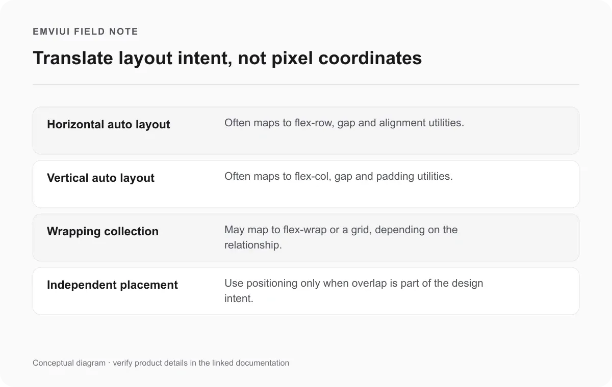
These are translations of relationships, not a fixed conversion table. A horizontal Auto Layout frame does not always mean flex-row: at a narrow width it might wrap, scroll, or change into a vertical stack. A dashboard that looks like a grid at desktop may become a one-column list on mobile. Absolute positioning can match one artboard quickly but often breaks when labels wrap or data changes, so use it only when overlap is genuinely part of the design.
A practical rule is to ask what should remain true when the content changes. If siblings should keep the same gap and share available space, flex may fit. If items align in both rows and columns, grid may fit. If one element overlays another, positioning may be warranted. Add responsive variants after understanding the content constraints, then test with longer text and smaller widths. The screenshot is evidence of one state; the relationship is the specification.
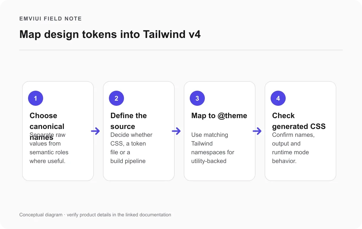
Map design tokens into Tailwind v4
Before copying colors and spacing into JSX, decide which values are shared tokens and what those names mean. A raw palette token such as blue-600 describes a value; a semantic token such as text-action-primary describes a role. Teams often need both: primitives make the palette coherent, while semantic roles let a theme or brand change without rewriting every component. The Figma variables guide explains collections, modes, aliases and variable types.
| Design intent | Implementation starting point |
|---|---|
| Shared color role | Tailwind v4 @theme color variable when a utility is useful |
| Runtime-only value | Regular CSS custom property |
| Multiple platform outputs | Token source plus a build pipeline, if maintenance is justified |
@import "tailwindcss";
@theme {
  --color-action-primary: oklch(0.55 0.18 260);
}
/* Example: use bg-action-primary in a component */
Tailwind CSS v4 uses CSS theme variables. Its theme documentation explains that variables declared with @theme do more than define CSS values: names in supported namespaces can create corresponding utilities. A color token can make color utilities available; breakpoint variables can define responsive variants. Ordinary CSS custom properties remain useful for values that should not create a utility class. Keep the distinction deliberate and confirm the namespace against the current Tailwind documentation.
For a small web-only system, a reviewed CSS theme file may be a simple source of truth. If the same tokens must produce artifacts for web, native apps, documentation or other consumers, a build system such as Style Dictionary can transform token source files into platform outputs. That adds configuration and a build step, so adopt it when multiple outputs justify the maintenance cost. Figma is an authoring and collaboration surface; it is not automatically the canonical runtime source for every codebase.
Whatever route you select, write down the mapping and check the output. Figma's Dev Mode variable details can show the variable name, collection, mode, value, alias chain, scope and a code snippet. Figma also notes that names may be normalized for valid CSS. Review the actual CSS variable and generated utility in your project rather than assuming an exported name is identical to a Figma label.
Check responsive behavior at four levels
A design can match its reference at 1440 pixels and still fail the moment a button label gets longer. Review four dimensions before calling a component done. First, content: try long titles, translated strings, missing values and realistic data. Second, width: check narrow, intermediate and wide viewports rather than only the endpoints. Tailwind's responsive design documentation describes its mobile-first breakpoint variants; choose breakpoints based on where the layout needs to change, not on device names alone.
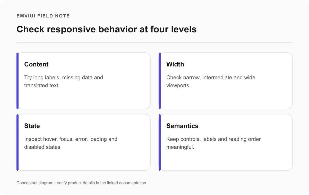
Third, state: inspect focus, disabled, loading, error and expanded states. A prototype or static frame may not specify each one, so resolve gaps with the designer. Fourth, semantics: make sure a control has an accessible name, the reading order makes sense, and keyboard focus is visible. Responsive behavior is about preserving usable structure, not shrinking every element until it fits.
Use a small review matrix. For a dashboard card, test one short and one long title at a narrow and a wide width; check the empty and error variants; then use keyboard navigation. For a navigation bar, test a short and long translated label and confirm the mobile menu order. This is usually more informative than comparing a single screenshot pixel by pixel.
A practical implementation checklist
Use these steps to keep design decisions explicit from the first component to final review.
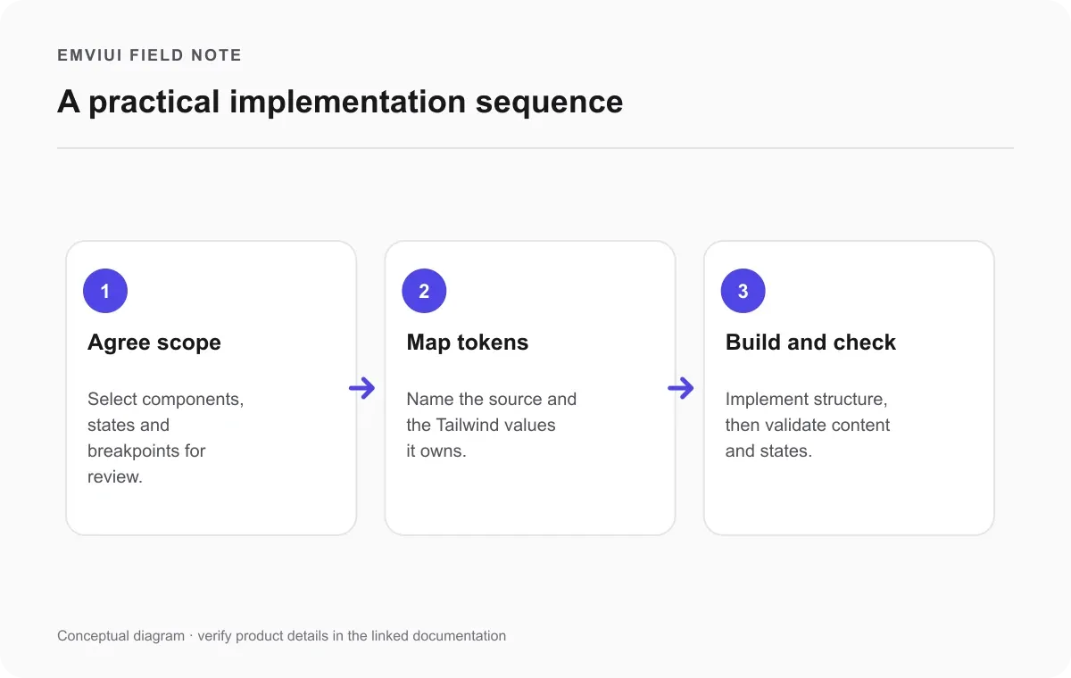
- Clarify the target: agree which pages, components, breakpoints and states are in scope.
- Clean the source: name layers, components and variables so inspection is useful; remove stale experiments from the handoff area.
- Agree token ownership: identify the canonical file or pipeline and map Figma variables to Tailwind names.
- Implement structure first: build semantic React markup and responsive relationships before fine visual tuning.
- Check generated output: confirm Tailwind emits the intended utilities and that CSS variables resolve in the right theme or mode.
- Review realistic scenarios: test content, viewport sizes, interactions, focus and empty/error conditions with the designer.
- Record exceptions: document intentional one-off values and unresolved design decisions instead of silently adding arbitrary classes.
This checklist makes the handoff repeatable, but it does not replace judgment. A Figma-to-code plugin or agent may accelerate scaffolding; generated markup still needs review for component boundaries, accessibility, responsive behavior and maintainability. The design file and browser implementation are different artifacts with different constraints.
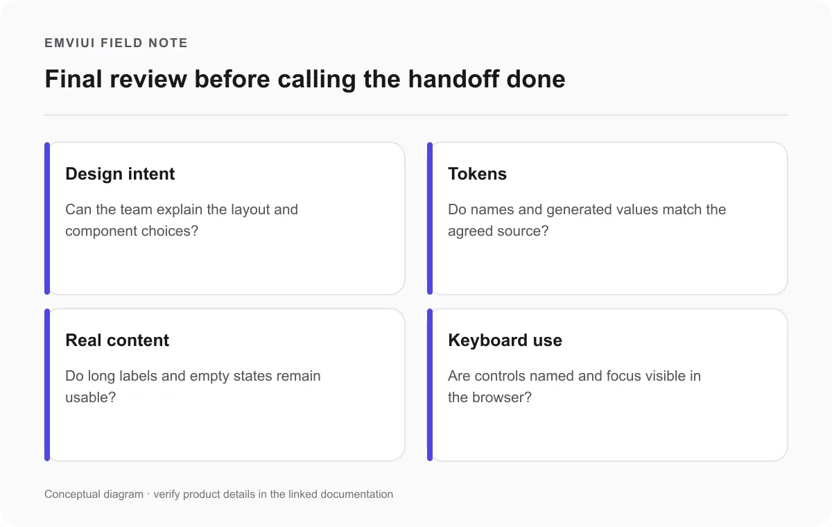
Before calling the handoff complete
Before merging, review whether the design intent, token mapping, realistic content behavior and keyboard interaction are all understood and verified.
Frequently asked questions about Figma to Tailwind
What is the best Figma-to-Tailwind workflow for React? Model reusable components, content and responsive intent in Figma; inspect the file in Dev Mode; agree on token names; implement semantic React components with Tailwind; then test real content, interaction states and several viewport widths in a browser.
Can Figma Auto Layout convert directly to Tailwind flex and grid? It provides useful layout relationships, but it cannot decide every responsive rule or semantic boundary. Treat the properties as implementation clues and choose flex, grid, wrapping or positioning based on the behavior you need.
How do Figma variables map to Tailwind CSS v4 theme tokens? Agree on names, put utility-backed values in the appropriate @theme namespace, and use regular CSS variables for values that should not create utilities. Verify the generated CSS in the project.
Should a team use Tailwind @theme or Style Dictionary? A CSS theme can suit a web-only Tailwind application. A token build system is useful when one source must produce several platform formats. Choose based on consumers and maintenance needs.
How should a team name and version Figma variables? Separate primitive and semantic roles where helpful, use stable names, document owners and intended use, and agree how changes are reviewed. Figma exposes modes and alias details, but teams own their policy.
How do you know the React result is truly responsive? Test multiple widths with long and short content, translated labels, empty and error states, and keyboard focus. A successful screenshot at one width is not enough.

Pablo Mayoral
Senior UX/UI & Web Designer with 10+ years of experience. Creator of EmviUI (10k+ components Figma design system), UImand, and Vitamin Bootstrap. Currently designing digital products at CQMRewards.