How to Use Tailwind CSS in Next JS: App Router Setup
Connect the CSS entry, prove styles reach two App Router routes, and keep static styling separate from client interaction.
Install the current Tailwind PostCSS integration, import Tailwind in global CSS and load that stylesheet from the root layout. Use complete classes, check two routes and repeat the review against a production build. Static utility styling does not need use client.
To use Tailwind CSS in Next.js with App Router, connect the current Tailwind PostCSS plugin, import Tailwind in a global stylesheet, and import that stylesheet from the root layout. Then apply complete utility classes through JSX’s className. Check two routes and a production build before expanding the design. Styling a Server Component does not require turning it into a Client Component.
Identify the Next.js app you are styling
Start by finding the application package, its router and its existing stylesheet entry. A working Tailwind installation created by the scaffold needs a review, not another configuration layered on top. Keep this first change small enough to trace from package to rendered page.
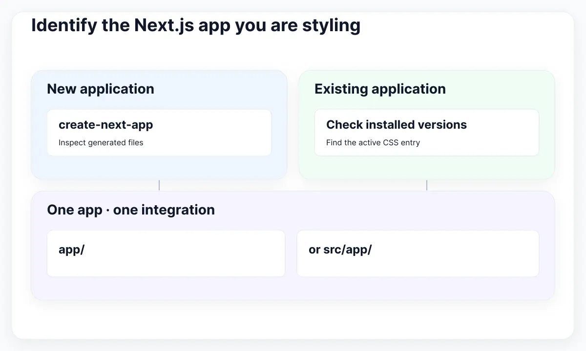
This guide proposes an implementation exercise for Orbit, a fictional project workspace. Its overview and activity pages must share a plain white panel, readable headings and navigation links. The exercise is deliberately about CSS delivery across routes. It does not add accounts, data fetching or a complete dashboard.
For a fresh project, Next.js installation documentation describes create-next-app and a Tailwind option. You can start with npx create-next-app@latest orbit-review and choose TypeScript, Tailwind and App Router. Inspect the resulting files before applying the manual setup below. Record the package versions resolved in your lockfile.
For an existing project, run npm ls next tailwindcss @tailwindcss/postcss in its application package. Record whether routes live in app/ or src/app/. The examples here use the former. Translate paths consistently if the project uses the latter; do not create a second unused app directory.
Tailwind’s upgrade guide separates the v4 PostCSS package and CSS import from the older v3 integration. Treat an established v3 application as a migration decision. Mixing snippets from both generations makes the result harder to diagnose. Check its browser requirements and existing plugins before changing dependencies.
Write an acceptance note now: both URLs show their own heading, the shared panel retains its padding, and navigation does not change its appearance. Save the initial screenshot and configuration diff. These proposed checks give the team a concrete stopping point without claiming that the example has already passed in your environment.
Connect PostCSS, global CSS and the root layout
Trace one continuous chain: installed packages, the active PostCSS configuration, the imported CSS file and the root layout. A correct utility in a page cannot repair a missing link in that chain. Verify the entry before changing the panel’s appearance.
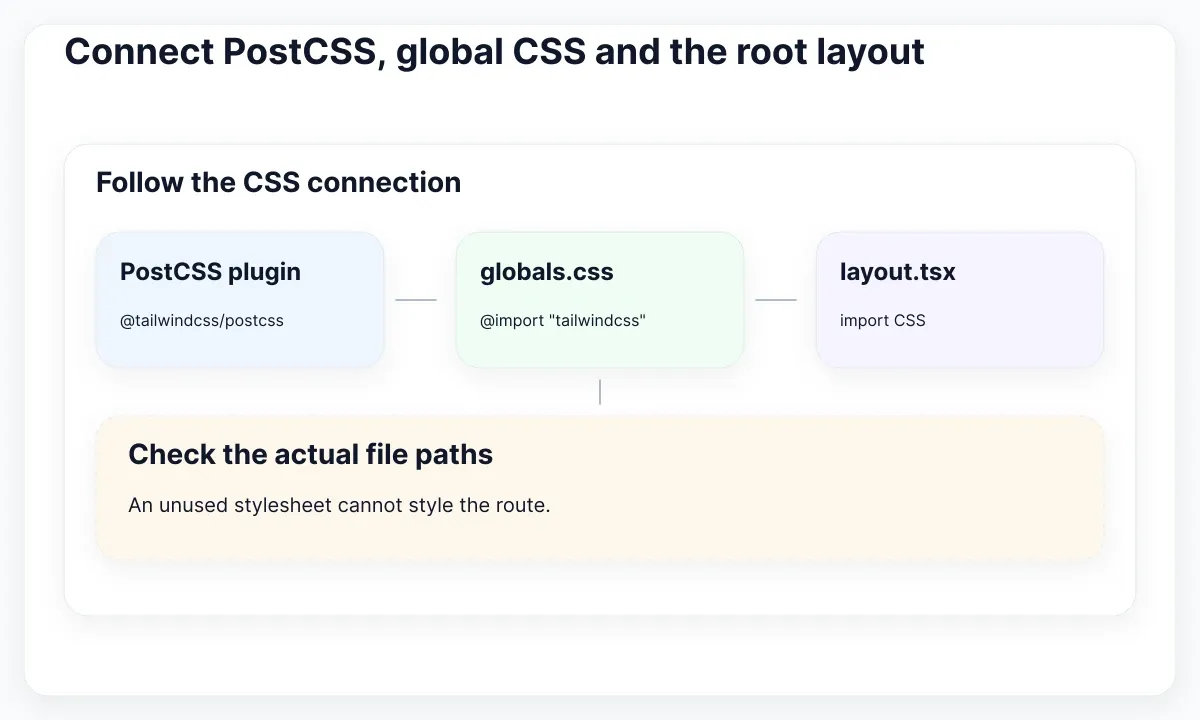
The official Tailwind Next.js installation guide specifies the packages and plugin below. In an existing project, merge the plugin into the working configuration rather than replacing unrelated transforms. The excerpt is a minimal reference for that integration, not a complete replacement for your application files.
npm install tailwindcss @tailwindcss/postcss postcss

// postcss.config.mjs
export default {
  plugins: { "@tailwindcss/postcss": {} },
};

/* app/globals.css */
@import "tailwindcss";

// app/layout.tsx
import "./globals.css";
The final import belongs at the top of your existing root layout. Keep its exported component and required document elements. Next.js CSS guidance shows the global stylesheet import in that layout. If the CSS file is named differently, use its actual relative path. An unused globals.css beside a working global.css is an easy mistake to miss.
For Orbit, use a simple review record with four entries: dependency package, configuration file, stylesheet path and importing module. Ask a teammate to follow those references directly. If any entry points to a different application or an unused file, resolve that mismatch before adding more utilities.
Restart the development process after changing build configuration, then open the route you intend to edit. Add a temporary visible heading change to confirm the correct package is running. Remove that diagnostic text once confirmed. This is a proposed debugging step; the heading itself does not demonstrate that PostCSS generated the expected CSS.
If the project is actually a Vite application, continue with the separate React and Vite setup guide. Keep its plugin configuration in that workflow. Here the entry under review is Next.js with PostCSS and an App Router layout.
Prove that styles reach two routes
Use two small routes to prove shared styling before assembling a large screen. Give both the same panel component and different titles. Direct loading and in-app navigation should expose the same spacing and typography for that shared specimen.
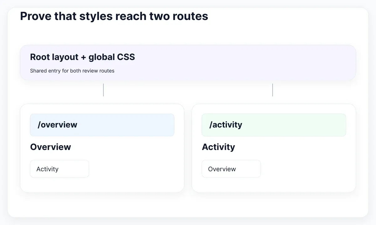
Next.js layouts and pages documentation explains how page files define routes and layouts wrap their children. For Orbit, add the following three files beneath the existing app directory. The links connect the two review pages so you can inspect each route without changing the specimen.
// app/ui/review-panel.tsx
import Link from "next/link";

export default function ReviewPanel({ title }: { title: string }) {
  return (
    <section className="rounded-xl border border-slate-200 bg-white p-6">
      <h1 className="text-2xl font-semibold text-slate-900">{title}</h1>
      <p className="mt-3 text-slate-700">Compare both review routes.</p>
      <nav aria-label="Review pages" className="mt-6 flex flex-wrap gap-4">
        <Link href="/overview" className="underline underline-offset-4">Overview</Link>
        <Link href="/activity" className="underline underline-offset-4">Activity</Link>
      </nav>
    </section>
  );
}

// app/overview/page.tsx
import ReviewPanel from "../ui/review-panel";
export default function Overview() {
  return <ReviewPanel title="Overview" />;
}

// app/activity/page.tsx
import ReviewPanel from "../ui/review-panel";
export default function Activity() {
  return <ReviewPanel title="Activity" />;
}
Open /overview directly, then follow Activity and return to Overview. Repeat from a direct load of /activity. Inspect the panel’s padding and heading rule in browser developer tools. Record the matching selector and computed property rather than judging setup only by a screenshot.
The classes are intentionally literal. Tailwind’s source-detection documentation explains why complete class names must be available in scanned source. If a later component chooses between appearances, map each choice to a complete class list. Do not construct a color utility from disconnected fragments and assume the build can infer every result.
Keep the two panels visually identical during this check. Adding a custom stylesheet to one route while changing the shared component on the other introduces a second explanation for every difference. After establishing the shared baseline, add route-specific styling as a separate change and repeat the same navigation sequence.
For a team review, capture both the initial URL and the destination after clicking. A report that says “Activity looks wrong after Overview” is more actionable than “Tailwind sometimes fails.” Include the actual viewport width and whether the result came from development or a production server.
Separate styling from client interaction
Keep the panel static until it needs interaction. Its classes describe appearance; they do not create client-side state. If a later control needs a click handler, isolate that responsibility so a styling change does not casually expand the browser module tree.
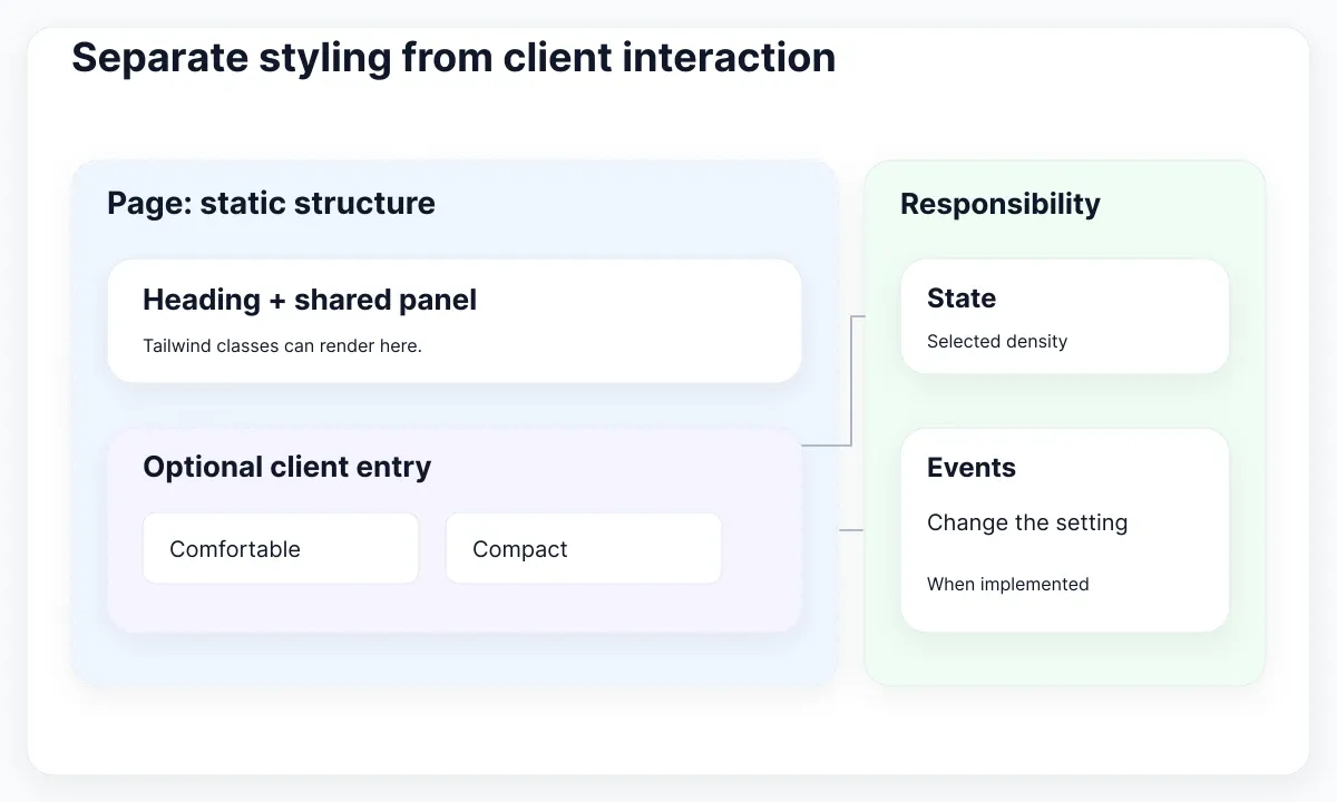
Next.js Server and Client Components guidance identifies state and event handlers as Client Component responsibilities and describes the use client boundary. The two page examples above do not need that directive merely to render Tailwind classes. Add it to a small interactive entry when there is a real behavior to implement.
Suppose Orbit later adds a density control. Write its task first: switch between comfortable and compact panel spacing. Keep the selected value with the component responsible for the change, and give each density a complete utility string. Review the selected control and the affected panel together. A changed button color alone would not prove that density changed.
Before implementing that extension, agree on its scope: does it affect only this panel, the whole route or a persisted preference? These are product decisions. The initial installation trial can finish without them. Recording the next task prevents a small CSS setup from expanding into an unfinished preferences system.
Also distinguish links from controls during review. The specimen’s links navigate to routes; a density control changes a local setting. Do not attach a click handler to every navigation item simply because an example button already uses one. Review behavior from the user’s intended action.
Once behavior exists, continue with the guide to color classes, focus and status for visual state decisions. The integration check here is narrower: shared styles reach both static pages, and any added client entry has a documented reason.
Inspect the production build and navigation
Repeat the route checks against a production build. A development preview is useful during editing, but it is only one environment. Keep the same content, route order and viewport sizes so differences are visible and reproducible.
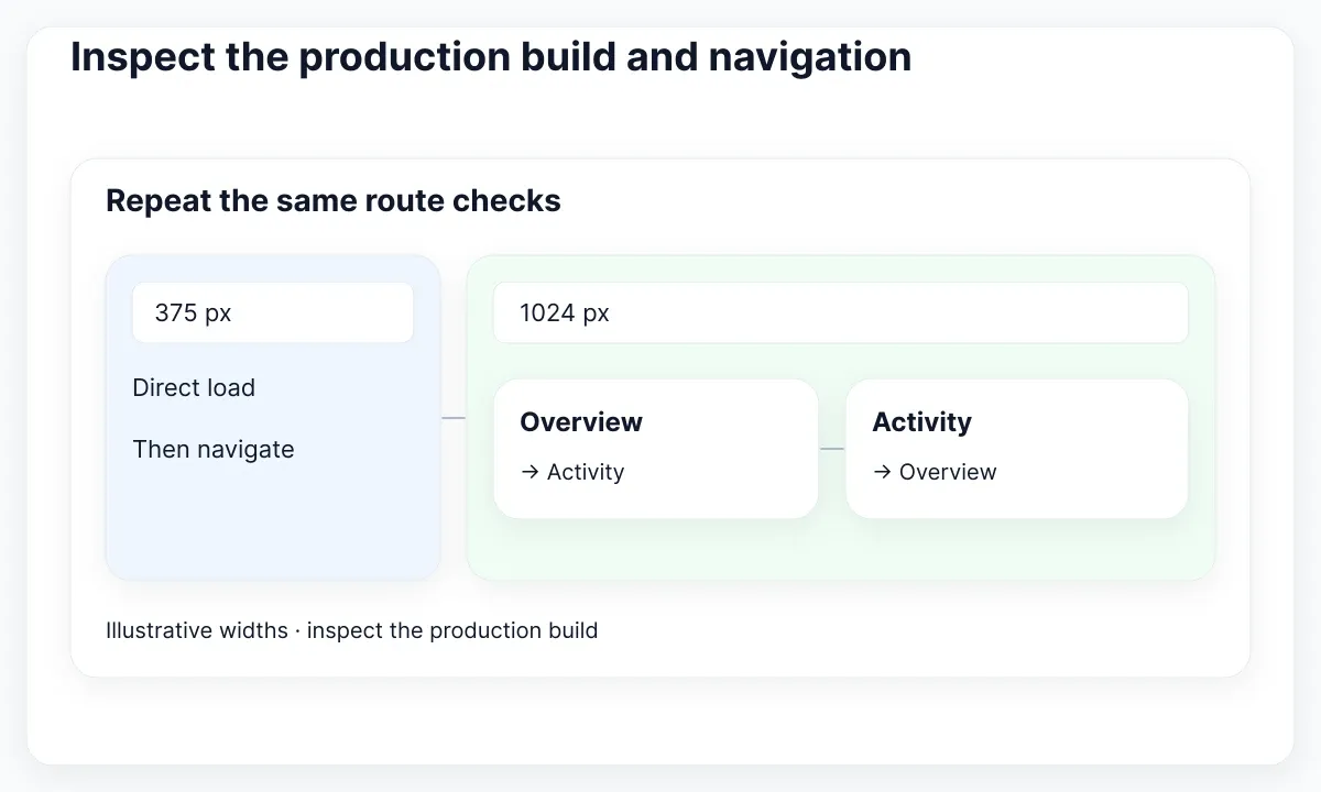
The Next.js production checklist recommends building locally and inspecting the application in a production-like environment. For a standard Node server project with the documented scripts, run npm run build, followed by npm run start after the build succeeds. Deployment-specific or export workflows need their own serving procedure.
For Orbit, record four observations: direct Overview, Overview to Activity, direct Activity, and Activity to Overview. Repeat at an illustrative narrow width of 375 pixels and a wider width of 1024 pixels. These are proposed review sizes, not evidence of universal device coverage. Add the dimensions your actual product supports.
Tailwind’s responsive-design documentation explains that unprefixed utilities apply across sizes, while breakpoint-prefixed utilities take effect at their breakpoint and above. Our simple panel starts without a breakpoint-specific layout. If you add one, test immediately below and above its configured boundary instead of checking only a large monitor.
| Symptom | First observation | Next check |
|---|---|---|
| Everything is unstyled | Is the CSS request successful? | Trace stylesheet import and PostCSS |
| Only one utility is missing | Does its complete class exist? | Inspect source detection and emitted rule |
| Rule exists but loses | Which declaration wins? | Inspect cascade and competing styles |
| Only navigation changes the result | Which route order triggers it? | Inspect route imports and CSS ordering |
Keep the first actionable build error with the configuration diff. If the build succeeds, inspect the delivered CSS request and the actual panel before approving the setup. Do not label an untested production route as verified because its development counterpart looked correct.
Translate an EmviUI reference into a delivery note
Use a real design reference to choose what should remain visually stable across routes. The EmviUI button-group specimen below provides horizontal and vertical arrangements for discussing navigation hierarchy. It is a Figma design specimen, not a screenshot of the Orbit implementation or proof of Next.js behavior.
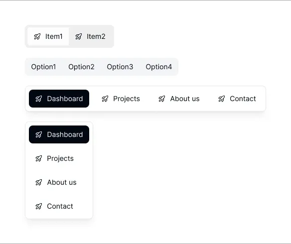
EmviUI presents an editable Figma UI kit and design system with Tailwind-oriented resources. A designer can use its navigation patterns to discuss spacing, labels and selected appearance before the developer builds a route-aware component. The screenshot does not establish a React API, a package installation command or working accessibility behavior.
For Orbit, choose only the two destinations already implemented. Replace the specimen’s sample labels with Overview and Activity in an authorized working copy. Record which destination is current, what changes at a narrow width and what the developer must demonstrate. Keep these proposed design decisions separate from the basic installation acceptance checks.
Finish the handoff with the package versions, CSS entry path, two review URLs, accepted viewport observations and any unresolved differences. Add the command used for the production check. This gives the next person enough context to repeat the result without guessing which preview the designer approved.
If the next decision is adopting a larger component resource, continue with the Next.js UI-kit integration guide. The current task is complete when the CSS chain is understood, the two routes have been checked in the intended environment and the design reference has a clear implementation owner.

Pablo Mayoral
Senior UX/UI & Web Designer with 10+ years of experience. Creator of EmviUI (10k+ components Figma design system), UImand, and Vitamin Bootstrap. Currently designing digital products at CQMRewards.