Troubleshoot EmviUI React Tailwind: Styling, Variants & Build Errors
Find the failing layer before changing a shared component’s visual recipe.
To troubleshoot EmviUI styling conflicts, missing component variants or build errors in React and Tailwind, first identify the resource you imported. Then isolate the failing layer: build, rendered component, generated CSS or cascade. Check one component on a minimal route and verify the correction in a production build.
To troubleshoot EmviUI styling conflicts, missing component variants or build errors in React and Tailwind, first identify the resource you imported. Then isolate the failing layer: build, rendered component, generated CSS or cascade. Check one component on a minimal route and verify the correction in a production build.
EmviUI’s button page describes editable Figma patterns. A Figma variant is a design reference; it does not establish a React prop API or install CSS. This guide follows a fictional Fieldnote toolbar implemented from that reference. Its recipes and diagnostic cases are proposed application code, not an official EmviUI SDK.
Locate the failing component layer
Record the exact symptom before changing styles. If the build fails, start with its first actionable error. If the component is absent, inspect rendering. If it exists but looks wrong, inspect its rules. The button anatomy below helps separate arrangement, internal space and surface decisions once you reach the CSS layer.
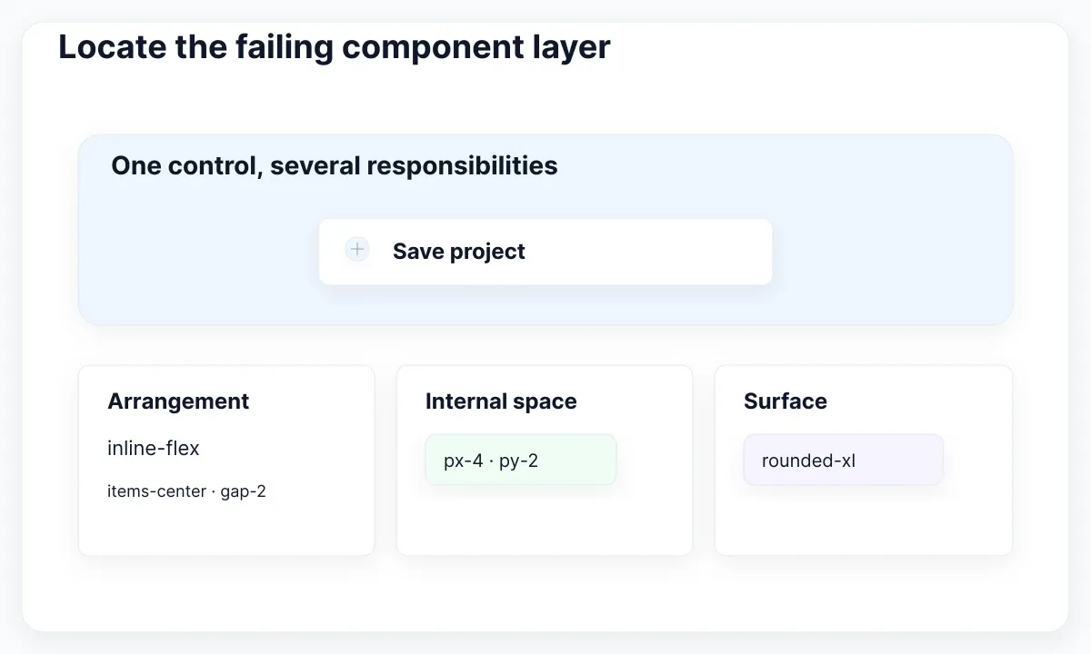
Create a temporary review route containing one button and its surrounding toolbar. Keep the same imports and stylesheet entry as the failing screen. Compare the affected role with one working role. Record the route, installed Tailwind version, expected appearance and observed result. Change one cause at a time so the result remains explainable.
If the minimal route works, add the original surrounding layout back in stages. A wrapper that changes width or a page stylesheet that overrides the surface can then be identified directly. Do not recreate the entire production screen before learning which addition makes the symptom return. Keep the reproduction until the fix has been checked in the real route.
Map component choices to complete classes
Keep finite component choices in a lookup table of complete utility strings. Tailwind’s source-detection documentation describes why class-name fragments assembled at runtime can be missed. In our example, the role “primary” selects a complete background-and-text recipe; it does not supply the middle of a generated class name.
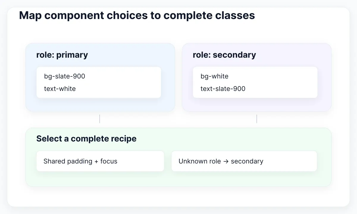
Let the component own its internal appearance. A caller chooses primary or secondary, while the component owns padding, focus styling and the approved role recipes. If a page needs extra space around the button, put that spacing on the surrounding toolbar. This makes a later change to the shared button easier to reason about.
Provide a fallback for an unexpected role. A runtime API response can still contain a value outside the intended vocabulary, even if the local TypeScript caller is well typed. In this example, an unknown role uses the secondary recipe. Document that decision so a new backend value does not silently become a brand-new visual state.
Avoid exposing an unrestricted color name simply because it makes the first example shorter. A role such as destructive carries a reviewable meaning; a shade such as red-600 only describes a paint choice. The recommended API lets the team revise the paint without changing every caller. Keep business permission checks outside this styling map.
const roles = {
  primary: "bg-slate-900 text-white enabled:hover:bg-slate-800",
  secondary: "bg-white text-slate-900 border border-slate-300"
};

export function SaveButton({ role = "primary", disabled = false, children }) {
  const recipe = Object.hasOwn(roles, role) ? roles[role] : roles.secondary;
  return (
    <button type="button" disabled={disabled}
      className={[
        "inline-flex items-center justify-center gap-2 rounded-xl px-4 py-2",
        "font-medium focus-visible:outline-2 focus-visible:outline-offset-2",
        "focus-visible:outline-blue-600 disabled:opacity-50",
        recipe
      ].join(" ")}>
      {children}
    </button>
  );
}
Separate missing markup from dynamic values
When a variant seems missing, inspect whether React rendered it at all. The React conditional-rendering guide shows how branches can include or omit JSX. Check the prop value at the component boundary, the selected branch and the resulting element before diagnosing its colors.
For Fieldnote, an empty toolbar is different from a visible button with the wrong surface. If the element is absent, confirm the permission and loading branches. If it exists, inspect its complete class string and role fallback. A correct Figma variant name does not guarantee that the application uses the same spelling or even the same API.
Keep true runtime values separate from class names. For a project accent, use a stable utility reading a validated CSS custom property, as described in Tailwind’s custom-style documentation. The marker below is decorative; it does not replace a visible project title. Test a missing value and a stored invalid value as well as two valid accents.
<span class="inline-block size-3 rounded-full bg-[var(--project-accent)]"
      style="--project-accent: #2563eb" aria-hidden="true"></span>
Check the source boundary before adding CSS
When a dependency or shared package supplies the markup, confirm that its source is included in the stylesheet’s detection boundary. In Tailwind v4, an explicit @source path can register an otherwise ignored library. Keep the path relative to the stylesheet and register the smallest relevant directory. The version matters when borrowing configuration examples.
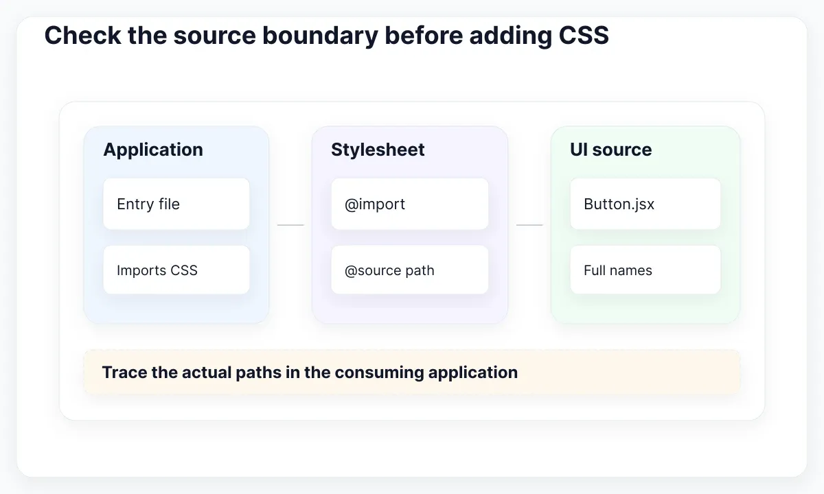
Draw a simple ownership map before editing configuration: the application entry imports the stylesheet, the stylesheet detects the UI source, and the UI source contains the intended utility strings. Put actual repository paths beside these three responsibilities. A broken arrow identifies a better next investigation than adding another background class to a page.
If the entire page is unstyled, verify the stylesheet import and network response first. If one role is missing while shared padding works, inspect that role’s recipe and the file containing it. If a package works in a local playground but not the consuming application, compare the package path and build entry in those two environments.
A narrow safelist can be appropriate for a small, intentional vocabulary supplied outside scanned source; v4 provides @source inline(). Write down the owner and reason for each exception. Avoid hiding a broken component contract behind a broad range of generated colors. For initial application wiring, use the separate React and Vite setup guide.
Inspect the winning rule and its condition
A generated utility can exist without being the rule that controls the element. The utility-class documentation explains how conflicting classes are resolved. Inspect the browser’s computed style and the conditions around the rule. When utilities compete under equivalent conditions, their order in the generated stylesheet matters; moving a token to the end of the HTML class attribute is not a reliable override strategy.
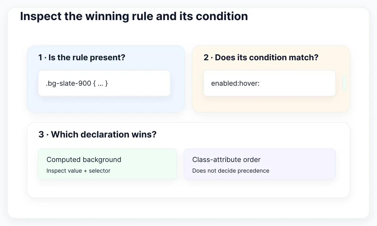
Start with one property, such as background-color. Find the value the browser currently uses, identify the selector that supplied it, and see whether the intended selector is absent, crossed out or conditional. Only then change the source. A missing rule, a competing rule and an inactive media query are three different failures.
State variants such as enabled:hover: and focus-visible: describe conditions; they do not create application behavior. Tailwind’s state documentation explains the selectors behind these variants. In the sample button, disabled is an actual HTML attribute. Merely adding disabled:opacity-50 without setting that attribute would not disable the control.
For width-dependent styling, unprefixed utilities form the baseline and breakpoint variants apply from their threshold upward, as described in the responsive-design documentation. Review the toolbar just below and above its chosen transition. Read the project’s configured breakpoints rather than assuming another repository’s numbers. For longer labels and zoom cases, continue with readable type and reflow checks.
Review the button states with EmviUI
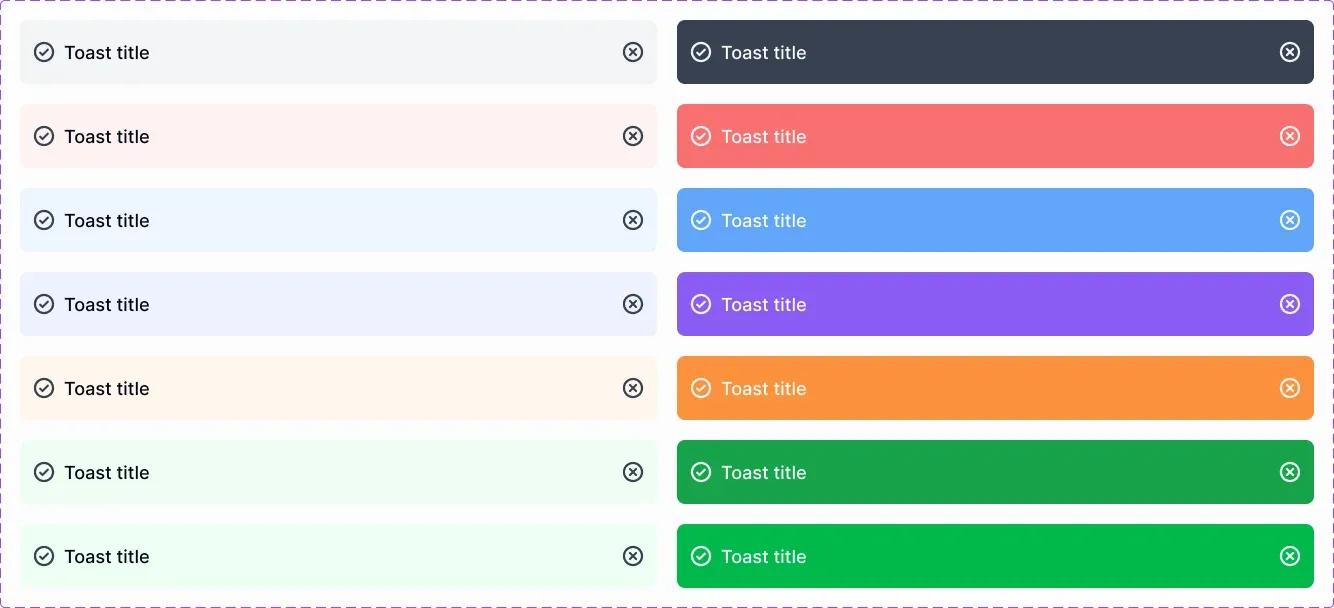
The EmviUI button component page offers editable Figma button patterns for comparing action treatments. The real EmviUI specimen below shows filled, outlined and lighter treatments in several colors. Use it to choose a small visual vocabulary for the toolbar, then record which state each implementation must demonstrate.
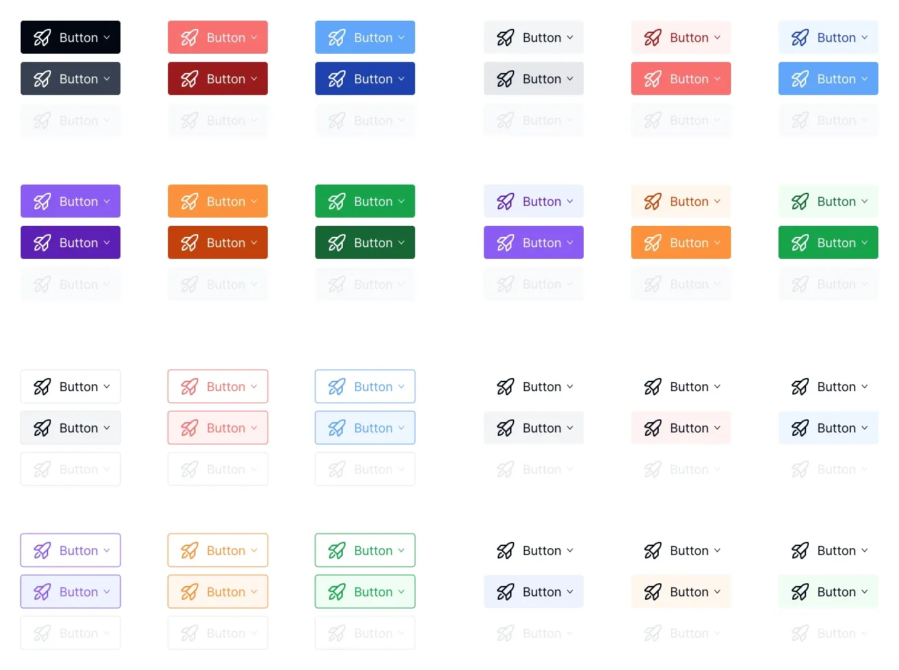
For this exercise, select one primary treatment and one secondary treatment. In Figma, place the same “Save project” label into both and compare the hierarchy beside a project title. Mark the intended default, hover and unavailable appearances in your own review sheet. The image supplies visual examples; it does not prove which HTML attributes or CSS rules implement them.
In the browser, add a visible focus treatment and reach the action with Tab. WCAG’s Focus Visible explanation describes why keyboard users need to see which control has focus. Keep that review separate from hovering with a mouse. A darker background during hover does not tell a keyboard user where they are.
Use the disabled state only when the action is actually unavailable, and explain the reason near the action when the context does not make it clear. For Fieldnote, “No changes to save” is more useful than an unexplained faded control. If saving fails, preserve the edited project name and give the person a clear retry path. The visual recipe cannot decide whether the save reached the server.
EmviUI can help the team align the appearance being reviewed. The application still needs its own event handling, validation and browser checks. Keep a short mapping from each selected Figma treatment to the corresponding component role and observed state. For the next interface review, use the practical form and state checklist.
Resolve build errors before visual debugging
A failed build is a different branch of this investigation. Read the first actionable error with its file path, line and command. Check whether the import exists, whether its export matches the usage and whether the command is running from the intended package. Fix that error before changing button colors.
For a Vite application, the production-build documentation describes the build entry and public base path. Run the project’s existing build script and serve its output using the configured preview workflow. If compilation succeeds but the deployed stylesheet returns 404, inspect the emitted URL and hosting path. That is a delivery problem, not evidence that the role recipe was missed.
Keep the exact failing command in the issue record. A missing module needs an import or dependency correction; a malformed CSS declaration needs a syntax correction. Neither is repaired by generating more utility classes. After the build passes, return to the original route and repeat the class and state checks; one resolved error does not prove every visual decision is correct.
Verify the built page with a small acceptance matrix
Finish with the actual production build served through the project’s preview command. Open the page directly, refresh it and repeat the important state changes. Record outcomes against the same component contract used in design review. The matrix below is a proposed acceptance tool, not a claim that every application uses these exact states.
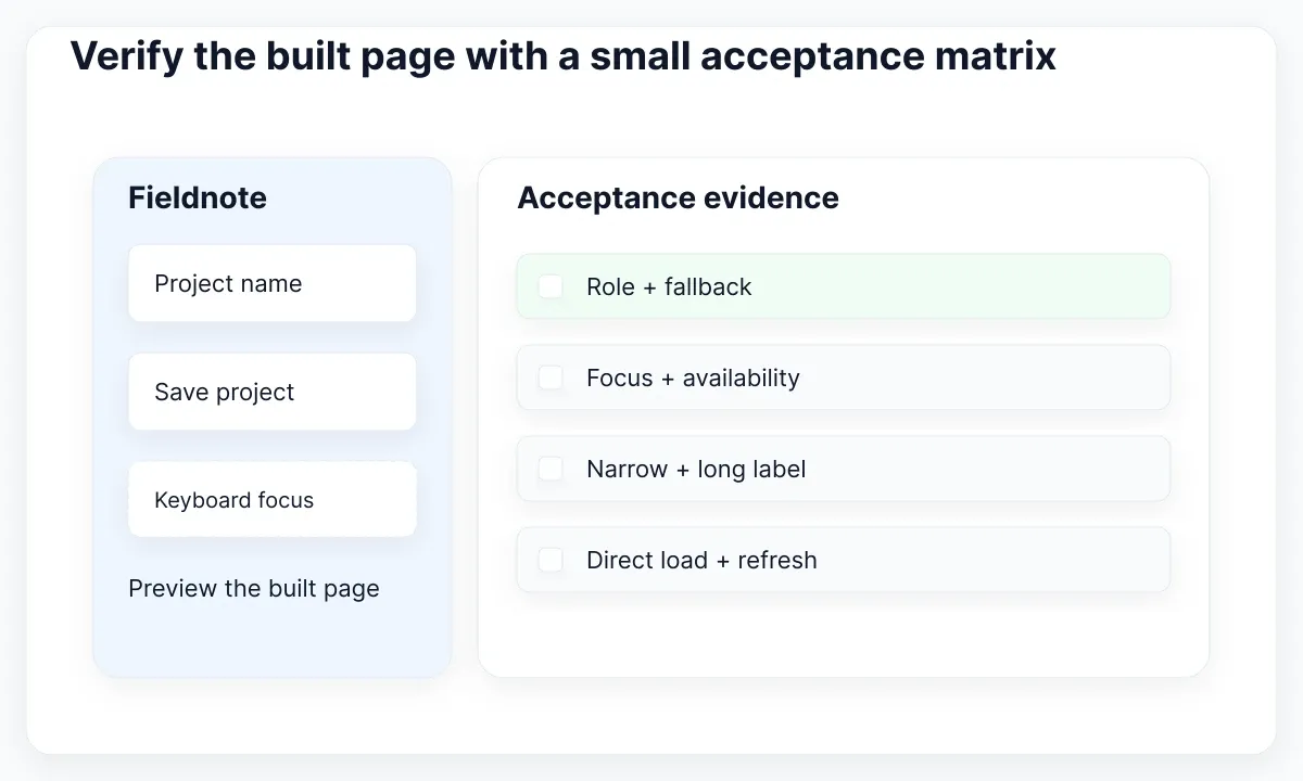
First, load the primary and secondary roles without navigating through another page. Confirm that both have their intended surface and internal spacing. Next, supply an unknown role and confirm the documented fallback. This catches a surprisingly common review gap: only the happy-path role was present in the demonstration.
Then use the keyboard to reach the Save action, disable it through the actual application state, and re-enable it after making an edit. Observe the indicator and the action’s availability. Finally, narrow the viewport and use the longer Spanish label. A successful build still needs a readable interface with a usable action.
Keep evidence brief: build identifier, route, tested role, observed rule and result. If a failure returns, that record tells the next person where to start. A class list is finished when its visual responsibilities, source boundary and state conditions can all be explained from the running page.
| Case | Expected evidence |
|---|---|
| Primary and secondary | Complete recipe and intended surface |
| Unknown role | Documented secondary fallback |
| Keyboard focus | Visible indicator on the active control |
| Disabled action | Actual disabled attribute and explanation |
| Narrow layout | Readable label and usable action |

Pablo Mayoral
Senior UX/UI & Web Designer with 10+ years of experience. Creator of EmviUI (10k+ components Figma design system), UImand, and Vitamin Bootstrap. Currently designing digital products at CQMRewards.