Best UI Kit for React: Test Forms, Dialogs and State
Choose a React UI kit through one invitation task. Compare delivery format, state ownership, keyboard behavior, error recovery and rendering in your application.
Choose a React UI kit through one invitation task. Compare delivery format, state ownership, keyboard behavior, error recovery and rendering in your application.
The best UI kit for React is the one whose delivery format, interaction model and styling approach fit your application. Start with a styled React library when its defaults suit the product; investigate unstyled primitives when you need more visual control. A Figma kit can define the intended interface, but you still need an implemented React component layer. Select through a working task, not a component count.
This guide turns “best UI kit for React” into an acceptance exercise: invite a teammate through a form and confirmation dialog. The proposed tests and decision rules are editorial recommendations, not benchmark results. They help a designer and developer decide what they can adopt, what they must customize and who will maintain it.
Choose the layer you actually need
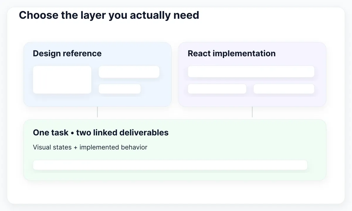
Begin by identifying the missing deliverable. A design file helps specify appearance and states. A styled React library supplies implemented controls with visual defaults. An unstyled component foundation supplies behavior while leaving more appearance work to your team. These options can cooperate, but buying or adopting one does not automatically provide the others.
For a concrete shortlist, Material UI documents prebuilt React components based on Material Design and customization options. Radix Primitives documents an unstyled, low-level component library with composition and controlled or uncontrolled behavior where applicable. React Aria offers components with interaction behavior and internationalization support, ready for custom styles. These are examples of approaches, not a measured ranking.
My starting recommendation: evaluate Material UI if your team accepts its visual foundation and wants prebuilt styling; investigate Radix or React Aria if you have a distinct visual language and capacity to style components. Start with your existing library if it already meets the task. Switching costs belong in the decision alongside the appeal of a fresh demo.
Write the deliverable at the top of the evaluation: “We need implemented React controls for a member-invitation screen, plus an editable design reference.” For the broader distinction between a collection of UI assets and a maintained system, read UI kit versus design system scope. Keep this review focused on adoption of React controls.
Use one invitation task as the trial
Build the same small task with each serious candidate: enter an email, choose a role, submit an invitation and review the result. Include a modal explaining the selected access level. Use invented member data. Keep the backend response simulated so differences in your API integration do not dominate the first evaluation.
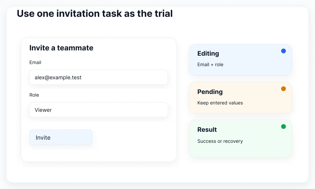
Prepare five cases before opening a library demo: an empty required field, a malformed address, a pending submission, a rejected invitation and a successful invitation. Add a long translated role description. These are proposed product cases; they are not claims that every library exposes identically named state props or includes a complete invitation workflow.
Allow the same scope for each candidate. A working default example is a starting point, not the result. Change its labels, apply your brand appearance and connect your simulated outcomes. Note every local wrapper, style exception and undocumented assumption. If one option needs a custom dropdown while another uses a native select, record the actual difference.
Measure work in a short decision log: what worked directly, what required adaptation and what remains unresolved. Avoid fabricated scores for accessibility or performance. A reproducible observation such as “the dialog returned focus after cancel” is more useful than an unsupported statement that the whole library is production ready for your application.
Check who owns the form state
React's state-sharing guide explains moving coordinated state to a common parent. Its input reference distinguishes a controlled value with an updating change handler from an uncontrolled initial value. During the trial, identify which component owns the email, role, pending result and dialog visibility; do not infer that ownership from the screenshot.
Try an external reset button in the evaluation page. Enter an email, select a role, reset and confirm that visible controls and submitted data agree. Next, prefill a saved draft and edit it. This exposes an API that looks convenient for a standalone demo but becomes awkward when the application must coordinate several controls.
Ask for the actual prop and event contract in the chosen version. A library may expose a value directly, a native event or another change callback. Write a small adapter only when it gives the application a useful stable boundary. Avoid hiding all native input attributes behind a wrapper that makes labels, names or validation harder to configure.
Inspect submission separately from editing. In this exercise, clicking Invite should preserve the entered address while the simulated request is pending. A rejected response should allow a correction without retyping unrelated data. These acceptance choices belong to your product; document them instead of assuming that a component package decides your entire request lifecycle.
Test the dialog with a keyboard
The WAI-ARIA modal dialog pattern describes focus moving inside an opened modal, a contained Tab sequence, Escape to close and an appropriate focus destination on exit. It also describes naming the dialog. Use this guidance to structure your review; a visually dimmed background does not establish those behaviors.
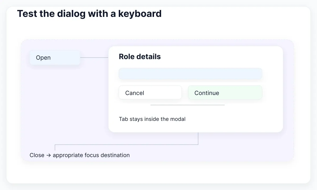
Open the role-explanation dialog from its button without using a mouse. Record the first focus destination, traverse the controls in both directions and close it. Repeat with a long explanation and at a narrow viewport. Include a visible close action. After closing, confirm that the next keyboard step follows a sensible path through the invitation task.
Also inspect the trigger. The APG button pattern describes Enter and Space activation for buttons. In your trial, verify the rendered element and accessible name, particularly if a library supports replacing its underlying element. A link-shaped control and a button-shaped control can look alike while representing different actions.
Keep a concise failure record with the action, expected behavior and observed result. Assign the repair to the application or component layer after isolating it. A failed customized example does not prove every use of the library fails; a passing default example does not verify all your changes. Repeat the relevant checks after styling and composition.
Make errors useful beyond their color
The W3C forms validation tutorial recommends identifying required input, helping people correct mistakes and validating on the server as well as the client. For this evaluation, use explicit messages such as “Enter an email address” and “This address already has access.” Choose copy that explains the next action rather than only reporting failure.
Compare the empty-field case with the rejected-request case. They can need different placement and recovery. An invalid email belongs near its field; a service interruption may need a message for the whole task. Keep a typed address available during a retry. In the decision log, separate the library's error presentation from your application's response handling.
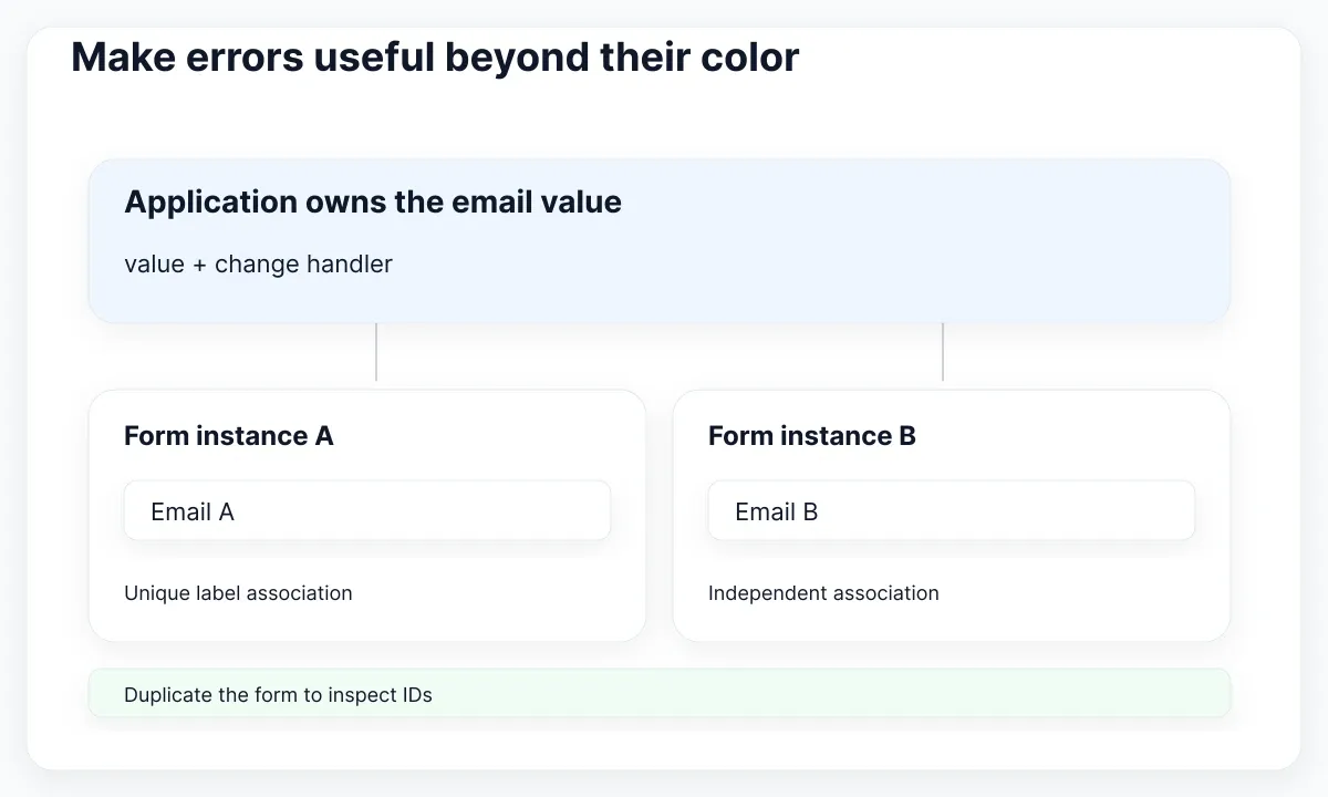
Duplicate the invitation form in the test page to expose identifier collisions. React's useId documentation describes generating IDs for accessibility associations and warns against using it for list keys. Inspect label and description relationships in both copies. The goal is a reusable control whose associations survive composition, not merely two visually matching forms.
Review disabled and pending states as distinct product decisions. Explain why an action is unavailable when that reason matters. Include text in a pending action rather than relying entirely on a spinner. These recommendations help evaluate whether a candidate can express your required states without invasive changes to its internals.
Review an EmviUI specimen as a design reference
The real EmviUI specimen below shows two modal arrangements: side-by-side actions and stacked actions. It is useful for reviewing action hierarchy and narrow-layout options. It is a visual design specimen, not evidence of a running React dialog, focus management or successful keyboard testing.
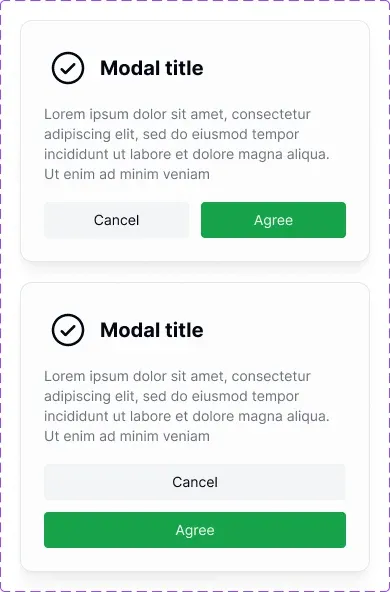
The EmviUI component catalogue includes inputs, buttons and modals for Figma design work. Use a chosen modal instance to agree on the role explanation, cancel action and confirmation treatment before styling the React implementation. Replace demonstration text with the actual product copy and record the layout that should apply when actions need more space.
For this trial, keep a paired reference: the intended design state and the implemented state with the same content. Have design and engineering inspect the disagreement together. EmviUI can supply the visual starting point; your React implementation still owns interaction and application integration. Tailwind-aligned appearance alone does not supply those runtime behaviors.
If the next problem is translating the chosen screen into a responsive implementation, use the Figma-to-Tailwind React workflow. If you need to specify additional visual states first, the guide to variants and UI states supports that design task.
Verify rendering in your actual application
For server-rendered React, the hydrateRoot reference says the first client output must match the server output and that mismatches should be fixed. Run the candidate in your actual application shell. A client-only sandbox cannot settle whether the selected component, theme setup and framework configuration cooperate in that environment.
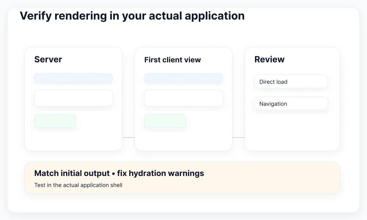
Load the invitation page directly, then arrive through client navigation. Try the expected initial theme and a saved role selection. Inspect warnings and unexpected layout changes before interacting. If a framework manages hydration, use its documented integration path; adding a separate root to silence a symptom would change the test instead of proving compatibility.
Record the imported components, package versions and local styles. Compare the trial route before and after adoption using your existing build tooling. Do not copy bundle-size claims from unrelated demos: your imports, styling and application baseline determine what you ship. Keep the measurements with the version tested so future upgrades have a meaningful comparison.
Finally, replace the brand color and lengthen the action text. Check the narrow layout again. This tests the customization work your team will repeatedly perform. Count fragile overrides as maintenance work even when the final screenshot looks correct. Prefer a documented extension point that another developer can find and understand.
Invite someone who did not build the trial to repeat it from the written cases. If they cannot identify which address was submitted or where to recover after rejection, revise the acceptance notes and interface together. Keep their concrete observation in the decision record.
Keep a decision that can be revisited
Use hard requirements before preferences. A candidate that cannot support the required task should remain unresolved rather than winning through attractive defaults. Once those requirements pass, compare styling effort, familiarity and upgrade ownership. These are local decisions, so keep the evidence with your recommendation and state which application was evaluated.
- Record the delivery format and chosen package versions.
- Run editing, reset, pending, rejection and success cases.
- Review keyboard interaction and field associations.
- Check direct loading and navigation in the application shell.
- Apply real content and a narrow layout.
- Name the owner of wrappers, styles and future upgrades.
A useful decision reads: “Adopt this candidate for the invitation flow; retain these two wrappers; recheck the dialog after an upgrade.” An unresolved identifier issue or hydration warning should appear beside that conclusion. Keep the trial route small enough to rerun when your requirements change. That is a stronger basis for choosing a React UI kit than a universal winner.

Pablo Mayoral
Senior UX/UI & Web Designer with 10+ years of experience. Creator of EmviUI (10k+ components Figma design system), UImand, and Vitamin Bootstrap. Currently designing digital products at CQMRewards.