UI Kit vs Design System: Scope for Product Teams
A practical guide to reusable UI assets, system layers, component contracts, and deciding when a growing kit needs ownership and governance.
A UI kit packages reusable interface assets; a design system also documents the decisions, behavior, ownership, and release practices that keep shared work coherent. Start with the smallest useful kit, then add system structure when repeated cross-team needs require it.
Short answer: A UI kit is a set of ready-to-use interface assets—often components, styles, and sample screens. A design system is the wider, maintained agreement that explains why those assets exist, how they should behave, how teams change them, and how they connect to production code. A kit can be one useful part of a system, but a folder of polished buttons and cards is not automatically a design system. Choose a kit when you need a bounded starting set; invest in a system when multiple people, products, or releases need the same decisions to stay coherent.
The phrase “ui kit vs design system” often hides two separate questions: what deliverable do we need this week, and what shared operating model will keep future work consistent? Answer them separately. A small team may need only a few reusable patterns today, while still documenting ownership and decisions so that the kit can grow without becoming a collection of unexplained exceptions.
What a UI kit gives you
A UI kit is a packaged collection of visual building blocks for interface work. In a design file it might include buttons, fields, cards, navigation, color and type styles, plus example pages. In code it may be a component package or a starter template. Its immediate value is speed: instead of drawing the same control from scratch, a designer or developer begins from an available example.
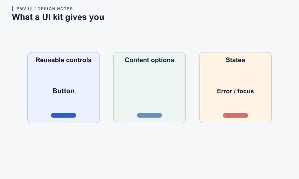
A kit can be narrow and still be good. A mobile checkout kit could include only the input, selection, summary, error, and confirmation patterns needed for that flow. A dashboard kit might supply navigation, tables, filters, and chart containers. The deciding question is coverage of the task, not how many components appear in the download. Check whether the kit includes the states you need—loading, empty, invalid, disabled, focus, and success—not just the default screenshot.
Look at the kit as a promise about reuse. Are names understandable? Can content change without breaking layout? Are controls usable by keyboard and assistive technology? Does the code or design file make it clear what is configurable? Figma’s component-property guidance distinguishes text, boolean, instance-swap, variant, and slot properties, each exposing a different kind of controlled flexibility. These are useful kit mechanics, but they do not by themselves create policy, documentation, or maintenance.
What a design system adds
A design system includes the reusable assets and the rules, documentation, governance, and implementation practices that help teams use them consistently. Atlassian describes its system as guidelines, foundations, tools, and components; GOV.UK separately documents styles, components, and task-focused patterns, with research context and coded examples. Those examples show why a system is broader than a visual library: it carries decisions and evidence alongside the files.
A system answers questions that a kit often leaves open: Which color role should a destructive action use? When should a team reuse a pattern, adapt it, or propose a new one? Who reviews a breaking component change? How are design and code versions released together? How does a product team report an accessibility issue? Without answers, teams invent local conventions and the apparent shared kit gradually forks in practice.
A design system is not necessarily a giant central product. A small product can have a lightweight system: a short set of tokens, a few tested components, usage notes, ownership, and a release process. The useful measure is whether people can make and maintain decisions reliably—not whether the system has a portal or a certain component count.
See the layers from foundations to screens
Think of the system as layers that answer different questions. Foundations define shared values and principles. Components solve repeatable interface mechanics. Patterns arrange components around a user task. Page compositions combine patterns and product-specific content for a particular screen. The boundaries are practical rather than universal: a team should choose names that match how its designers and developers work.
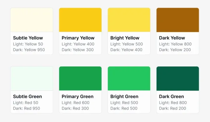
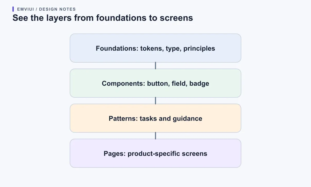
For example, a semantic color role such as “surface-danger” belongs closer to foundations; a button is a component; a destructive confirmation flow is a pattern; and a billing page is a page composition. The kit may contain all four as assets, but the system explains which layer owns each decision and how a change flows through the others. This avoids two common traps: putting every screen in a kit, and trying to make one generic component encode every product workflow.
Components, patterns, and compositions have different jobs
Use a component for a repeatable interface element with a stable purpose: a button submits an action, an input accepts a value, a badge communicates a compact status. GOV.UK defines components as reusable UI parts and notes they can appear in different patterns and contexts. A pattern solves a recurring user-focused task, often by combining components and guidance. A page composition arranges those solutions for one product’s content and priorities.
Suppose a team is building account recovery. The text field, button, and inline error can be components. The “recover access” sequence—identify the account, explain the next step, recover from a failed attempt—is a pattern. The complete settings page with product navigation and account details is a composition. If the account-recovery flow later changes, the system should let the team update the pattern without rebuilding every text field or forcing unrelated pages to inherit its layout.
Keep composition-specific decisions near the composition until evidence shows they recur. If a product-specific card has a unique editorial layout, it may remain a local composition. If several teams independently need the same card behavior and can agree on its contract, promote the reusable behavior—not every pixel of the first page—into a shared component or pattern.
Choose the smallest useful starting point
Start with a UI kit when one team needs a short-term design baseline, the product scope is bounded, or you are testing a direction before standardizing it. A kit is also reasonable for a one-off campaign or prototype if you label it as such and avoid promising cross-product support. Pick a design system when repeated work crosses teams, products, or releases and the cost of inconsistent decisions is becoming visible.
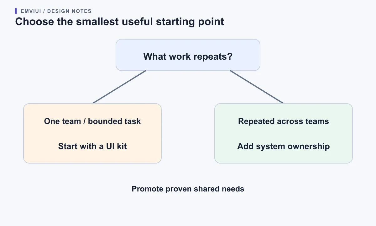
Use a simple signal check. If the same interface decisions are repeated, if fixes must be copied across files, if teams disagree about which component is current, or if a shared accessibility correction cannot reach every product, the gap is no longer merely missing assets. You need ownership, documentation, versioning, and a route for contribution. Conversely, if one designer owns one small prototype, a formal governance board adds overhead before it adds value.
Do not turn the choice into a one-way migration. A kit can mature into a system by adding evidence, contracts, and maintenance around the pieces that earn reuse. A system can publish a focused kit for a new team. USWDS, for instance, offers packages so projects can include only needed components; its documentation describes packages as discrete units of functionality and an engine package for shared foundations. Selective adoption is a useful pattern for keeping a system practical.
Build a maintainable component contract
For each shared component, write a small contract before adding configuration. State its user purpose, supported content, states, accessibility behavior, responsive behavior, and what is intentionally unsupported. A button contract might define label, optional icon, primary or secondary emphasis, size, and disabled/loading behavior. It should also say that a button is for an action, while a link is for navigation. This keeps visual reuse connected to meaning.
Limit options to decisions users of the component actually need. If a component has independent axes for size, state, theme, icon, density, and layout, the theoretical combinations multiply quickly. Figma properties can expose text, visibility, swaps, and variants, while slots allow flexible nested content; the Figma guide recommends reviewing the existing system before deciding which aspects should become properties or variants. That is a reminder to model real choices, not every possibility.
When a local variation appears, ask what changed. If it is a small visual adjustment that preserves the component’s purpose, a documented modifier or token override may suffice. If the content structure, interaction, or user need changes substantially, create a distinct component or pattern. GOV.UK’s production guidance warns that large modifications can become fragile and recommends forking a component when the change is extensive, while noting that a fork no longer receives upstream updates. The exact code tactic differs by stack, but the trade-off is general: shared maintenance versus independent control.
Governance keeps the system useful
Governance does not need a committee for every change. Give each shared asset an owner, a contribution path, and a release status such as draft, trial, stable, or deprecated. Require a short proposal when a change affects API, visual behavior, accessibility, or many consumers. Include designers, engineers, and content or accessibility specialists where the change touches their work. Record the reason, compatibility impact, and migration path.
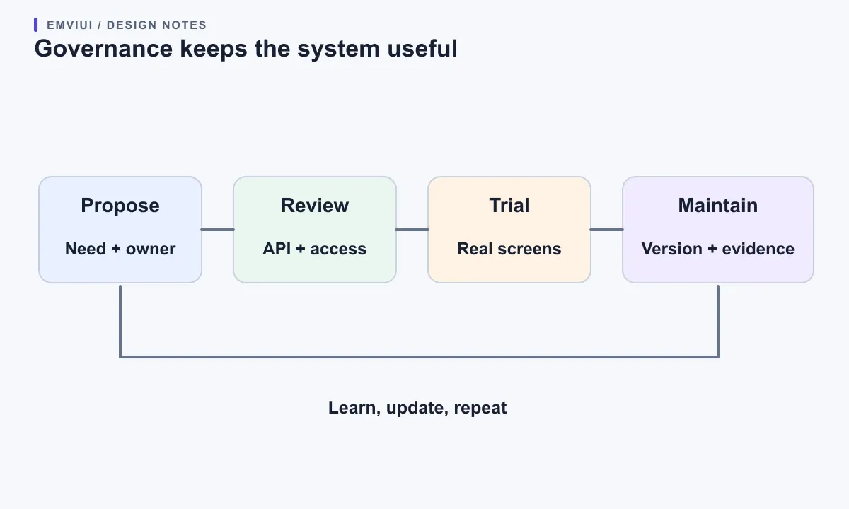
Keep evidence close to the component. A screenshot helps show appearance, but usage guidance should explain when it fits, what alternatives exist, and which states need testing. GOV.UK includes research context with published resources and cautions that community suggestions may not yet be tested; teams should validate them in their own service. Treat local research as an input, not as proof that one pattern works everywhere.
Versioning is useful when consumers need a predictable upgrade path. Define how breaking changes are announced, how long deprecated patterns remain supported, and whether design assets and code releases move together. Track a few measures tied to real work: repeated local copies, time to resolve system issues, adoption of accessible states, and unresolved requests. A high adoption count alone does not prove that the system is easy or correct to use.
Relate the model to EmviUI
EmviUI can serve as a practical source of interface examples and reusable starting points while a team defines its own system boundary. Its public UI kit and component examples help a designer compare patterns or assemble a first page; teams should still verify current component behavior, implementation details, and accessibility requirements against the product files and their own application. A catalog of components is useful kit material, not a substitute for your organization’s ownership, governance, user research, or release policy.
If your immediate need is to create a small reusable library, see the practical plan for making a UI kit. To decide which visible differences should become controlled component choices, use the guide to Figma variants and UI states. For the foundations layer, the design-token guide explains how named decisions can connect design and code. These are starting references; they do not claim that EmviUI ships a complete governance model for your product.
Primary documentation: Atlassian Design System overview; GOV.UK guidance on components, patterns, research and getting started, and extending components; USWDS component packages; and Figma’s guide to component properties.
A practical decision checklist
- Name the work: prototype, one team’s product UI, or shared multi-product capability.
- List repeated decisions: colors, type, controls, task flows, content patterns, and page layouts.
- Separate layers: foundation, component, pattern, and product composition; avoid promoting a whole page without a reusable need.
- Choose a kit scope: include only the assets needed to complete the next representative workflow.
- Write component contracts: purpose, supported options, states, accessibility behavior, and responsive expectations.
- Assign ownership: name who approves changes and how consumers learn about releases.
- Test adoption: implement one real screen, including an edge state, then observe where the kit fails to guide the team.
- Expand from evidence: promote a local pattern only after repeated use and a clear maintenance owner.
This approach makes “kit or system?” a scope decision, not a branding exercise. Start small, but make the reusable decisions legible. If a second team needs the same pieces, extend the documentation and ownership before adding a large menu of components. If the work stays local, keep the kit lightweight and avoid pretending that a folder is a service-wide standard.

Pablo Mayoral
Senior UX/UI & Web Designer with 10+ years of experience. Creator of EmviUI (10k+ components Figma design system), UImand, and Vitamin Bootstrap. Currently designing digital products at CQMRewards.