How to Make Your Own UI Kit: A Practical Figma Plan
Start with real product screens, build only the components your team needs, and maintain a Figma kit people can use confidently.

Start with one product and a small set of repeated needs. Define semantic foundations, build components with necessary properties and states, test them in real screens, then document and share the library.
Short answer: If you are asking how to make your own UI kit, start with one product and a small set of repeated interface needs. Define a few visual foundations, build reusable components with only the states people need, test them in realistic screens, then document and share the kit. In Figma, a component library can hold components, styles, and variables; it does not need to contain every possible page or state. A useful kit helps a team make consistent decisions faster and makes its limits easy to understand.
Start with the product, not a component count
Before opening a blank Figma page, pick a real interface: perhaps a SaaS settings area, a booking flow, or a small admin dashboard. List three screens the team expects to build. Circle the controls that repeat across them, such as a text field, button, navigation item, status label, or table row. That list is your first kit brief. It keeps the work tied to a product and avoids spending days drawing components nobody will use.
Ask who will use the kit and what decisions it should make easier. A solo designer may need a compact file with local components. A product team may need a published library shared across several files. A code team may need an aligned implementation catalogue as well. Those are different deliverables. Figma's library feature shares reusable design assets; it does not generate or maintain the application's code for you.
Write a short purpose statement, for example: “A Figma library for the account and billing area of our web app, used by two product designers.” Add boundaries too: which product area it covers, which brands or themes it supports, and what the kit will not attempt yet. A clear boundary helps the team say no to unrelated additions and revisit the scope when real usage changes.
Separate foundations, components, patterns, and screens
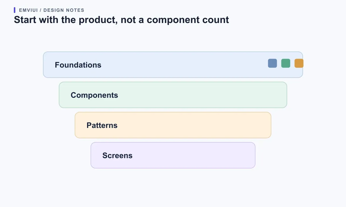
Organize the kit into layers that answer different questions. Foundations describe shared visual choices: color roles, type styles, spacing steps, radii, and elevation. Components are repeatable controls such as buttons, fields, tabs, and badges. Patterns combine components to help with a recurring task, such as a search-and-filter toolbar or a recoverable form error. Screens show how those parts work together in one product context.
Keep a pattern distinct from a component when it carries a task-specific decision. A text input can appear in account creation, billing, and search. A “change payment method” flow uses inputs, helper text, validation, and a save action in a particular sequence. Making that whole flow a universal component can hide its purpose; keeping every instance bespoke can create inconsistency. Reuse the control, document the pattern, and promote it only when other screens need the same solution.
Do not put every illustration, content section, and full page into the first release. Start with the smallest layer that removes repeated work. GOV.UK's published component and pattern guidance also distinguishes reusable interface parts from solutions for specific user tasks. Its contribution criteria ask teams to show that additions are useful and unique. Those are good checks for a private kit too: solve a repeated need and look for an existing component before adding another.
Choose foundations that explain intent
Begin with a small set of semantic roles rather than a long palette of unexplained swatches. For color, define roles such as text-primary, surface-page, border-control, action-primary, and status-error. For typography, define heading, body, label, and helper-text roles with the intended size and line height. Add a spacing scale that covers the gaps your screens actually use. The exact values are a team decision; consistency and legibility matter more than copying a fashionable scale.
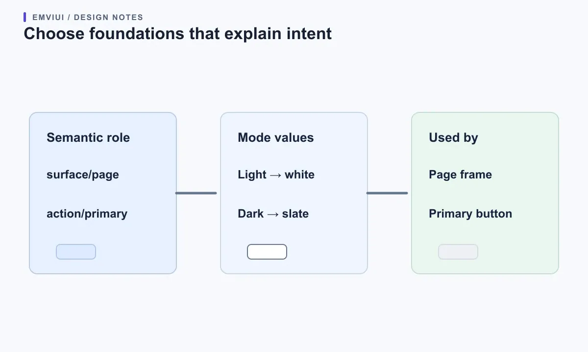
In Figma, variables can store reusable values and let a design switch between sets such as light and dark modes. Use a mode only when it represents a real context the product supports. For example, semantic surface/page can resolve to a light neutral in one mode and a dark neutral in another while components keep using the same role. Do not create a dark mode just to increase the kit's feature count; check contrast and component states in every supported mode.
Keep the role name separate from its current value. If a button uses green-600 directly, a later brand update can require many edits and the intent remains unclear. If it uses action-primary, the team knows why the color is there and can change the mapped value centrally. This is a design recommendation; Figma variables make value reuse possible, but they do not decide which meanings your product needs or guarantee a matching CSS token.
Build one component contract at a time
Choose the first component by frequency and consequence. A primary button, text field, or navigation item is often a better starting point than an unusual chart. Draw its default appearance, then write what the component does and what can change. For a button, that could include size, visual intent, and whether an icon is present. For a field, it could include label, help text, invalid state, and whether the value is optional.
Keep independent decisions as separate properties only when people need to change them independently. If a button has two sizes and three intents, avoid manufacturing every pairing unless the product uses those combinations. Figma's component properties support Boolean visibility, text, instance swaps, and variants; its variants guidance also says a set need not contain every theoretical combination. Start from observed needs, then add a property when a real use case asks for it.
| First kit item | Define | Try it in context |
|---|---|---|
| Color roles | Surface, text, action, status | Check contrast in each supported mode |
| Button | Intent, size, loading | Try long labels and keyboard focus |
| Text field | Label, help, invalid state | Use long error copy and zoom |
| Navigation | Active item and responsive behavior | Test keyboard movement and narrow width |
Use names a teammate can predict. “Button / Primary / Default” is easier to find than “Green big 3.” Name properties by the decision they represent, such as Type, Size, or State, and use values consistently. Figma recommends documenting a naming structure and supports slash-separated names to group related components. Add a short description and a link to usage guidance when a component has limits or a non-obvious behavior.
Think of each component as a contract between the kit and the person using it: what can be changed, what must remain consistent, and what states exist. A field might allow its label and helper copy to change while preserving internal spacing and error placement. A navigation item may allow an icon swap but still need a text label. This contract reduces accidental detaching and helps a designer understand whether a request is supported or needs a new pattern.
Design states before adding more components
A component that only looks good in its default state is not ready for a real product. For each control, identify the states that affect its meaning or operation: hover, focus, pressed, selected, disabled, invalid, loading, empty, or complete. You do not need all of these for every component. A static brand badge may not be interactive; a submit button needs a clear disabled or loading treatment if the product uses those states.
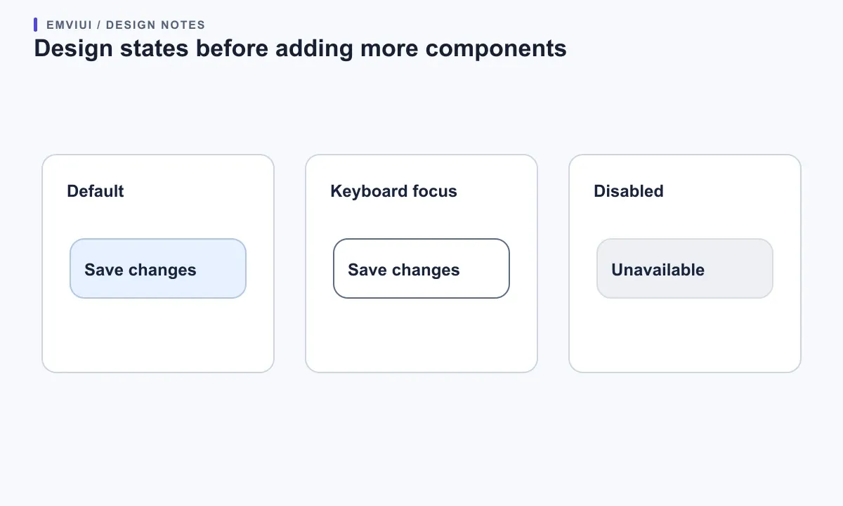
Make state differences visible without relying on color alone. Pair an error border with an error message; pair a selected tab with an indicator or weight change; show a loading label or progress cue where the user needs to wait. Document what triggers the state and what it communicates. Figma can show the visual variant, while the application still needs meaningful HTML semantics, keyboard behavior, and announcements for dynamic changes.
Review states in context, not only as a tidy component sheet. Put a long validation message into the form. Use a button label that wraps on a narrow screen. Check a disabled action next to the reason it is unavailable. If a component breaks when the copy becomes realistic, fix the component contract or narrow its supported use before adding more variants.
Test the kit in real screens and with real users
Assemble one representative screen from instances of the components. Include realistic copy, long names, an error, and a smaller viewport. Ask a teammate who did not create the kit to find a component, choose its state, and make one screen change. Watch for the places where they hesitate. A library can look well organized to its creator and still be hard for another person to search or apply.
Check accessibility at both design and implementation stages. The W3C explains that accessibility depends on several parts working together, including content, code, browsers, assistive technology, and evaluation. In the design file, specify labels, focus appearance, error placement, contrast intent, and state changes. In the browser, test keyboard operation, visible focus, zoom, screen-reader names, and dynamic feedback. A Figma kit can guide these decisions but cannot certify the final interface.
Gather feedback from people who represent the kit's actual users. GOV.UK's component contribution criteria include user research with a representative sample, including disabled users, and checks across browsers, assistive technologies, and devices for its public system. A small product team can scale the process to its context: test the important interactions with a few users and record the limits of what was tested. Avoid presenting an untested prototype as proven guidance.
When an element works only for one screen, keep it local. When the same need appears again and the solution remains stable, consider adding it to the library. This is how a kit grows from repeated evidence instead of guesses. Track a lightweight signal such as where instances are used, repeated requests, or the number of local copies that teams have made. Use it to prioritize maintenance, not as a contest to maximize component quantity.
Organize, publish, and explain changes
Make the file structure match how teammates search. A practical first file might have pages for “Read me,” “Foundations,” “Components,” and “Patterns.” Group components by purpose and use predictable names. Figma's organization guidance explains that the file and page structure appears in the Assets tab and that slash-separated names help related components appear together. Test the structure by asking a new teammate to locate a field or alert.
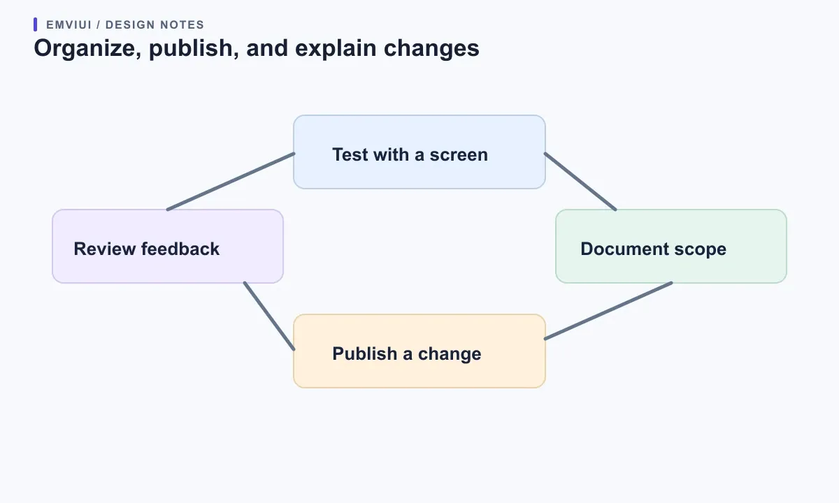
Keep a “Read me” section with the audience, scope, naming rules, supported states, and contact for questions. For each component, add one line of guidance: where it works, what must remain, and any known limitation. When design decisions depend on product behavior, link to the relevant product documentation rather than hiding all explanation in layer names.
Figma lets teams publish components, styles, and variables from a source file as a library so others can reuse them. The official guide says assets start local to their file and updates become available for users of the published library to review. Confirm plan and permission requirements before promising cross-file publishing: Figma's current help page says library publishing is available on paid plans. Describe each release so users know what changed and whether it affects their designs.
Do not move or rename a widely used component casually. Check where instances appear, announce a breaking change, and give users time to review it. If you remove a component, provide the replacement and explain any migration steps. A small changelog with date, component, change, reason, and impact is enough for a small kit. The goal is for collaborators to make an informed choice when an update appears.
Use EmviUI as a reference, not a substitute for your product rules
EmviUI can help you study how a broad Figma kit groups controls and screens. Its current component catalogue lists foundations and examples such as buttons, inputs, alerts, tables, forms, and accordions. Compare those examples with your product brief: which controls do you actually need, which states belong in your first release, and what should remain specific to your brand? The product catalogue is a useful reference; your team's tested requirements decide what belongs in your own kit.
If you are starting from an existing kit, inspect components before copying them into a new library. Keep the ones that solve a real need, document any changes, and avoid layering a local variant on top of a component whose purpose you do not understand. Our guide to evaluating a UI kit can help you decide what to reuse. Then see how clear Figma variants keep supported states understandable and how design tokens can express reusable values.
For current product details, consult the EmviUI component catalogue. For Figma's behavior, read its guides to creating components, component properties, variables, organizing components, and publishing a library. The GOV.UK contribution criteria offer a public example of usefulness, uniqueness, testing, consistency, and ownership checks; the component catalogue shows reusable controls alongside guidance on when they fit.

Pablo Mayoral
Senior UX/UI & Web Designer with 10+ years of experience. Creator of EmviUI (10k+ components Figma design system), UImand, and Vitamin Bootstrap. Currently designing digital products at CQMRewards.