TailwindCSS UI Kit Free: How to Choose One That Fits
A free UI kit can save setup time, but only if its license, components, responsive behavior, and code fit the product you need to ship.

A free Tailwind CSS UI kit is useful when its license permits your intended use, its components cover real product needs, and its responsive layouts and interaction states work in your implementation. Check the source, supported Tailwind version, accessibility details, and maintenance path, then test one representative page before adopting the whole kit.
Searching for a tailwindcss ui kit free to use? “Free” describes the price, not whether the kit fits your project. Before copying components, check the license, the real coverage, the responsive and interaction states, and how the code fits your existing Tailwind setup. Then implement one representative page as a small trial. That is usually enough to spot the mismatch before a kit spreads through the product.
Check coverage before you copy components
Start with the actual interface you need to build: perhaps a settings form, a dashboard table, or a responsive product page. List its components and states, not just its visual style. A pretty hero section does not tell you whether the kit includes empty, loading, error, disabled, and keyboard-focus states for the controls your users will rely on.
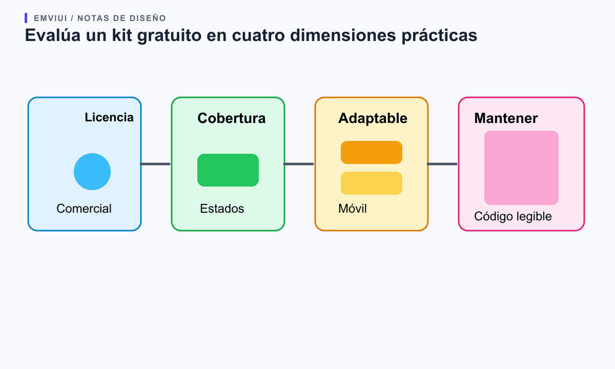
Next, inspect what “free” means for the asset you plan to use. Check the license and attribution requirements for the Figma file, icons, illustrations, fonts, and code separately; a kit may bundle assets with different terms. Confirm whether commercial use, modification, and redistribution are allowed for your intended use. If the terms are missing or ambiguous, ask the owner or choose another resource rather than assuming that a free download grants unrestricted rights.
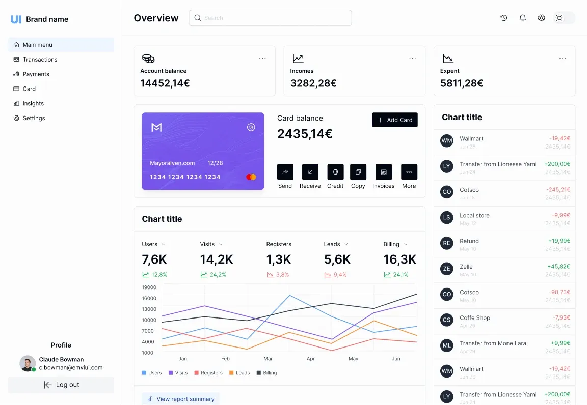
Check component coverage against your needs. A useful starter set often includes buttons, fields, navigation, cards, tables, dialogs, alerts, and empty states, but completeness is project-specific. Look for usable variations and semantic markup, not a huge variant count. Review whether the example components can be composed or whether every change requires copying and editing a whole page. EmviUI’s public catalogue, for example, labels foundations, base components, and combined components; it lists free and premium items, so check each item’s status rather than assuming the entire catalogue has one access level.
Test responsive behavior and interaction states
Tailwind’s responsive utilities are mobile-first: unprefixed classes define the base layout and breakpoint-prefixed classes layer changes on wider screens. Its documentation also describes container queries for components that should respond to their parent’s available space. A kit should show how a card, navigation bar, or data table adapts; test actual narrow widths and long content rather than trusting a single desktop preview.
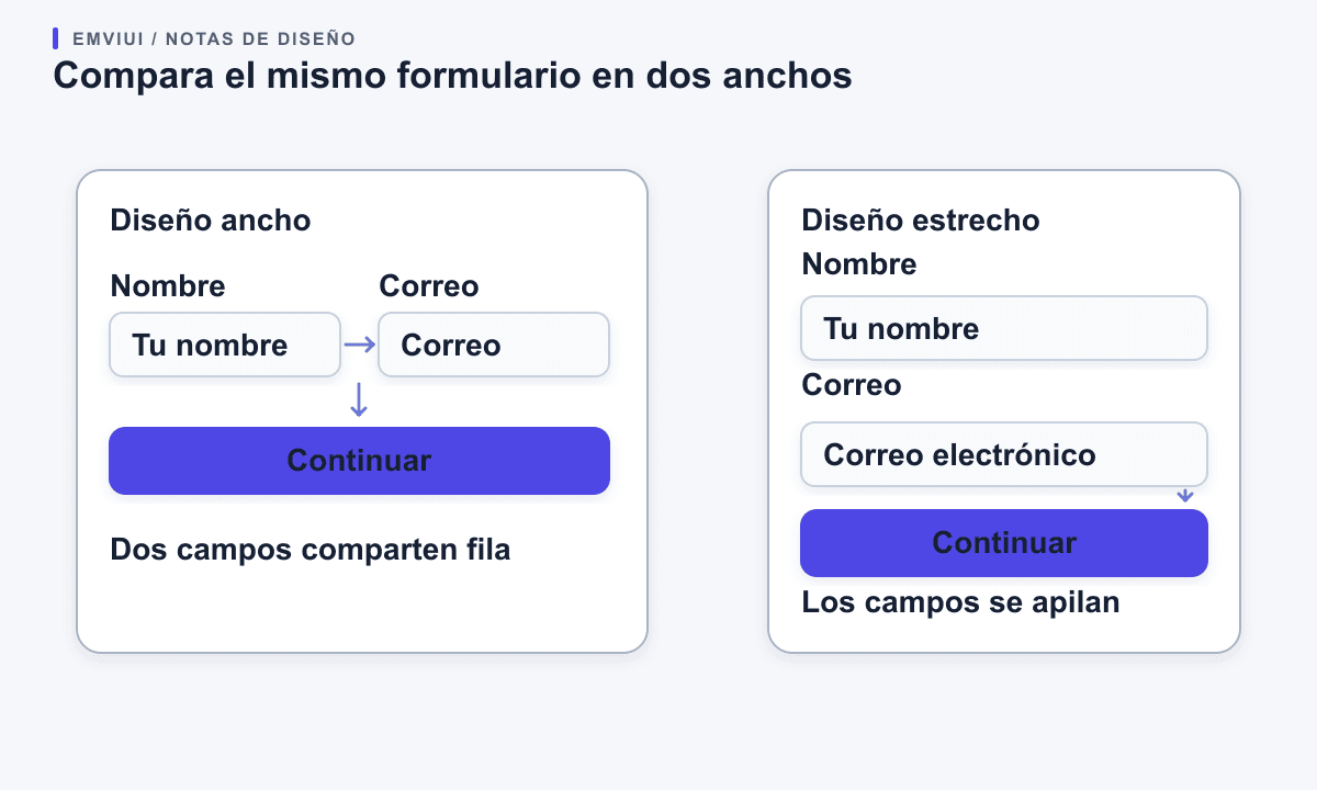
Compare the same form at two viewport widths
Use realistic labels and the controls your product actually needs. The example shows why a kit should be tried at more than one width: the same form may keep its fields in a row on a wide screen and stack them when space gets tight.
Interaction coverage deserves the same attention. Tailwind provides state variants for hover, focus, active, disabled, and other conditions, but having a utility available does not mean a kit has designed a complete interaction. Tab through controls with a keyboard, inspect visible focus, test validation and disabled states, and confirm that dialogs and menus have understandable behavior. For dark themes, check both text and surface combinations; a dark-mode class alone does not prove contrast or readability.
Think about component-level space as well as viewport width. A sidebar panel may be narrow even on a large monitor. A layout that adapts to its container can be more reusable than one tied only to global breakpoints. If the kit provides only static screenshots, treat the unseen behavior as work you must supply, not as a feature the download already contains.
Test a small slice in your own project
Do not install every component first. Choose one screen that uses a few representative pieces, such as navigation, a form, and a feedback message. Add realistic copy, a long label, validation errors, and the mobile layout. Then implement it in your actual application and note where the kit needs exceptions.
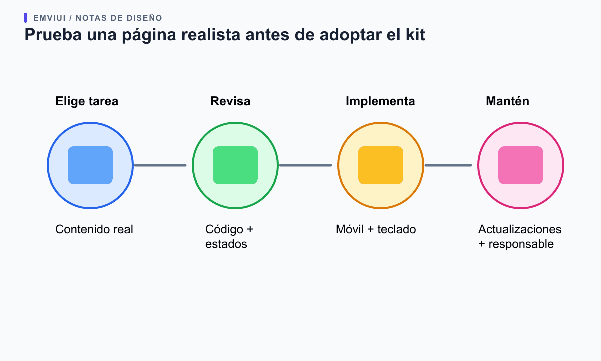
Check the Tailwind version and configuration before merging classes into an existing codebase. Look for assumptions about theme variables, plugins, fonts, icon packages, CSS resets, and build-time class detection. Tailwind generates styles from classes it detects in source files; dynamically assembled class names may need a different implementation so the expected CSS is present. Inspect whether the provided markup uses semantic elements and whether its CSS changes remain local when another page adopts the same component.
Also review how the project will receive fixes. Is there a public source repository, a changelog, a version number, and a way to report issues? Can your team update without overwriting custom changes? A free kit with no clear maintenance path may still be a good starting point, but budget for your team to own bugs, accessibility improvements, and future framework changes.
Decide what to keep and what to adapt
Adopt the kit when its license is clear, the core pieces match real needs, and the trial integrates cleanly. Keep only the components you understand and expect to maintain. Replace decorative examples or product assumptions that do not suit your audience, and document any local changes so teammates know which parts remain close to the source.
If only a few pieces fit, use those as references rather than importing the whole system. If the kit's markup, visual tokens, or version assumptions conflict with your application, the cheapest option may be to reuse its ideas and build a smaller set of native components. A UI kit should reduce repeated work; it should not create a parallel design system that your team must support.
Check the kit's dependencies before integrating it
A kit can look self-contained while depending on decisions that belong to the original project. Read the installation notes and inspect the source for theme variables, plugins, icon packages, fonts, CSS resets, component primitives, and build assumptions. Compare those requirements with the versions and conventions already in your app. A mismatch does not make a kit unusable, but it changes the cost: you may need to adapt the markup or configuration before the design is safe to reuse.
Run the example in a small branch or isolated page first. Check whether the provided classes are written literally in scanned source files or assembled dynamically. Tailwind's build process needs to detect the class names it should generate; a string assembled from fragments can leave the page without the expected styles. If the kit uses its own theme names, translate them into your project's existing design tokens instead of silently maintaining two competing palettes.
Also check the content model, not just the CSS. A component that assumes one short English label may break with translated copy, validation text, or user-generated content. Replace the sample copy with realistic values and see whether the markup remains understandable and responsive.
Review interaction and accessibility ownership
A downloadable component is a starting point, not proof that the interaction is complete. Inspect semantic elements, keyboard order, visible focus, accessible names, validation feedback, and how a dialog or menu opens and closes. For each control, decide which states the kit supplies and which the product team still has to design. The examples should remain clear with long labels, zoom, narrow screens, and the error messages used in the actual product.
Inspect the states a screenshot cannot show
Use realistic labels and the controls your product actually needs. The example shows why a kit should be tried at more than one width: the same form may keep its fields in a row on a wide screen and stack them when space gets tight.
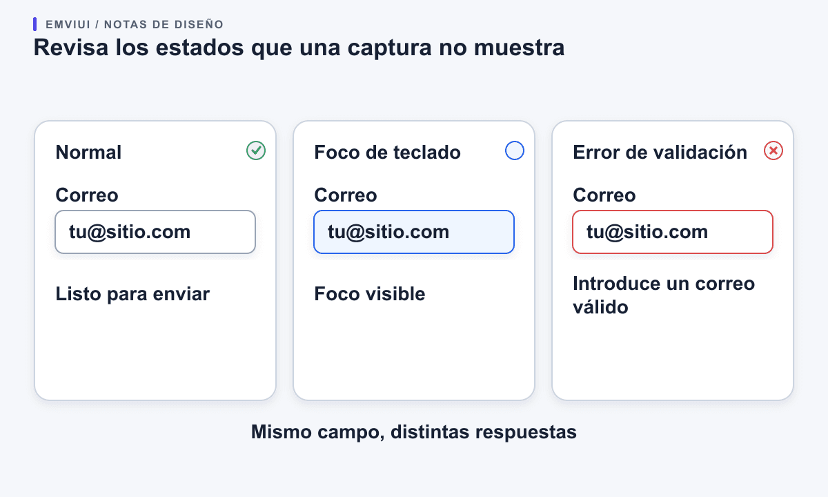
Set a small acceptance checklist around the screen you are testing: can a keyboard user reach and operate every action; does focus remain visible; does an error identify the field and explain how to correct it; and does the layout still work when text wraps? When a kit includes only a static visual, record behavior as unfinished work rather than assuming the screenshot represents a tested component.
EmviUI's component catalogue can help you compare the kinds of base and combined patterns available for a screen. Use the catalogue as a design reference and check the access label on each item. Your implementation still needs project-specific keyboard, content, contrast, and responsive checks.
Plan how the kit will be maintained
Before adoption, decide who owns copied code, local changes, and future fixes. Record the original source and version, note any license or attribution requirement, and keep a short list of changes your team made. If updates arrive, review them as code changes rather than overwriting your adaptations. If the kit has no visible maintenance history, budget for your team to own bugs and framework changes.
Keep the smallest useful set. Moving every page and component into a new kit can create a second design system with its own tokens, exceptions, and release process. Adopt the pieces that fit the app, map their visual choices to existing tokens, and document the components your team has changed. If only the examples are useful, treat them as references and build native components around your application's actual requirements.
A sensible decision is based on the trial, not the size of the download: reuse the kit when its terms are clear, its behaviors match the product, and your team can maintain the result. Adapt a few parts when they save time but need local changes. Walk away when the missing interactions, unclear license, or incompatible assumptions cost more to repair than to build.
Use a short adoption scorecard
Before the trial, write down the screen you want to support and the components it needs. After the trial, record four concrete results: whether the license is clear for your use; whether the required controls and states exist; whether the code fits your Tailwind version and theme; and how much work remains for responsive behavior and accessibility. These notes turn “I like the look” into a decision the team can explain and revisit.
Separate blockers from adjustments. A missing icon or color can be an easy local change. A license that does not cover the planned use, a dialog with no keyboard behavior, or markup that assumes a different application architecture can be a reason to stop. Estimate the effort in the same units you use for product work, such as components to rewrite or states to add, and include maintenance after launch.
Finally, ask someone who did not choose the kit to review the trial. They can check whether the component names and source are understandable, whether local edits are recorded, and whether the page still follows your product's conventions. Keep the scorecard with the implementation notes. If the kit is adopted, it becomes a small record of why and how the team uses it; if it is rejected, it shows which requirements a better resource must meet.
For the next step, see this guide to design tokens in web design and this practical Figma-to-Tailwind workflow. Tailwind’s official guides cover responsive design, interaction states, dark mode, and utility-first styling. The EmviUI component catalogue is the primary source for its current item categories and access labels.

Pablo Mayoral
Senior UX/UI & Web Designer with 10+ years of experience. Creator of EmviUI (10k+ components Figma design system), UImand, and Vitamin Bootstrap. Currently designing digital products at CQMRewards.