Figma Login UI Kit: Sign-In, Error and Recovery States
Apply a Figma login UI kit with clear labels, submission states, useful recovery and mobile checks. Review a real EmviUI screen and a practical checklist.
Apply a login kit by defining the accepted identifier, submission outcomes and complete recovery route. Preserve labels, review translated and narrow layouts, then verify autofill, focus and response behavior in the implemented form.
A Figma login UI kit is useful when you can adapt one sign-in screen into a coherent set of entry, submission, failure and recovery states. Start with the fields your product actually accepts, preserve visible labels, specify what happens after submission and test the same route with longer copy and a narrow viewport. Select the kit by how clearly it supports those changes.
This guide develops a proposed exercise for Fieldnote, a fictional project workspace. It uses email and password for an existing account. The state names, copy and review procedure are editorial recommendations, not a claim that a kit supplies working authentication. The reader task is applying a kit to sign-in; account creation and a broader component-library architecture are separate projects.
Define the sign-in contract
Write a four-line contract beside the first frame: accepted identifier, primary action, destination after success and recovery entry. For Fieldnote, the identifier is an email address, the action is Sign in, success opens the workspace, and Forgot password begins recovery. Avoid mixing username and email terminology unless the service actually accepts both. A designer should be able to explain the route without opening another page.
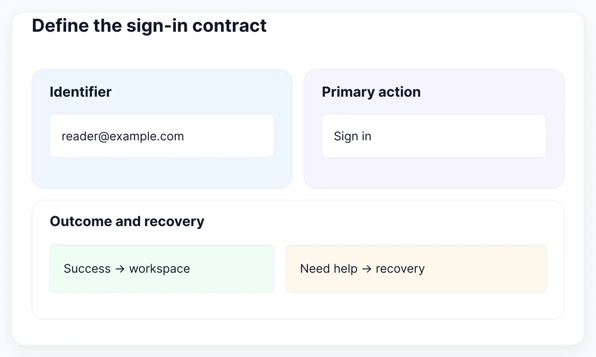
Choose a candidate screen, duplicate it into an exercise page and replace its sample content before changing its styling. Use a synthetic account such as reader@example.com. Remove promotional claims and decorative testimonials from the exercise. They distract from the question being tested: can someone identify the fields, attempt access and find a useful next step when the attempt fails?
Create an inventory with columns for screen, trigger, message and next action. Include empty entry, populated entry, submitting, unsuccessful response, recovery request and recovery confirmation. This is a proposed minimum exercise, not an exhaustive identity policy. Add enterprise single sign-on or another method only when the product supports it. A button that promises an unavailable method creates an implementation question rather than a finished design.
Keep the scope visible during kit selection. A polished empty frame is only one item in that inventory. Ask whether its editable parts let you add a second line of help, a translated action and a form-level message without detaching every component. For a broader integration review after this exercise, use the React UI kit guide to forms and state.
| Fixture | Trigger | Next action |
|---|---|---|
| Entry | Open sign-in | Enter identifier and password |
| Submitting | Send request | Wait for the response |
| Failure | Unsuccessful response | Correct or recover |
| Recovery | Request help | Review the confirmation |
Keep labels visible after typing
Use a label above each field in the exercise: Email address and Password. Add realistic content, then inspect the populated state. The user should still be able to tell which value belongs where. A placeholder can demonstrate a format, but it disappears while typing; do not make the exercise depend on remembering that disappearing instruction.
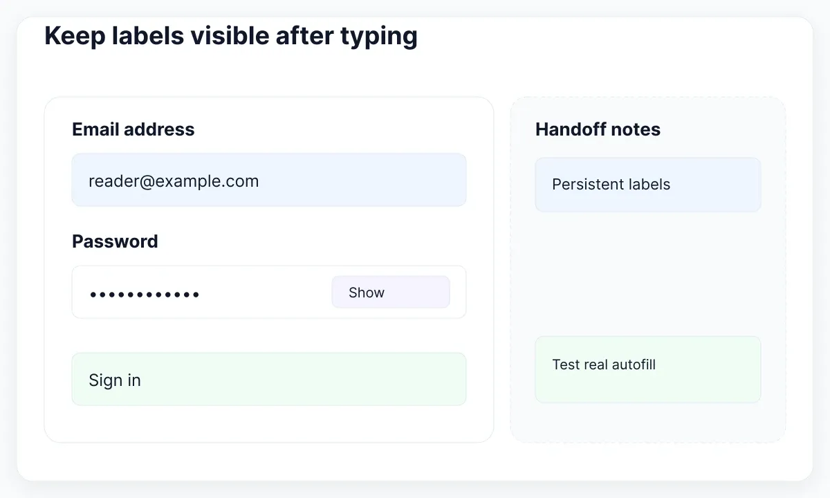
The WAI labeling tutorial explains the relationship between labels and controls. Annotate the intended label-to-input association for implementation. In the Figma file, make the field name, optional instruction and error text separate editable layers. This gives a reviewer somewhere to put content without squeezing every explanation inside the input itself.
Add a proposed Show password control beside the masked value and specify its two action labels: Show password and Hide password. Treat it as an interactive control during handoff. Record that toggling visibility should preserve the entered value in this exercise. Have a teammate inspect the two states with a long password substitute; use invented characters and never a real account secret.
For implementation, note username for the email identifier and current-password for the existing password in the autocomplete specification. These values are documented in the MDN autocomplete reference. The markup contract is distinct from the visible label: an email can serve as a username. A screenshot cannot demonstrate whether a browser or password manager receives the right metadata.
Separate submission from failure
Give submission its own frame instead of replacing the form with a generic spinner. In this proposed exercise, the button says Signing in while the surrounding context remains recognizable. Document whether another submission is accepted during the request. Ask the implementation team to define timeout and response behavior; the Figma transition should not silently invent a backend guarantee.
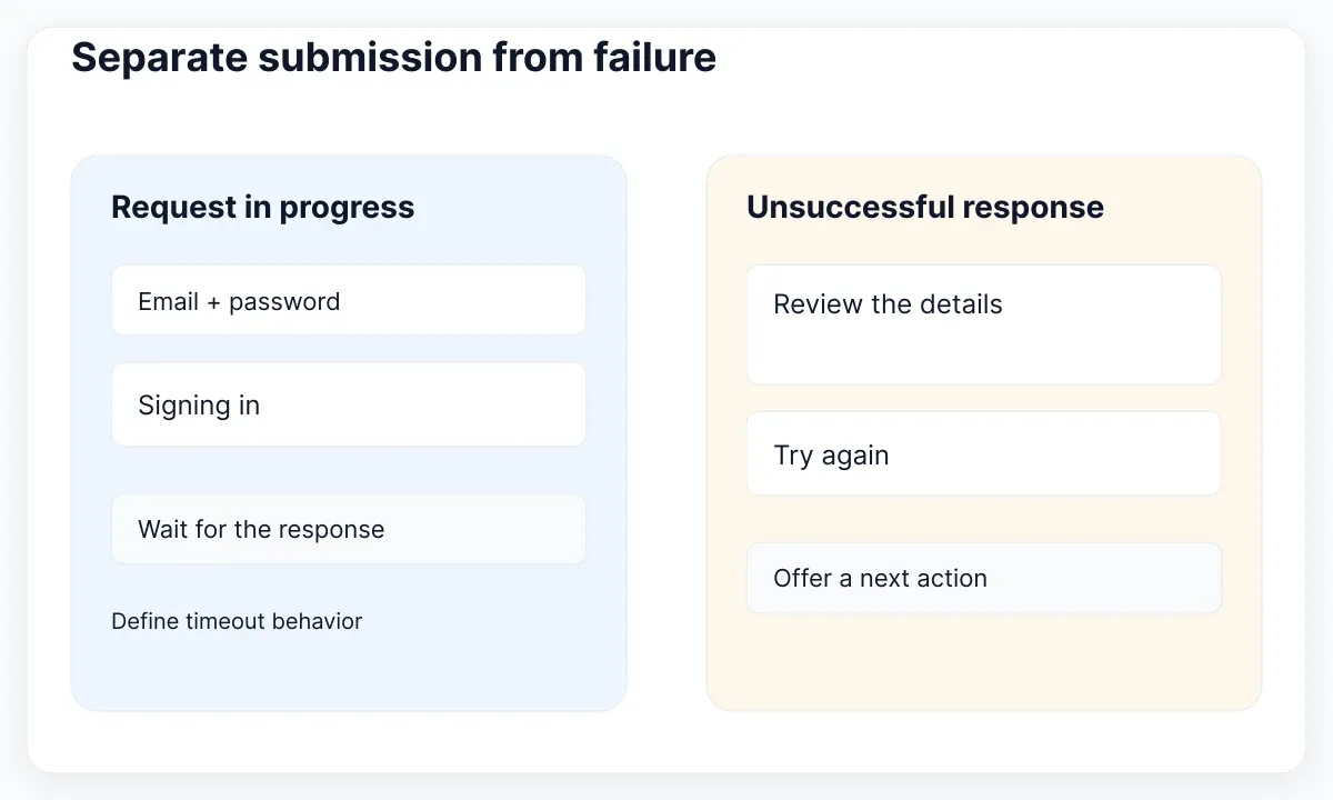
Prepare two failure fixtures. An omitted identifier can receive a local message such as Enter your email address. A response from the sign-in service needs a separate form-level treatment and a useful next action. Let the identity team approve its exact wording. The designer should not infer whether a particular account exists from a mocked response or invent a production disclosure policy.
The WAI notification tutorial calls for clear feedback about submission outcomes and helpful error instructions. In our fixture, put the relevant message near the related content and reserve sufficient height for two lines. Use a text explanation alongside its visual emphasis. Then ask the developer how the message will be associated and announced in the implemented form.
For a repeatable review, simulate an unsuccessful response, edit the identifier and try again. The file should make both the attempted correction and the next action clear. Do not reuse the failure frame as the loading frame: waiting and needing a correction demand different decisions. Continue with Figma variants for UI states if the kit makes those differences hard to maintain.
Make recovery a complete route
Follow Forgot password all the way to an explicit confirmation in the exercise. Define the request screen, its submit action and the route back to sign-in. Include an editable identifier so the reviewer can correct a typo before requesting another message. Keep any resend timing and delivery guarantees unresolved until the actual identity service supplies its rules.
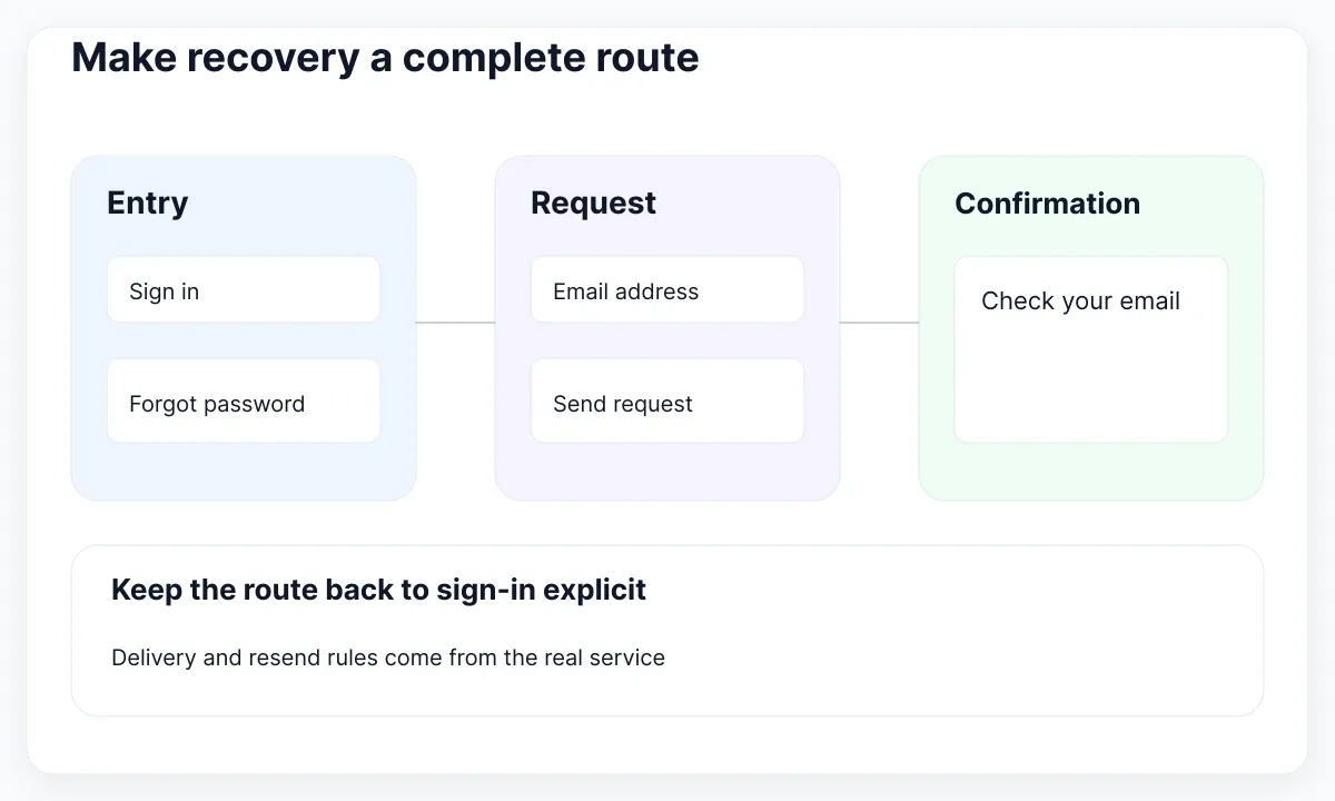
A useful fictional confirmation says Check your email for the next step, with a return-to-sign-in action. Mark this as proposed copy for review. Its purpose in the exercise is to prevent the route from ending on an unexplained checkmark. Also include an expired-link fixture if recovery links are part of the real product, and identify who owns that state.
The WCAG accessible-authentication guidance discusses assistance such as password managers and copy and paste. Carry a short requirement into the handoff: support those mechanisms in the implemented sign-in route. A row of separate code boxes or a beautiful password field does not establish that this works. Test the real controls rather than accepting a prototype animation as evidence.
Keep the recovery review focused on an observable question: after requesting help, can the participant explain the next step and return to entry? Avoid testing receipt of a real email in a visual prototype. For planning small simulations with deliberate alternatives, see prototype examples for recovery tasks.
Adapt the form before the decoration
Start from the widest composition, then create a narrow review frame with the same form content. Let the form determine the necessary height. In Fieldnote, the large artwork is secondary; our proposed narrow treatment removes that panel while keeping the identifier, password, primary action and recovery route together in their original reading sequence.
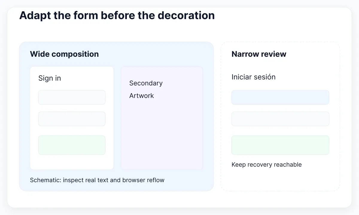
The WCAG reflow explanation describes a width equivalent to 320 CSS pixels for vertically scrolling content, with stated exceptions. Use that as an implementation acceptance reference, not as proof conferred by a 320-wide Figma frame. In the design exercise, inspect wrapping and reachable actions; in the browser, verify the corresponding behavior at the required conditions.
Replace Sign in with Iniciar sesión, then add a longer recovery explanation. Check the button, the message area and the space between the password control and its adjacent action. Prefer a taller form over clipped copy. Our review recommendation is to vary content first, width second, so a layout defect has an identifiable trigger instead of several simultaneous causes.
Define visible keyboard focus as another implementation requirement, using the WAI Focus Visible reference. Add a focus specimen for the field, visibility toggle, submit button and recovery link. Keep the active control identifiable in the design, then inspect actual keyboard navigation in the browser. A drawn focus ring alone cannot demonstrate navigation order or operability.
Inspect the real EmviUI login specimen
The real EmviUI screen below has a left-side login card and a large illustration panel. The card includes Username, Password, Log in, Remember me, Reset and Register. Use the editable EmviUI Figma kit as a visual starting point, then adapt its terminology and states to the product contract rather than copying every control automatically.
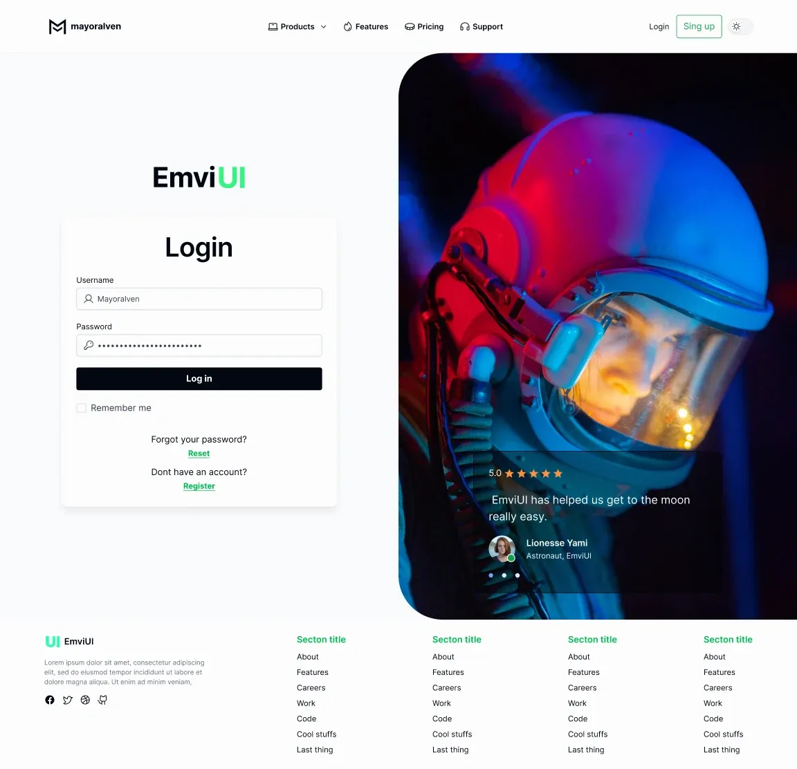
For Fieldnote, change Username to Email address because the fictional contract accepts email. Decide whether Remember me belongs in the implementation before retaining it. Review the Reset link as the entrance to recovery and keep registration visually secondary. The specimen demonstrates a composition and visible controls; it does not reveal live authentication, password-manager behavior or a complete accessibility test.
The image contains demonstration content and decorative marketing. Do not reuse its testimonial as evidence about your product. Keep the original reference beside your adapted frame so a reviewer can see which changes are intentional. If the candidate needs extensive repair to fit the agreed states, record that cost before choosing another kit solely for its colors.
Organize reusable states without a variant maze
Separate field-level appearance from the overall request result. A password field can be focused while the form still shows an unsuccessful-response message. In our exercise, use a small field state set and a separate form-status example. This prevents one giant property from attempting to describe every combination of focus, visibility, content and server outcome.
Figma’s variant documentation describes grouping similar components and exposing properties. Apply that capability only where it helps the next consumer choose a meaningful configuration. Label one instance as the reference and another as the adapted screen. Ask a teammate to change the field state without altering the surrounding recovery content.
Finish with a compact handoff record: supported identifier, field labels, autocomplete intent, request states, error-copy owner, recovery destination and pending implementation checks. The WAI validation tutorial distinguishes client-side checks from server-side validation. Keep authentication and validation responsibilities assigned to the implementation team; the kit provides editable design material, while the implemented flow supplies the behavioral evidence.
Run one acceptance rehearsal before choosing the kit
Add a small decision log after the rehearsal. Record the starting component, each changed label, the states added and the browser checks still pending. For example, a kit that adapts cleanly to the email contract but needs a new recovery confirmation can remain a candidate with that work explicitly estimated. Compare that effort with a second candidate using the same inventory, rather than comparing unrelated hero screenshots.
Give a teammate a five-minute task: open the adapted entry frame, point to the identifier, submit an empty form, correct it, encounter the unsuccessful response and enter recovery. Do not explain the screen while they work. Record the first point at which they need guidance and the component or copy that caused the uncertainty.
Repeat with the Spanish copy and narrow frame, then transfer the outstanding checks to a browser-based implementation review. Accept the design exercise when every state has a visible purpose and next action, the translated content fits, and another designer can reproduce the adaptation. Choose the kit that makes this work understandable and maintainable, with any unfinished behavior clearly assigned.

Pablo Mayoral
Senior UX/UI & Web Designer with 10+ years of experience. Creator of EmviUI (10k+ components Figma design system), UImand, and Vitamin Bootstrap. Currently designing digital products at CQMRewards.